
Before and after is designed for visual comparisons such as restoration, fit, finish, or product results. Visitors move a divider to reveal more of either image.
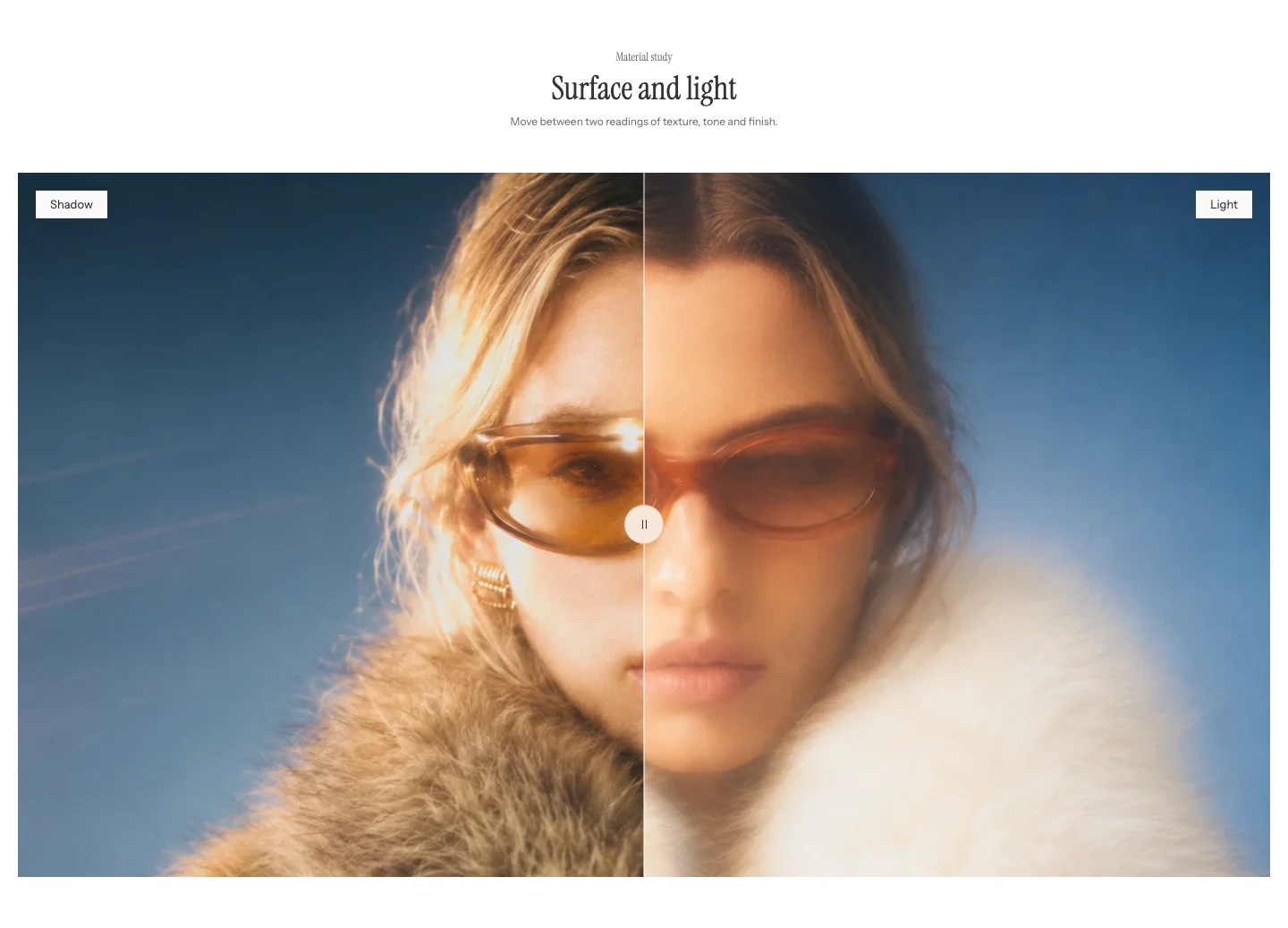
Visitors drag the handle to reveal more of either image.
Add Before and after
- Open Online Store > Themes > Edit theme.
- Use the page selector to open the template where the comparison should appear.
- Select Add section, then choose Before and after.
- Add both source images before adjusting the divider position or ratios.
This section is available in regular page content, but not in header, footer, or overlay section groups.
Content
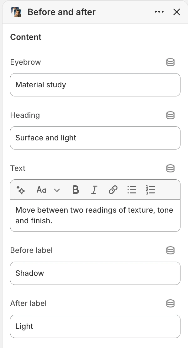
The Content group in the Theme Editor. The values shown are examples, not defaults.
Eyebrow
Adds the short line above the section heading. The default is See the difference.
Heading
Adds the main section heading. The default is Before and after.
Text
Adds the supporting rich text below the heading. The default is Drag the handle to compare two images.
Keep the explanation useful even when a visitor has not moved the divider.
Before label and After label
Identify the two sides of the comparison. The defaults are Before and After; use specific terms when those words would be ambiguous.
Media
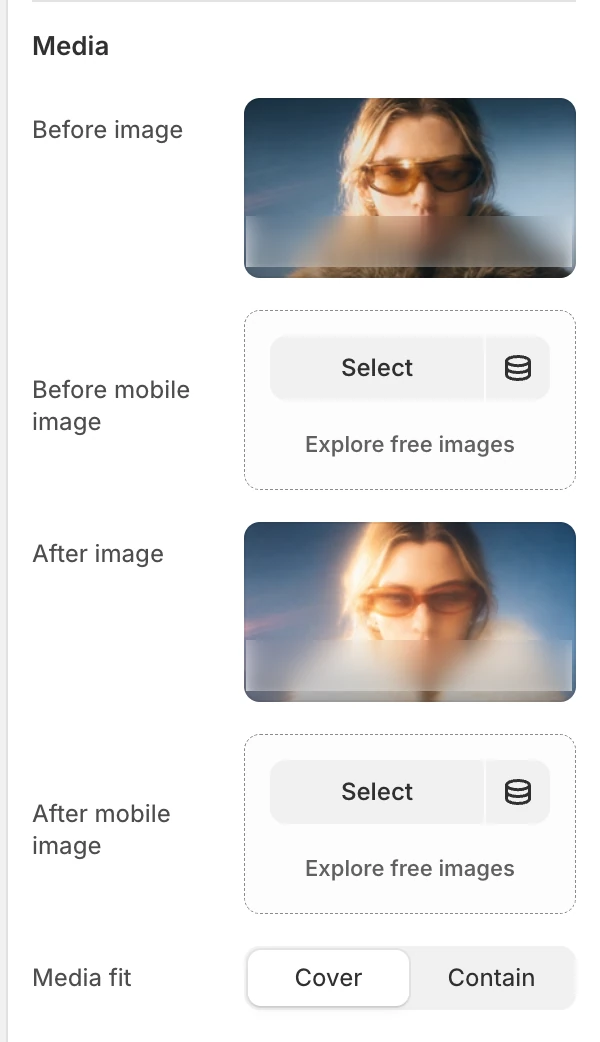
The Media group in the Theme Editor.
Before image and After image
Choose the two primary images. Add both images before publishing so visitors can make a meaningful comparison.
Before mobile image and After mobile image
Optional replacements for narrow screens. When a mobile image is blank, Strata uses the corresponding main image. Use these fields when the desktop crop loses the subject or comparison detail on mobile.
Media fit
Cover fills the comparison frame and can crop; Contain keeps the full image visible and can leave unused space. Default: Cover.
Layout
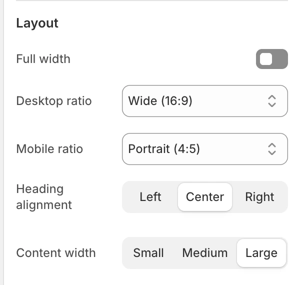
The Layout group in the Theme Editor.
| Setting | Options and use |
|---|---|
| Full width | Extends the section beyond the normal page container when on. Default: Off. |
| Desktop ratio | Portrait (4:5), Square (1:1), Landscape (4:3), or Wide (16:9). Default: Wide (16:9). |
| Mobile ratio | Portrait (4:5), Square (1:1), or Landscape (4:3). Default: Portrait (4:5). |
| Heading alignment | Left, Center, or Right. Default: Center. |
| Content width | Small, Medium, or Large. Default: Large. Controls the readable width of the introduction. |
The selected ratio controls the comparison frame independently at each responsive size. Check both source images in the selected frame; changing the ratio does not correct a mismatched subject position.
Controls
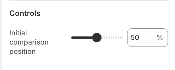
The Controls group in the Theme Editor.
| Setting | Options and use |
|---|---|
| Initial comparison position | Sets where the divider starts, from 10–90% in 5% steps. Default: 50%. This is the starting position, not a limit on how far visitors can move the divider. |
The visitor-facing comparison range runs from one side to the other. Review both endpoints with keyboard and touch input.
Shoppers drag the divider to compare the two images.
Colors
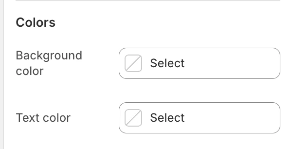
The Colors group in the Theme Editor.
| Setting | What it controls | Default |
|---|---|---|
| Background color | The section surface around the comparison. | Leave blank to inherit Theme settings > Colors > General; selecting a color in this section overrides the inherited value. |
| Text color | The default text color for the heading, labels, and supporting copy. | Leave blank to inherit Theme settings > Colors > General; selecting a color in this section overrides the inherited value. |
Check the labels and supporting copy against the selected colors.
Spacing
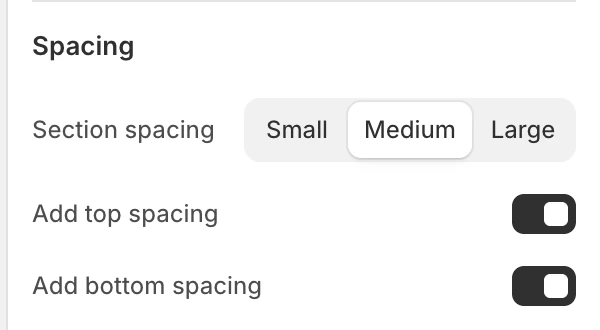
The Spacing group in the Theme Editor.
| Setting | Options and use |
|---|---|
| Section spacing | Small, Medium, or Large. Default: Medium. |
| Add top spacing | Adds the section's top spacing. Default: On. |
| Add bottom spacing | Adds the section's bottom spacing. Default: On. |
Prepare the image pair
Use images taken from the same viewpoint and with the same framing. If their dimensions or subject positions differ, the slider can imply a change that is only caused by alignment. Preview Cover crops on both sizes before publishing.
Blocks
Before and after has no configurable blocks. The two image sides and their labels are section settings.
Desktop and mobile behavior
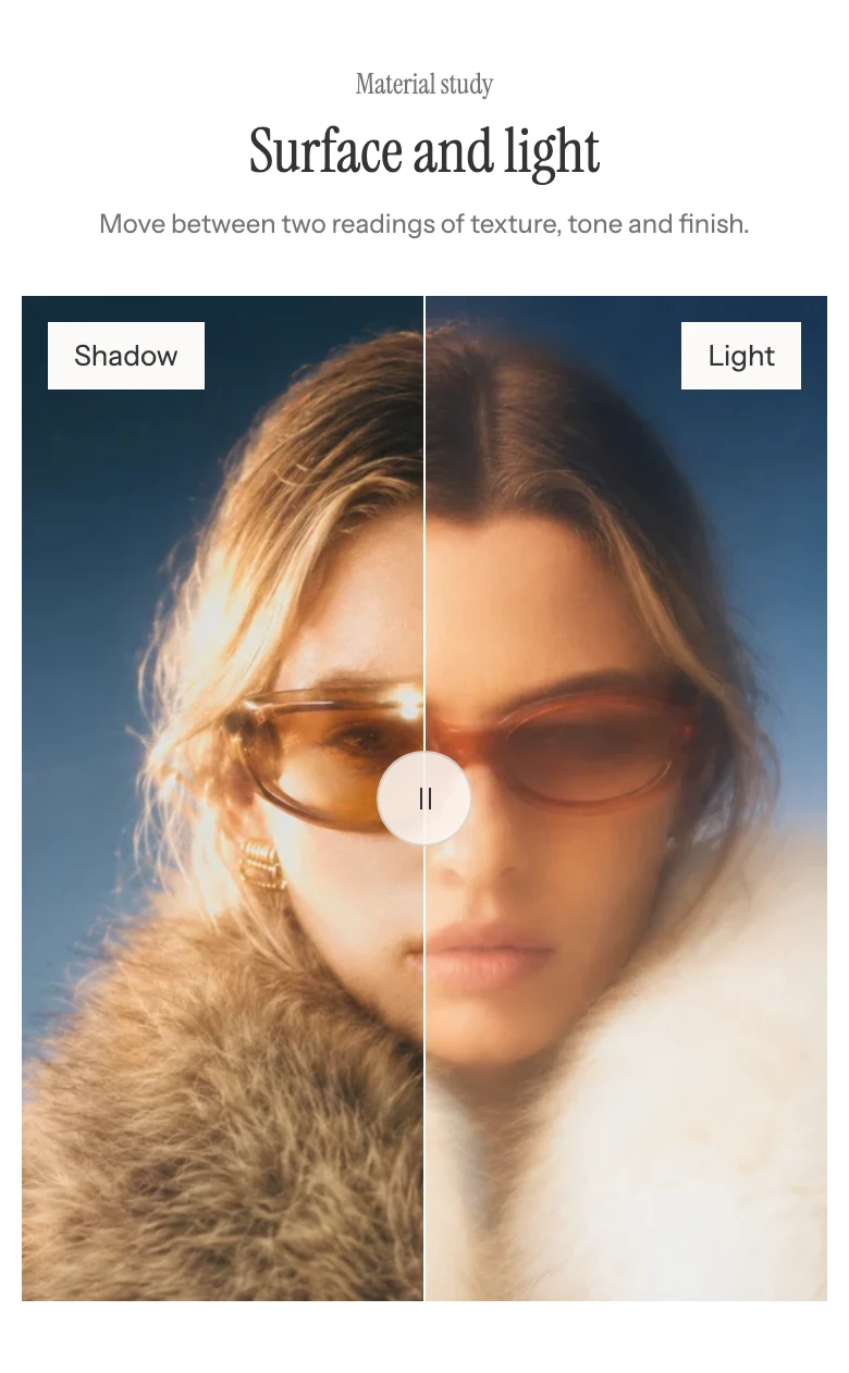
On mobile the comparison uses the Mobile ratio.
Desktop and mobile ratios are separate. Mobile source images are optional fallbacks to the desktop sources, so a comparison can use the same pair at both sizes or a portrait-specific pair. The final crop and divider position need checking in both viewport classes.
Accessibility and interaction
The section exposes a labelled range control for the divider and updates its text value as the position changes. Keep Before label and After label meaningful, and do not make the comparison the only place where a claim is explained in words. Review keyboard operation, visible focus, touch dragging, and both endpoints.
Common issues
- The comparison looks like two unrelated images: use matching viewpoints and framing, then review both crops with Media fit.
- The subject disappears on mobile: add the relevant mobile image and choose a mobile ratio that preserves the subject.
- The divider starts in an unexpected place: check Initial comparison position; it controls the initial value only.
- A side is blank: confirm that the corresponding Before image or After image has been selected.
Related guides
- Media hero for a single focal image or video that can expand into a slideshow.
- Flexible media grid for mixed media items with independent spans.
- Animation for the global reduced-motion controls.