
Logo carousel presents a continuously moving row of brand marks. Use it for partners, stockists, press, certifications, or compatible services—not as a substitute for descriptive content.
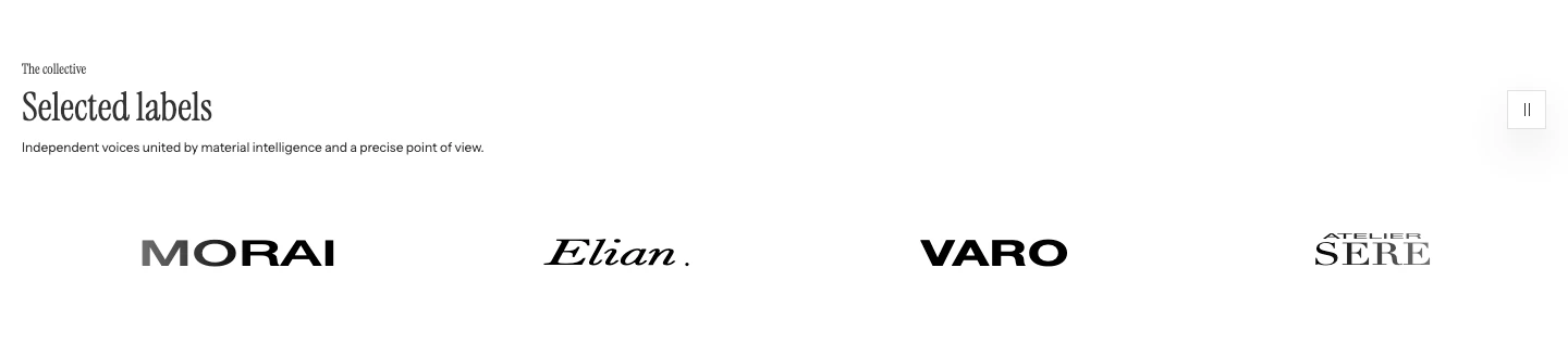
Logo carousel on desktop. The row of logos moves continuously.
Add Logo carousel
- Open Online Store > Themes > Edit theme.
- Use the page selector to open the template where the partner or brand marks should appear.
- Select Add section, then choose Logo carousel.
- Add the Logo blocks and link only the marks that need a destination.
The section supports up to 24 Logo blocks. Continuous movement is available when the section has more than one block, including blocks that are still using the empty-logo wordmark.
Content
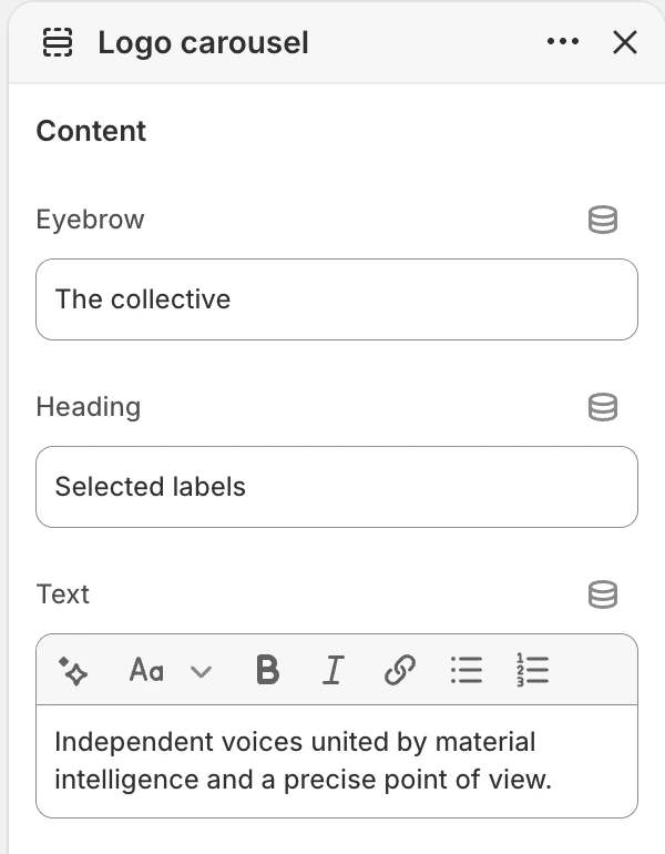
The Content group in the Theme Editor. The values shown are examples, not defaults.
| Setting | Options and use |
|---|---|
| Eyebrow | Short label above the heading. Default: Selected partners. |
| Heading | Main section heading. Default: Featured brands. |
| Text | Supporting rich text. Default: A rotating selection of names we work with. |
Use the heading to explain what the marks represent. Do not make visitors infer a partnership or certification from a logo alone.
Layout
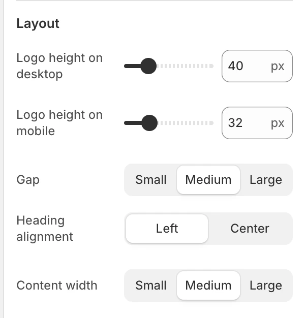
The Layout group in the Theme Editor.
| Setting | Options and use |
|---|---|
| Logo height on desktop | 12–140 px in 4 px steps. Default: 40 px. |
| Logo height on mobile | 12–96 px in 4 px steps. Default: 32 px. |
| Gap | Small, Medium, or Large. Default: Medium. On mobile these choices use approximately 20 px, 40 px, or 60 px between marks. |
| Heading alignment | Left or Center. Default: Center. |
| Content width | Small, Medium, or Large. Default: Medium. |
The two logo-height settings are independent. Review the visible weight of the marks rather than matching their source file dimensions.
Motion and controls
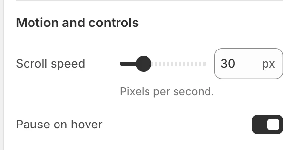
The Motion and controls group in the Theme Editor.
| Setting | Options and use |
|---|---|
| Scroll speed | 10–100 px/s in 5 px/s steps. Default: 30 px/s. |
| Pause on hover | Pauses the moving row while a pointer rests over a logo item on hover-capable devices. Default: On. |
The section also provides a pause/play control while automatic movement is active. A visitor can pause the row, and focus or direct pointer interaction pauses movement while the item is being inspected. Reduced-motion preferences stop the automatic movement and hide the automatic-motion toggle.
Colors
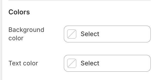
The Colors group in the Theme Editor.
| Setting | What it controls | Default |
|---|---|---|
| Background color | The section surface behind the logo row. | Leave blank to inherit Theme settings > Colors > General; selecting a color in this section overrides the inherited value. |
| Text color | The default text color for the heading and supporting copy. | Leave blank to inherit Theme settings > Colors > General; selecting a color in this section overrides the inherited value. |
Check the heading, labels, and controls against the selected colors.
Spacing
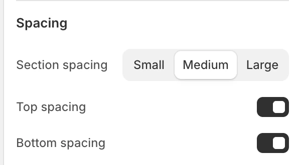
The Spacing group in the Theme Editor.
| Setting | Options and use |
|---|---|
| Section spacing | Small, Medium, or Large. Default: Medium. |
| Top spacing | Adds the section’s top spacing. Default: On. |
| Bottom spacing | Adds the section’s bottom spacing. Default: On. |
Blocks
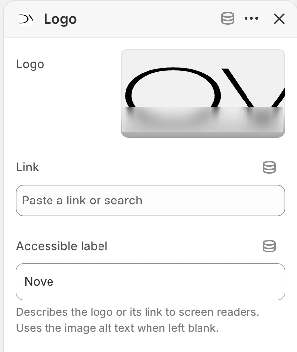
Logo block settings.
Add up to 24 Logo blocks and reorder them in the Theme Editor.
| Setting | What it controls |
|---|---|
| Logo | The image used for the mark. |
| Link | Optional destination for the mark. Leave it blank when the logo is informational only. |
| Accessible label | Describes the logo or its destination to screen readers. When blank, Strata uses the image alt text; if that is also blank, it falls back to a numbered logo label. |
Write an accessible label that names the organization and explains the destination when the mark is linked. Do not put private dashboard links or account-only URLs in a public logo block.
When Logo is blank, the block displays a generic Logo wordmark on a setup surface. Use it only while arranging the section, then upload the intended mark or remove the unused block before publishing. An uploaded logo displays without that placeholder background; any empty space inside the source file remains part of the artwork.
Desktop and mobile behavior
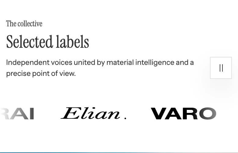
On mobile the logos use Logo height on mobile.
Desktop and mobile logo heights are separate. With more than one block, the row moves continuously. Review mark crop, spacing, and the pause control at both sizes; a mark that looks balanced on desktop can have a different visual weight at the mobile height.
Media recommendations
Use clean logo files with consistent visual weight and a transparent background when the artwork needs to sit on different surfaces. Add meaningful image alt text in Shopify Files, then use Accessible label when the link needs more context. Review the selected heights at desktop and mobile sizes.
Accessibility and motion
- Keep the explanatory Heading or Text when a row of marks would otherwise be ambiguous.
- Use Accessible label for linked marks and confirm keyboard focus is visible.
- Use the visitor pause control or reduced-motion settings when the row is distracting.
- Check that every link has a clear destination independent of hover or scrolling.
- Review pause/play, focus, pointer interaction, and reduced-motion behavior before publishing.
Common issues
- The row does not move: confirm the section contains at least two Logo blocks; reduced-motion preferences also stop movement.
- Marks look uneven: adjust the two logo-height settings and use source files with more consistent visual weight.
- A logo is announced incorrectly: add Accessible label or correct the image alt text.
- A mark has no action: add Link only when visitors should be taken somewhere.
Related guides
- Auto-scroll gallery for linked community or campaign images.
- Footer for the footer’s own logo and navigation content.
- Animation for reduced motion and shared parallax behavior.