
Auto-scroll gallery
Present linked community, campaign, or social-style image cards in a moving gallery.
Auto-scroll gallery displays up to 24 linked visual cards in a moving or manually controlled row. Use it to bring community images, campaign moments, or selected social content into the storefront.
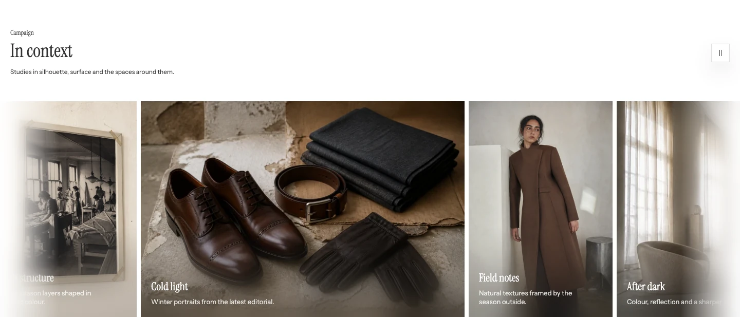
Auto-scroll gallery on desktop. The cards move continuously from right to left.
Add Auto-scroll gallery
- Open Online Store > Themes > Edit theme.
- Use the page selector to open the template where community or campaign images should appear.
- Select Add section, then choose Auto-scroll gallery.
- Add the Social card blocks and set a link only when the card should open a destination.
The section supports up to 24 Social card blocks and is not available in header, footer, or overlay section groups.
Content
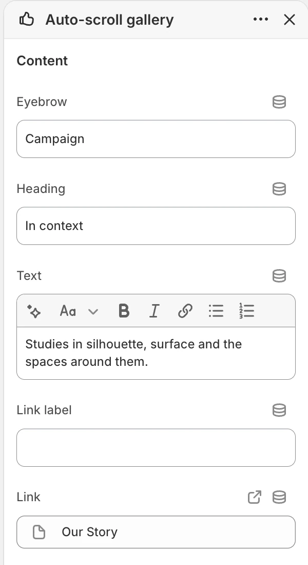
The Content group in the Theme Editor. The values shown are examples, not defaults.
| Setting | What it controls |
|---|---|
| Eyebrow | Short label above the heading. Default: Follow along. |
| Heading | Main section heading. Default: From the community. |
| Text | Supporting rich text. Default: Show social posts, customer photos, or moments from your brand. |
| Link label | Label for the section-level link. Default: View social profile. |
| Link | Destination for the section-level link. |
The section-level link is separate from each card’s Card link. Use it for a profile, gallery, or collection destination that represents the entire row.
Layout
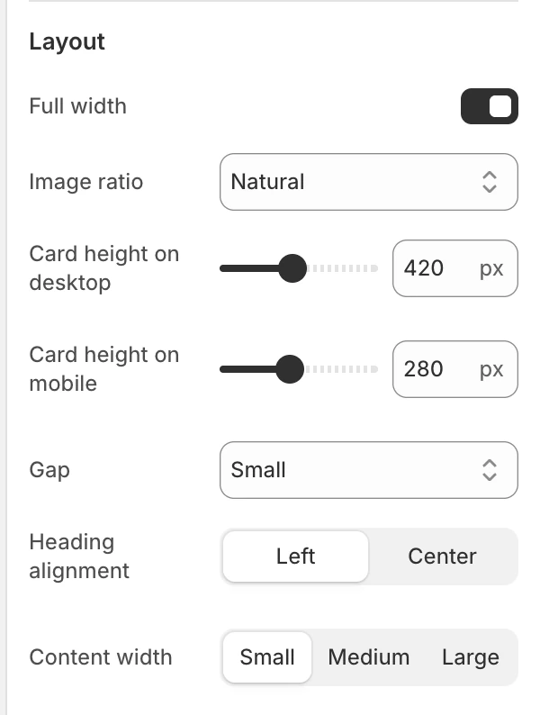
The Layout group in the Theme Editor.
| Setting | Options and use |
|---|---|
| Full width | Lets the carousel track use the full available width when on. Default: On. |
| Image ratio | Natural, Landscape, Square, or Portrait. Default: Natural. |
| Card height on desktop | 240–640 px in 20 px steps. Default: 420 px. |
| Card height on mobile | 160–440 px in 20 px steps. Default: 220 px. |
| Gap | None, Small, Medium, or Large. Default: Medium. |
| Heading alignment | Left or Center. Default: Left. |
| Content width | Small, Medium, or Large. Default: Medium. |
Natural preserves the source image ratio; the other choices create a consistent presentation across cards. Review every image because a ratio that suits one card can crop another subject.
Motion and controls
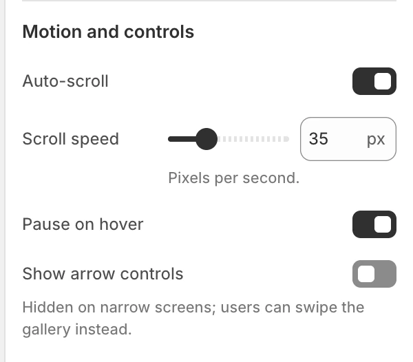
The Motion and controls group in the Theme Editor.
| Setting | Options and use |
|---|---|
| Auto-scroll | Enables continuous movement. Default: On. |
| Scroll speed | 10–100 px/s in 5 px/s steps. Default: 35 px/s. Visible when Auto-scroll is on. |
| Pause on hover | Pauses automatic movement while a pointer rests over a card on hover-capable devices. Default: On. Visible when Auto-scroll is on. |
| Show arrow controls | Adds previous and next card controls on desktop. Default: On. The arrows are hidden on mobile, where shoppers swipe the gallery instead. |
When automatic scrolling is active, shoppers can pause or resume the row. Keyboard focus pauses movement while a shopper uses the gallery controls. Manual swiping or scrolling pauses it temporarily, then automatic movement resumes after the interaction ends. A tap that gives a control focus on mobile does not count as hover, and Pause on hover applies only to a mouse on a hover-capable device. If a shopper selects the pause control, the row remains paused until they resume it. Movement also stops while the section is not visible or reduced motion is requested.
Colors
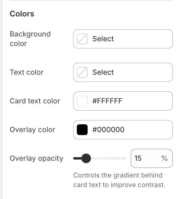
The Colors group in the Theme Editor.
| Setting | Options and use |
|---|---|
| Background color | Leave blank to inherit Theme settings > Colors > General > Background. Choose a value here only when this gallery needs its own surface. |
| Text color | Leave blank to inherit Theme settings > Colors > General > Text. This controls the section heading and supporting content, not the copy over each card. |
| Card text color | Color for copy over the card image. Default: #FFFFFF. |
| Overlay color | Sets the gradient color behind card copy. Default: #000000. |
| Overlay opacity | 0–80% in 5% steps. Default: 15%. The gradient sits behind card copy. |
Section colors override the General colors only for this gallery. Card text color controls the copy over each card.
Spacing
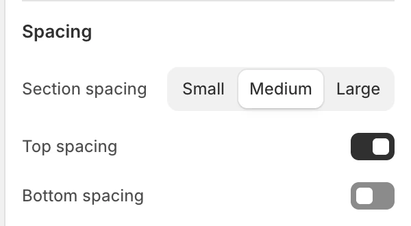
The Spacing group in the Theme Editor.
| Setting | Options and use |
|---|---|
| Section spacing | Small, Medium, or Large. Default: Medium. |
| Top spacing | Adds the section’s top spacing. Default: On. |
| Bottom spacing | Adds the section’s bottom spacing. Default: On. |
Blocks
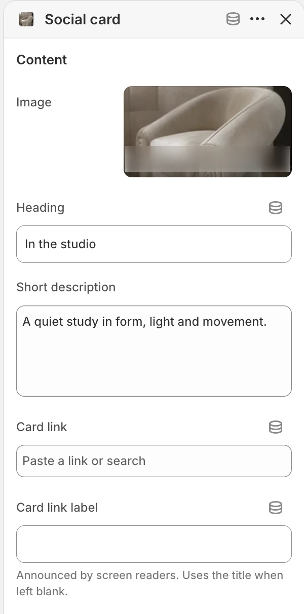
Social card block settings.
Add up to 24 Social card blocks and reorder them in the Theme Editor.
Content
| Setting | What it controls |
|---|---|
| Image | Card image. Its alt text is used when no other image description is supplied. |
| Heading | Card heading. Default: Add a title. |
| Short description | Supporting card copy. Default: Add context for this image or post. |
| Card link | Optional destination for the card. |
| Card link label | Screen-reader label for the linked card. When blank, Strata uses the title and then a generic card label. |
Keep the card title and link label useful without depending on the image itself. If the card has no link, it remains informational.
Desktop and mobile behavior
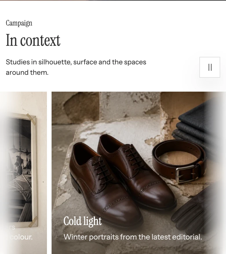
Auto-scroll gallery on mobile.
Desktop and mobile card heights are independent. The selected image ratio, source focal point, and card height determine the visible crop at each size. Check cards, the section-level link, and motion states at both sizes.
Media recommendations
Use public-facing images with a clear focal subject and meaningful alt text. Keep descriptions short enough for the selected card height, then review the crop and overlay at desktop and mobile sizes.
Accessibility and motion
- Use Card link label when a title does not explain the destination.
- Keep arrow and pause controls keyboard reachable and visibly focused.
- Do not rely on auto-scroll to reveal a card’s only important message.
- Check Card text color, Overlay color, and Overlay opacity against every card image.
- Review reduced-motion, touch, keyboard, hover-pause, and arrow behavior before publishing.
Common issues
- The row does not move: confirm Auto-scroll is on, the section is visible, and reduced-motion is not suppressing movement.
- Speed or hover settings are missing: these settings appear only when Auto-scroll is on.
- An arrow is missing: confirm Show arrow controls is on and the section has card blocks.
- A card’s copy disappears into the image: adjust Overlay color, Overlay opacity, and Card text color, then check all cards.
- The destination is unclear: add Card link label and verify the URL behind Card link.
Related guides
- Logo carousel for partner or certification marks.
- Flexible media grid for mixed editorial blocks.
- Animation for reduced motion and automatic movement.
- Appearance and spacing for the optional global blur enhancement.