
Appearance and spacing sets the shared geometry and control treatment of the storefront. Use it to establish the page width, spacing rhythm, button style, and link behavior before tuning an individual section.
Open Appearance and spacing
Open Theme settings > Appearance and spacing in the Shopify Theme Editor. The editor groups the settings as general page geometry, section spacing, button, link, rounding, effects, shadow, and icon treatment.
Page geometry
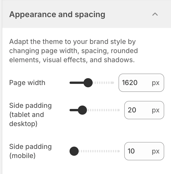
The settings at the top of Appearance and spacing. Values shown are from the demo store, not defaults.
Page width
Sets the maximum page width from 1000–2560 px, in 20 px steps. New installations start at 2560 px. A smaller value keeps long-form and commerce content closer to the reading line; a larger value gives wide media grids and multi-column sections more room.
Side padding (tablet and desktop)
Sets the shared horizontal page padding for tablet and desktop from 10–60 px, in 1 px steps. The default is 20 px. Review it with wide media, product grids, tables, and the Header at several desktop widths.
Side padding (mobile)
Sets the shared horizontal page padding for mobile from 10–60 px, in 1 px steps. The default is 20 px. Use the independent mobile value to preserve usable content width without forcing the tablet and desktop gutters to match it.
Section spacing
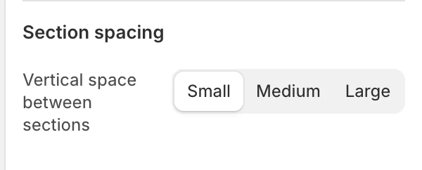
The Section spacing group in the Theme Editor.
Vertical space between sections
Chooses the shared gap between sections:
| Option | Use it when |
|---|---|
| Small | Sections should read as a compact sequence. |
| Medium | The default balance of separation and page length. |
| Large | Editorial pages need clearer pauses between stories. |
The default is Medium. Individual section settings may still create their own internal padding or media treatment.
Button
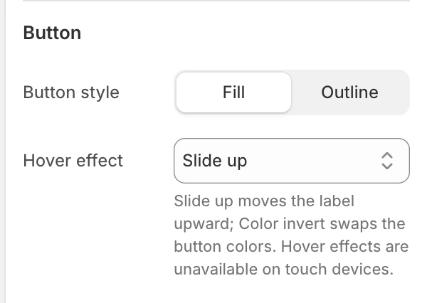
The Button group in the Theme Editor.
These settings provide the default treatment for supported theme buttons. A section-level Button style can still choose a primary, secondary, or text-link treatment where that section exposes one.
Button style
Choose Fill or Outline. The default is Fill.
| Option | Effect |
|---|---|
| Fill | Supported primary actions use their configured button background and text colors. |
| Outline | Supported primary actions use a transparent center with the configured action color as the border and label. |
Review primary actions against both plain and image-backed surfaces. Secondary, tertiary, app-provided, disabled, and native Shopify controls can keep their own treatment.
Hover effect
Choose None, Slide up, or Color invert. The default is Slide up.
| Option | Effect |
|---|---|
| None | The button keeps a static label and color treatment. |
| Slide up | The label moves upward and a matching copy enters from below. |
| Color invert | The configured button and label colors swap on pointer hover. |
Hover effects are unavailable on touch devices. Reduced-motion visitors receive the static treatment rather than the moving label. Always check focus, loading, disabled, and sold-out actions as well as hover.
Link
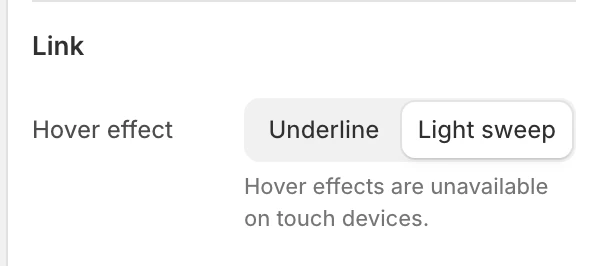
The Link group in the Theme Editor.
Hover effect
Choose Underline or Light sweep. The default is Light sweep.
- Underline uses the shared underline treatment for supported navigation and text links.
- Light sweep sends a brief highlight across the link label on pointer hover.
Touch interaction stays static, and keyboard focus keeps a visible link indicator. Reduced-motion visitors do not receive the moving sweep. Check Header navigation, Footer menus, and inline calls to action because the same global choice appears across several surfaces.
Rounding
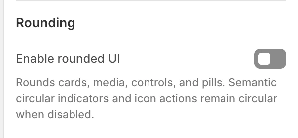
The Rounding group in the Theme Editor.
Enable rounded UI
Controls the shared rounded treatment. New theme installations default to Off, and you can turn it on when rounded cards, media, controls, and pills suit the store's design.
| State | Effect |
|---|---|
| On | Cards, media surfaces, controls, and pills use the theme’s rounded treatment. |
| Off | Those shared UI surfaces become square. Semantic circular indicators and icon actions remain circular where their shape communicates their function. |
Review product cards, drawers, buttons, inputs, badges, and media blocks together. This switch is not a guarantee that every decorative or semantic shape becomes square.
Contained cards, panels, media, and form surfaces can follow this setting across the storefront. This includes supported Header promotion images and menus, localization panels, editorial media, product media, and Article comment fields. Full-width media and a Fullscreen layout at its active desktop or mobile breakpoint remain square and edge to edge. Individual section guides explain the result when a layout can switch between contained and full width.
Effects
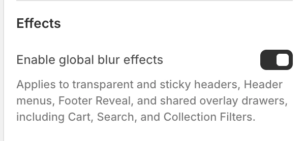
The Effects group in the Theme Editor.
Enable global blur effects
Controls the translucent blur treatment used by supported layered surfaces. The default is On. It applies to:
- transparent and sticky headers;
- header menus;
- shared overlay drawers, including Cart, Search, and Collection Filters;
- the optional progressive layer in the Footer Reveal transition;
- text over media in the Blog feature story, Parallax waterfall image and video cards, and Auto-scroll gallery cards;
- Auto-scroll gallery edge enhancement.
| State | Effect |
|---|---|
| On | Supported translucent surfaces can blur content behind them. |
| Off | Removes the blur only. Supported surfaces keep their configured color, transparency, or gradient treatment. |
The Header's Show dark background gradient setting is independent. Turning global blur off does not remove that gradient or make a transparent Header opaque. The exact appearance still depends on the surface, its background color, and browser support.
Shadow
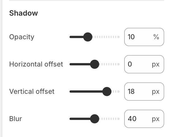
The Shadow group in the Theme Editor.
The shadow controls apply to the shared shadow treatment:
Opacity
Sets shadow opacity from 0–30%, in 1% steps. The default is 10%.
Horizontal offset
Sets the horizontal shadow offset from -30 to 30 px, in 1 px steps. The default is 0 px.
Vertical offset
Sets the vertical shadow offset from -30 to 30 px, in 1 px steps. The default is 18 px.
Blur
Sets shadow blur from 0–80 px, in 2 px steps. The default is 40 px. Higher blur values spread the shadow farther; they do not increase the element’s actual size.
Icon
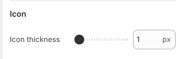
The Icon group in the Theme Editor.
Icon thickness
Choose 1, 1.5, or 2 px for supported theme icons. The default is 1 px.
This is a shared visual control rather than an icon-size setting. It changes the weight of supported navigation, cart, close, filter, gallery, and other theme-owned line icons without changing their touch target or surrounding layout. App-provided artwork, payment logos, social-brand artwork, and filled icons may keep their own design.
Review the setting in the Header, drawers, product gallery, filters, and small icon buttons at both light and dark color schemes. A very thin value can lose clarity at small sizes; a heavier value can make compact controls feel crowded.
Responsive and accessibility review
- Recheck page width, both side-padding controls, and section gaps at mobile, tablet, and desktop widths.
- Test text and controls over image-backed or translucent surfaces, not only over a plain background.
- Keep focus indicators and control boundaries visible when rounding, blur, or shadow changes.
- Compare Icon thickness in both ordinary controls and small icon-only actions; it must not be used to compensate for an icon that is too small or a touch target that is too tight.
- Reduced-motion preferences do not change these static geometry settings, but they can change how a drawer or header reaches its final position.
Footer behavior: Reveal can still run when global blur is off. This setting controls whether its supported transition receives the progressive blur layer; it is not the switch that enables or disables the Reveal layout itself.