
Featured blog carousel brings editorial content into a storefront page. Use it for recent stories, guides, campaigns, or product education that should remain connected to a Shopify blog.
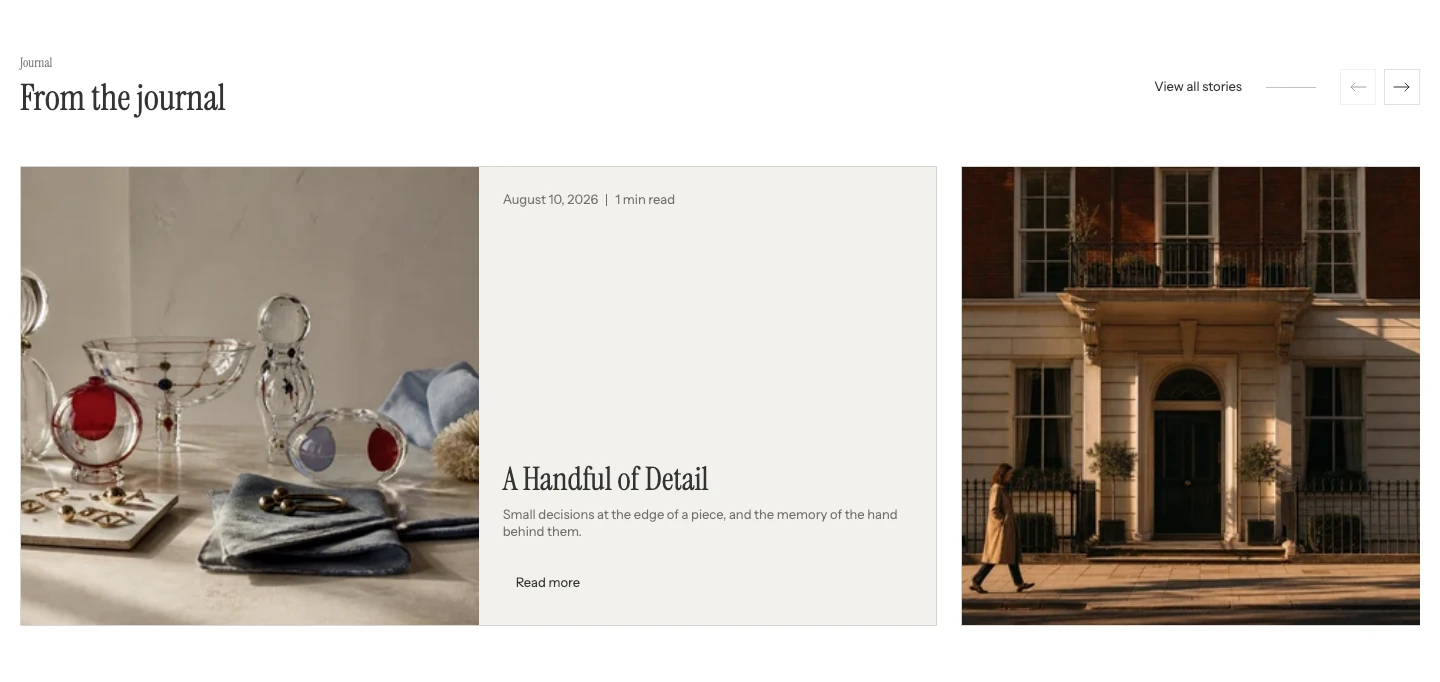
Featured blog carousel on desktop.
Add the carousel
In Shopify's theme editor, add Featured blog carousel to a compatible template or open an existing section. It is not available in the header or overlay groups.
Content
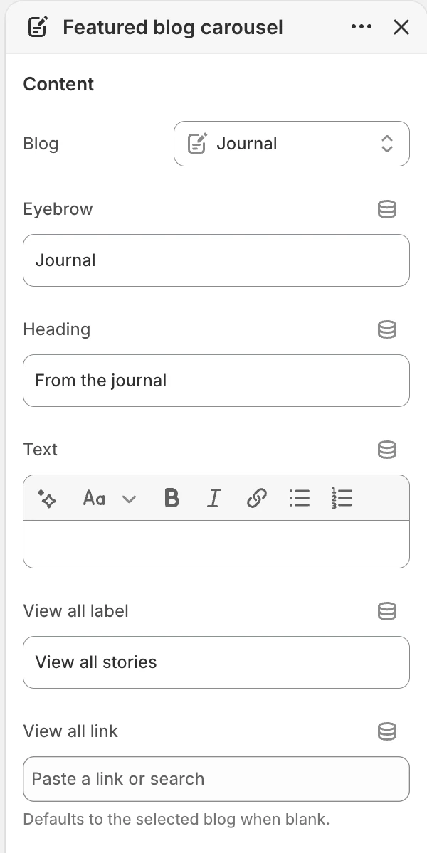
The Content group in the Theme Editor. The values shown are examples, not defaults.
| Setting | What it controls | Options or default |
|---|---|---|
| Blog | Selects the Shopify blog whose articles are shown. | No default. |
| Eyebrow | Short label above the section heading. | Default: Journal. |
| Heading | Main heading for the article group. | Default: From the journal. |
| Text | Optional rich text below the heading. | No default. |
| View all label | Text for the link to the complete blog. | Default: View all stories. |
| View all link | Destination for that link. | No default. When blank, it uses the selected blog. |
Select a blog with published articles before judging the section.
Articles
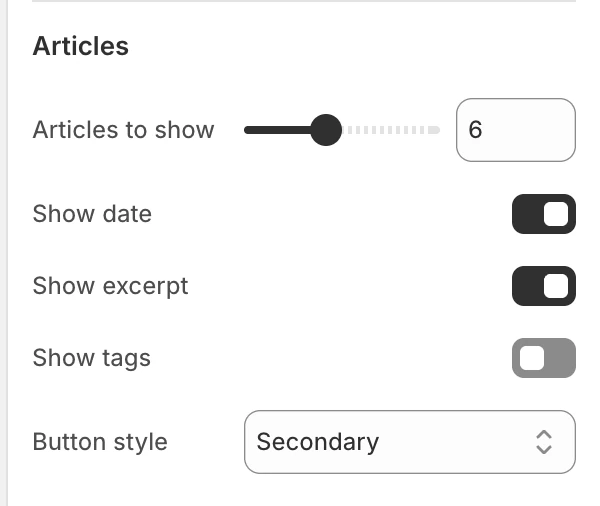
The Articles group in the Theme Editor.
| Setting | What it controls | Options or default |
|---|---|---|
| Articles to show | Maximum number of articles rendered from the selected blog. | Range 2–12, step 1. Default: 6. |
| Show date | Shows each article's publication date and reading-time metadata. | Enabled by default. |
| Show excerpt | Shows the article excerpt when available. | Enabled by default. |
| Show tags | Shows article tags when the article has tags. | Disabled by default. |
| Button style | Sets the article-card action treatment. | Primary, Secondary, or Text link. Default: Secondary. |
Articles follow the selected blog's article order. A featured image is used when available; add one to every article that should have a visual card. The excerpt uses the article excerpt or article content as a fallback and is shortened for the card, so review long and short source articles in preview.
When more than one live article is available, previous and next controls are provided for the carousel. If the blog has zero or one article, do not expect live carousel navigation.
Layout
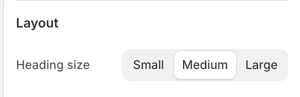
The Layout group in the Theme Editor.
| Setting | What it controls | Options or default |
|---|---|---|
| Heading size | Changes the hierarchy of the section heading. | Small, Medium, or Large. Default: Medium. |
Colors
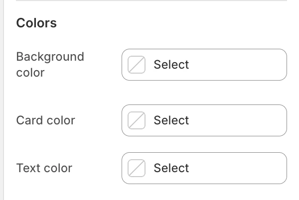
The Colors group in the Theme Editor.
| Setting | What it controls | Default |
|---|---|---|
| Background color | The section surface behind the article cards. | Leave blank to inherit Theme settings > Colors > General; selecting a color in this section overrides the inherited value. |
| Card color | The surface of each article card. | Leave blank to use the existing default card surface. |
| Text color | The default text color for the section. | Leave blank to inherit Theme settings > Colors > General; selecting a color in this section overrides the inherited value. |
Check article titles, metadata, excerpts, actions, and controls against the selected section and card colors.
Spacing
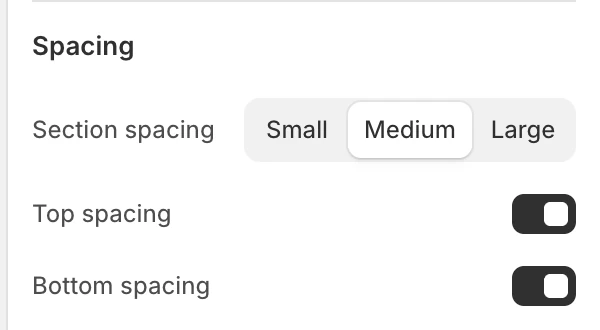
The Spacing group in the Theme Editor.
| Setting | What it controls | Options or default |
|---|---|---|
| Section spacing | Chooses the section's spacing scale. | Small, Medium, or Large. Default: Medium. |
| Top spacing | Adds or removes the section's top spacing. | Enabled by default. |
| Bottom spacing | Adds or removes the section's bottom spacing. | Enabled by default. |
Desktop and mobile behavior
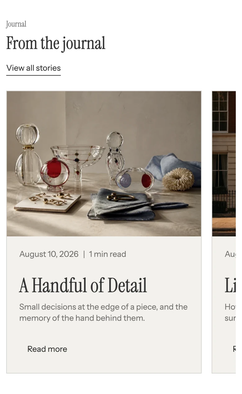
On mobile, visitors swipe through the article cards.
Select anywhere on an article card to open the article. The card also shows a Read more action. Keep titles and excerpts comparable so the card group remains easy to scan. Review card visibility, horizontal overflow, and transitions at desktop and mobile sizes.
Accessibility and motion
Use descriptive article titles, meaningful featured-image alt text in the source article, and tags only when they help navigation. Test previous/next controls and each article link with keyboard focus. Do not make essential information available only in a moving card or excerpt.
Common issues
| Symptom | Safe check |
|---|---|
| No articles appear | Select a Blog and confirm that it contains published articles. |
| View all goes to the wrong page | Set View all link explicitly; a blank field falls back to the selected blog. |
| Tags or excerpts are missing | Check the source article's tags and excerpt/content before changing the section. |
| Navigation controls are absent | Confirm the selected blog has more than one article available to the section. |
| A card count seems different | Check Articles to show and the number of published articles in the selected blog. |