
The Product template brings a product's media, purchase controls, supporting details, and recommendations together on one page. Use it when the same product-page structure should apply to every product assigned to this template.
Go straight to media layouts, product information blocks, or recommendations when you already know what you need to change.
Open the Product template
- From Shopify admin, go to Online Store > Themes > Edit theme.
- Use the page selector to open Products > Default product, or choose the product template you want to review.
- Select the Product page section to edit its settings and blocks.
- Use the template preview to check a product with several media items, multiple variants, and an unavailable variant before saving.
Choose a supplied product template
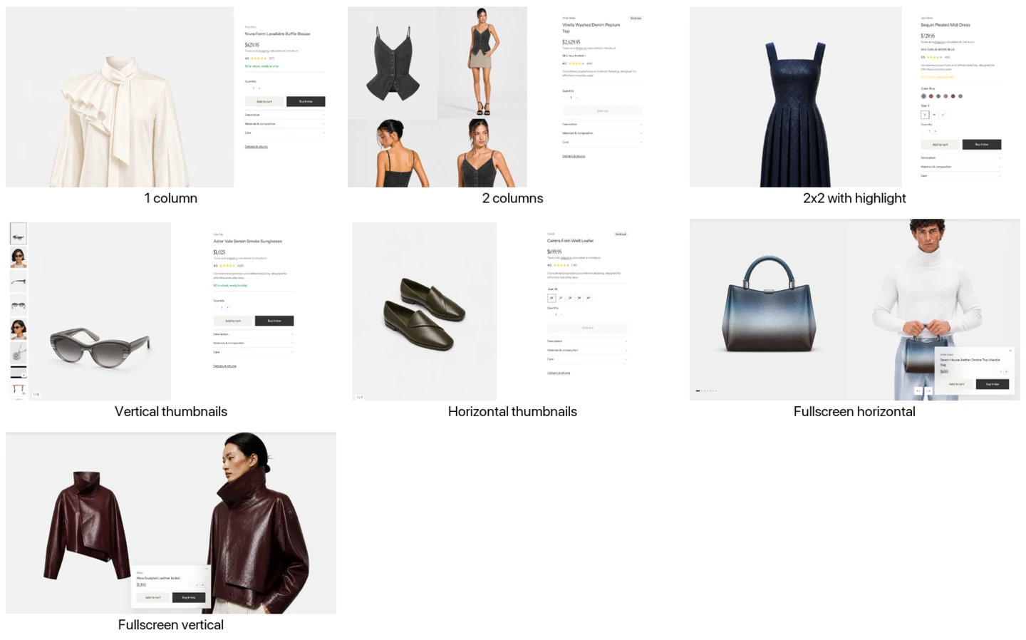
The seven Desktop media layout options. Each supplied product template starts with one of them.
Strata includes seven named product templates that start with a different Desktop media layout. Default product starts with Vertical thumbnails. Choose the closest starting point, then adjust the Product page settings if needed.
| Template | Starting presentation | Choose it when |
|---|---|---|
| 1 column | One large media column | Shoppers should view product images one after another at a generous size. |
| 2 columns | Two-column media grid | Several images should be visible together for quick comparison. |
| 2x2 with highlight | Mixed grid with a larger featured image | The gallery needs more visual rhythm while keeping one image prominent. |
| Vertical thumbnails | Carousel with thumbnails beside the main media | You want a familiar, compact gallery that keeps product details prominent. |
| Horizontal thumbnails | Carousel with thumbnails below the main media | You want the thumbnail row beneath a wider main image. |
| Fullscreen horizontal | Full-height gallery that moves sideways | Product photography should lead an immersive desktop experience. |
| Fullscreen vertical | Two-column media wall with an information panel | Shoppers should browse an immersive gallery while product information stays available. |
Assign a product template
Shopify admin lists templates from the published theme. To try a template in a draft theme, select it in the Theme Editor and use Preview > Change to choose a product. This previews the template without changing the product’s assignment.
Once the template is available in the published theme:
- In Shopify admin, open Products and select the product.
- In Theme template, choose the Strata product template.
- Save the product, then open Online Store > Themes > Edit theme.
- Preview the assigned product on desktop and mobile before publishing.
Changing one of these templates affects every product assigned to it. Create a separate product template when only selected products need a different section structure.
Product page settings
Layout
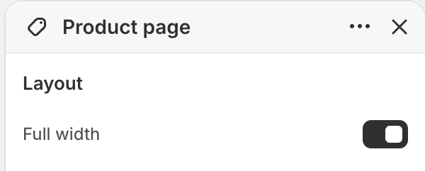
The Layout group in the Theme Editor. The values shown are examples, not defaults.
Full width
- Controls: Chooses whether the Product page section uses the full available width or the standard page-width container.
- Use it when: Use full width for a more expansive media-and-details composition; turn it off when the product page should align with other constrained content.
- Check before publishing: Compare the media-and-details balance on a wide desktop and a narrow screen.
Media
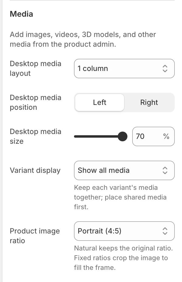
The Media group in the Theme Editor.
Product media comes from the product record in Shopify and can include images, videos, and 3D models.
Desktop media layout
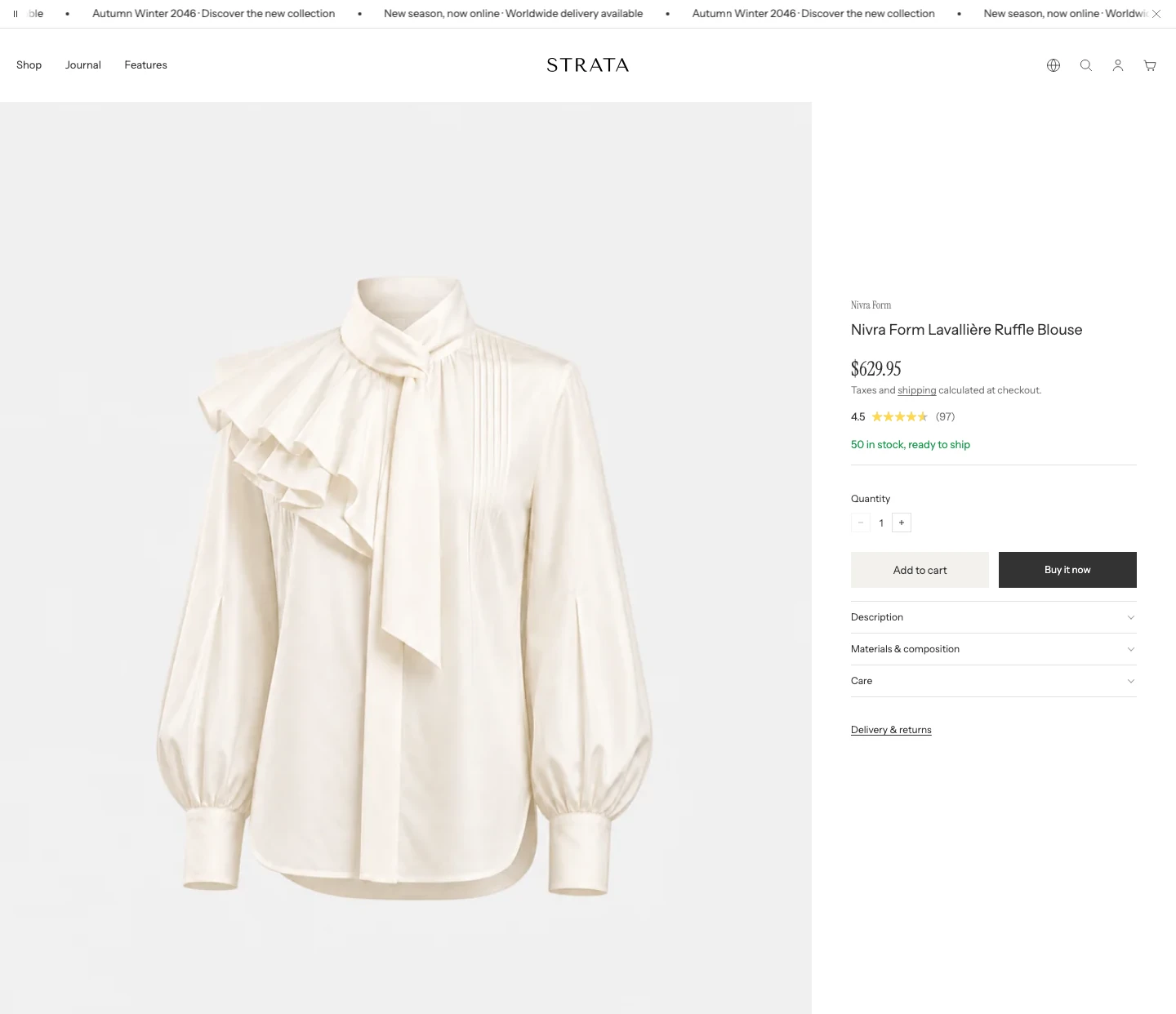
Desktop media layout: 1 column. The first image and purchase information are shown.
- Controls: Chooses how product media is arranged on desktop.
- Options: Under Grid, choose
1 column,2 columns, or2x2 with highlight. Under Carousel, chooseVertical thumbnailsorHorizontal thumbnails. Under Gallery, chooseFullscreen horizontalorFullscreen vertical. The supplied Default product template starts with Vertical thumbnails. - Use it when: Choose a grid when shoppers benefit from seeing several images together. Choose a thumbnail carousel when the purchase details should remain the visual focus. Use a Fullscreen layout when the media should lead the desktop experience and the product information can sit in a compact overlay panel.
- Grid behavior: Grid layouts show the media as a flat page sequence without gallery arrows. In 2x2 with highlight, the first media item spans both columns. Each grid media frame follows global Enable rounded UI.
- Fullscreen horizontal: Places full-height media in a horizontal gallery with arrows and position controls. The product information panel overlays the media near the bottom of the screen.
- Fullscreen vertical: Places media in a two-column vertical gallery and keeps the product information panel available while the visitor scrolls. Use Info panel position to place the panel on the left, center, or right.
- Header treatment: Fullscreen horizontal and Fullscreen vertical are desktop-only Header overlay targets. When the Header's transparent mode is enabled, Strata adds the dark-gradient treatment behind Header controls. Review the transparent logo and navigation contrast against the opening product media.
- Check before publishing: Review crop, active-media controls, and Header contrast for every layout you intend to use.
Video and 3D media
Product videos follow Enable video autoplay in every gallery layout. 3D models use their own interaction controls.
- Autoplay off: A video shows its cover and play button. Selecting it in a carousel does not start playback; the shopper presses play.
- Autoplay on: Videos start muted while visible and pause when scrolled out of view. On desktop, Grid, Fullscreen horizontal, and Fullscreen vertical can play several visible videos independently. Thumbnail carousels and mobile galleries play only the selected video. A video the shopper pauses stays paused until they resume it.
- Shopify-hosted video: A central pause or play button appears on hover or keyboard focus and stays visible on touchscreens. These videos remain muted.
- YouTube and Vimeo: The embedded player retains its own controls, including sound controls.
- Leaving and returning: Shopify-hosted, YouTube, and Vimeo videos pause when they leave the visible gallery and continue from the same position when they return. This also applies after the shopper starts a video with autoplay off. If the shopper presses pause, the video stays paused until they press play again.
- 3D: Carousel layouts load the selected model. Grid and Fullscreen vertical show a cover and view button until the shopper activates the model.
- Reduced motion: Videos do not start automatically when the shopper prefers reduced motion.
- Media shape: Product image ratio sets the frame for videos and 3D as well as images. YouTube and Vimeo remain fully visible inside that frame, so a different video shape can leave space around the player.
- Video navigation: In Fullscreen horizontal, shoppers can swipe left or right over a video or use the gallery arrows. Playback controls remain usable.
- 3D navigation: Swiping an active 3D model rotates it. Use the gallery arrows to move to another item.
- Check before publishing: Open each video and 3D model in the layouts you use, on desktop and mobile, and confirm the cover image represents the product well.
Desktop media position
- Controls: Places the media area on the Left or Right of the product information on supported desktop layouts. The default is Left.
- Dependency: This setting is hidden for both Fullscreen layouts, where the information uses its overlay panel instead.
- Use it when: Choose the side that best supports the page's reading order. Recheck sticky purchase controls and long product information after changing it.
Initial info panel state
Selecting the arrow on the panel expands and collapses it.
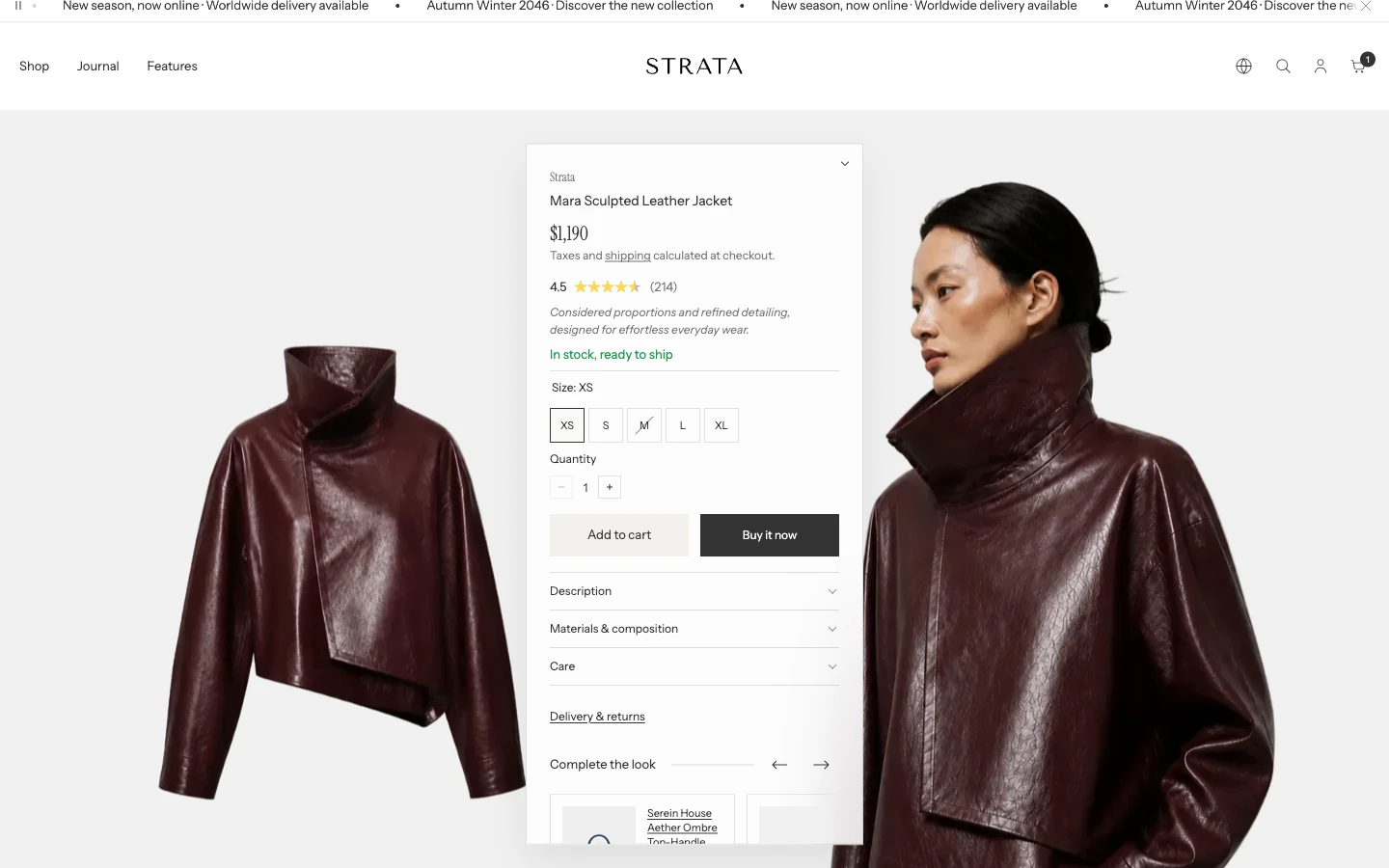
Initial info panel state: Expanded.
- Controls: Chooses whether the product information panel starts Expanded or Collapsed in either Fullscreen layout. The default is Collapsed.
- Collapsed state: Keeps the product heading, price, quantity, and add-to-cart controls available while hiding the supporting information until the panel is opened.
- Responsive behavior: This starting state applies on desktop. Mobile keeps the product information expanded.
Info panel position
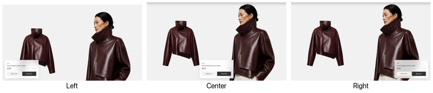
Info panel position: Left, Center, and Right, each with the panel collapsed.
- Controls: Places the sticky information panel on the Left, Center, or Right. The supplied Default product template starts with Center.
- Dependency: This setting appears only when Desktop media layout is Fullscreen vertical.
- Use it when: Position the panel where it avoids the most important parts of the product photography, then review several media items rather than judging only the first image.
Desktop media size
- Controls: Sets the desktop share of the page used by product media.
- Use it when: Increase it when the product imagery is the primary selling element; reduce it when product details need more room.
- Options: 40–70%, in 1% steps.
- Dependency: This setting is hidden for both Fullscreen layouts.
Variant display
Variant display: Hide unselected variant media. Choosing a color shows that color’s images.
- Controls: Chooses which product media remains visible when a shopper selects a variant.
- Options: Show all media, Hide unselected variant media, or Show only selected variant media. The default is Show all media.
- Show all media: Keeps the complete product media set visible while moving the selected variant's featured media into view.
- Hide unselected variant media: Shows the selected variant's complete media group together with shared media placed before the first variant group.
- Show only selected variant media: Shows only the selected variant's media group, beginning with its featured media and ending before the next variant's featured media.
- Content dependency: Keep each variant's media together and place shared media first. Make each variant's featured media the start of its intended group. A variant without featured media cannot establish a selected group and should be tested before publishing.
Gallery gap
- Controls: Sets the space between items in supported desktop gallery layouts.
- Options: None, Extra small (10 px), Small (20 px), or Large (30 px). The default is None.
- Dependency: It appears for 2 columns, 2x2 with highlight, Fullscreen horizontal, and Fullscreen vertical. It is hidden for 1 column and both thumbnail carousel layouts.
Product image ratio
- Controls: Chooses the media frame in every gallery layout, on desktop and mobile, for images, videos, and 3D models.
- Options: Natural, Landscape (4:3), Square (1:1), Portrait (4:5), or Tall (2:3). The default is Portrait (4:5).
- Use it when: Use Natural to preserve each item's own proportions. Fixed ratios create consistent frames. Images and Shopify-hosted videos can be cropped to fill them; YouTube and Vimeo stay fully visible inside the frame. Review focal points and product edges at desktop and mobile sizes.
Motion and controls
Mobile carousel control
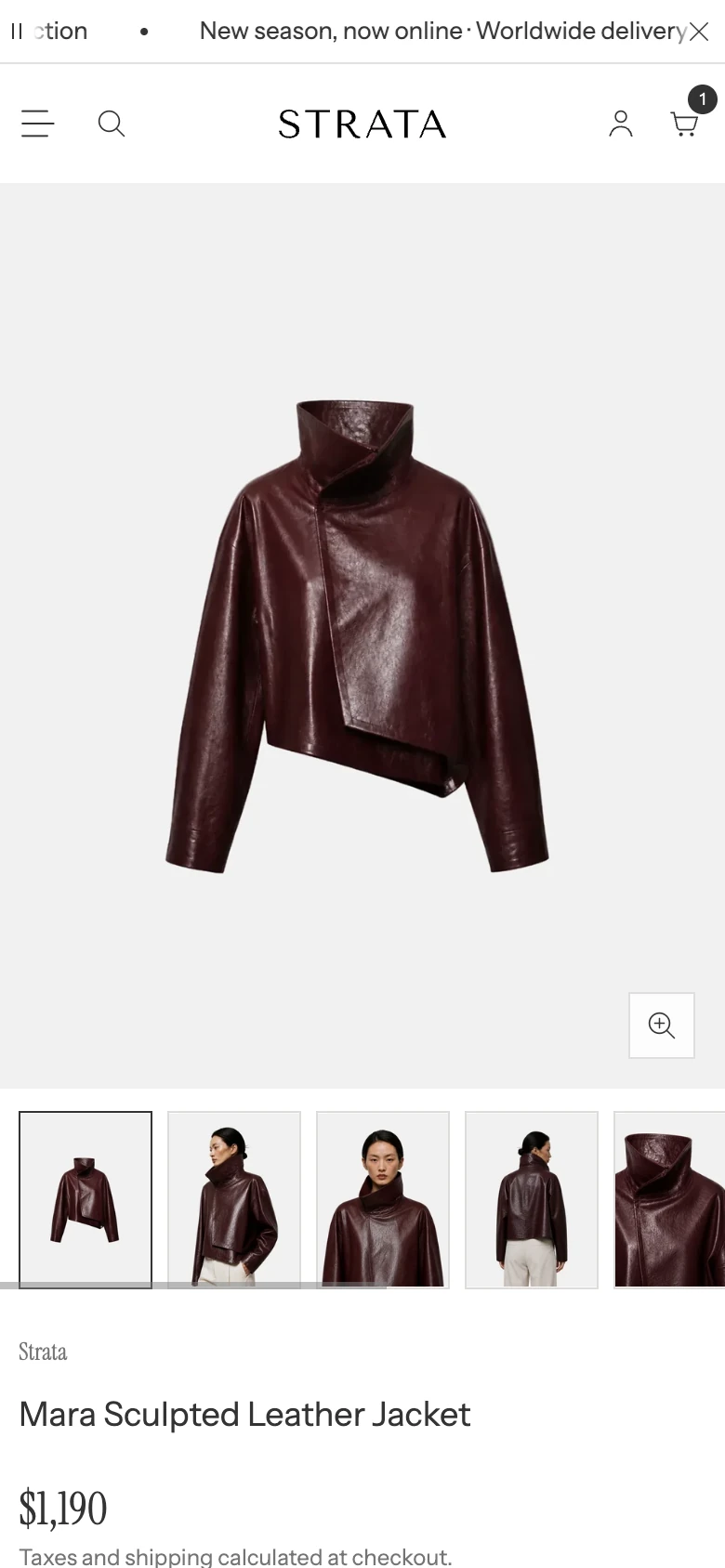
Mobile carousel control: Thumbnails.
- Controls: Chooses the control shown when mobile media is presented as a carousel.
- Options:
Floating dots,Thumbnails, orNone. All supplied product templates start with Floating dots; you can change this for each template. - Thumbnails: The selected thumbnail stays in view as shoppers move through the gallery. None removes the carousel position control; gallery navigation for an active video or 3D model remains available.
- Use it when: Use dots for a compact position indicator or thumbnails when shoppers need to identify media before selecting it. Choose None only when swipe behavior and the media count remain obvious without a visible position control.
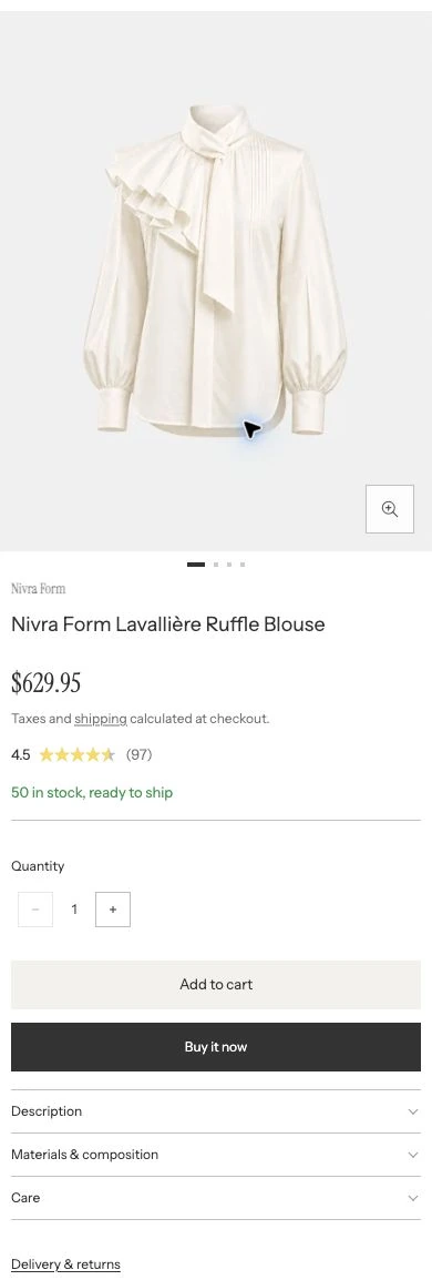
Mobile carousel control: Floating dots. Product information follows the gallery.
Enable video autoplay
- Controls: Starts visible product videos automatically. When off, shoppers press play, including after selecting a video in a carousel.
- Default: On in all supplied product templates. Turn it off if you prefer shoppers to start videos themselves.
- Use it when: Enable it when the video communicates useful product information without sound. Autoplay is muted and works in Grid, Carousel, and both Fullscreen layouts. Videos pause when they leave the viewport. A manually paused video stays paused when the shopper scrolls away and back.
- Check before publishing: Review playback with reduced motion and on mobile.
Enable video looping
- Controls: Repeats product videos after playback reaches the end.
- Default: On.
- Use it when: Enable it for short demonstrations that make sense as a loop; leave it off when the video has a clear ending.
- Check before publishing: Review looping with autoplay and manual playback on desktop and mobile.
Image zoom
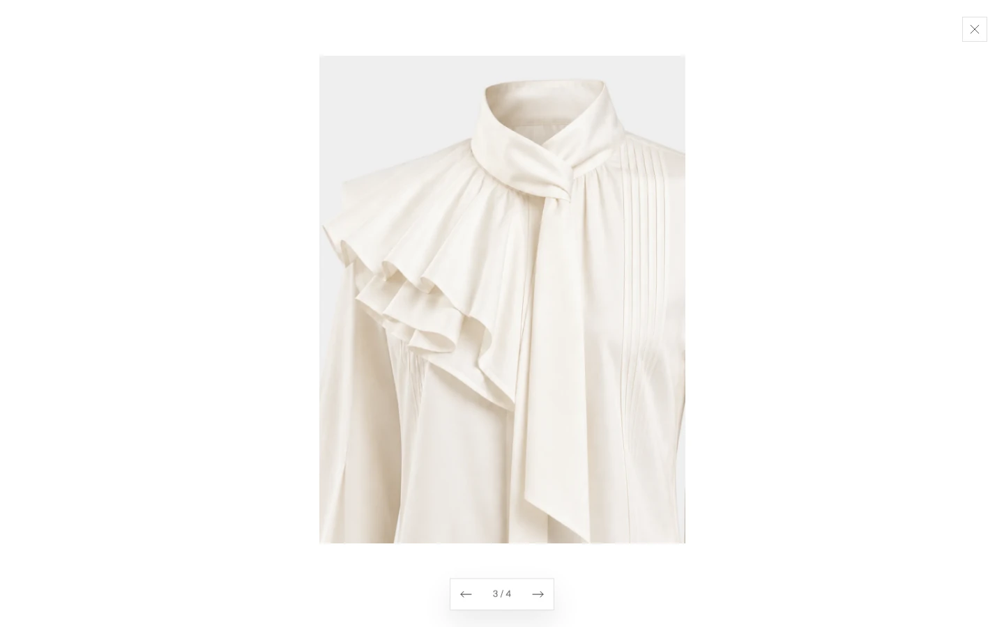
The zoom viewer opens when a shopper selects a product image.
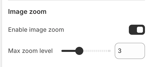
The Image zoom group in the Theme Editor.
Enable image zoom
- Controls: Enables the larger image viewer for product images.
- Use it when: Enable it when material, finish, or construction details need a closer inspection.
- Check before publishing: Open and close several product images with a keyboard and at mobile size.
Max zoom level
- Controls: Sets the maximum zoom level available in the image viewer.
- Options: 2–5, in whole-number steps. The default is 3.
- Use it when: Use a higher value only when the source images contain enough detail to support it; a higher setting cannot create detail that is absent from the uploaded image.
Features
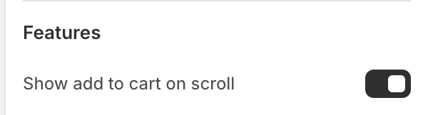
The Features group in the Theme Editor.
Show add to cart on scroll
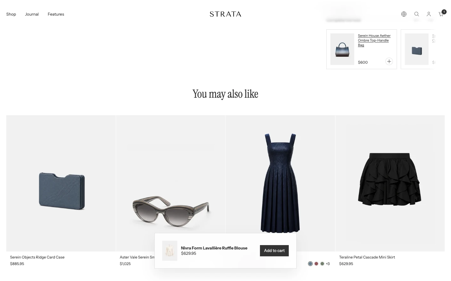
After the shopper scrolls past the product information, this bar keeps Add to cart in reach.
- Controls: Shows a persistent add-to-cart control as the customer moves through the product page.
- Use it when: The product information is long enough that customers may need to add the selected variant without returning to the main purchase area.
- Check before publishing: Confirm that the selected variant, price, and availability remain clear on desktop and mobile.
Product information blocks
These blocks belong to the Product page section. To add one, select Add block under Product page in the Theme Editor sidebar. Blocks are rendered in the order shown in the Theme Editor. Reorder them only when the resulting purchase path remains clear on both desktop and mobile.
Vendor
Shows the product vendor when the product provides one. This block has a limit of one.
Title
Shows the product title. This block has a limit of one.
Badges
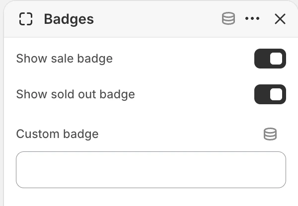
Badges block settings.
This block has a limit of one and includes:
- Show sale badge: Shows the sale state when the product has a compare-at price relationship.
- Show sold out badge: Shows the unavailable state when the product cannot be purchased.
- Custom badge: Adds the merchant's short badge text.
Preview sale and unavailable products to confirm that badges remain clear over the selected media.
Price
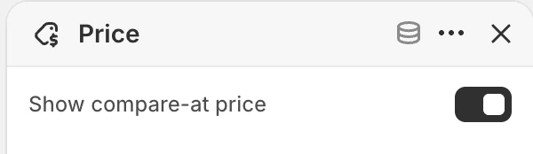
Price block settings.
This block has a limit of one.
- Show compare-at price: Shows the compare-at price when the product supplies one.
SKU
Shows the selected variant’s SKU when it is available. This block has a limit of one and stays hidden for a variant whose SKU is blank.
Add the block where shoppers or support staff are likely to look for a product reference, then switch between variants to confirm the displayed SKU follows the selection.
Inventory status
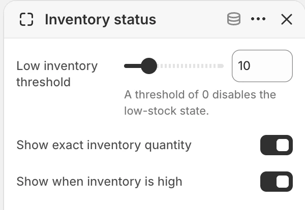
Inventory status block settings.
This optional block has a limit of one and follows the selected variant as its inventory changes.
- Low inventory threshold: 0–50, in whole-number steps. The default is 10. Set it to 0 to disable the low-stock state.
- Show exact inventory quantity: Includes the tracked quantity in the high- or low-stock message. The default is off.
- Show when inventory is high: Shows the high-stock or generally available state. The default is on; turning it off keeps the block focused on low and out-of-stock states.
Set up the inventory data
- From Shopify admin, go to Products and open the product.
- For a product with variants, open the variant whose inventory you want to configure.
- In Inventory, turn on quantity tracking and enter the available quantity.
- Decide whether the variant should stop selling at zero or Continue selling when out of stock.
- In the Theme Editor, open Products > Default product, select Product page, and add or select the Inventory status block.
The block uses the selected variant's Shopify inventory. Its storefront message changes as follows:
| Shopify product state | Inventory status result |
|---|---|
| Tracked quantity is above Low inventory threshold | Shows In stock, ready to ship, or the exact quantity when enabled. Hidden when Show when inventory is high is off. |
| Tracked quantity is between 1 and the threshold | Shows Low stock, ready to ship, or the exact quantity when enabled. |
| Quantity is zero or below and Continue selling when out of stock is on | Shows the available message when Show when inventory is high is on. |
| Inventory is not tracked and the variant is available | Shows the available message when Show when inventory is high is on. |
| Quantity is zero or below and selling stops | The Inventory status line is hidden; the product's purchase controls show that the selected variant is unavailable. |
Set Low inventory threshold to 0 when you do not want a separate low-stock message. Recheck every variant after changing inventory tracking or out-of-stock behavior. For Shopify's inventory setup steps, see Setting up inventory tracking.
Rating
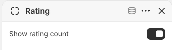
Rating block settings.
This block has a limit of one.
- Show rating count: Includes the count alongside the rating when valid product-rating data is available.
Set up rating data
- Install and configure a product-review app that syncs its average rating and review count with Shopify.
- Import or collect reviews for the products that should show a rating.
- In the Theme Editor, open Products > Default product and select Product page.
- Add or select the Rating block, then choose whether to enable Show rating count.
The Product page displays the average value, stars, and optionally the rating count. When the selected product has no rating data, the block stays hidden. Ratings are managed in the review app rather than entered in the Theme Editor.
Product cards use the same standard rating data but have their own global controls under Theme settings > Product card. See Product card ratings.
Product benefit
The Product benefit block shows a short product-specific summary beneath the main product information. It has a limit of one and stays hidden when the product has no benefit text.
To use Shopify's standard product subtitle:
- From Shopify admin, go to Settings > Metafields and metaobjects > Products.
- Add the standard Product subtitle definition.
- Open a product and enter its short subtitle in the product metafields.
- In the Theme Editor, add the Product benefit block to Product page and place it where the summary should appear.
Keep the value concise: Shopify's standard Product subtitle is intended as a short summary rather than a replacement for the full product description. Learn more about adding standard metafield definitions.
Payment installments
Shows payment-installment information when the store and product are eligible. This block has a limit of one; the availability of the message depends on Shopify's payment configuration and the product context.
Separator
Adds a visual separator between product information groups. You can add more than one.
Description
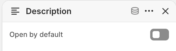
Description block settings.
This block has a limit of one.
- Open by default: Opens the product description disclosure when the page loads. The default is off.
The block is useful when the product description should remain part of the purchase information without occupying the initial view when closed.
Accordion item
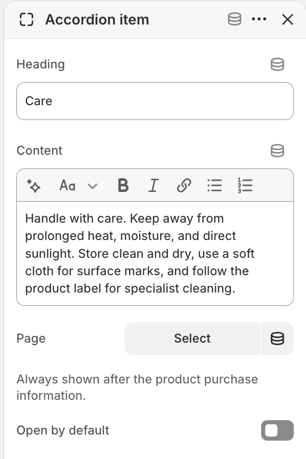
Accordion item block settings.
Adds a reusable details panel. You can add more than one.
- Heading: The visible disclosure heading. The default is
Product details. - Content: Rich text for materials, care, delivery, or other supporting information.
- Page: Uses a Shopify page as the panel content when a page is more appropriate than inline text.
- Open by default: Opens the panel on initial display. The default is off.
The block appears where you place it in the block list. Check the resulting reading order when several accordions are used.
Materials
The Materials block shows product-specific materials and composition in a disclosure. It has a limit of one and stays hidden when the product has no materials value.
Set it up once as a Product metafield:
- From Shopify admin, go to Settings > Metafields and metaobjects > Products and select Add definition.
- Name the definition
Materials, set its namespace and key tocustom.materials, and choose Multi-line text. - Open each product and enter its materials value in the new metafield.
- In the Theme Editor, add the Materials block to Product page and place it with the other supporting product details.
Use one material or composition item per line when that makes the disclosure easier to scan. The block is designed for the main Product page; use an ordinary text or accordion block when another section needs independently authored materials content.
Popup
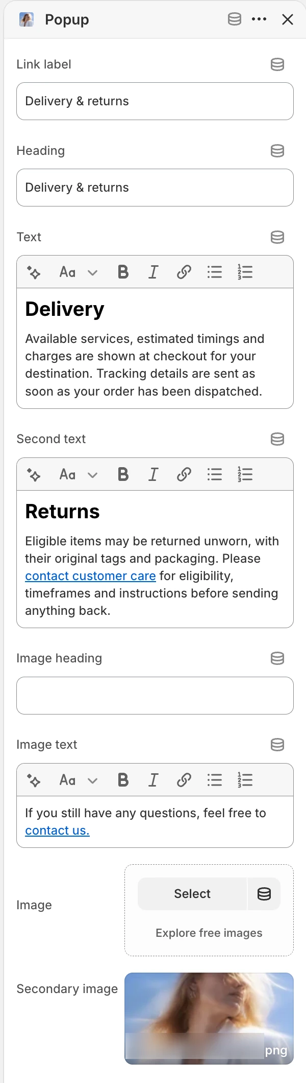
Popup block settings.
This optional block has a limit of one. Its Link label opens a product-information drawer; leave the label blank when the drawer should not be offered.
- Heading: Names the drawer. The default is
Product information. - Text and Second text: Add two independent rich-text areas for information such as delivery, returns, materials, or sizing.
- Image heading and Image text: Introduce the media area.
- Image and Secondary image: Add up to two supporting images.
The popup opens in a drawer with close controls, Escape and backdrop dismissal, and keyboard focus management. Keep essential purchase terms understandable and review long-content scrolling and the mobile drawer before publishing.
Complementary products
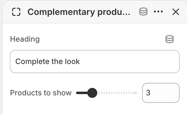
Complementary products block settings.
This optional block has a limit of one and loads Shopify complementary recommendations for the current product.
- Heading: Names the row. The default is
Complete the look. - Products to show: 1–10, in whole-number steps. The default is 3.
Manage the relationships in Shopify Search & Discovery. The block stays hidden when Shopify returns no available complementary product with a featured image. A single-variant product can be added directly, while a multi-variant product opens its option picker. This block is separate from the full-width Product recommendations section.
Variant picker
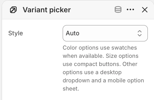
Variant picker block settings.
This block has a limit of one.
- Style: Choose
Auto,Swatches, orDesktop dropdown / mobile option sheet. - Auto: Eligible color options use swatches. Size options use compact buttons, and other options use a desktop dropdown and a mobile option sheet.
- Swatches: Requests swatches for eligible color options and uses the non-swatch fallback for other option types.
- Desktop dropdown / mobile option sheet: Uses the enhanced dropdown on desktop and opens the option choices in a mobile sheet. Size options continue to use compact buttons.
The visible choices still depend on the product's options and variants. Verify unavailable combinations, the selected variant's media, and keyboard selection before publishing a recommendation.
Quantity selector
Allows the customer to select quantity. This block has a limit of one. The visible minimum, increment, and maximum can come from the selected variant's quantity rules; review products that use those rules before publishing.
Buy buttons
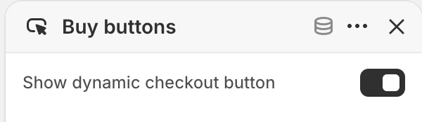
Buy buttons block settings.
This block has a limit of one.
- Show dynamic checkout button: Shows Shopify's dynamic checkout action when the store and product support it. The default is on.
Verify the unavailable-variant state and the relationship between the standard add-to-cart and dynamic checkout actions.
Pickup availability
This block has a limit of one. It can show pickup information when the selected variant has pickup-enabled store availability. Verify both an available and unavailable location state, and confirm that the location dialog is keyboard accessible.
App blocks
@app blocks allow compatible Shopify app content to be inserted into the product information area. The theme does not define the fields or behavior of an individual app block; review the app's own documentation and test it in an unpublished theme.
Custom liquid
Adds merchant-authored Liquid. You can add more than one.
- Custom liquid: The Liquid content entered for this block.
Use only Liquid that the merchant understands and can support. Do not place payment credentials, customer data, or private API values in this field.
Product recommendations
Product recommendations is independent of the Product page blocks. See the dedicated Product recommendations guide for product sources, loading, and empty states.
Content
- Eyebrow: Optional short label above the heading.
- Heading: The section heading. The default is
You may also like. - Text: Optional supporting rich text.
Products
- Recommendation type: Choose
Related productsorComplementary products. - Dynamic recommendations count: 2–10 products, in whole-number steps. The default is 6.
- Manual recommendations: Select up to 12 products. Selecting manual recommendations replaces automatic recommendations.
Dynamic recommendations are managed through Shopify Search and Discovery. Verify the empty and partially populated states before relying on this section for merchandising.
Layout
- Full width: Uses the full available section width when enabled. The default is on.
- Stack products: Changes the product presentation from the carousel-style layout to a stacked layout. The default is off.
- Products per row (mobile):
1or2; the default is1. - Products per row (desktop): 2–6 products per row; the default is 3.
- Heading alignment:
Left,Center, orRight; the default isLeft. - Content width:
Small,Medium, orLarge; the default isMedium.
Colors
- Background color: Section background. Leave blank to inherit Theme settings > Colors > General.
- Text color: Heading and supporting text color. Leave blank to inherit Theme settings > Colors > General. Product cards use Theme settings > Colors > Product.
Spacing
- Section spacing:
Small,Medium, orLarge; the default isMedium. - Top spacing: Adds or removes top spacing; the default is off.
- Bottom spacing: Adds or removes bottom spacing; the default is on.
Recently viewed products
Recently viewed products shows eligible products viewed in the same browser. It can remain hidden when no eligible history is available or customer-privacy preferences do not allow it. Choose Layout: Carousel or Stack; heading alignment is Left or Center. See Recently viewed products for all settings, colors, and visibility conditions.
Media hero below the product
Every supplied product template ends with a Media hero section below the recommendations. Use it for a brand or campaign image that closes the product page, replace its example media and copy, or hide or remove it when the product page should end with the recommendations.
Desktop and mobile behavior
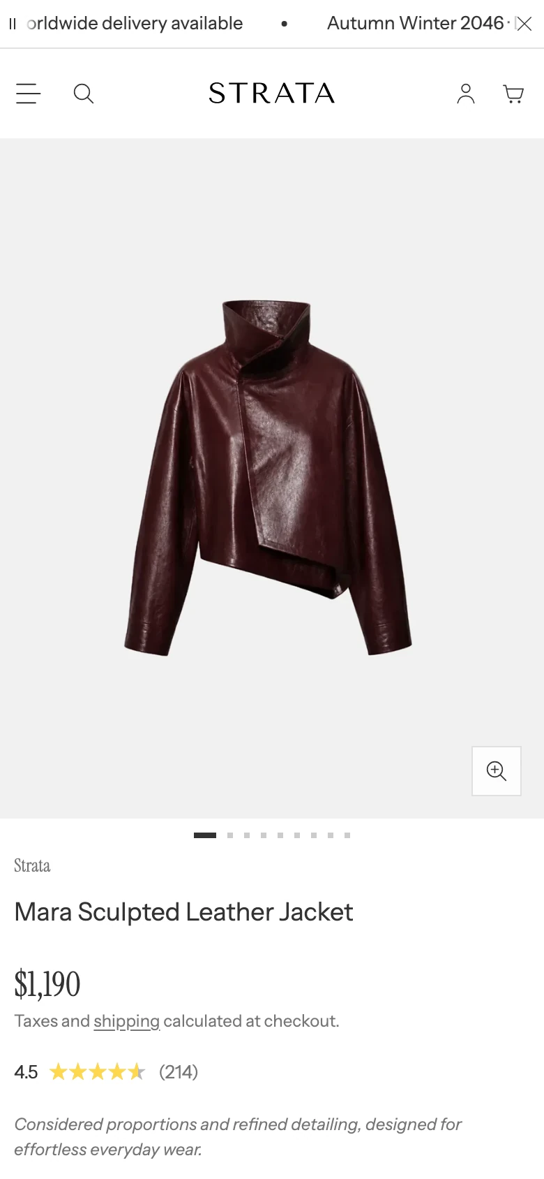
On mobile every layout becomes an image carousel above the product information.
The Product page provides separate desktop media layouts, a shared Product image ratio for every media type and layout, Fullscreen information-panel controls, gallery-gap and variant-media choices, and mobile carousel controls. Non-swatch variant options also use different desktop and mobile selection surfaces. Before publishing, review:
- media order, crop, and selected-variant updates;
- both Fullscreen directions, the expanded and collapsed information panel, and the Fullscreen vertical panel position;
- all three Variant display modes, including a variant without featured media;
- sticky add-to-cart placement;
- zoom and video controls;
- the desktop dropdown, mobile option sheet, and selected/unavailable option states;
- quantity rules, unavailable variants, and pickup availability;
- Inventory status across high, low, continue-selling, untracked, and unavailable variants;
- Rating, Product benefit, and Materials with populated and empty product data;
- Popup content, close/focus behavior, and Complementary products with single- and multi-variant recommendations;
- recommendation and recently viewed layout when the sections contain different numbers of products.
Media recommendations
Use product media with enough crop flexibility for every selected desktop layout and the chosen Product image ratio. With Natural, include media whose changing proportions will not make the surrounding purchase information difficult to follow. If Show only selected variant media is used, place each variant's featured media before its supporting media.
Accessibility and motion
Provide meaningful alternative text for informative product media. Verify keyboard access for the media viewer, variant picker, disclosures, pickup dialog, and purchase controls. Autoplay remains muted, and reduced-motion behavior should be checked before enabling motion-heavy product media.
Common checks
- If a block is missing, confirm that you are editing the Product template and that the block has not been removed or moved below the visible product information.
- If a setting appears unavailable, check whether it is a block setting with a one-block limit or a section setting shared by the whole Product section.
- If recommendations or pickup information are empty, verify the Shopify product, Search and Discovery, payment, or pickup configuration before treating it as a theme issue.
- If Complementary products is absent on the storefront, confirm Search & Discovery supplies an available complementary item with a featured image.
- If Inventory status is absent, confirm the selected variant's tracking, available quantity, out-of-stock behavior, and Show when inventory is high setting.
- If Rating is absent, confirm that the selected product has a published rating in the review app and that the app syncs ratings with Shopify.
- If Product benefit or Materials is absent, confirm that the expected Product metafield contains a value for the selected product.
- If the wrong variant media remains visible, check the product-media order and featured-media assignment before changing Variant display.