
Split media banners presents one or two independent promotions in the same section. Add an Image or Video block for each promotion, then give each block its own copy, destination, and content position.
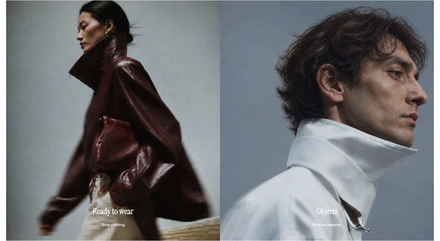
Split media banners with two banners and no gap.
Add Split media banners
- Open Online Store > Themes > Edit theme.
- Use the page selector to open the template where the promotions should appear.
- Select Add section, then choose Split media banners.
- Add one Image or Video block for a single promotion, or two blocks for a split presentation.
The section supports up to 2 blocks. Its preset starts with two Image blocks.
Layout
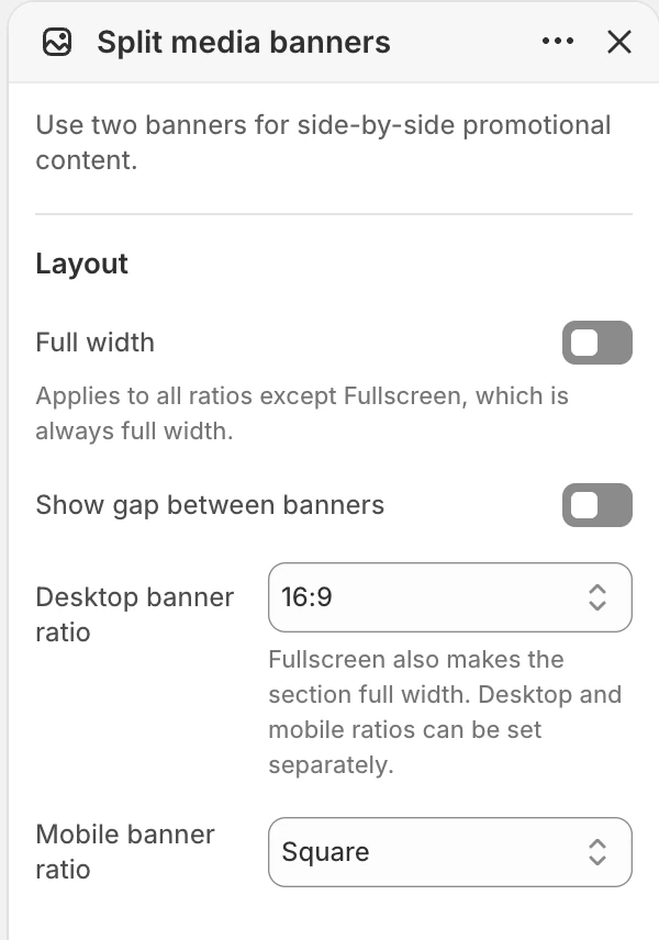
The Layout group in the Theme Editor. The values shown are examples, not defaults.
| Setting | Options and use |
|---|---|
| Full width | Extends the section to the available page width. Default: Off. The Fullscreen desktop ratio is always full width. |
| Show gap between banners | Adds separation between the two blocks. Default: On. |
| Desktop banner ratio | Fullscreen, Natural, 16:9, 2:1 (square split), 21:9, 3:1, or 32:9. New sections start with 16:9. |
| Mobile banner ratio | Square, 4:3 portrait, 4:3 landscape, or 2:1 landscape. Default: 4:3 portrait. |
Natural follows the first banner’s available media ratio. A fixed ratio keeps the two banners aligned, but can crop subjects; check both blocks together.
When global Enable rounded UI is on, a contained section follows the gap choice: with Show gap between banners off, the two banners share one rounded outer outline; with it on, each banner is rounded separately. A full-width section stays square. Choosing Fullscreen on desktop also makes the section full width and square.
Header
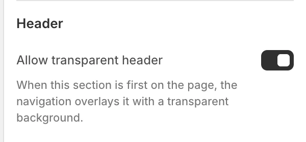
The Header group in the Theme Editor.
Allow transparent header
Default: On. When this section is first on the page, it can sit beneath a transparent Header. The Header’s own transparent mode must also permit that state. This setting does not make a later section transparent.
Colors
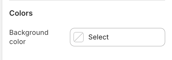
The Colors group in the Theme Editor.
| Setting | What it controls | Default |
|---|---|---|
| Background color | The section surface around the banner blocks. | Leave blank to inherit Theme settings > Colors > General; selecting a color in this section overrides the inherited value. |
Each Image or Video block controls its own copy color and overlay treatment.
Spacing
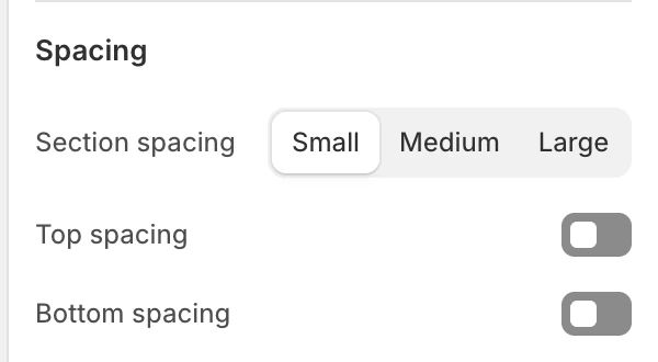
The Spacing group in the Theme Editor.
| Setting | Options and use |
|---|---|
| Section spacing | Small, Medium, or Large. Default: Small. |
| Top spacing | Adds the section’s top spacing. Default: Off. |
| Bottom spacing | Adds the section’s bottom spacing. Default: Off. |
Blocks
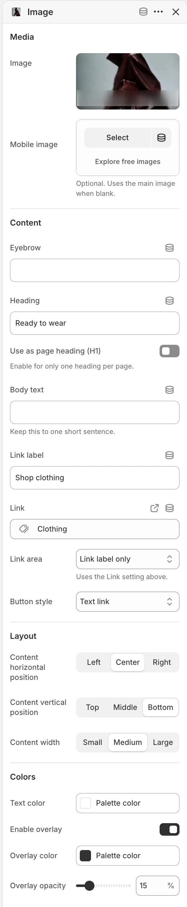
Image block settings. The Video block has the same Content, Layout, and Colors groups, with video sources under Media.
Add up to 2 Image or Video blocks and reorder them in the Theme Editor.
Media
| Setting | Options and use |
|---|---|
| Image block: Image | Main image for an Image block. |
| Image block: Mobile image | Optional narrow-layout image. When blank, the main image is reused. |
| Video block: Desktop background video | Hosted video for a Video block. |
| Video block: Mobile background video | Optional narrow-layout video. When blank, the desktop video is reused. |
| Video block: Fallback image | Still image shown when the video is unavailable or motion is reduced. |
| Video block: Mobile fallback image | Optional mobile still. When blank, the main fallback image is reused. |
Choose Video only when a hosted background video and a useful still fallback are ready. A mobile-specific video or fallback image is useful when the desktop crop does not preserve the subject.
Content
| Setting | What it controls |
|---|---|
| Eyebrow | Optional short label. |
| Heading | Main banner heading. Default: Featured collection. |
| Use as page heading (H1) | Makes this block's Heading the main page heading. Enable it for one heading per page only. Default: Off. |
| Body text | Supporting copy. Keep it to one short sentence when possible. Default: Use this banner for a collection, campaign, or key message. |
| Link label | Visible action label. Default: Explore collection. |
| Link | Destination used by the action or whole banner, depending on Link area. |
| Link area | Link label only keeps the destination on the visible action; Entire banner makes the whole banner the link. Default: Link label only. |
| Button style | Text link, Primary, or Secondary. Default: Text link. Visible when Link area is Link label only. |
The label action appears only when both Link label and Link are present. When Link area is Entire banner, the banner-wide link appears only when Link is present; the button-style control is not relevant. New Video blocks use the heading Create a video block and supporting video copy so they are easy to distinguish while setting up the section.
Layout
| Setting | Options and use |
|---|---|
| Content horizontal position | Left, Center, or Right. Default: Center. |
| Content vertical position | Top, Middle, or Bottom. Default: Middle. |
| Content width | Small, Medium, or Large. Default: Medium. |
Colors
| Setting | Options and use |
|---|---|
| Text color | Color used by the banner copy. Default: #FFFFFF. |
| Enable overlay | Adds a color layer over the media. Default: On. |
| Overlay color | Color used by the overlay. Default: #000000. |
| Overlay opacity | 0–80% in 5% steps. Default: 30%. |
One banner or two
With one block, the section behaves as a single promotion. With two, the larger layout places the banners side by side and Show gap between banners controls their separation. At narrower sizes the blocks stack; review their order, crop, and copy length on mobile.
Desktop and mobile behavior
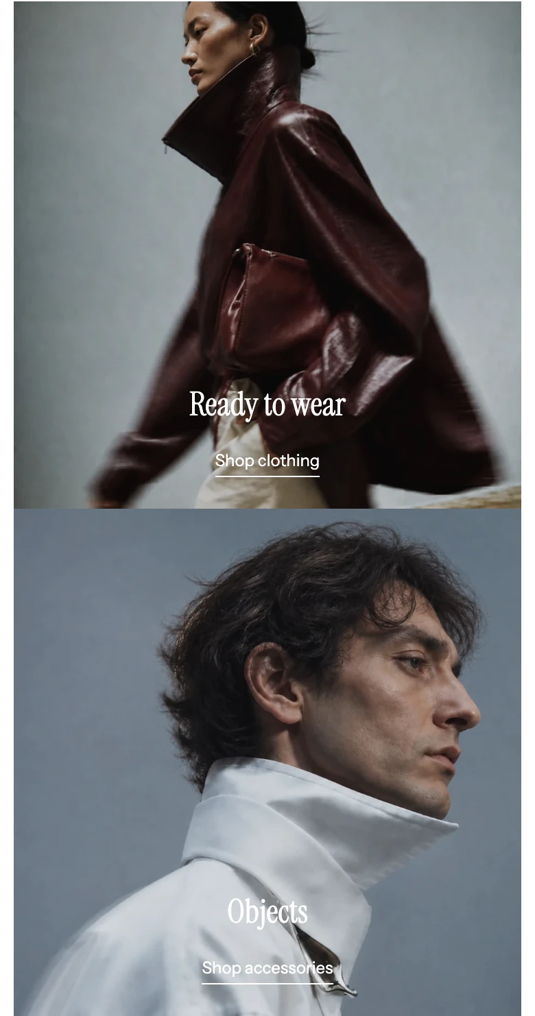
On mobile the banners stack.
Desktop and mobile ratios and media sources are independent. Check both banners at both sizes, especially when using Natural or a mobile-specific source. Do not assume two desktop-wide crops will remain legible when the banners stack.
Media recommendations
Keep key copy in the content fields rather than inside the media. Add useful alt text to images in Shopify Files and a meaningful fallback for every Video banner. Review both selected ratios before publishing.
Accessibility and motion
- Use descriptive Link label and Heading values so a linked banner has a clear purpose.
- If Link area is Entire banner, check that the destination is obvious without a separate button.
- Keep Overlay opacity and Text color readable across both images or videos.
- Test the static fallback, keyboard focus, and reduced-motion result for Video banners.
- Verify transparent Header contrast when this is the first page section.
Common issues
- The second promotion is missing: add a second Image or Video block; the section supports a maximum of two.
- The action is not clickable: confirm both Link label and Link when using Link label only, or confirm Link when using Entire banner.
- Button style is unavailable: it is shown only when Link area is Link label only.
- A banner is hard to read: adjust Enable overlay, Overlay opacity, Overlay color, and Text color together.
- Video shows no useful still: populate Fallback image and verify both video sources.
Related guides
- Media hero for one large static hero or a multi-slide story.
- Image with text for one image and one focused message.
- Video for a focused video section.