
Featured product places a selected product’s media, information, variants, and buy controls inside a page template. Use it for a campaign focus or a product that needs more detail than a product card.
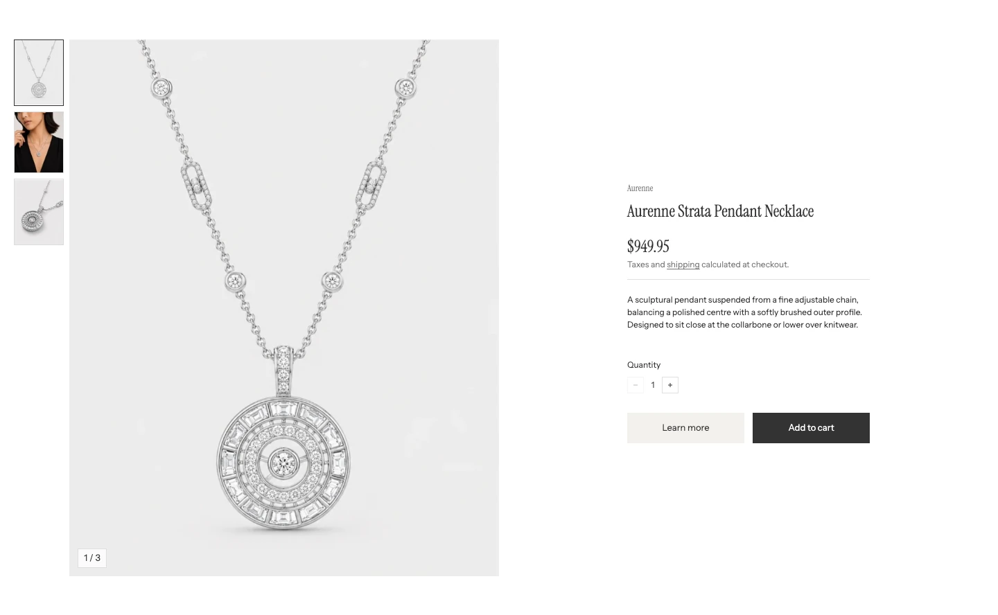
Featured product on desktop.
Product
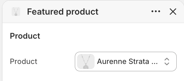
The Product group in the Theme Editor. The values shown are examples, not defaults.
The Product group contains one setting:
| Setting | Default | What it controls |
|---|---|---|
| Product | Blank | Chooses the product shown by this section. Select one before publishing. |
Select a Product before publishing so the section has real media, information, and purchase controls.
Layout
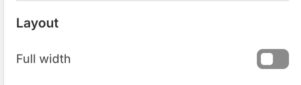
The Layout group in the Theme Editor.
| Setting | Default | What it controls |
|---|---|---|
| Full width | Off | On uses the wider section container. Off keeps the featured product in the page-width container. |
Media
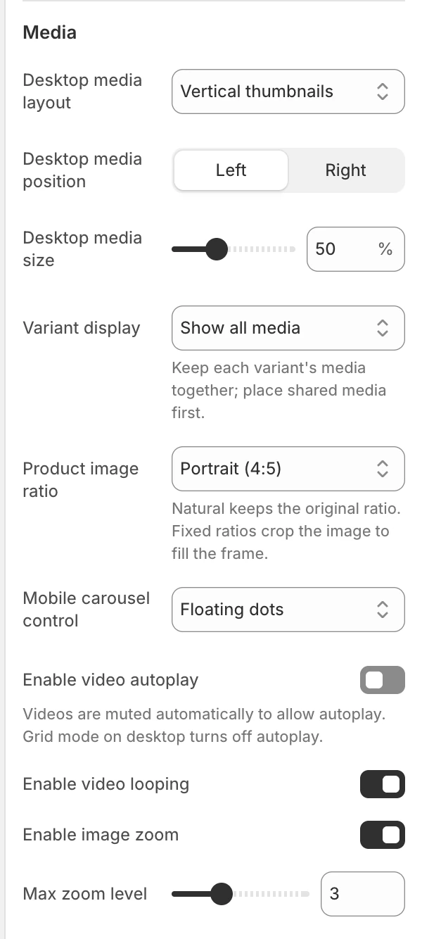
The Media group in the Theme Editor.
| Setting | Options and default | What it controls |
|---|---|---|
| Desktop media layout | 1 column, 2 columns, 2x2 with highlight, Vertical thumbnails, or Horizontal thumbnails; default Vertical thumbnails | Choose a grid to show several media items together, or a thumbnail carousel to keep the gallery compact. Fullscreen layouts are not available in Featured product. |
| Desktop media position | Left or Right; default Left | Places the media beside the product information on desktop. |
| Desktop media size | 40–70%, step 1; default 50% | The media share of the desktop two-column layout. |
| Variant display | Show all media, Hide unselected variant media, or Show only selected variant media; default Show all media | Show all media keeps the complete gallery. Hide unselected variant media shows shared media plus the selected variant’s group. Show only selected variant media shows only that group. |
| Gallery gap | None, Extra small, Small, or Large; default None | Changes the space between images in 2 columns and 2x2 with highlight layouts. It is hidden for other layouts. |
| Product image ratio | Natural, Landscape (4:3), Square (1:1), Portrait (4:5), or Tall (2:3); default Portrait (4:5) | Applies to images, videos, and 3D in every layout. Natural preserves each item's shape. Fixed ratios give consistent frames; images and Shopify-hosted videos can be cropped, while YouTube and Vimeo stay fully visible inside them. |
| Mobile carousel control | Floating dots, Thumbnails, or None; default Floating dots | Chooses how shoppers move between product media on mobile. None removes the extra visual navigation, so use it only when the swipe order remains obvious. |
| Enable video autoplay | Off | On starts visible videos muted in Grid and Carousel layouts and pauses them when they leave the viewport. Off requires the shopper to press play, including after selecting a video in a carousel. |
| Enable video looping | On | Allows product video media to loop during playback. |
| Enable image zoom | On | Shows the image zoom control when the product has image media. |
| Max zoom level | 2–5; default 3 | Sets the maximum image magnification when zoom is enabled. |
The gallery uses the selected product’s media. Choose its desktop layout according to how many images need to be compared at once, then review the independent mobile carousel control. Zoom is for image media, so the control is hidden while a video or 3D item is active.
Shopify-hosted videos use a central pause or play button, shown on hover or keyboard focus and kept visible on touchscreens. They remain muted. Shopify-hosted, YouTube, and Vimeo videos pause when they leave the visible gallery and continue from the same position when they return, including videos the shopper started with autoplay off. A manually paused video stays paused until the shopper presses play again. YouTube and Vimeo retain their own player controls. A reduced-motion preference prevents automatic playback.
For Shopify’s usual one-image-per-variant setup, arrange shared media before the first variant image. Each variant image starts a group; the media that follow it stay in that group until the next variant image. If several images are assigned directly to one variant, Strata uses those assigned images instead. When no matching variant media is available, the complete gallery remains visible.
Colors
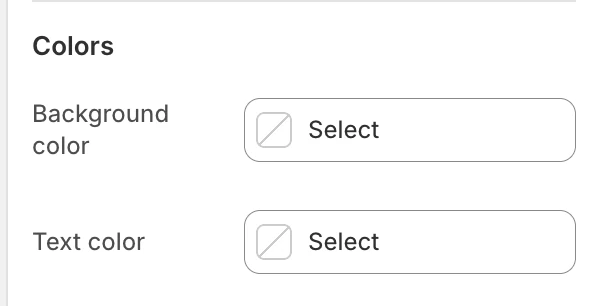
The Colors group in the Theme Editor.
| Setting | What it controls | Default |
|---|---|---|
| Background color | The section surface behind the product media and details. | Leave blank to inherit Theme settings > Colors > General; selecting a color in this section overrides the inherited value. |
| Text color | The default text color for the product details. | Leave blank to inherit Theme settings > Colors > General; selecting a color in this section overrides the inherited value. |
Product and form controls can add their own treatments; check their contrast against the selected section colors.
Spacing
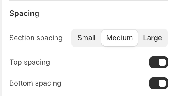
The Spacing group in the Theme Editor.
| Setting | Options and default |
|---|---|
| Section spacing | Small, Medium, or Large; default Medium. |
| Top spacing | On by default. |
| Bottom spacing | On by default. |
Product blocks
Add and reorder blocks to match the buying decision. The preset starts with the core blocks below; each named core block is limited to one instance.
| Block | Limit | What it does |
|---|---|---|
| Vendor | 1 | Shows the product vendor when it is available. |
| Title | 1 | Shows the product title. In this section it is rendered as the product heading. |
| Price | 1 | Shows the current price, sale comparison when applicable, unit price, and tax note. The supporting tax and fee text follows this section's text color. |
| SKU | 1 | Shows the selected variant’s SKU when that value is available. |
| Payment installments | 1 | Renders Shopify payment-term information when available. |
| Description | 1 | Shows the product description in the featured-product details area when it is not blank. |
| Variant picker | 1 | Lets shoppers select a variant. It contains the Style setting. |
| Quantity selector | 1 | Lets shoppers set quantity subject to the selected variant’s quantity rules. |
| Buy buttons | 1 | Provides the section's purchase actions. |
| App | App block | Renders a compatible app block in the details area. |
| Custom liquid | No limit | Renders the block’s Custom liquid value. |
Blocks render in the order shown in the Theme Editor. Keep Title, Price, Variant picker, Quantity selector, and Buy buttons together so shoppers can understand what they are buying.
The SKU block updates with the selected variant and remains hidden when that variant has no SKU. Place it near the title or price when the code helps shoppers or support staff identify the exact item.
Buy buttons
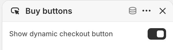
Buy buttons block settings.
Show dynamic checkout button is on by default. Turn it on to show Shopify’s accelerated checkout option below Add to cart when one is available for the shopper. Turn it off when the purchase flow should use Add to cart only.
Variant picker
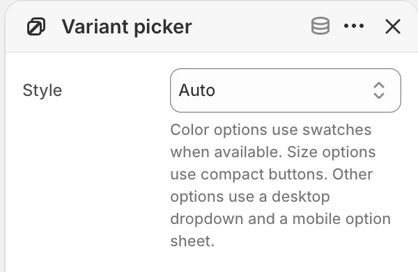
Variant picker block settings.
The Variant picker block has one setting:
| Setting | Default | Options and use |
|---|---|---|
| Style | Auto | Auto uses swatches for eligible color options, compact buttons for Size, and a responsive selector for other options. |
| Swatches requests swatches but falls back when the option is not eligible or the global product-page swatch setting is off. Desktop dropdown / mobile option sheet applies to non-Size options. |
The global Color swatches settings can therefore change the result of Auto and Swatches. A color option must also expose eligible swatch data for swatches to render.
Desktop and mobile behavior
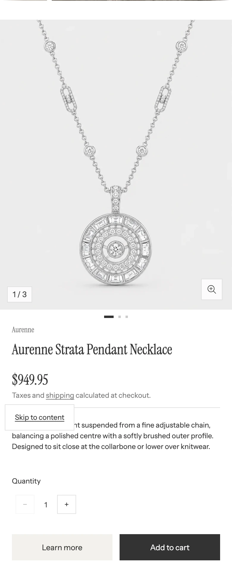
Featured product on mobile.
Desktop media layout, Desktop media position, Desktop media size, and Gallery gap shape the wide-screen presentation. On smaller screens, the gallery and product information become a single-column presentation and Mobile carousel control chooses the navigation treatment. Use Shopify’s device previews to check the selected product’s real media, fixed-ratio crop, and block order.
Availability, cart, and empty states
- The current variant controls the displayed price, quantity rules, and button availability.
- An unavailable variant disables Add to cart.
- A product with selling plans may expose purchase options through the shared product form.
- A blank Product setting does not create a usable purchase flow.
- This section is a product detail layout, not a Product card; global Product card settings do not control its media or text. Global Color swatches and Cart settings can still affect its variant controls and add-to-cart path.
Accessibility and motion
Variant choices use a fieldset/legend or a labelled select, quantity controls can be disabled for unavailable variants, and form errors are announced as alerts. Check keyboard focus, screen-reader labels, and a reduced-motion preference with the real product. The section has no separate motion toggle.
Common issues
- The section has no purchasable product: select a Product in the Product group.
- Swatches do not appear: check the global product-page swatch setting, the variant option’s swatch data, and the Style value.
- Zoom is missing: enable Enable image zoom, choose an image item, and confirm the product has image media.
- The gallery feels too narrow or wide: adjust Desktop media size and review the mobile layout separately.
- Gallery gap is missing: choose 2 columns or 2x2 with highlight for Desktop media layout.
- A variant shows the wrong media: review Variant display, the images assigned to that variant, and the product media order in Shopify.
- A video does not autoplay: confirm Enable video autoplay is on, the video is visible, and reduced motion is off. If the shopper paused it, press play to resume.
- Add to cart opens the wrong surface: review the global Cart drawer setting and test on the actual template.