
Rich text is Strata's general-purpose content section. Its blocks can be reordered, repeated, or mixed to create an introduction, policy summary, campaign message, or simple call to action without a fixed media layout.
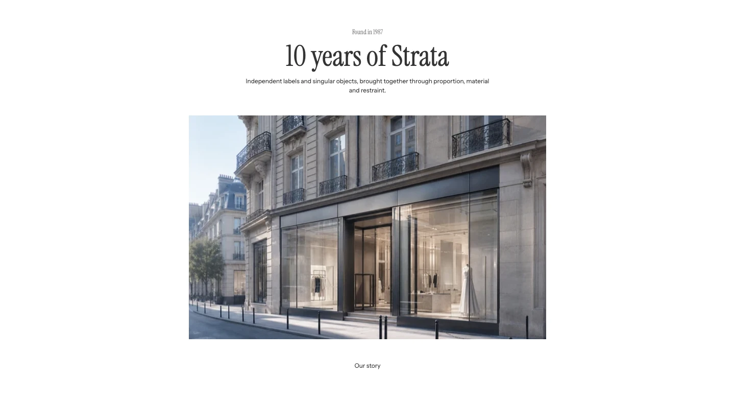
Rich text with Eyebrow, Heading, Text, Image, and Button blocks.
Add Rich text
In Shopify's theme editor, add Rich text to a compatible template or open an existing section. It is not available in header, footer, or overlay groups.
Layout
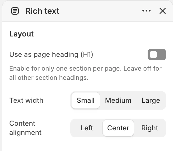
The Layout group in the Theme Editor. The values shown are examples, not defaults.
| Setting | What it controls | Options or default |
|---|---|---|
| Text width | Sets the readable width of Eyebrow, Heading, and Text blocks. | Small, Medium, or Large. Default: Medium. |
| Content alignment | Aligns the section's block content. | Left, Center, or Right. Default: Center. |
| Use as page heading (H1) | Makes the first Heading block the main title of the page. Turn it on in one section only. | Off |
Use Small for short, reading-heavy copy and Large when headings or supporting text need more room. Image, Button, Liquid, and App blocks keep their own width behavior.
Motion and controls
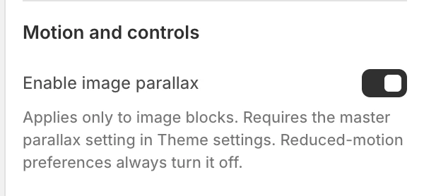
The Motion and controls group in the Theme Editor.
| Setting | What it controls | Default or dependency |
|---|---|---|
| Enable image parallax | Adds parallax to Image blocks when the global setting permits it. | Enabled by default. Requires global Enable parallax effects; reduced-motion preferences turn it off. |
Keep the reading order and actions complete when the section is static.
Colors
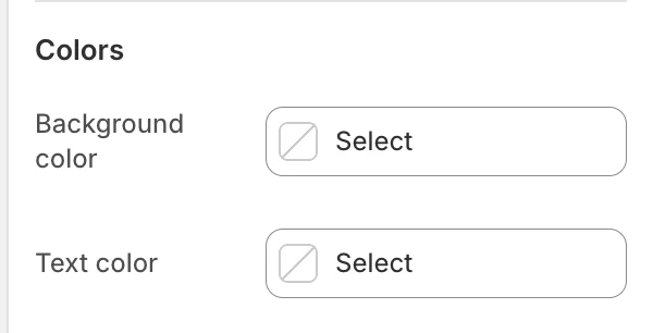
The Colors group in the Theme Editor.
| Setting | What it controls | Default |
|---|---|---|
| Background color | The section surface. | Leave blank to inherit Theme settings > Colors > General; selecting a color in this section overrides the inherited value. |
| Text color | The default text color for the section. | Leave blank to inherit Theme settings > Colors > General; selecting a color in this section overrides the inherited value. |
Check links, buttons, app output, and Liquid content against the selected colors; a block can introduce its own styling.
Spacing
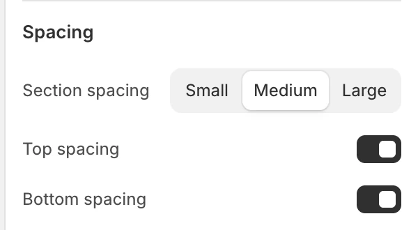
The Spacing group in the Theme Editor.
| Setting | What it controls | Options or default |
|---|---|---|
| Section spacing | Chooses the section's spacing scale. | Small, Medium, or Large. Default: Medium. |
| Top spacing | Adds or removes the section's top spacing. | Enabled by default. |
| Bottom spacing | Adds or removes the section's bottom spacing. | Enabled by default. |
Blocks
The section accepts up to 12 blocks. Blocks can be added, repeated, and reordered in the Theme Editor.
Eyebrow
| Setting | What it controls | Default |
|---|---|---|
| Text | Short context above the main heading. | Introduction. |
Heading
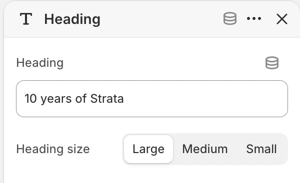
Heading block settings.
| Setting | What it controls | Options or default |
|---|---|---|
| Heading | The main heading text. | Add a clear message. |
| Heading size | Sets the visual heading size. | Large, Medium, or Small. Default: Medium. |
Use a heading block for actual section structure rather than styling ordinary body text as a heading.
Text
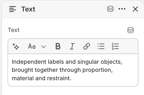
Text block settings.
| Setting | What it controls | Default |
|---|---|---|
| Text | Rich body content, including supported links and formatting. | Use this section for an introduction, brand story, product details, or editorial message. |
Image
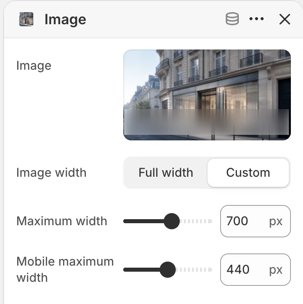
Image block settings.
| Setting | What it controls | Options or default |
|---|---|---|
| Image | The image shown in the block. | No default. |
| Image width | Chooses a full-width image or a constrained image. | Full width or Custom. Default: Custom. |
| Maximum width | Maximum image width when Image width is Custom. | 80–1200 px, step 20 px. Default: 320 px. Only visible for Custom. |
| Mobile maximum width | Maximum mobile image width when Image width is Custom. | 80–800 px, step 20 px. Default: 600 px. Only visible for Custom. |
When Image is blank, the block shows a neutral image illustration so you can judge its size and position. Upload the intended image or remove the unused block before publishing. The width controls constrain the image block; they do not create a separate mobile image source. Check tall and wide sources at both viewport sizes.
Liquid
| Setting | What it controls | Default |
|---|---|---|
| Custom liquid | Liquid output inserted at this block's position. | No default. |
Use this only when standard blocks cannot provide the content. Custom output can introduce its own markup, scripts, or accessibility requirements.
Button
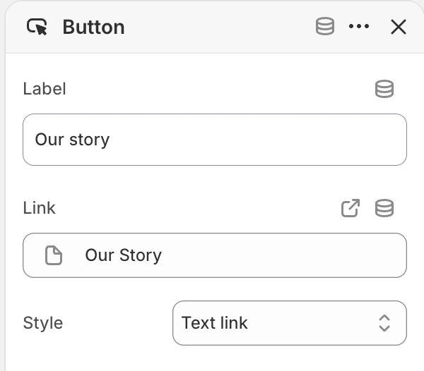
Button block settings.
| Setting | What it controls | Options or default |
|---|---|---|
| Label | Visible action text. | Learn more. |
| Link | Destination for the action. | No default. |
| Style | Visual treatment for the action. | Primary, Secondary, or Text link. Default: Text link. |
Set a destination that matches the label. Remove a Button block that has no useful destination.
App
App inserts a compatible Shopify app block. The app provider controls its content, validation, loading, and accessibility.
Desktop and mobile behavior
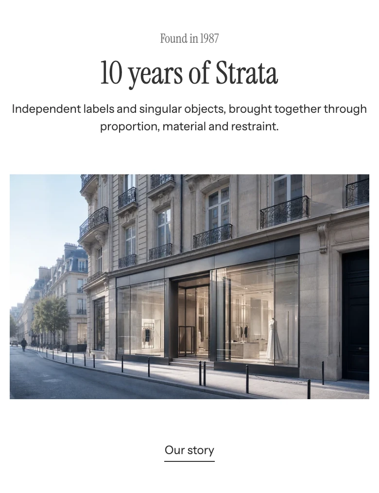
Rich text on mobile.
Rich text keeps the Theme Editor block order on both desktop and mobile, while width and wrapping change with the available space. Review the chosen block mix and any app content at both sizes.
Accessibility and motion
- Keep one logical heading structure and do not use repeated headings only for visual spacing.
- Give every meaningful image suitable alt text; mark decorative images appropriately in the source asset.
- Check link purpose, focus visibility, text contrast, and app controls.
- Ensure Liquid and app content remains usable with keyboard navigation and reduced motion.
Common issues
| Symptom | Safe check |
|---|---|
| Image width controls are missing | Choose Custom under Image width; the two maximum-width controls are conditional. |
| The block order is wrong | Reorder blocks in the Theme Editor to match the intended reading order. |
| A button is not useful | Set a matching Label and Link, then test the destination. |
| App or Liquid content looks different | Inspect the provider or authored output; it is not governed by the standard Rich text blocks. |
| Parallax is absent | Confirm global Enable parallax effects and check reduced-motion settings. |