
Typography controls the heading and body type system used across Strata. Set it before reviewing section layout because font metrics change line wrapping, card height, and navigation fit.
Open Typography
Open Theme settings > Typography in the Shopify Theme Editor. The settings are grouped in the same order as the editor: Headings, then Body text.
Headings
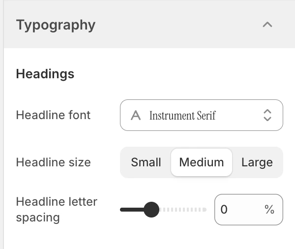
The Headings group in the Theme Editor. Values shown are from the demo store, not defaults.
Headline font
Choose the font used for headings and other headline treatments. New installations start with Instrument Serif, regular weight. Review the longest heading in each template after changing it; a font with wider glyphs can create an extra line and change the section’s height.
Headline size
Choose one of these options:
| Option | Use it when |
|---|---|
| Small | The page has dense supporting content or long headings. |
| Medium | The default balance of hierarchy and available width. |
| Large | A short editorial headline needs stronger emphasis. |
The default is Medium. This is a theme-level choice, so check product titles, collection headings, article titles, and section headings together.
Headline letter spacing
Adjusts heading letter spacing from -5% to 10%, in 1% steps. The default is 0%. Small negative values can tighten a large display heading; positive values can help an all-caps label breathe. Avoid using spacing as a substitute for a readable font size.
Body text
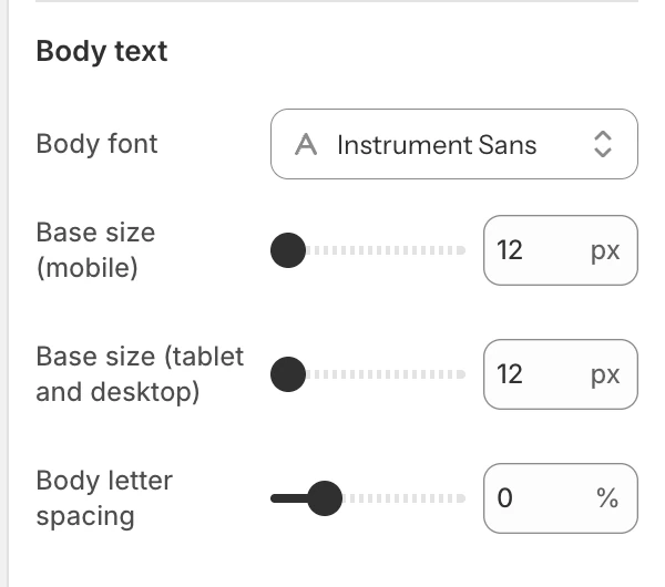
The Body text group in the Theme Editor.
Body font
Choose the font used for paragraphs, controls, labels, and other body copy. New installations start with Instrument Sans, regular weight. Check buttons, filters, forms, and long navigation labels as well as paragraphs; these are often the first places where a font change creates overflow.
Base size (mobile)
Sets the base body size on mobile from 12–20 px, in 1 px steps. New installations start at 12 px. Keep enough size and line height for shoppers reading product information and form errors on a small screen.
Base size (tablet and desktop)
Sets the base body size on tablet and desktop from 12–22 px, in 1 px steps. New installations start at 12 px. A larger value can improve readability in wide editorial layouts but may make dense filters or cart summaries taller.
Body letter spacing
Adjusts body letter spacing from -3% to 10%, in 1% steps. The default is 0%. Use conservative values for paragraphs and form controls; excessive positive spacing makes a line longer and can reduce the space available for labels.
Responsive and accessibility review
- Review the same page at mobile, tablet, and desktop widths after changing either base-size setting.
- Check headings that wrap, buttons with long labels, product cards, navigation, cart lines, and error messages.
- Preserve readable contrast and avoid using letter spacing or a display font to communicate meaning by shape alone.
- If a visitor’s browser or operating system applies a font fallback, the final line wrapping can differ from the Theme Editor preview.
Related guides
- Header for desktop and mobile Header logo widths.
- Appearance and spacing for page width and section rhythm.
- Colors for text and surface contrast.