
Featured products creates a product carousel or stacked grid. Use a collection for an automatically maintained selection, or choose individual products when the merchandising order must be exact.
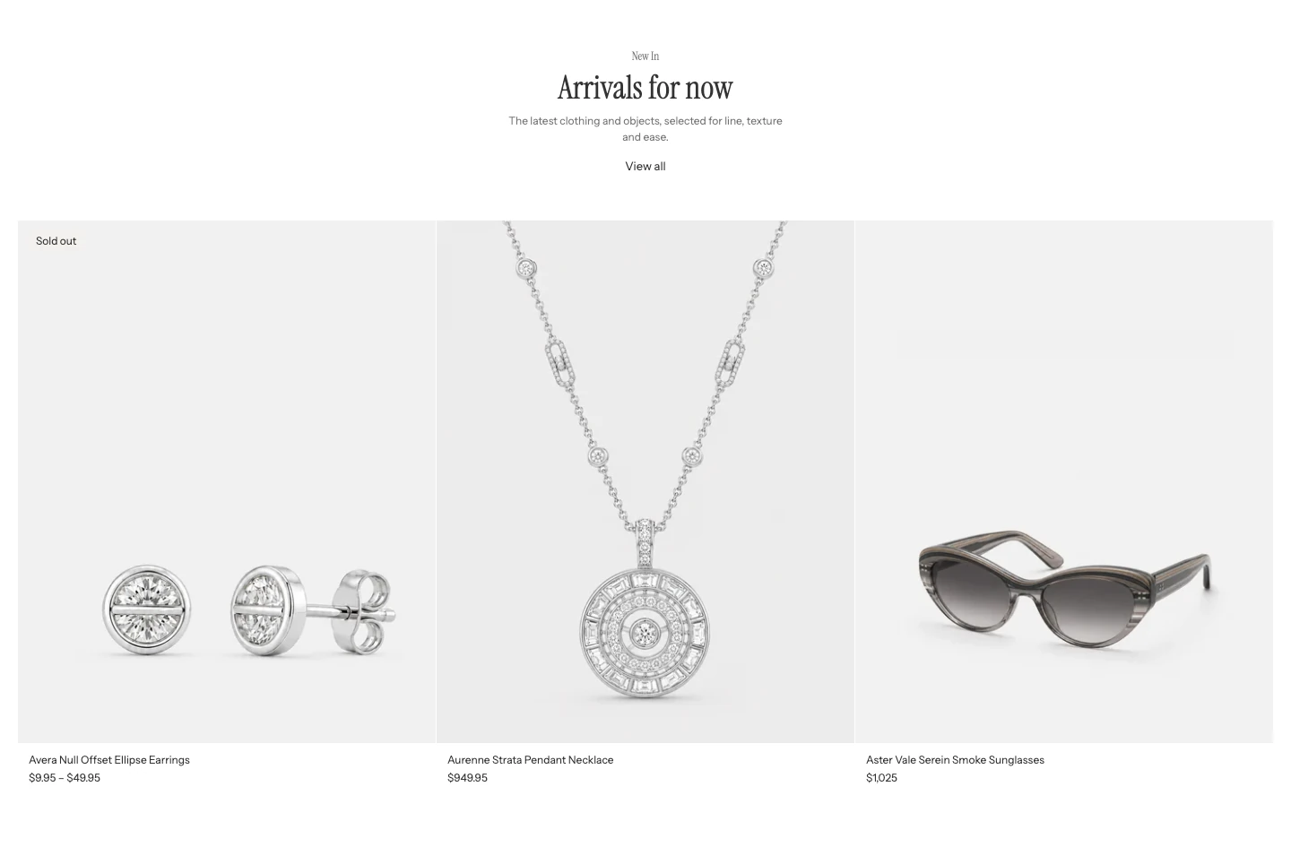
Featured products in the Carousel layout, with a centered heading.
Content
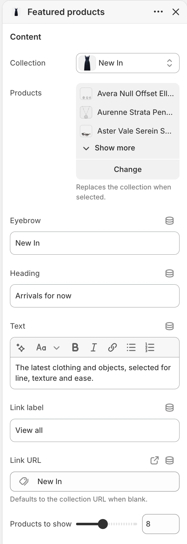
The Content group in the Theme Editor. The values shown are examples, not defaults.
| Setting | Default | What it controls |
|---|---|---|
| Collection | Blank | Supplies products from the selected collection. |
| Products | Blank; up to 16 selected products | A hand-picked source. When populated, it replaces Collection. |
| Eyebrow | Featured | Short text above the heading. |
| Heading | Featured products | Main heading for the product group. |
| Text | Show a collection or a hand-picked selection of products. | Optional rich text below the heading. |
| Link label | View all products | Optional label for the heading link. |
| Link URL | Blank | Destination for the heading link. When blank, it falls back to the selected collection URL. |
| Products to show | 2–16, step 1; default 6 | Maximum number of products rendered from the selected source. |
When both product sources are present, Products wins. Select a product source before publishing.
Layout
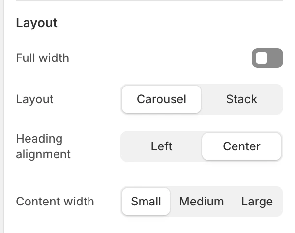
The Layout group in the Theme Editor.
| Setting | Default | Options and use |
|---|---|---|
| Full width | On | On uses the wider product container; Off keeps it in the page-width container. |
| Layout | Carousel | Carousel creates a horizontally browsable row. Stack creates a multi-row grid. |
| Products per row (desktop) | 2–6, step 1; default 4 | Card density on desktop. Shown only for Stack. |
| Products per row (mobile) | 1 or 2; default 2 | Card density on mobile. Shown only for Stack. |
| Heading alignment | Left | Left or Center. |
| Content width | Medium | Small, Medium, or Large width for the heading content. |
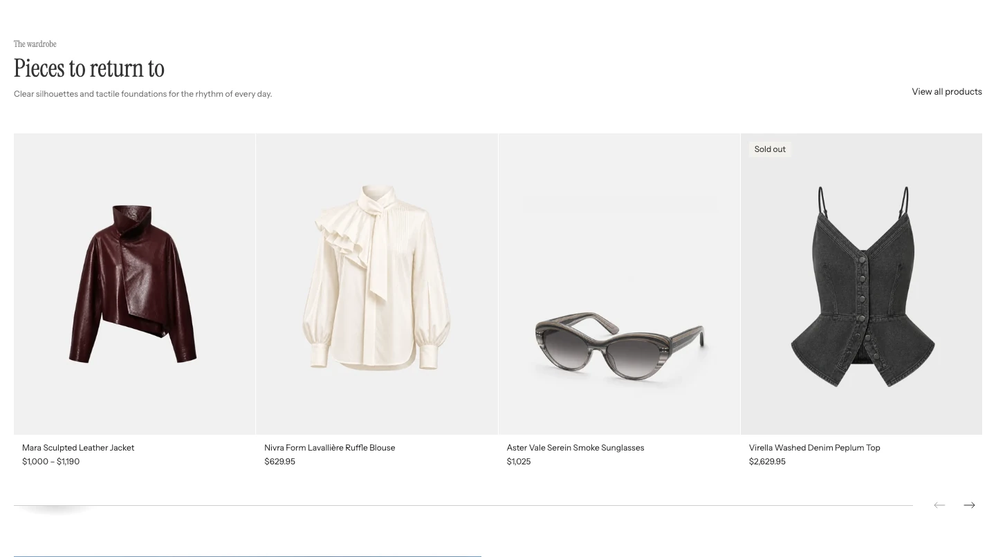
Another Carousel, with Heading alignment: Left and a View all products link.
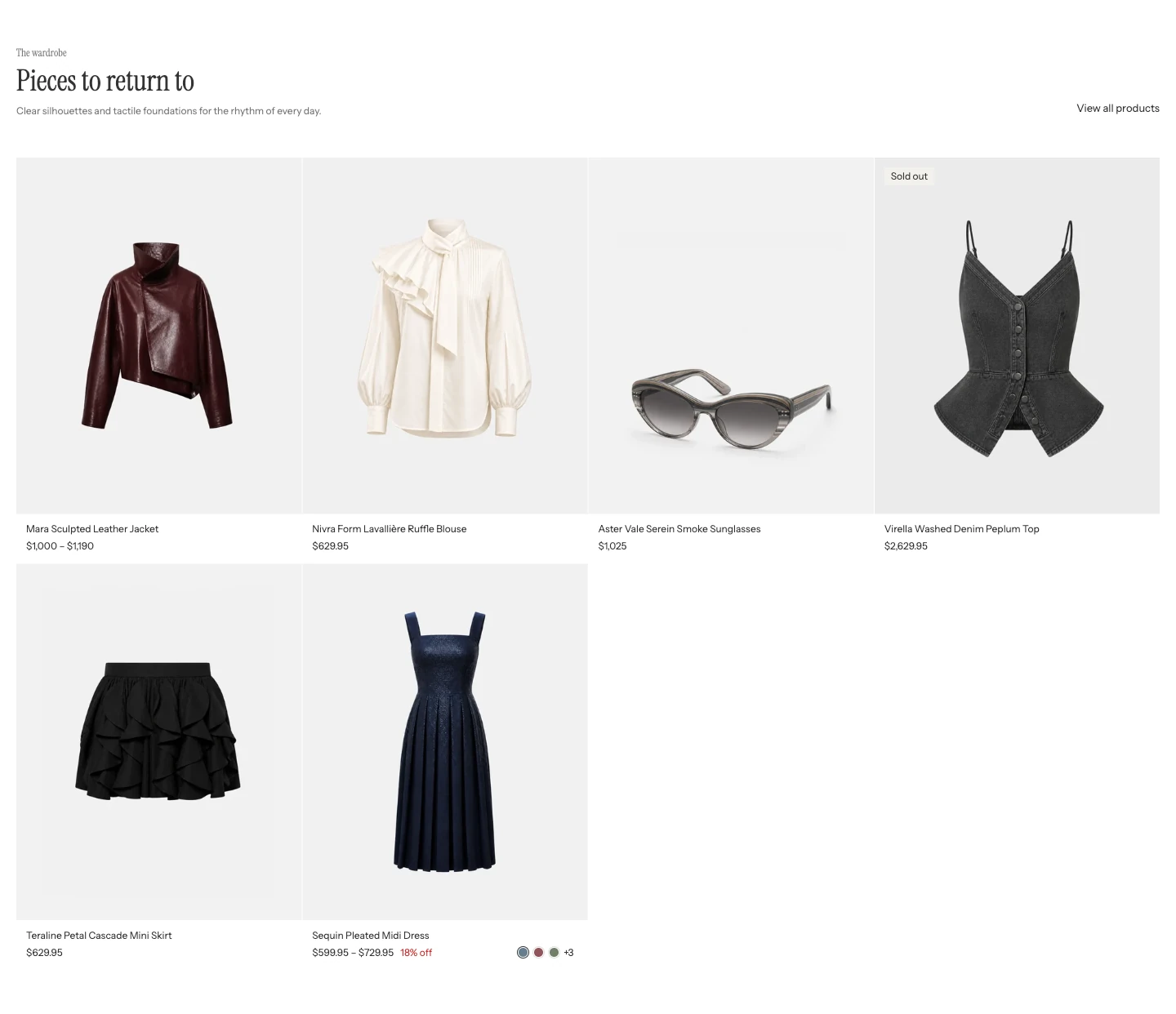
Layout: Stack. All products show at once in rows.
Motion and controls
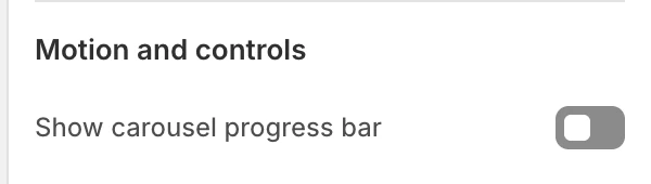
The Motion and controls group in the Theme Editor.
Show carousel progress bar is on by default and appears only when Layout is Carousel. It changes the carousel feedback without changing the product source or order.
Colors
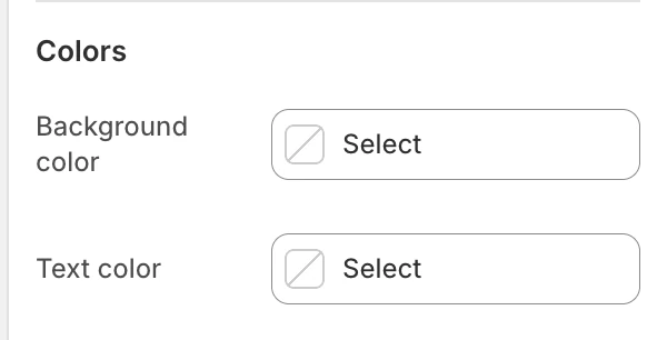
The Colors group in the Theme Editor.
| Setting | What it controls | Default |
|---|---|---|
| Background color | The section surface around the heading and product cards. | Leave blank to inherit Theme settings > Colors > General; selecting a color in this section overrides the inherited value. |
| Text color | The section heading, supporting text, and section-level link. | Leave blank to inherit Theme settings > Colors > General; selecting a color in this section overrides the inherited value. |
Product-card backgrounds, titles, prices, and quick-buy controls use Theme settings > Colors > Product > Card background and Card text. They do not follow this section's Text color.
Spacing
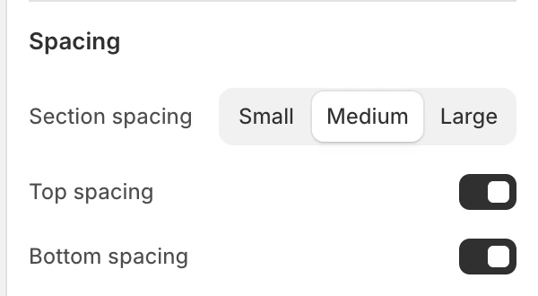
The Spacing group in the Theme Editor.
| Setting | Options and default |
|---|---|
| Section spacing | Small, Medium, or Large; default Medium. |
| Top spacing | On by default. |
| Bottom spacing | On by default. |
Product card dependencies
Every item uses the global Product card settings for image ratio, vendor, badges, ratings, text alignment, quick buy, and related card controls. Card colors come from Theme settings > Colors > Product, while eligible color options use the global Color swatches switch and display mode.
Quick-buy availability and its desktop/mobile behavior follow the shared Product card rules. After a successful add, the global Cart drawer setting determines whether the cart drawer is used on supported layouts.
Desktop and mobile behavior
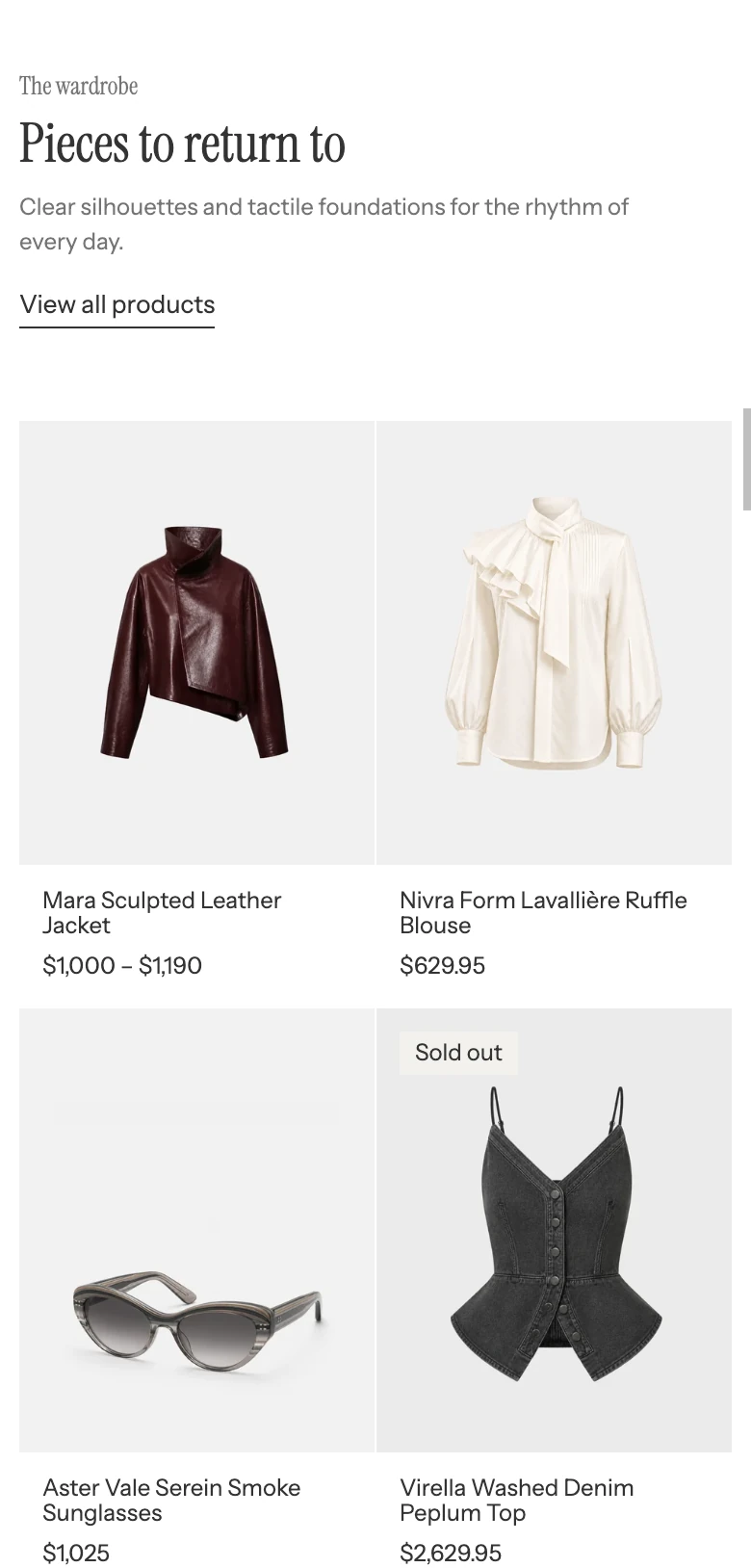
Stack on mobile, with two products per row.
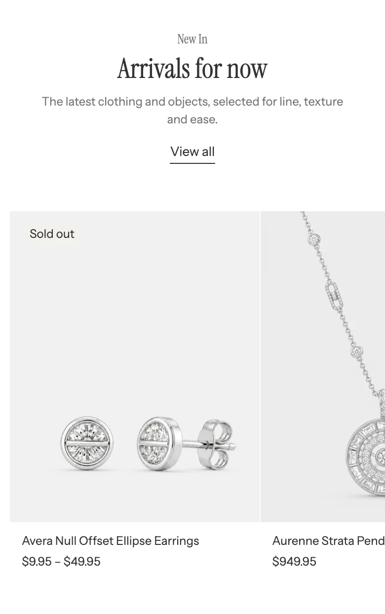
Featured products on mobile.
For Stack, the mobile and desktop column values are independent. Use Stack when all products should be visible in page flow; use Carousel when shoppers should browse horizontally. Check the final carousel card or last grid row at both device previews.
Accessibility and motion
Product titles and images link to the product page. Check that heading links, card links, carousel arrows, progress feedback, and quick-buy controls have visible focus and useful accessible names. Review card reveal and carousel behavior with reduced motion enabled; this section does not add a separate motion setting.
Common issues
- The wrong products appear: confirm whether Products is populated; it replaces Collection.
- The heading link goes somewhere unexpected: enter Link URL; otherwise it follows the selected collection.
- The column controls are missing: choose Layout: Stack.
- The progress bar is missing: it is shown only when Layout is Carousel.
- No products appear: choose a collection or product list before publishing.
- Quick buy is unavailable: check product availability, selling plans, and global Product card quick-buy settings.
- Swatches are absent: check Color swatches and the product’s option data.