
Collection banner is the first section of the Collection template. It owns the collection title and breadcrumbs, plus an optional image-led hero. The product grid, filters, sorting, and promotional blocks belong to the separate Collection section that follows it.
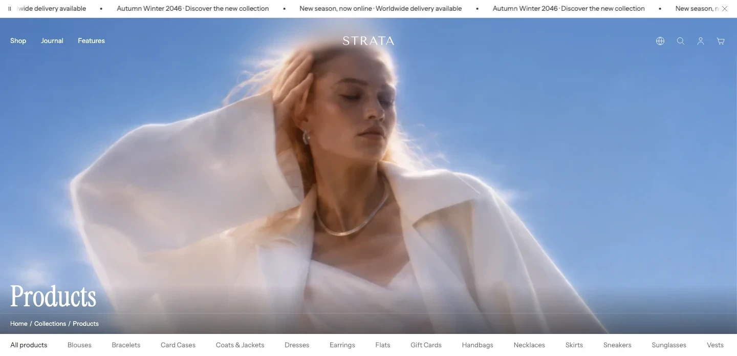
Collection banner on desktop with an image and a transparent Header.
Open Collection banner
- Open Online Store > Themes > Edit theme.
- Use the page selector to open a collection template.
- Select Collection banner, above the Collection section.
- Preview a collection with and without a hero image before publishing.
Content
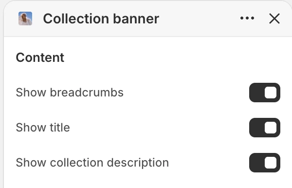
The Content group in the Theme Editor. The values shown are examples, not defaults.
| Setting | What it controls | Default |
|---|---|---|
| Show breadcrumbs | Shows the path back to the collections index. A hidden visual breadcrumb does not remove the collection heading. | On |
| Show title | Shows the collection title in the banner. When off, Strata keeps a visually hidden page heading for document structure. | On |
| Show collection description | Shows the description saved on the collection. | On |
Use the title unless the page has another clear, accessible collection heading. Breadcrumbs are most useful when shoppers regularly move between the collections index and individual collections.
Media
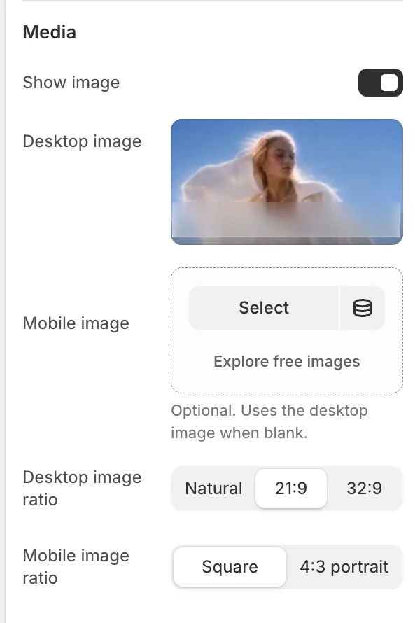
The Media group in the Theme Editor.
Show image
The default is On. Strata uses the collection image automatically unless you choose a different Desktop image. Turn it off for a simple text banner; the image-only controls are then hidden.
Desktop image
Optionally replaces the collection image for this template. When blank, Strata uses the collection image.
Mobile image
Provides an optional mobile-specific composition. When blank, Strata reuses Desktop image.
Desktop image ratio
Choose Natural, 21:9, or 32:9. The default is 32:9.
Mobile image ratio
Choose Square or 4:3 portrait. The default is Square.
The ratio changes the visible frame rather than editing the source file. Use a mobile-specific image when the desktop subject or text-safe area cannot survive the narrower crop.
Header
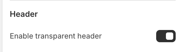
The Header group in the Theme Editor.
Enable transparent header
The default is On and the setting appears only when Show image is on. When the Collection banner is the first normal template section and Header transparent mode is also enabled, the Header can overlay the hero.
This setting does not replace Header > Enable transparent header. Both controls must permit the overlay. If Show image is off, the banner returns to the plain presentation and the transparent hero state is unavailable.
Motion and controls
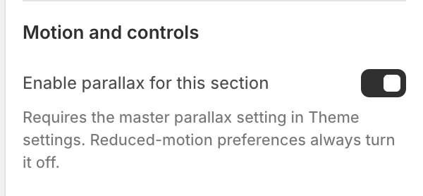
The Motion and controls group in the Theme Editor.
Enable parallax for this section
The default is On. Parallax runs only when all of these conditions are true:
- Desktop image is present;
- this section setting is on;
- global Theme settings > Animation > Enable parallax effects is on;
- the visitor has not requested reduced motion.
The banner remains fully visible without the effect.
Colors
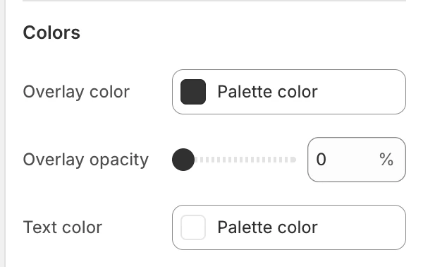
The Colors group in the Theme Editor.
The following settings appear when Show image is on:
| Setting | What it controls | Default |
|---|---|---|
| Overlay color | Color layered over the hero image. | Global brand color |
| Overlay opacity | Strength of the overlay, from 0–80% in 5% steps. | 15% |
| Text color | Collection title and breadcrumb color over the image. | Global background color |
Check the title, breadcrumb links, Header controls, and focus states against both the image and overlay.
Desktop and mobile behavior
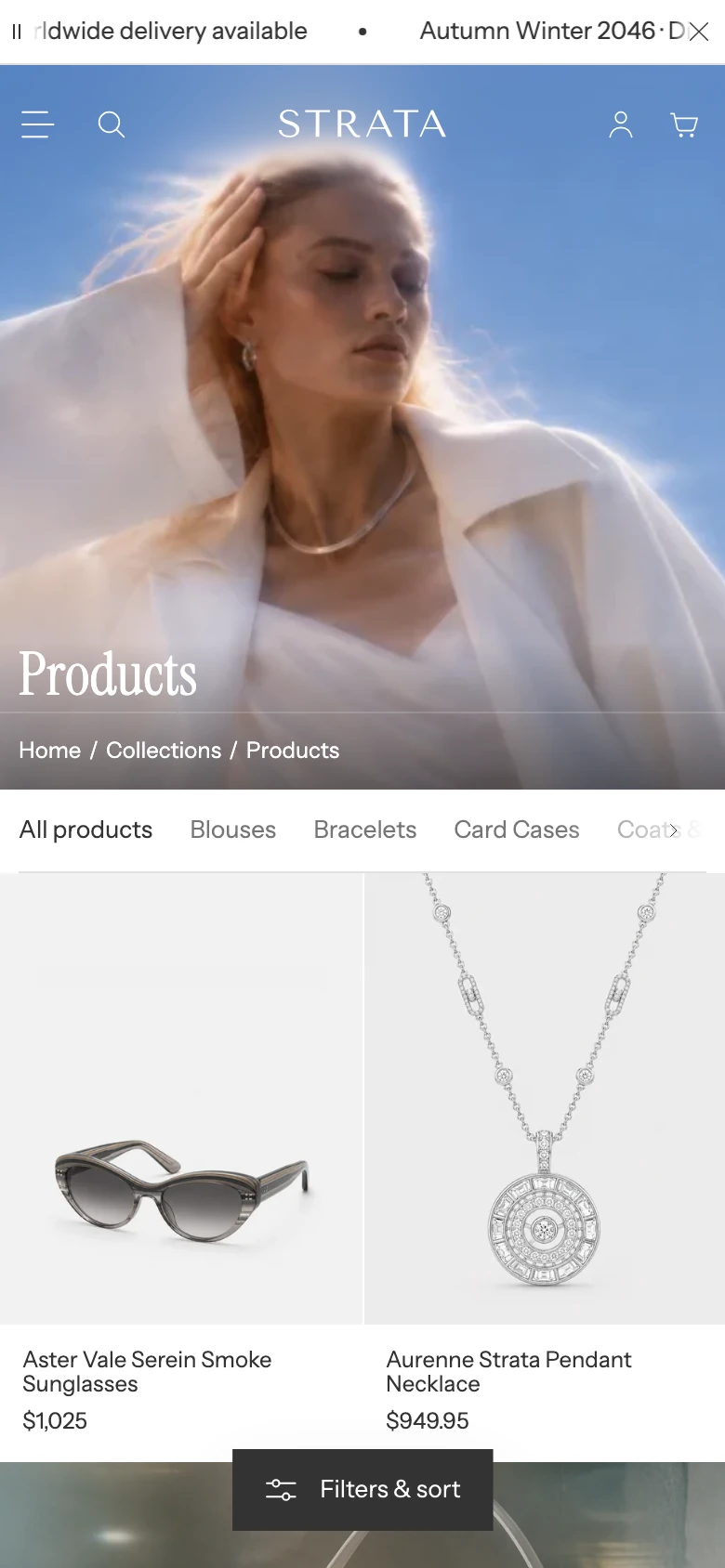
Collection banner on mobile.
- Desktop and mobile can use different source images and ratios.
- The mobile image inherits the desktop image's focal point when it has no separate focal point.
- Keep the hero file efficient and the first view readable before any motion runs.
- Without an image, the title and breadcrumbs use the plain collection-banner layout.
Common issues
- The image controls are missing: turn on Show image.
- The wrong desktop image appears: select Desktop image to replace the collection image for this template.
- The mobile image is ignored: confirm Show image is on. When Mobile image is blank, Strata reuses the desktop or collection image.
- The Header stays solid: enable transparent mode in both Header and Collection banner, keep the banner first, and confirm an image is present.
- Parallax does not run: check the local and global parallax switches plus reduced-motion preferences. A static image is the expected fallback.
- The collection grid settings are missing: open the separate Collection section below the banner.