
Multiple images with text
Present up to five image-and-copy items as a gallery, page turn, or blur reveal.
Multiple images with text presents a short sequence of related stories. Use it when two to five items belong together but each needs its own media, copy, and action. A new section starts with three items.
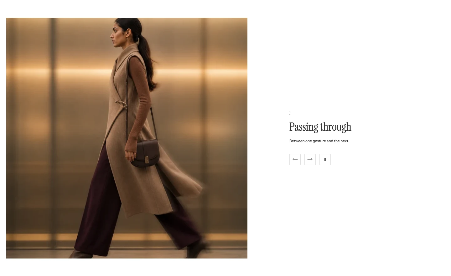
Multiple images with text on desktop.
Add Multiple images with text
In Shopify's theme editor, add Multiple images with text to a compatible template or open an existing section. It is not available in header, footer, or overlay groups.
Layout
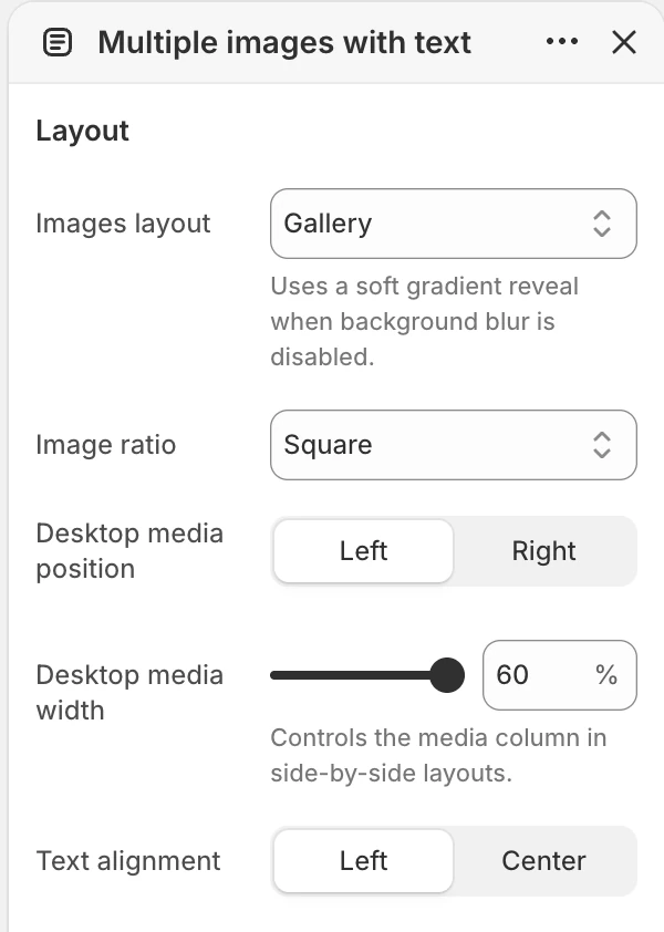
The Layout group in the Theme Editor. The values shown are examples, not defaults.
| Setting | What it controls | Options or default |
|---|---|---|
| Images layout | Chooses how the item media is presented. | Gallery, Page turn, or Blur reveal. Default: Gallery. |
| Image ratio | Sets one shared image shape. | Natural, Portrait, Square, or Landscape. Default: Square. |
| Desktop media position | Places the media to the left or right of the text on desktop. | Left or Right. Default: Left. |
| Desktop media width | Sets the share of the desktop section used by media. | 40%–60%, in 1% steps. Default: 50%. |
| Text alignment | Aligns the copy in Gallery. | Left or Center. Default: Left. Shown only for Gallery. |
Images layout chooses the presentation:
- Gallery shows one Item image at a time. Previous, next, and autoplay changes keep the image and its matching content together.
- Page turn presents one main Item at a time with the page-turn transition and supports horizontal swiping on touch screens.
- Blur reveal presents the same Item sequence with a soft layered transition. When global blur effects are off, it keeps a gentle gradient transition without the blur, and visitors can still move between Items normally.
Use Desktop media position to place the media on the side that best supports the page flow. Use Desktop media width to rebalance media and copy without changing the Item content. Mobile remains a single-column presentation.
Choose a fixed Image ratio for a consistent frame, or Natural to follow each uploaded image. When using Natural, prepare images with similar proportions so the section does not change height noticeably as visitors move through the sequence.
Motion and controls
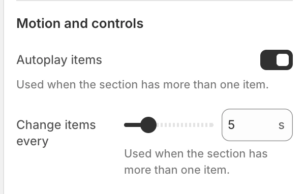
The Motion and controls group in the Theme Editor.
| Setting | What it controls | Options or default |
|---|---|---|
| Autoplay items | Enables automatic changes between items when the section has more than one item. | Enabled by default. |
| Change items every | Sets the autoplay interval. It is shown only when Autoplay items is enabled. | Range 3–12 seconds, step 1 second. Default: 5 seconds. |
When more than one item exists, the section provides previous and next controls for the active Item. When autoplay is enabled, it also provides a pause/play control; the control is not rendered when autoplay is off. Test the controls before publishing rather than relying on the first item.
With Gallery, Page turn, or Blur reveal and more than one item, shoppers can swipe horizontally to move between items. A successful swipe restarts the autoplay interval so the next automatic change does not immediately replace the selected item. Review horizontal swiping and vertical page scrolling together on mobile.
Reduced-motion settings stop automatic transition movement while keeping the controls usable. Keep each Item complete when read statically.
Colors
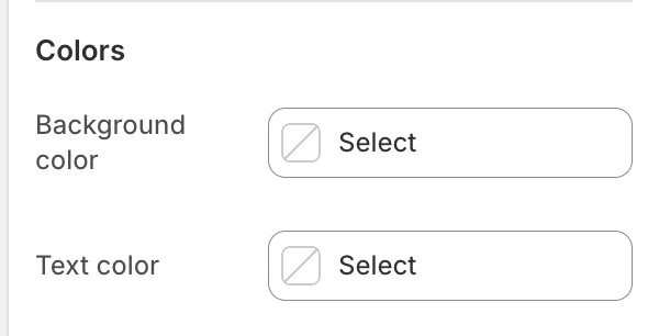
The Colors group in the Theme Editor.
| Setting | What it controls | Default |
|---|---|---|
| Background color | The shared section surface. | Leave blank to inherit Theme settings > Colors > General; selecting a color in this section overrides the inherited value. |
| Text color | The shared item text color. | Leave blank to inherit Theme settings > Colors > General; selecting a color in this section overrides the inherited value. |
Check image contrast and button contrast against the selected surface; these colors do not replace the media in an item.
Spacing
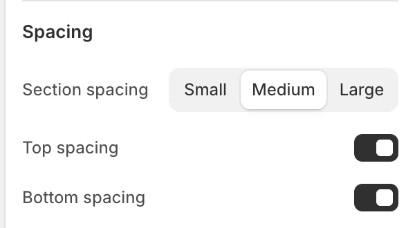
The Spacing group in the Theme Editor.
| Setting | What it controls | Options or default |
|---|---|---|
| Section spacing | Chooses the section's spacing scale. | Small, Medium, or Large. Default: Medium. |
| Top spacing | Adds or removes the section's top spacing. | Enabled by default. |
| Bottom spacing | Adds or removes the section's bottom spacing. | Enabled by default. |
Item blocks
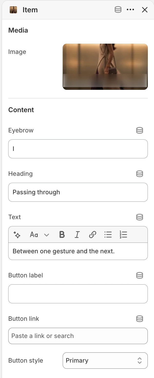
Item block settings.
Add up to 5 Item blocks. Their Theme Editor order is the item order used by the composition and controls.
Media
| Setting | What it controls | Default or condition |
|---|---|---|
| Image | Main image for the item. | No default. |
Content
| Setting | What it controls | Default |
|---|---|---|
| Eyebrow | Short context above the item heading. | Our story. |
| Heading | Main item message. | Tell a story in chapters. |
| Text | Rich text for the item. | Use each slide to introduce a product, value, process, or part of your story. |
| Button label | Visible action text. | No default. |
| Button link | Destination for the action. | No default. |
| Button style | Visual treatment for the action. | Primary, Secondary, or Text link. Default: Primary. |
The item button appears only when both Button label and Button link are present. Keep the media, heading, text, and action about the same story so changing items does not change the visitor's context unexpectedly.
Desktop and mobile behavior
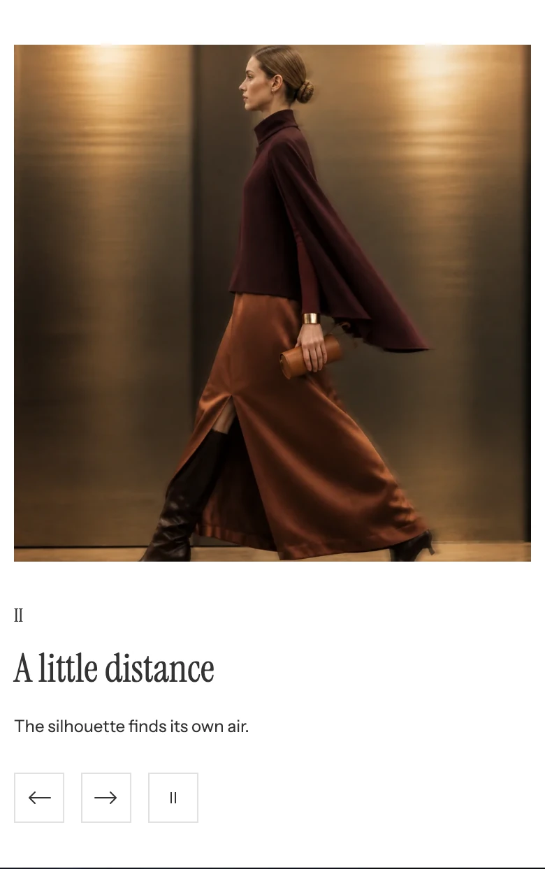
On mobile the image sits above the text and controls.
Gallery, Page turn, and Blur reveal switch the active media and content together. On mobile, the section height follows the current media and content rather than being fixed to one screen. Preview every Item, including the one with the longest heading or text. On desktop, compare the 40% and 60% media-width boundaries against the longest copy.
Accessibility and motion
- Give each image meaningful alt text, or make the image decorative when the adjacent copy carries the same information.
- Test previous/next and autoplay pause/play controls with keyboard focus and touch.
- Test horizontal swiping in both directions without blocking normal vertical page scrolling.
- Do not make a legal or product limitation available only while a slide is moving.
- Keep item headings and links unique enough to identify their destination.
- Verify the static result with reduced motion enabled.
Common issues
| Symptom | Safe check |
|---|---|
| The interval setting is missing | Enable Autoplay items; Change items every is conditional on that switch. |
| Only one story appears | Confirm multiple Item blocks exist and that each has content. |
| The item action is missing | Set both Button label and Button link. |
| Gallery shows the wrong image for the text | Confirm the corresponding Image and content live in the same Item block, then use the previous and next controls to review every Item. |
| Item content does not advance automatically | Enable Autoplay items, add more than one Item, and check the reduced-motion preference. |
| Horizontal swipe does not change the item | Confirm Images layout is Gallery, Page turn, or Blur reveal, more than one Item block exists, and the gesture is primarily horizontal. |