
Newsletter adds a Shopify customer email signup to a storefront page. Use it when the value of subscribing can be explained clearly and the store is ready to manage consent and follow-up messages.
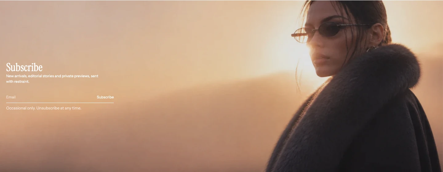
Image layout: Background image.
Add Newsletter
In Shopify's theme editor, add Newsletter to a compatible template or open an existing section. It is not available in the header or overlay groups.
Content
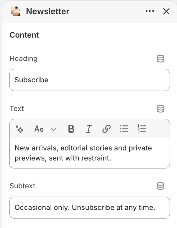
The Content group in the Theme Editor. The values shown are examples, not defaults.
| Setting | What it controls | Default |
|---|---|---|
| Heading | Main subscription message. | Join our newsletter. |
| Text | Rich text explaining the value of subscribing. | Receive new arrivals, stories, and updates by email. |
| Subtext | Supporting consent or unsubscribe information. | You can unsubscribe at any time. |
Write Subtext and Success text to match the store's actual consent, privacy, and email workflow. Do not promise a discount or delivery unless the store has configured it separately.
Form
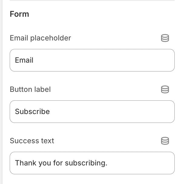
The Form group in the Theme Editor.
| Setting | What it controls | Default |
|---|---|---|
| Email placeholder | Placeholder shown in the email field. | Email. |
| Button label | Submit button text. | Subscribe. |
| Success text | Message shown after Shopify accepts the subscription. | Thank you for subscribing. |
Media
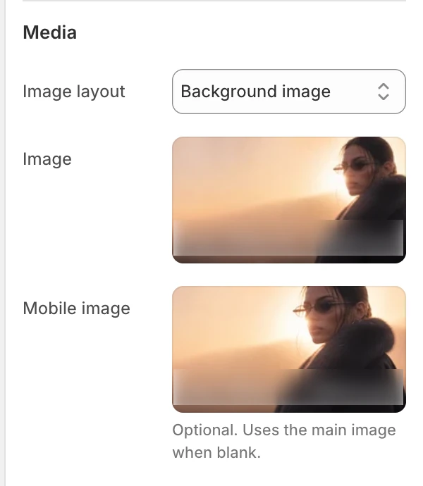
The Media group in the Theme Editor.
| Setting | What it controls | Options or default |
|---|---|---|
| Image layout | Chooses where the image sits relative to the signup content. | Image left, Image right, or Background image. Default: Background image. |
| Image | Main image source. When blank, the selected image layout shows a neutral illustration. | No default. |
| Mobile image | Optional mobile-specific source. | Uses Image when blank. |
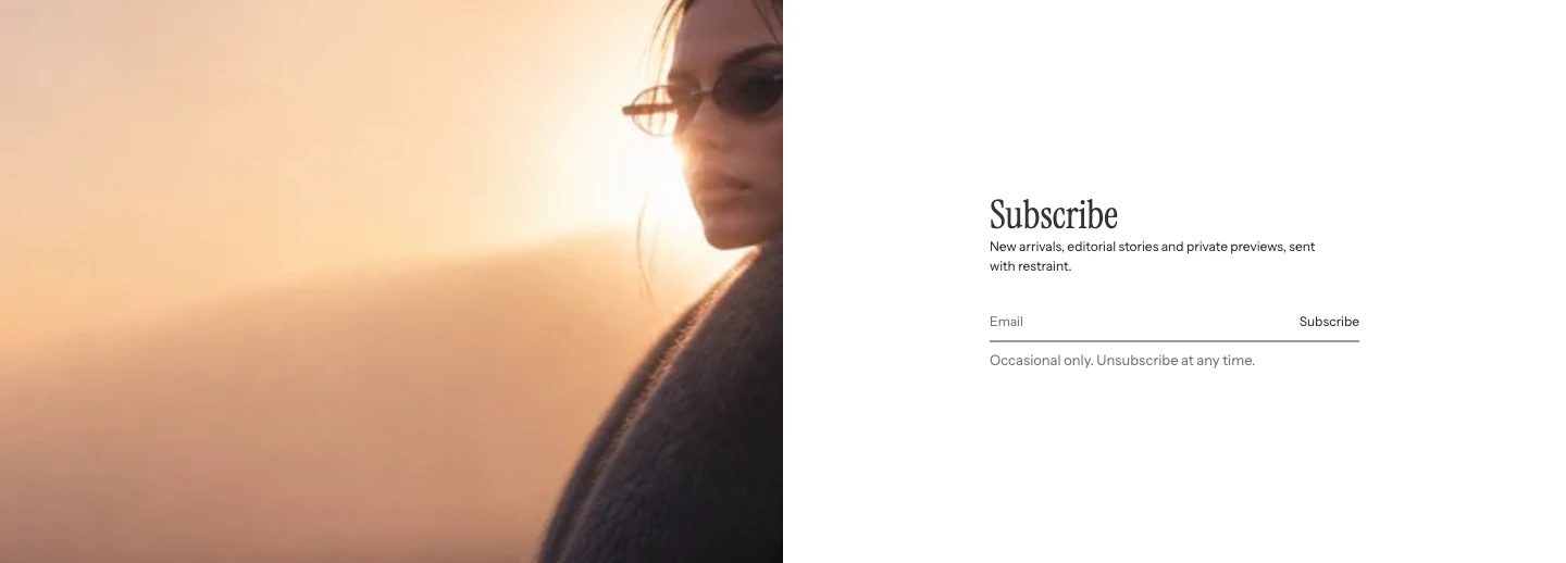
Image layout: Image left, with Text color cleared so the copy uses the theme text color.
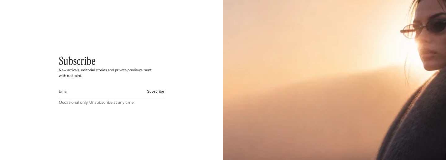
Image layout: Image right.
Layout
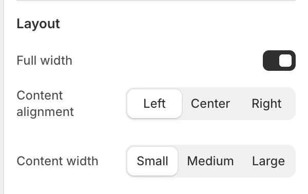
The Layout group in the Theme Editor.
| Setting | What it controls | Options or default |
|---|---|---|
| Full width | When off, constrains the complete section shell, adds inner side space, and follows global Enable rounded UI. When on, the section is full width and square. | Disabled by default. |
| Content alignment | Aligns heading, copy, and form. | Left, Center, or Right. Default: Left. |
| Content width | Limits the content column. | Small, Medium, or Large. Default: Medium. |
Motion and controls
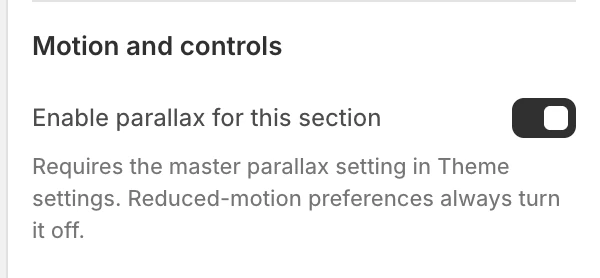
The Motion and controls group in the Theme Editor.
| Setting | What it controls | Default or dependency |
|---|---|---|
| Enable parallax for this section | Opts the background or supporting image into scroll parallax when permitted globally. | Enabled by default. Requires global Enable parallax effects; reduced-motion preferences turn it off. |
The email form is independent of parallax. The image must not carry the only explanation of what subscribing does.
Colors
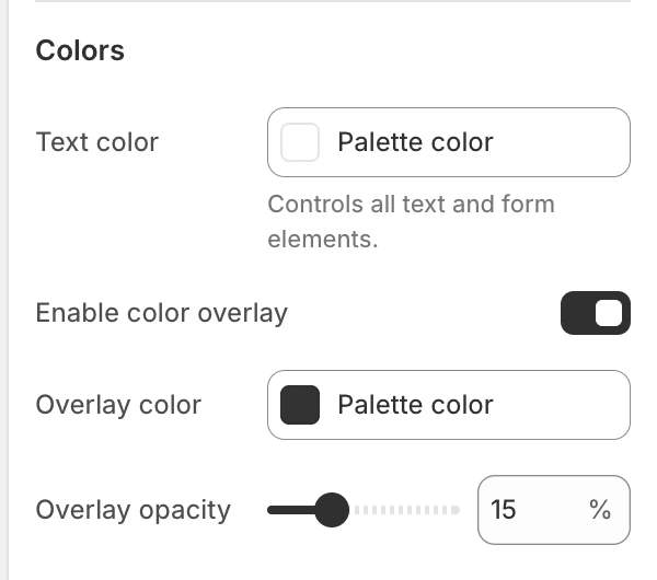
The Colors group in the Theme Editor.
| Setting | What it controls | Options or default |
|---|---|---|
| Background color | Sets the section surface for Image left and Image right. | Leave blank to inherit Theme settings > Colors > General. Shown only for those two layouts. |
| Text color | Controls all heading, body, input, placeholder, button, and form-feedback text. | When blank, Background image uses white; Image left and Image right use the theme text color. |
| Enable color overlay | Adds a color overlay when a background image is used. | Enabled by default. |
| Overlay color | Sets the overlay color. | #000000. Shown for Background image. |
| Overlay opacity | Sets the overlay opacity. | 0–50%, step 1%. Default: 30%. Shown for Background image. |
Enable color overlay, Overlay opacity, and Overlay color appear only when Image layout is Background image. For the two beside-content layouts, check the selected text and form colors directly against the surface.
A color you choose explicitly always takes priority over the automatic value. To return to the layout-aware color, clear Text color rather than trying to match the inherited color manually.
Spacing
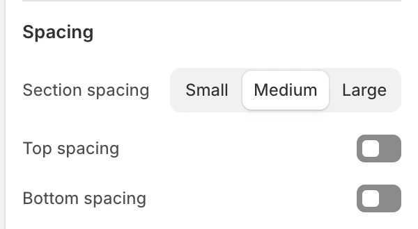
The Spacing group in the Theme Editor.
| Setting | What it controls | Options or default |
|---|---|---|
| Section spacing | Chooses the section's spacing scale. | Small, Medium, or Large. Default: Large. |
| Top spacing | Adds or removes the section's top spacing. | Enabled by default. |
| Bottom spacing | Adds or removes the section's bottom spacing. | Enabled by default. |
Form validation and states
The section submits a Shopify customer newsletter signup. The email field is required and uses the browser's email validation. Shopify displays an error when the submission fails and shows Success text after a successful subscription.
Test an empty value, an invalid email, and a non-sensitive test address. Confirm the messages are readable and do not obscure the surrounding content. The section does not define consent wording beyond the text you enter, so review the store's privacy and email-provider requirements separately.
Desktop and mobile behavior
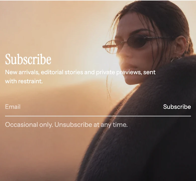
Background image layout on mobile.
The selected image layout, content width, and optional mobile image affect the composition. Preview the background crop or side-by-side image at desktop and mobile sizes, especially when the image contains text or a focal subject.
Accessibility and media
- Keep the subscription benefit and consent expectation in text, not only in the image.
- Check text and form contrast after changing Overlay color, Overlay opacity, or Text color.
- Use meaningful alt text for side-by-side images. A background image is decorative and should not carry essential information.
- Test keyboard focus, browser autofill, invalid email messaging, and the success status.
- Verify reduced motion with parallax disabled and the form still fully usable.
Common issues
| Symptom | Safe check |
|---|---|
| A setup illustration appears instead of the intended image | Upload Image and confirm the chosen Image layout uses it. |
| The mobile crop is wrong | Upload Mobile image or adjust the source focal point; a blank mobile field reuses Image. |
| Overlay changes have no visible effect | Enable color overlay is meaningful for Background image layout; check the layout and image first. |
| Subscription does not submit | Use a valid email and check Shopify's customer-form error message. |
| Success message is misleading | Rewrite Success text to match the configured email workflow and privacy notice. |
| Form controls have poor contrast | Adjust Text color, then check input, button, focus, error, and success states together. |
| Text stays the same color after changing the image layout | Clear the explicitly selected Text color to restore the automatic layout-aware color. |