
Recently viewed products gives visitors a way to reopen products they viewed in the same browser. It is a browser preference, not an account history, and can be empty for a first-time visitor or after stored site data is cleared.
Content
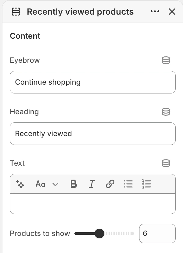
The Content group in the Theme Editor. The values shown are examples, not defaults.
| Setting | Default | What it controls |
|---|---|---|
| Products to show | 2–12, step 1; default 6 | Maximum number of stored products requested for this section. |
| Eyebrow | Continue shopping | Short text above the heading. |
| Heading | Recently viewed | Main heading for the history group. |
| Text | Blank | Optional rich text below the heading. |
Layout
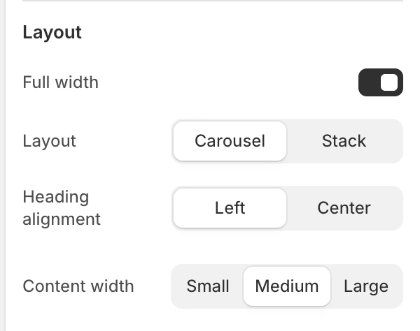
The Layout group in the Theme Editor.
| Setting | Default | Options and use |
|---|---|---|
| Full width | On | On uses the wider product container; Off keeps it in the page-width container. |
| Layout | Carousel | Carousel creates a horizontally browsable row. Stack creates a multi-row grid. |
| Products per row (desktop) | 2–6, step 1; default 4 | Card density on desktop. Shown only for Stack. |
| Products per row (mobile) | 1 or 2; default 2 | Card density on mobile. Shown only for Stack. |
| Heading alignment | Left | Left or Center. |
| Content width | Medium | Small, Medium, or Large width for the heading. |
The product currently being viewed is excluded. Only eligible products from the same browser’s history can appear. To preview this section, open a few product pages in the same browser; displaying products on the homepage does not add them to the viewing history.
Motion and controls
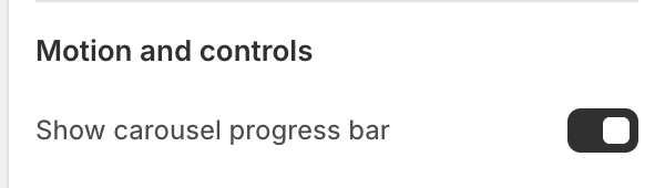
The Motion and controls group in the Theme Editor.
Show carousel progress bar is on by default and appears only when Layout is Carousel.
Colors
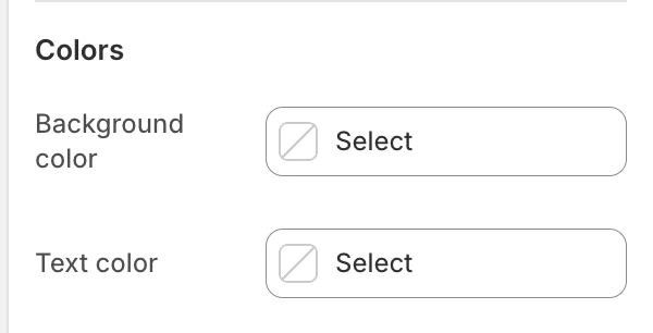
The Colors group in the Theme Editor.
| Setting | What it controls | Default |
|---|---|---|
| Background color | The section surface around the heading and recently viewed cards. | Leave blank to inherit Theme settings > Colors > General; selecting a color in this section overrides the inherited value. |
| Text color | The section heading and supporting text. | Leave blank to inherit Theme settings > Colors > General; selecting a color in this section overrides the inherited value. |
Product-card backgrounds, titles, prices, and quick-buy controls use Theme settings > Colors > Product > Card background and Card text. They do not follow this section's Text color.
Spacing
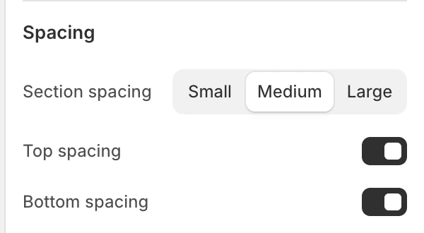
The Spacing group in the Theme Editor.
| Setting | Options and default |
|---|---|
| Section spacing | Small, Medium, or Large; default Medium. |
| Top spacing | On by default. |
| Bottom spacing | On by default. |
How visibility works
The section appears only when customer-privacy preferences allow the feature and the browser has stored eligible product history. In the Theme Editor the section shows sample cards instead, so you can style it before any history exists. It stays hidden when there are no valid cards, storage is unavailable, consent is not allowed, or loading fails.
This history is not shared between devices or accounts. It is browsing history, not a saved wishlist or customer profile.
Product card and cart dependencies
The rendered items are normal Product cards. Their image ratio, vendor, badges, ratings, text alignment, and quick buy inherit the global Product card settings. Their colors come from Theme settings > Colors > Product, and eligible color choices use the global Color swatches settings.
Quick-buy availability and its desktop/mobile behavior follow the shared Product card rules. The global Cart drawer setting can affect the surface used after a quick add.
Desktop, mobile, and accessibility
For Stack, the mobile and desktop column settings are independent. Check the first loaded card, the configured limit, and the final carousel card or grid row. Verify that cards, carousel controls, links, and quick-buy controls retain visible focus and useful accessible names. Test with reduced motion enabled because this section has no separate motion setting.
Privacy, empty states, and common issues
- Nothing appears: open the storefront preview outside the Theme Editor, allow the relevant customer-privacy preference, view one or more product pages, then return to the page containing the section.
- The current product is missing: it is intentionally excluded from the list.
- The list resets: clearing browser site data or using another browser/device removes the local history.
- The section is missing: browse eligible products in the same browser and check customer-privacy preferences.
- A product disappears: the product may have been deleted, unpublished, or given a new URL, or it may have failed to load.
- The column controls are missing: choose Layout: Stack.
- The progress bar is missing: it is used only when Layout is Carousel.