
The Collection list template presents the store's collections as a browsable index. Use it when shoppers need to choose a collection before viewing its products.
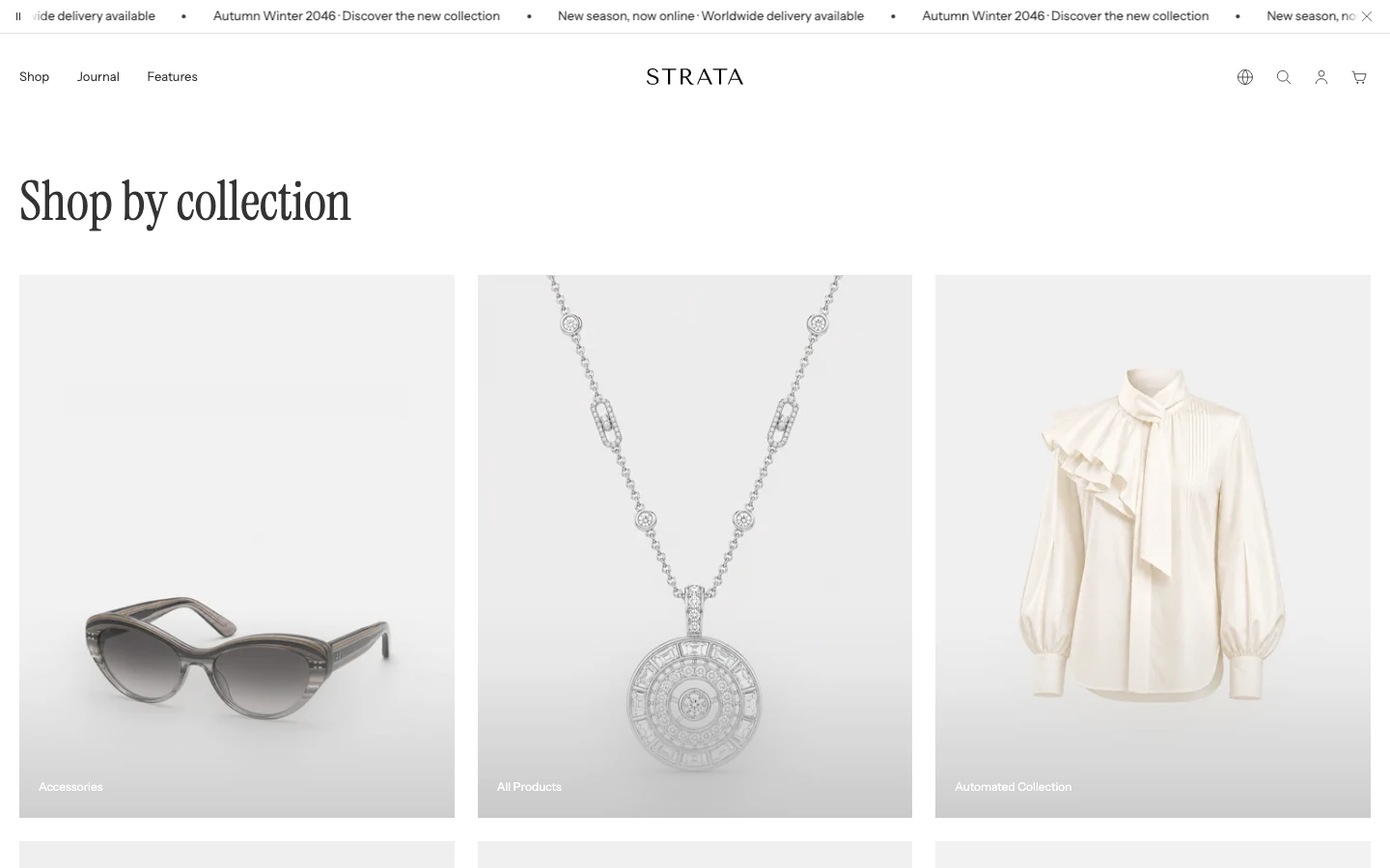
The Collection list template on desktop.
Open the Collection list template
- From Shopify admin, go to Online Store > Themes > Edit theme.
- Use the page selector to open Collections > Collection list.
- Select the Collections grid section.
- Preview the index with a small and a large number of collections before saving.
Collections grid is fixed to this template and cannot be added to another template. To place a chosen group of collections elsewhere, add the reusable Collections section.
Content
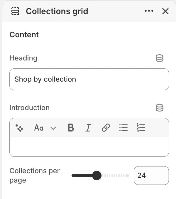
The Content group in the Theme Editor. The values shown are examples, not defaults.
Heading
- Controls: The main heading for the collection index.
- Default:
Shop by collection. If cleared, Strata uses Shopify's translated collection-index title.
Introduction
- Controls: Rich text below the heading.
- Use it when: Briefly explain how the collections are organised.
Collections per page
- Controls: Sets how many collection cards are loaded per page.
- Options: 6–48, in steps of 3. The default is 24.
Layout
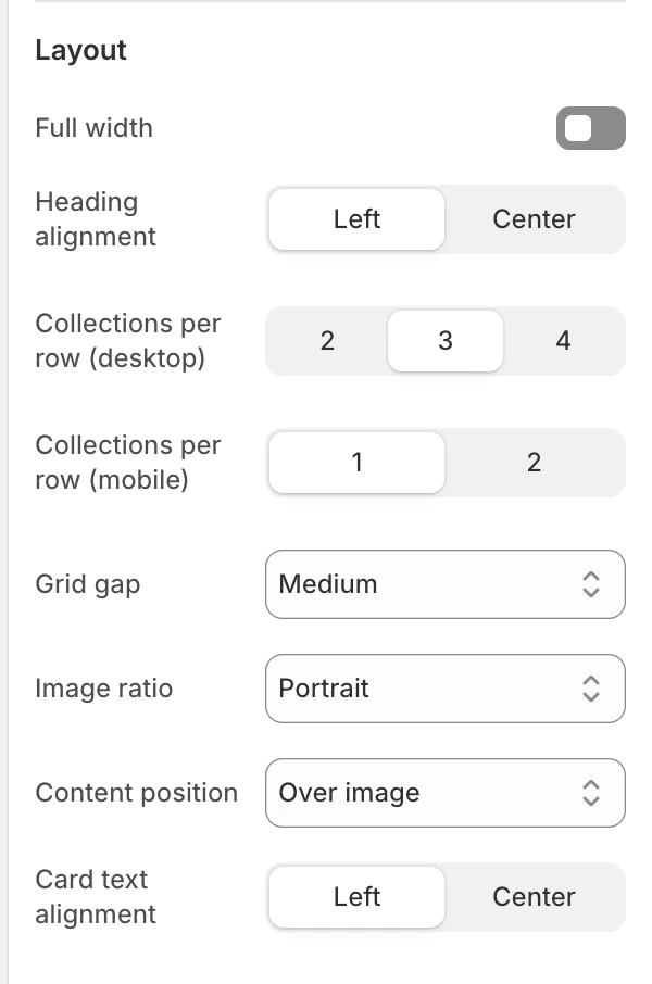
The Layout group in the Theme Editor.
Full width
- Controls: Uses the full available width when enabled. The default is off.
Heading alignment
- Controls: Aligns the heading and introduction.
- Options:
LeftorCenter. The default isLeft.
Collections per row (desktop)
- Controls: Sets the number of collection cards per desktop row.
- Options:
2,3, or4. The default is3.
Collections per row (mobile)
- Controls: Sets the number of collection cards per mobile row.
- Options:
1or2. The default is1.
Grid gap
- Controls: Sets the horizontal and vertical space between cards.
- Options:
None,Small,Medium, orLarge. The default isMedium.
Image ratio
- Controls: Sets the collection-card image ratio.
- Options:
Natural,Portrait,Square, orLandscape. The default isPortrait.
Content position
- Controls: Chooses where collection-card text appears.
- Options:
Below imageorOver image. The default isBelow image. - Use it when: Use below-image content when readability is the priority; use over-image content only after checking text contrast against every collection image.
Card text alignment
- Controls: Aligns the text inside collection cards.
- Options:
LeftorCenter. The default isLeft.
Colors
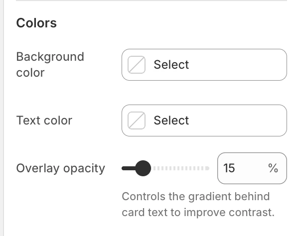
The Colors group in the Theme Editor.
Background color
- Controls: Sets the section background behind the heading and cards.
- When blank: Inherits Theme settings > Colors > General.
Text color
- Controls: Sets the heading, introduction, and card text color.
- When blank: Inherits Theme settings > Colors > General.
Overlay opacity
- Controls: Sets the strength of the contrast layer behind card text when Content position is Over image. It does not control blur.
- Options:
0–80%, in5%steps. The default is15%.
Spacing
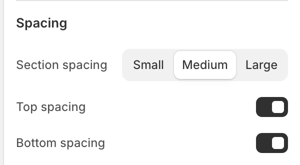
The Spacing group in the Theme Editor.
Section spacing
- Controls: Sets the section spacing to
Small,Medium, orLarge. The default isMedium.
Top spacing
- Controls: Adds or removes top spacing. The default is on.
Bottom spacing
- Controls: Adds or removes bottom spacing. The default is on.
Desktop and mobile behavior
The template exposes independent mobile and desktop card-column controls. Before publishing, compare:
- card image crop at every selected ratio;
- one-column and two-column mobile layouts;
- long collection titles;
- pagination when the collection count exceeds Collections per page.
Media recommendations
Choose collection images with a clear focal point that survives the selected ratio and the optional over-image text treatment.
Accessibility and motion
Use meaningful alternative text for collection images and keep the collection-card link text understandable without relying only on the image. Verify visible keyboard focus and reduced-motion behavior for image reveal before publishing.
Common checks
- If a collection is missing, verify that it is available to the storefront and that the page is using the Collection list template.
- If the index feels too dense, compare Collections per row (desktop) and the image ratio before changing collection artwork.