
The Collection template presents a collection's context and products, then helps shoppers narrow and scan the catalog. Use it for collection-level merchandising rather than for an individual collection-list section.
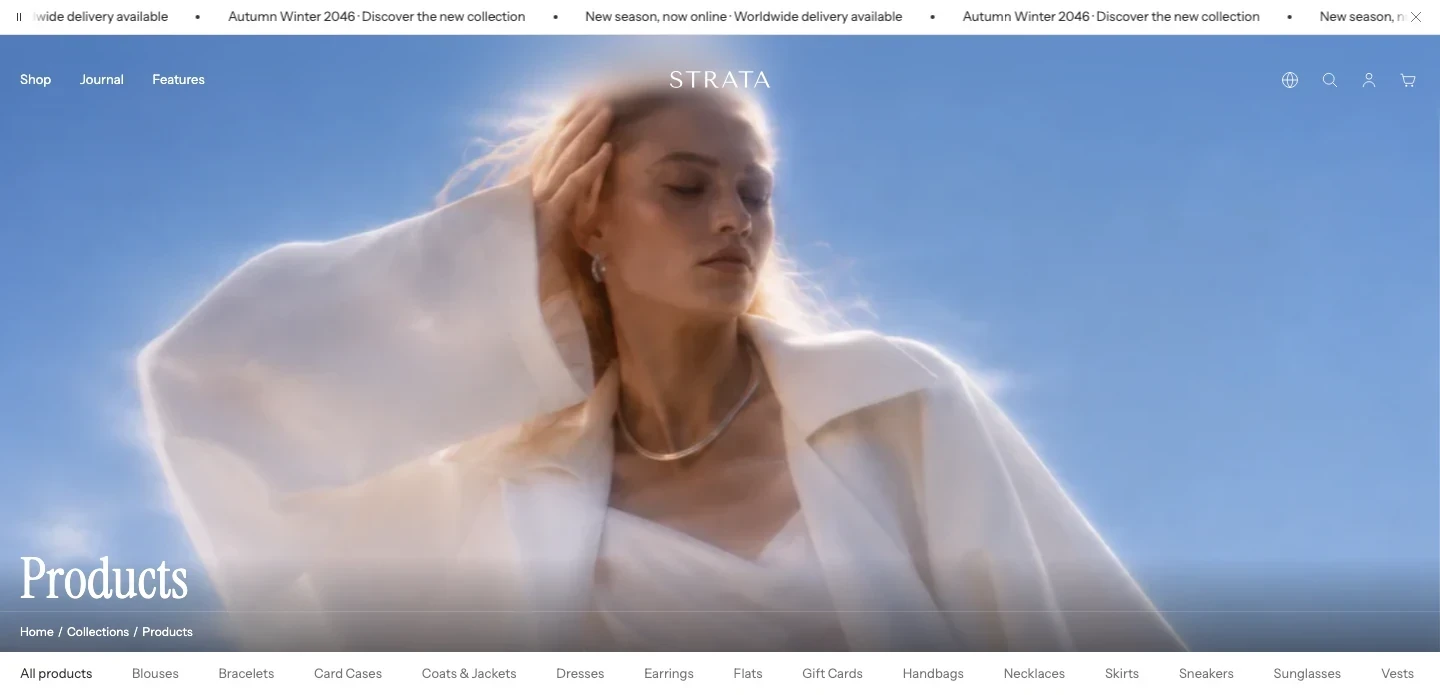
The Collection template on desktop.
Open the Collection template
- From Shopify admin, go to Online Store > Themes > Edit theme.
- Use the page selector to open Collections > Default collection, or choose the collection template you want to review.
- Select Collection banner for title and hero media, or Collection for filters, sorting, product loading, and merchandising blocks.
- Preview a collection with enough products to reach a second page, a collection with no matching filter results, and a collection with a category filter before saving.
The template separates the visual introduction from the product-browsing area: Collection banner owns the hero, while Collection owns filters, sorting, the grid, and merchandising blocks.
Collection banner
The first section owns Show breadcrumbs, Show title, hero images and ratios, parallax, overlay colors, and transparent-Header eligibility. See the Collection banner guide for its complete setting order and dependencies.
Products
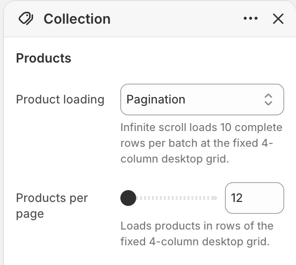
The Products group in the Theme Editor. Values shown are from the demo store, not defaults.
Product loading
- Controls: Chooses how additional products are loaded.
- Options:
Infinite scrollorPagination. The supplied Collection template starts with Pagination. - Use it when: Use pagination when customers need a stable page sequence or shareable result pages. Use infinite scroll when continuous browsing is more important.
- Loading amount: Infinite scroll loads 10 complete desktop rows per batch.
When there are no more products to load, the progress summary shows that browsing is complete.
Products per page
- Controls: Sets the number of products loaded per page when Product loading is
Pagination. - Options: 12–48, in steps of 12. The supplied Collection template starts with 12.
- Dependency: The field is shown only when Product loading is set to
Pagination.
Features
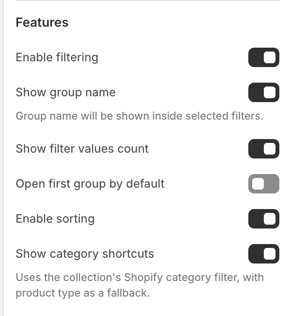
The Features group in the Theme Editor.
Enable filtering
- Controls: Enables the collection's Shopify filters.
- Use it when: Enable it when the store's products have useful filter definitions and values.
- Dependency: The filter-group controls below are available only when filtering is enabled.
Show group name
- Controls: Shows a filter group name inside selected filters.
- Use it when: Keep it on when shoppers need to understand which attribute an active filter belongs to.
Show filter values count
- Controls: Shows the result count associated with filter values.
- Use it when: Keep it on when counts help shoppers decide which option to open.
Open first group by default
- Controls: Opens the first filter group when the filter interface is first displayed. The default is off.
- Use it when: Enable it only when the first group is the most useful starting point for the collection.
Enable sorting
- Controls: Enables the collection sorting control. The default is on.
- Use it when: Keep it on when shoppers should be able to change the product order independently of filters.
- Desktop behavior: Filter and Sort use separate panels. Opening one closes the other so they do not cover the product grid at the same time.
Show category shortcuts
- Controls: Shows category shortcuts derived from the collection's Shopify category filter, with product type as a fallback.
- Use it when: Enable it when the collection has meaningful category or product-type values that should be reachable near the collection heading.
Layout
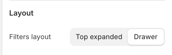
The Layout group in the Theme Editor.
Filters layout
- Controls: Chooses how filtering is presented.
- Options:
Top expandedorDrawer. The supplied Collection template starts with Drawer. - Use it when: Use top-expanded filters when comparison at a glance is useful. Use drawer when the collection should give more space to the product grid.
- Appearance: Desktop Filter and Sort panels follow global Enable rounded UI.
- Check before publishing: Review expanded filters, the mobile filter drawer, focus return, and active-filter summaries.
The filter drawer reports the number of active filters on its clear action and the current result count on its view-results action. These counts help shoppers understand the effect of their choices without closing the drawer first.
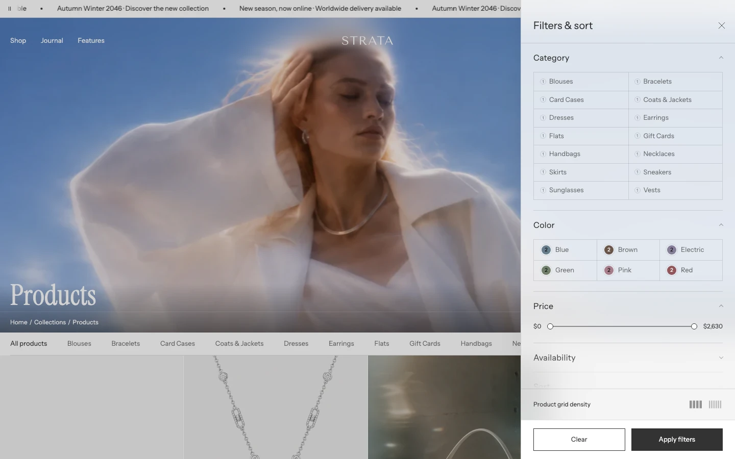
Filters layout: Drawer, with the drawer open.
Product grid density
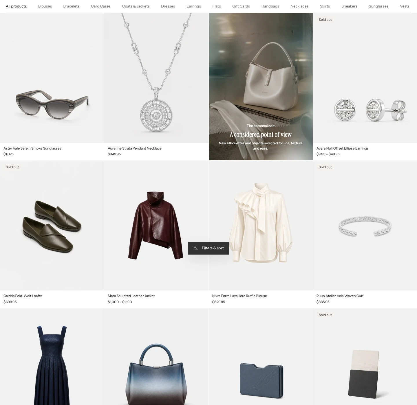
The product grid on desktop.
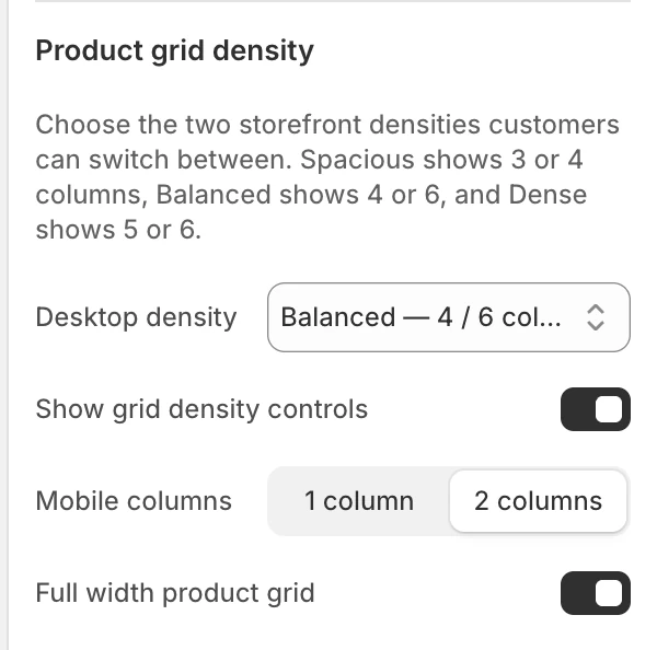
The Product grid density group in the Theme Editor.
Desktop density
Choose the two desktop grid densities shoppers can switch between:
| Option | Available densities |
|---|---|
| Spacious — 3 / 4 columns | Gives product cards the most room. |
| Balanced — 4 / 6 columns | Balances larger cards with faster catalogue scanning. This is the default. |
| Dense — 5 / 6 columns | Keeps more products visible across each row. |
Choose the pair that still keeps your longest titles, prices, badges, swatches, and quick-buy controls easy to read.
Show grid density controls
- Controls: Lets shoppers switch between the two column counts selected by Desktop density.
- Default: On.
- Use it when: Keep it on when shoppers may want either larger cards or more products in view. Turn it off when the collection should keep one consistent density.
When available, the shopper's choice can be remembered in the same browser.
Mobile columns
- Controls: Sets the number of product columns on mobile.
- Options:
1 columnor2 columns. The default is2 columns. - Use it when: Use one column when product imagery and text need more room; use two when faster catalogue scanning is more important.
Full width product grid
- Controls: Allows the product grid to use the full available width instead of the normal page-width container.
- Initial setting: On.
- Use it when: Enable it when product discovery should use more of a wide screen. Turn it off when the grid should align with the collection's other constrained content.
Spacing
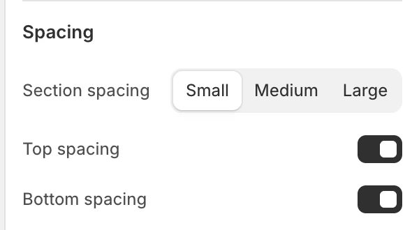
The Spacing group in the Theme Editor.
Section spacing
- Controls: Sets the Collection section spacing to
Small,Medium, orLarge. The supplied Collection template starts with Small.
Top spacing
- Controls: Adds or removes top spacing. The default is on.
Bottom spacing
- Controls: Adds or removes bottom spacing. The default is on.
Blocks
You can add one Promotional banner and one Subscribe banner. Their After product values determine where they are inserted in the product grid. Strata places a banner after the next complete product row; a value beyond the current page uses the last complete row, and a one-product result places the banner after that product.
Promotional banner
Limit: 1.
Media
- Media: Choose
ImageorVideo. The default isImage. - Image / video fallback: Supplies the image fallback or still image used with the media block.
- Desktop background video: Selects the desktop background video.
- Mobile background video: Optional mobile video. The desktop video is used when this field is blank.
Content
- Eyebrow: Short supporting label. The default is
Featured. - Heading: Main promotional heading. The default is
Collection spotlight. - Body text: Supporting rich text. The default introduces a collection, campaign, or seasonal story.
- Banner link label: An accessible name for the linked banner. The default is
Shop collection. It is read by assistive technology and is not shown as a visible button. - Banner link: Makes the complete banner—including its image and content—the destination. Leave it blank for a non-interactive editorial banner.
Layout
- After product: Position from 1–60, in steps of 1. The default is 1.
- Content horizontal position:
Left,Center, orRight; the default isLeft. - Content vertical position:
Top,Middle, orBottom; the default isBottom.
Motion and controls
- Enable parallax for this block: On by default. It requires the global Enable parallax effects setting and is disabled by reduced-motion preferences.
Colors
- Text color: Color used by the promotional copy.
- Overlay color: Color layered over the media.
Subscribe banner
Limit: 1.
Media
- Background image: Optional image behind the subscribe content.
Content
- Heading: Main heading. The default is
Stay in the loop. - Text: Supporting rich text.
Form
- Email placeholder: Placeholder text in the email field. The default is
Email address. - Button label: Submit button text. The default is
Subscribe. - Success message: Message shown after a successful submission. The default is
Thank you for subscribing.
Layout
- After product: Position from 1–60, in steps of 1. The default is 15. The same complete-row placement rule applies as for the Promotional banner.
Motion and controls
- Enable parallax for this block: On by default. It requires the global Enable parallax effects setting and is disabled by reduced-motion preferences.
Colors
- Background color: Banner surface color.
- Text color: Color for the content.
- Overlay color: Color layered over the background image.
- Overlay opacity: 0–80%, in 5% steps. The default is 15%.
Desktop and mobile behavior
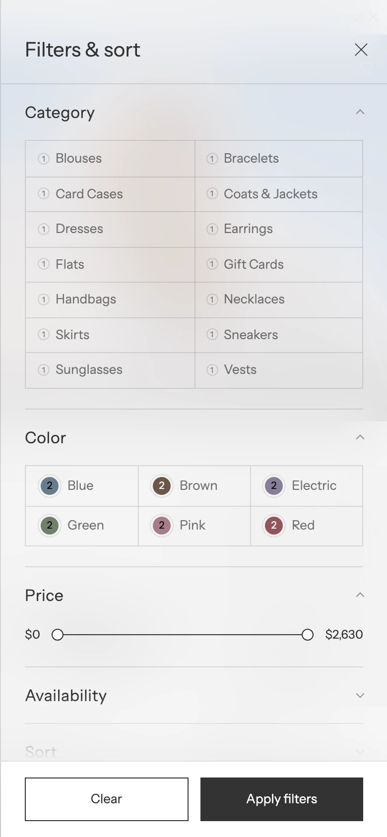
On mobile, filters always open in a drawer.
The template exposes separate desktop and mobile hero images and ratios plus a mobile product-grid choice. Before publishing, review:
- Collection banner crop, transparent Header, overlay contrast, and title/breadcrumb placement;
- top-expanded versus drawer filters and sort controls;
- the selected desktop density pair and contained versus full-width product grids;
- one-column versus two-column mobile products;
- infinite scroll versus pagination loading states;
- promotional and subscribe banner placement when the collection has few or many products.
Media recommendations
Choose collection hero media with enough crop flexibility for both desktop and mobile. Supply a mobile-specific image or video when the subject cannot remain clear in both ratios. Promotional media should preserve a readable text-safe area under the configured overlay.
Accessibility and motion
Use meaningful alternative text for collection and promotional images. Keep filter labels, active states, sort controls, and drawer close/focus behavior testable by keyboard. Check the hero, product loading, and promotional video with reduced motion turned on.
Common checks
- If filters are empty, verify the collection's Shopify filter definitions and product attributes before treating the result as a theme issue.
- If Products per page is unavailable, confirm that Product loading is set to
Pagination. - If a promotional block appears in an unexpected position, review its After product value and the number of products in the collection.
- If a visible promotional button is missing, note that the Promotional banner has no visible button. Add Banner link to make the whole card interactive and use Banner link label for its accessible name.
- If density controls are missing, confirm Show grid density controls is enabled. Mobile uses Mobile columns instead.
- If a promotional or subscribe image does not move, check the block's parallax toggle, global Enable parallax effects, and the visitor's reduced-motion preference.