
Custom section is a flexible container for compatible Theme blocks. Use it when the available blocks can form the content you need but no dedicated Strata section has the right structure.

A Custom section built from a Text block and a horizontal Group of three columns.
Add Custom section
In Shopify's Theme Editor, add Custom section to a compatible page template or open an existing section. It is not available in the Header or Overlay groups.
Media
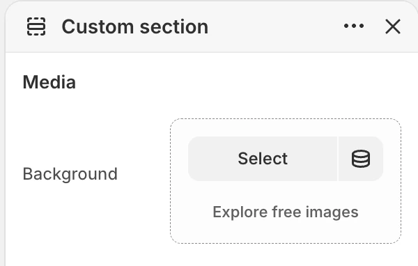
The Media group in the Theme Editor. The values shown are examples, not defaults.
| Setting | What it controls | Default |
|---|---|---|
| Background | Optional image behind the block content. | No default. |
The background is decorative and appears behind the content. It has no separate mobile source or ratio control. Check the focal subject and text contrast at both viewport sizes.
Colors
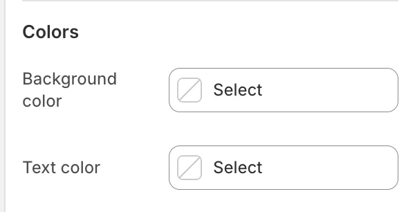
The Colors group in the Theme Editor.
| Setting | What it controls | Default |
|---|---|---|
| Background color | The section surface behind the blocks and optional background image. | Leave blank to inherit Theme settings > Colors > General; selecting a color in this section overrides the inherited value. |
| Text color | The default text color for the blocks. | Leave blank to inherit Theme settings > Colors > General; selecting a color in this section overrides the inherited value. |
Check block copy against the selected colors and the optional background image.
Spacing
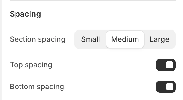
The Spacing group in the Theme Editor.
| Setting | What it controls | Options or default |
|---|---|---|
| Section spacing | Chooses the section's spacing scale. | Small, Medium, or Large. Default: Medium. |
| Top spacing | Adds or removes the section's top spacing. | Enabled by default. |
| Bottom spacing | Adds or removes the section's bottom spacing. | Enabled by default. |
Theme blocks
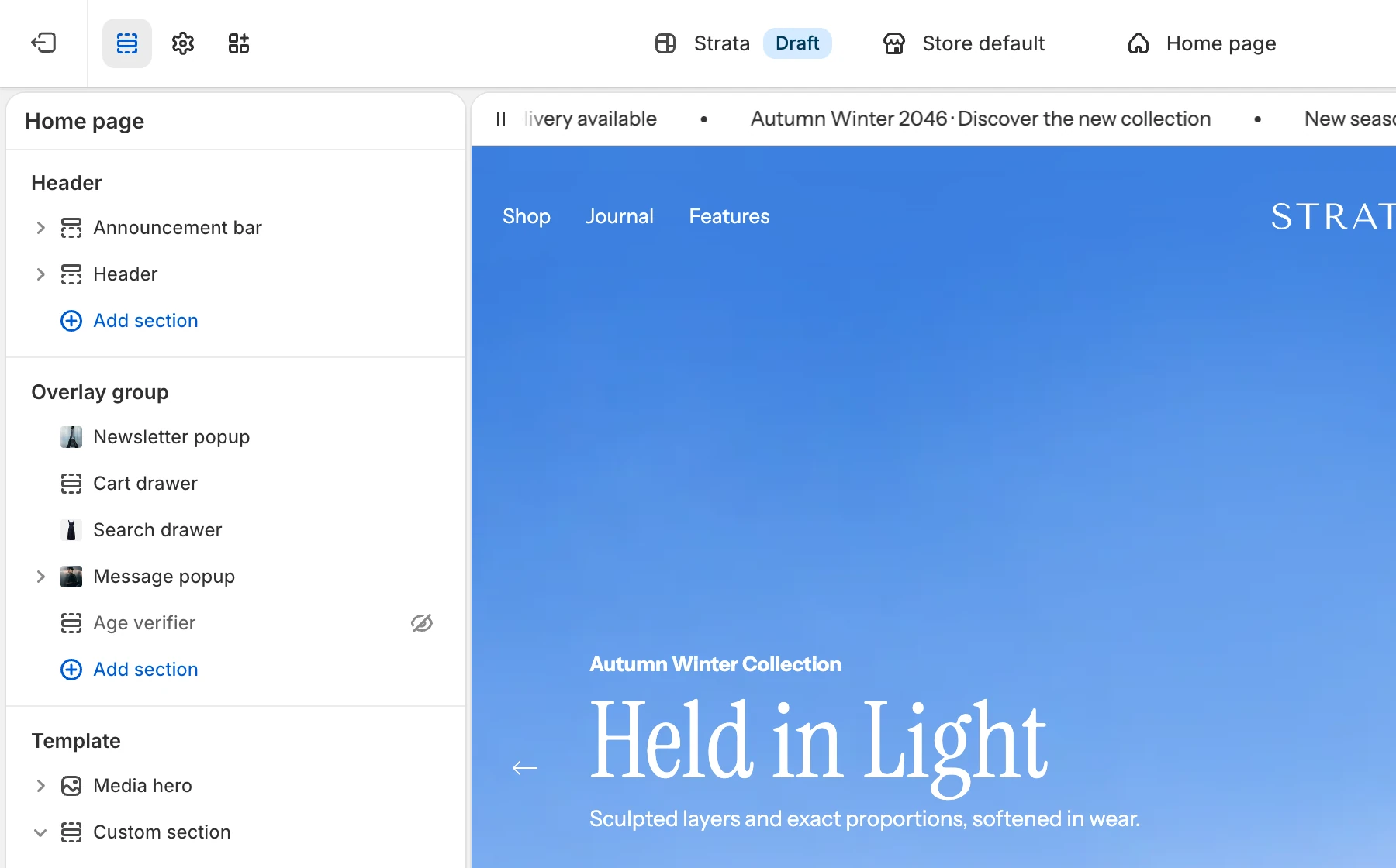
In the sidebar, nested blocks appear indented under their Group.
The section's block picker provides Group and Text. Blocks appear in Theme Editor order. Group can contain nested theme blocks, so use it to create a row or column and then add compatible children.
Group
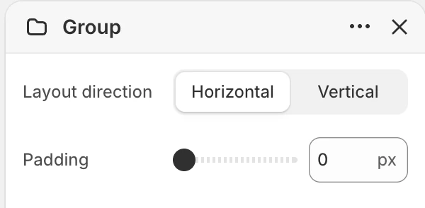
Group block settings. With Horizontal selected, the Alignment control is hidden.
| Setting | What it controls | Options or default |
|---|---|---|
| Layout direction | Arranges the group's children horizontally or vertically. | Horizontal or Vertical. Default: Vertical. |
| Alignment | Aligns children when the direction is vertical. | Left, Center, or Right. Default: Left. Visible only for Vertical. |
| Padding | Adds group padding. | 0–200 px, step 2 px. Default: 0 px. |
The available Group presets are Column (vertical, left-aligned) and Row (horizontal). A horizontal group does not expose the vertical Alignment control.
Text
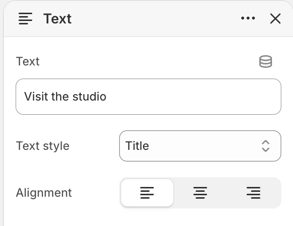
Text block settings.
| Setting | What it controls | Options or default |
|---|---|---|
| Text | The text content displayed by the block. | Text. |
| Text style | Sets the block's title, subtitle, or normal-text treatment. | Title, Subtitle, or Normal text. Default: Title. |
| Alignment | Aligns the text within the block. | Left, Center, or Right. Default: Left. |
Use Normal text for supporting copy instead of using a title style for every block. Keep the order of headings and body copy logical for assistive technology.
Desktop and mobile behavior
The section keeps the block order and group direction, while available space can change wrapping and the visual result. The background uses one source and is fitted behind the section; no mobile-specific image setting exists here. Test the deepest Group nesting, longest Text value, and background focal subject on desktop and mobile before publishing.
Accessibility and media
- Use the dedicated section or content blocks for structured headings, links, and forms when they are available.
- Do not use Text style only to create a visual heading without preserving a logical reading order.
- Keep sufficient contrast between the background image and every text block.
- Make sure nested groups do not create an unexpected keyboard or reading order.
- Treat the background as decorative; essential information must remain in the text blocks.
Common issues
| Symptom | Safe check |
|---|---|
| A block is not available | Only the blocks shown in this section's Theme Editor picker can be added here. |
| Alignment is missing in Group | Choose Vertical under Layout direction; Alignment is conditional. |
| Text wraps unexpectedly | Shorten the content, adjust Group Padding, or test the other direction at the target viewport. |
| Background reduces readability | Replace or crop the image and recheck text contrast; the section has no overlay color control. |
| Content appears in the wrong order | Reorder the direct blocks or inspect the nested order inside each Group. |