
Editorial collection places a large story image beside a product carousel. Use it when a collection or hand-picked selection needs a stronger visual introduction than a regular product row.
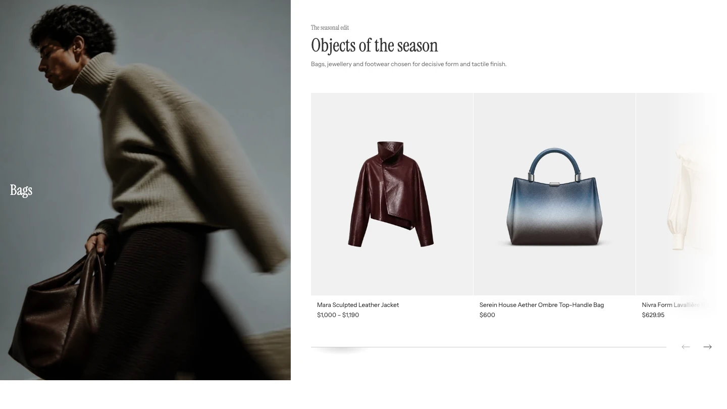
Editorial collection on desktop.
Content
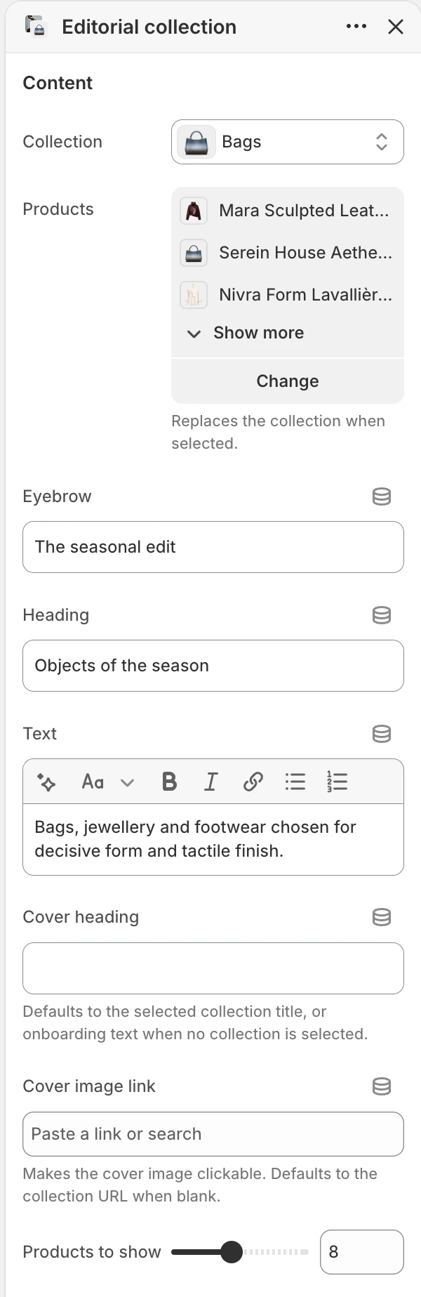
The Content group in the Theme Editor. The values shown are examples, not defaults.
| Setting | Default | What it controls |
|---|---|---|
| Collection | Blank | Supplies products when Products is blank. |
| Products | Blank; up to 16 | A hand-picked list that replaces the selected collection when populated. |
| Eyebrow | Featured | Short text above the product-area heading. |
| Heading | Shop the collection | Main product-area heading. |
| Text | Introductory collection copy | Supporting rich text below the heading. |
| Cover heading | Blank | Text over the cover. When blank, it uses the selected collection title or setup text when no source is selected. |
| Cover image link | Blank | Makes the cover clickable. When blank, it uses the selected collection URL when available. |
| Products to show | 8 | Limits the product carousel to 2–16 products. |
When both sources are present, Products wins. If neither source is selected, the section shows setup placeholders instead of pulling every product from the store. Select the intended source before publishing.
Media
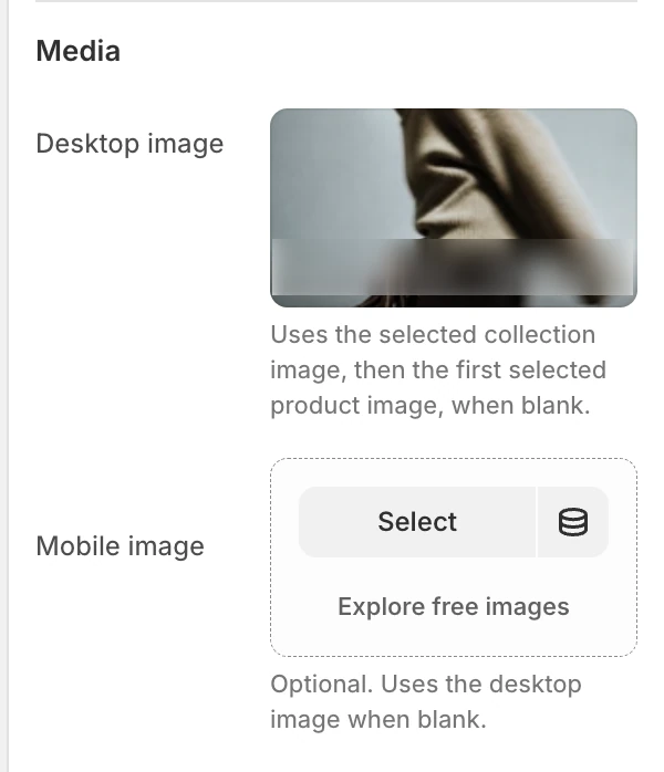
The Media group in the Theme Editor.
| Setting | Default | What it controls |
|---|---|---|
| Desktop image | Blank | Main cover image. When blank, Strata uses the collection image, then the first available product image. |
| Mobile image | Blank | Optional narrow-screen cover. When blank, the desktop image is reused. |
Layout
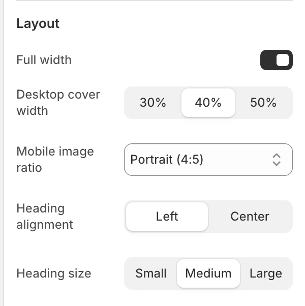
The Layout group in the Theme Editor.
| Setting | Default | What it controls |
|---|---|---|
| Full width | On | Lets the cover and product area use the wider section container. |
| Desktop cover width | 50% | Gives 30%, 40%, or 50% of the desktop composition to the cover. |
| Mobile image ratio | Landscape (4:3) | Natural, Portrait (4:5), Square, or Landscape (4:3). |
| Heading alignment | Left | Left or Center. |
| Heading size | Medium | Small, Medium, or Large. |
On wide screens, the cover and product area sit side by side. At smaller sizes they stack, and the product row remains a carousel; there is no separate mobile column setting.
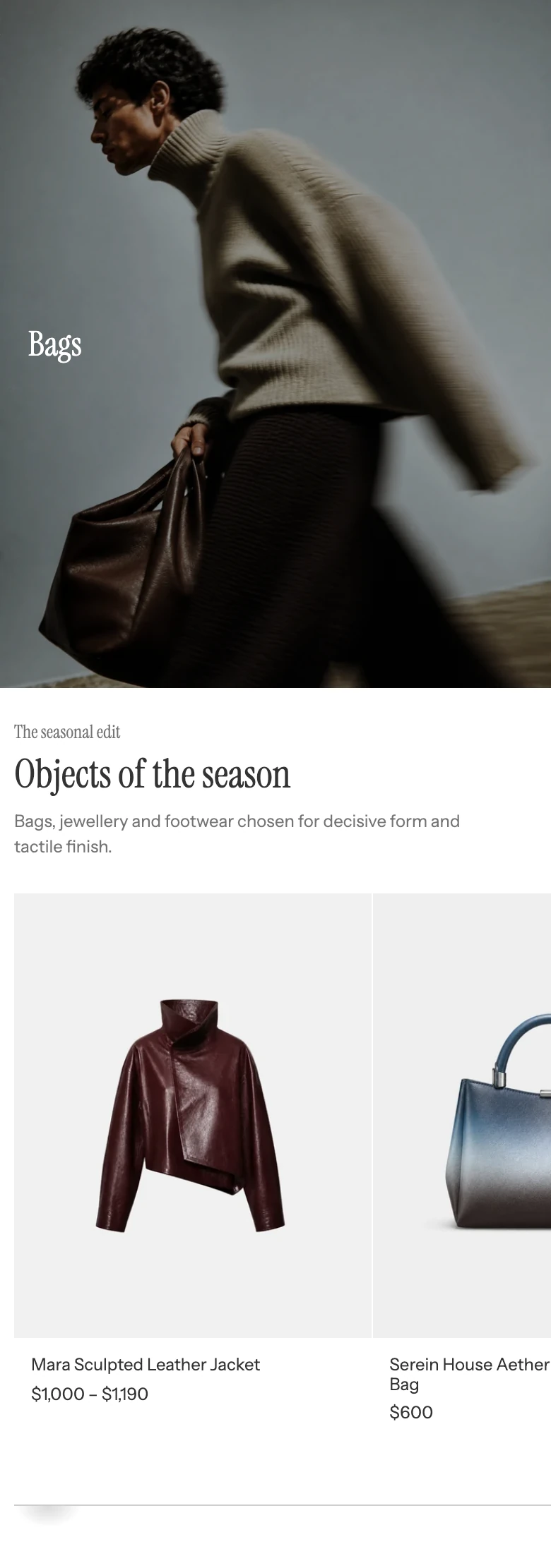
On mobile the image sits above the products.
Motion and controls
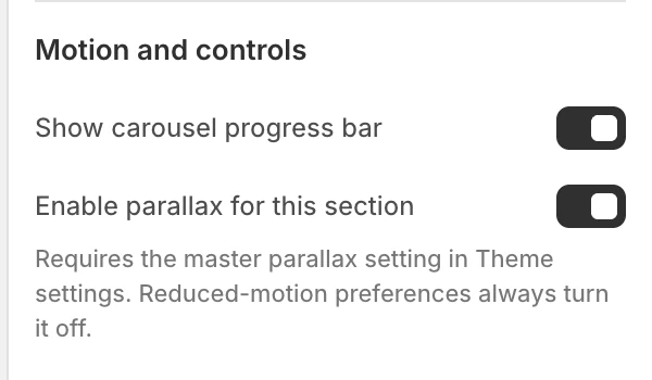
The Motion and controls group in the Theme Editor.
- Show carousel progress bar is on by default and controls the product-row progress indicator.
- Enable parallax for this section is on by default. It also requires Theme settings > Animation > Enable parallax effects; reduced-motion preferences keep the cover static.
Colors
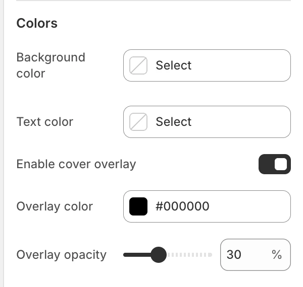
The Colors group in the Theme Editor.
| Setting | Default | What it controls |
|---|---|---|
| Background color | Inherited | Section surface behind the cover and products. |
| Text color | Inherited | The product-area heading and supporting copy. Product-card colors are configured globally. |
| Enable cover overlay | On | Adds a contrast layer over the cover image. |
| Overlay color | #000000 | Cover overlay color. |
| Overlay opacity | 15% | Overlay strength from 0–80% in 5% steps. |
Review the cover heading against the lightest and darkest parts of the image. Turn the overlay off only when the image already provides enough contrast.
Spacing
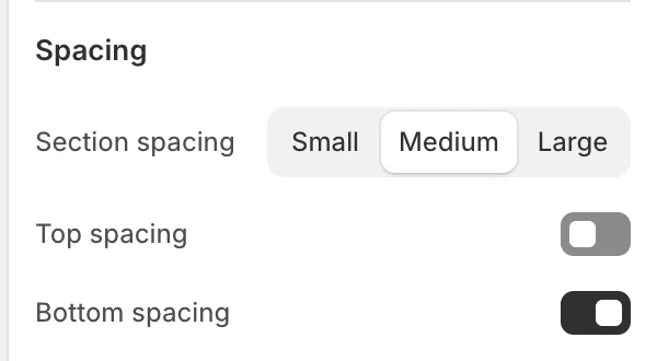
The Spacing group in the Theme Editor.
Section spacing offers Small, Medium, and Large; Medium is the default. Top spacing and Bottom spacing are enabled by default.
Product card dependencies
Cards inherit the global Product card settings for images, vendor, badges, ratings, alignment, and quick buy. Their backgrounds, titles, prices, and quick-buy controls use Theme settings > Colors > Product > Card background and Card text, independently of this section's Text color. Eligible color options also depend on Color swatches. The global Cart setting can affect the surface used after a successful quick add.
Common issues
| Symptom | Safe check |
|---|---|
| The chosen collection is ignored | Check Products; a hand-picked list deliberately replaces Collection. |
| The cover image is unexpected | Add Desktop image, or review the selected collection and first available product image. |
| The mobile crop is unexpected | Add Mobile image and choose the appropriate Mobile image ratio. |
| The cover link goes to the collection | Enter Cover image link to replace the automatic collection destination. |
| No real products appear | Select a collection or hand-picked products before publishing. |
| Parallax does not move | Check both parallax settings and the visitor's reduced-motion preference. |