
The Message popup is a flexible overlay for a promotion, campaign message, or short call to action. Use it when the message needs more structure than an Announcement bar but does not need a form.
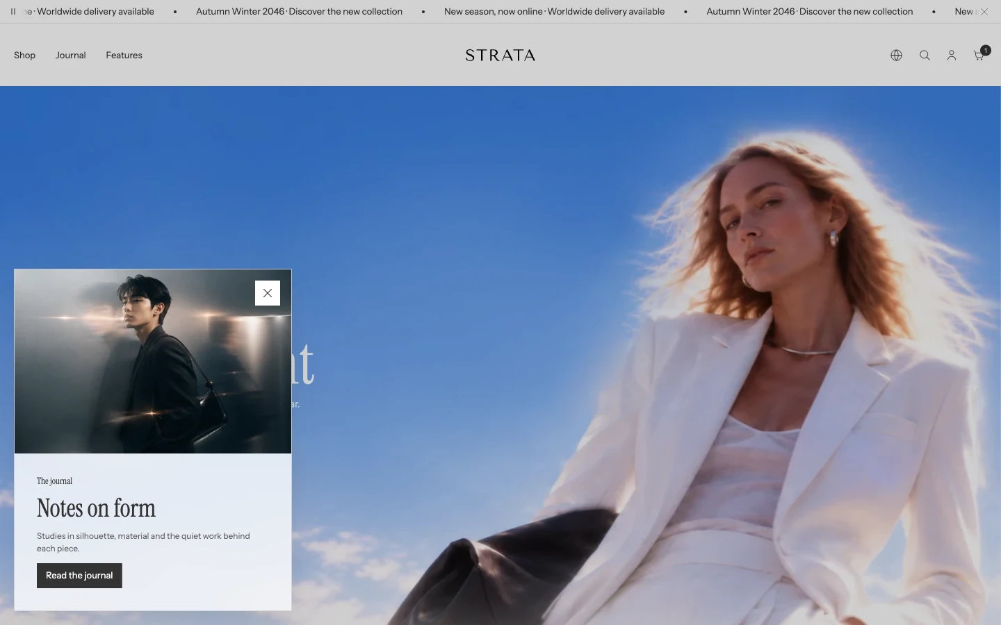
Message popup on desktop, Position: Bottom left.
Add or open this feature
In Shopify, open Online Store > Themes > Edit theme, select the Overlay group, and open Message popup. Strata allows one Message popup in the overlay group. A new Strata install already includes Message popup in the Overlay group, hidden. Select it in the sidebar and choose Show section (the eye icon) to turn it on; its content is ready to edit.
Content
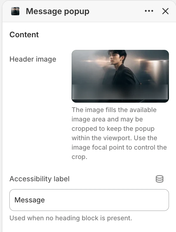
The Content group in the Theme Editor. The values shown are examples, not defaults.
Header image
Adds an optional image above or beside the message. The image fills the available media area and may be cropped so the popup stays within the viewport. Set the image focal point in Shopify's media picker to keep the subject visible.
Accessibility label
Provides a label for the popup when no Heading block is present. Write a short description of the purpose of the message rather than a generic label.
Layout
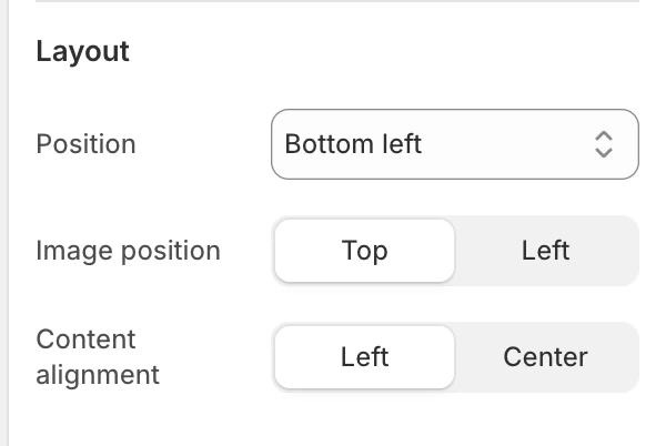
The Layout group in the Theme Editor.
Position
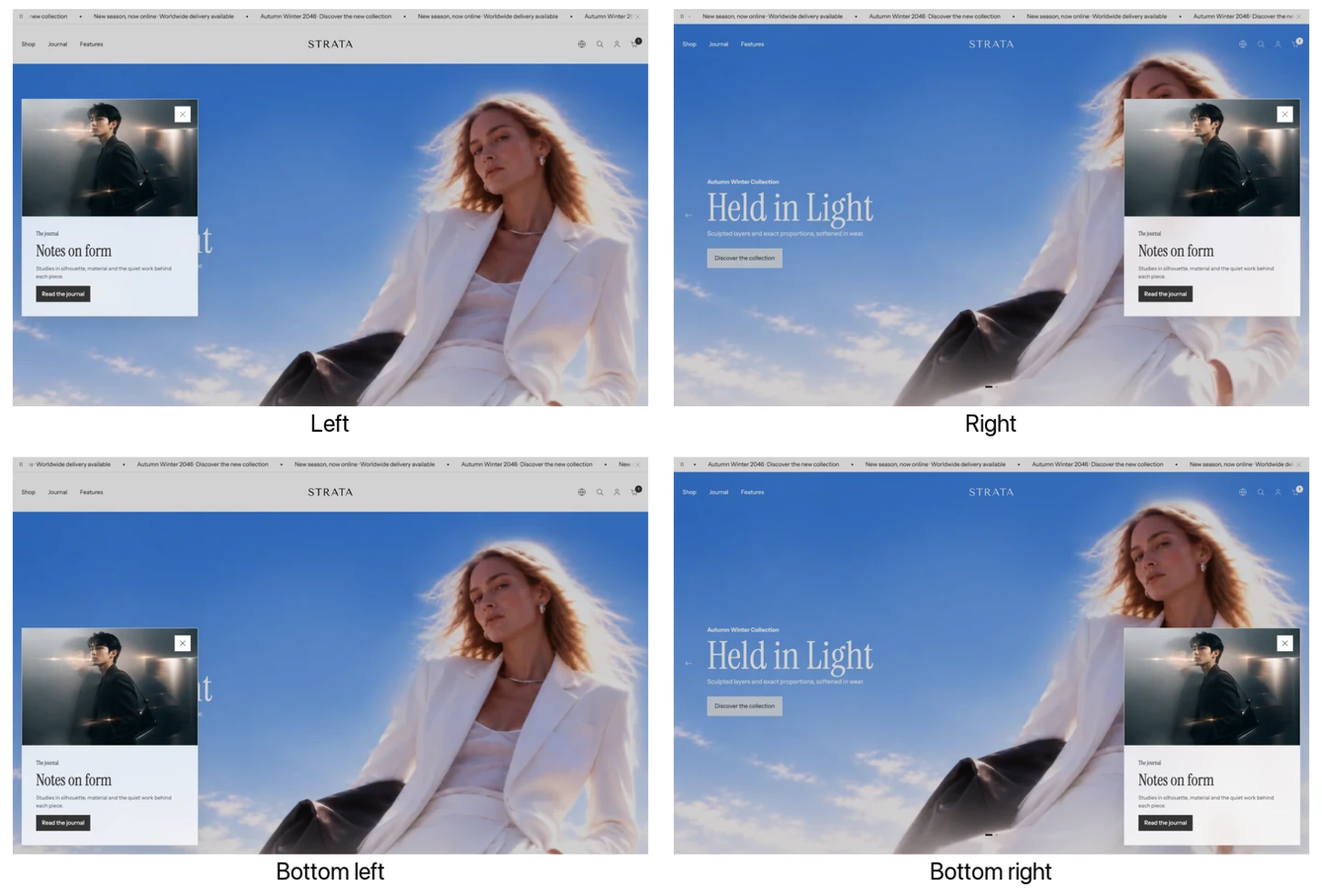
The four Position options.
Choose Left, Bottom left, Right, or Bottom right. Use an edge position that does not cover the primary navigation, cart, or an important product control in the opening view.
Image position
Choose Top or Left. Top places media above the message; Left places it beside the content where the layout supports it.
Content alignment
Choose Left or Center for the popup content.
Behavior
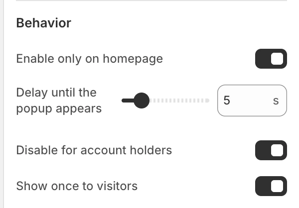
The Behavior group in the Theme Editor.
Enable only on homepage
Limits the popup to the home page. Enable this for a home-page campaign; disable it for a store-wide notice.
Delay until the popup appears
Sets the delay before the popup can appear, from 0–30 s in 1 s steps.
Disable for account holders
Prevents the automatic popup from appearing to signed-in customers. Use it when account holders should not receive the same acquisition or promotion prompt.
Show once to visitors
Stores the shown state in the visitor's browser so the automatic popup appears once. Disable it for a recurring message, and remember that a different browser or cleared browser storage can produce a new visitor state.
Blocks
You can add up to 20 blocks. Reorder blocks to control reading order. A useful sequence is an Eyebrow, Heading, Rich text, then Button, but you can omit blocks that do not answer a real visitor question.
Eyebrow
The Text field adds a short context line above the main heading, such as a campaign label.
Heading
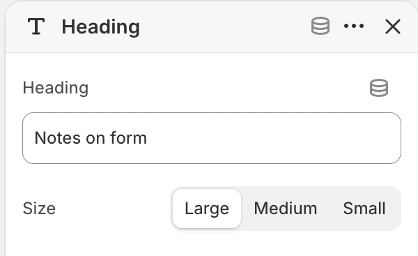
Heading block settings.
The Heading field adds the main message. Size offers Large, Medium, or Small. Choose the size according to the importance of the message within the popup, not only the length of the text.
Rich text
The Text field adds formatted supporting copy. Keep essential terms and conditions readable without requiring a visitor to open another page.
Button
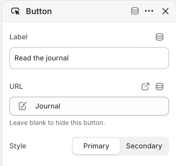
Button block settings.
The Label is the action text and URL is its destination. Leave URL blank to hide the button. Style offers Primary or Secondary.
Popup state matrix
| Merchant choice | Result |
|---|---|
| Enable only on homepage on | The automatic message is limited to the home page. |
| Show once to visitors on | The browser remembers that the message has been shown. |
| Header image with Image position Top | Image sits above the message. |
| Header image with Image position Left | Image sits beside the message when space permits. |
| No Heading block | Accessibility label supplies the popup label. |
| Button URL blank | The Button block does not show a button. |
Desktop and mobile behavior
The position and image layout adapt to the viewport. Review the popup with a long heading and a long button label on mobile.
Accessibility and motion
Use a heading or a descriptive Accessibility label, keep button labels action-oriented, and ensure the message remains understandable when motion is reduced. Verify focus order and close behavior before using the popup for critical information.
Common issues
- The popup is not visible: check that the popup is present and visible in the Overlay group, then review the delay, Enable only on homepage, Disable for account holders, and the browser's Show once to visitors state.
- The button is missing: give the Button block a URL.
- The image crop hides the subject: adjust the image focal point, try the other Image position, or use a source with more safe space around the subject.
- The popup appears for the wrong audience: check Enable only on homepage and Disable for account holders.