
The Cart drawer is the side-cart experience for adding, reviewing, and checking out products while a shopper remains on the current page.
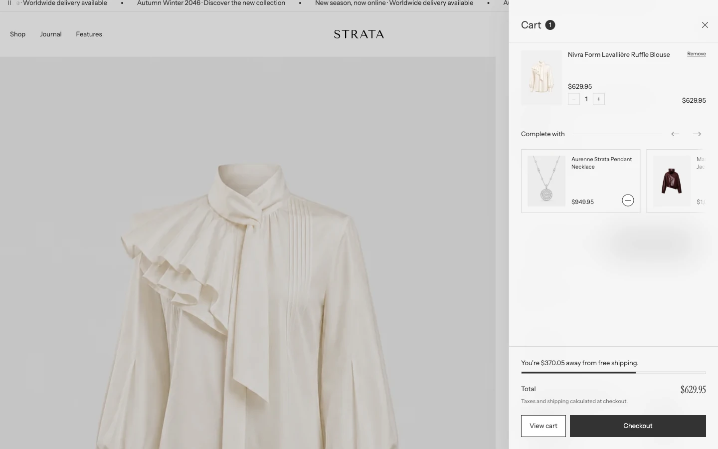
Cart drawer on desktop with one item.
Add or open this feature
The drawer is part of the Overlay group. Its primary switch is global:
- In Shopify, open Online Store > Themes > Edit theme.
- Open Theme settings > Cart.
- Configure Enable cart drawer.
Enable cart drawer
When enabled, the Header cart action opens the side drawer unless the shopper is already on the Cart page or is using a phone-sized screen (see Desktop and mobile behavior). When disabled, it goes directly to the Cart page. Use the drawer for a quick review flow; use the cart page when the store needs a full-page cart experience or when the drawer would compete with complex cart content.
Theme settings > Cart
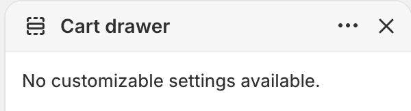
The Cart drawer section itself has no settings. Its options live in Theme settings > Cart.
Show product recommendations
Enabled by default. Turn it off to hide the Complete with row inside the drawer. It does not control the separate Product recommendations section on the Cart page.
Cart icon
Choose the icon shown for the cart action:
- Shopping basket
- Tote bag
- Shopping cart
Choose one icon and keep it consistent with the product language used in the rest of the store.
Empty cart button link
Sets the destination of the button shown when the cart is empty. The default is All Products (/collections/all), and the same setting controls the empty Cart page link. You can choose another useful shopping destination; if you leave it blank, Strata uses All Products.
Free shipping minimum amount
Sets the order amount used by the free-shipping progress message. Leave the field blank or enter 0 to hide the bar. The bar is shown only to shoppers using the store currency, so check localization and market settings before treating it as a universal promise.
What shoppers can do
When the cart contains products, the drawer shows line items with product media, variant details, prices, quantity controls, discounts when present, and the order total. Shoppers can:
- change quantities, including reducing a line to zero;
- open a product from its line item;
- review cart-level and line-level discounts;
- view the cart page or continue to checkout.
The drawer's Complete with row shows up to 4 related products based on the first product in the cart. Configure that product's Related products in Apps > Search & Discovery > Product recommendations. The row is hidden when no eligible results are available. For a hand-picked list on the full Cart page, use the separate Product recommendations section. The order-note field is also available on the full Cart page, not in the drawer.
Drawer totals, line prices, and recommendation prices follow the current storefront currency formatter and the global Currency format choice.
When the cart is empty, the drawer shows the empty-cart message and the destination configured by Empty cart button link.
Drawer state matrix
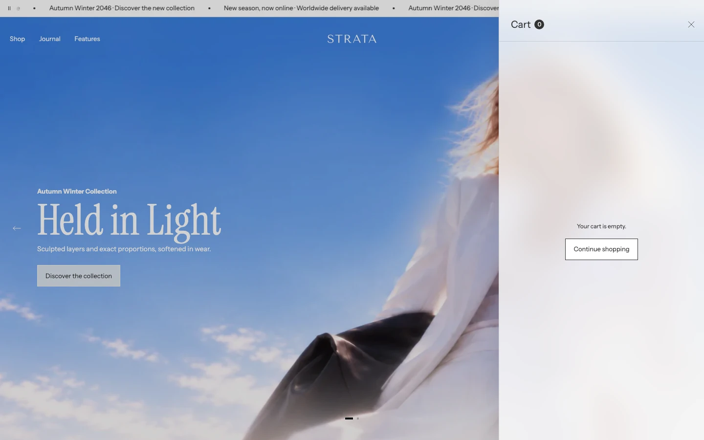
The empty state. The button uses Empty cart button link.
| Merchant choice | Result |
|---|---|
| Enable cart drawer on | On screens 750 px and wider, the Header cart action opens the drawer, except on the Cart page itself. Phones open the Cart page. |
| Enable cart drawer off | Cart actions go directly to the cart page. |
Free shipping minimum amount blank or 0 | The free-shipping bar is hidden. |
| Enable global blur effects on | The shared drawer surface can use the blurred treatment from Theme settings > Appearance and spacing. |
| Reduce drawer animation on | Drawer opening and closing use the reduced-motion treatment. |
The last two rows are global Theme settings. They affect shared overlay surfaces, not only the cart.
Desktop and mobile behavior
The drawer is used on screens 750 px wide and larger. On phones (narrower than 750 px) Strata skips the drawer: Add to cart updates the cart count in the Header, and the Header cart icon opens the full Cart page. Check the empty state, a multi-line cart, a quantity update, and the checkout action in the drawer on desktop and on the Cart page on a phone before publishing.
Accessibility and motion
The drawer has a labelled title, a close action, quantity controls, and a focus-managed overlay. Keep product titles and variant information meaningful, and test the full quantity-to-checkout path with keyboard navigation. Use Reduce drawer animation or the global reduced-motion setting when the storefront should minimize movement.
Common issues
- Cart opens a page instead of a drawer: check Enable cart drawer in Theme settings > Cart.
- The shipping message is missing: check that Free shipping minimum amount is not blank or
0, and confirm the shopper is using the store currency. - The empty-cart button goes to an unexpected place: review Empty cart button link. The default and blank-field fallback are All Products.
- Recommendations are missing: enable Theme settings > Cart > Show product recommendations, then check the first cart product’s Related products in Shopify Search & Discovery. Some products may have no eligible recommendations.
- The order-note field is missing: it belongs to the full Cart page. Use View cart when a shopper needs to add a note.