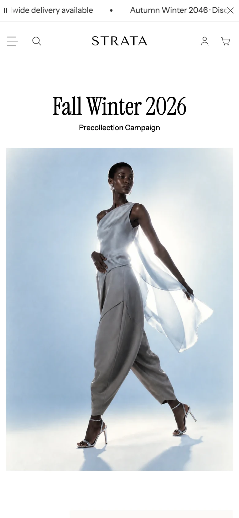
Parallax grid
Build an editorial image-card grid with controlled depth and movement.
Parallax grid combines image cards with individually controlled width, vertical offset, and parallax speed. Use it for editorial storytelling where movement supports the composition and a static card grid would feel too uniform.
Add Parallax grid
- Open Online Store > Themes > Customize.
- Use the page selector to open the template where the image wall should appear.
- Select Add section, then choose Parallax grid.
- Add the image cards and establish a readable static composition before enabling motion.
The section supports up to 24 Image card blocks and is not available in header, footer, or overlay section groups.
Content
| Setting | What it controls |
|---|---|
| Eyebrow | Short label above the section heading. Default: Make room for contrast. |
| Heading | Main section heading. Default: A study in movement. |
| Text | Supporting rich text. Default: Pair natural proportions with a little movement. |
If all three fields are blank, the section does not render an introduction above the cards.
Layout
| Setting | Options and use |
|---|---|
| Heading alignment | Left, Center, or Right. Default: Center. |
| Content width | Small, Medium, or Large. Default: Large. |
| Full width | Extends the heading and grid beyond the normal page container when on. Default: Off. |
Use a wider content setting for a long editorial introduction, but keep card copy short enough that it does not dominate the images.
Card appearance
| Setting | Options and use |
|---|---|
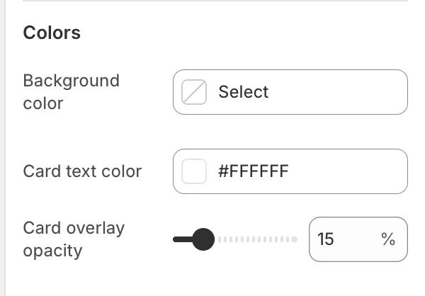
| Overlay opacity | 0–80% in 5% steps. Default: 30%. This is the gradient behind card text. |
| Card text color | Color used for card copy. Default: #FFFFFF. |
| Gap | None, Small, Medium, or Large. Default: Medium. |
Adjust the overlay and text color together. A value that works for one photograph may not provide enough contrast for the next card.
Motion and controls
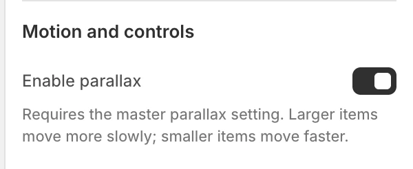
Enable parallax for this section
Default: On. This section can use parallax only when the global Enable parallax effects setting is also on. The global Parallax speed setting is visible only while that master switch is on and ranges from 50–200% in 10% steps, with a default of 100%. See Animation.
Reduced-motion preferences and the global Reduce animation path remove the card translation, leaving the static grid available. Check that the static state still tells the story before enabling either motion setting.
Spacing
| Setting | Options and use |
|---|---|
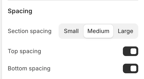
| Section spacing | None, Small, Medium, or Large. Default: Medium. |
| Top spacing | Adds the section’s top spacing. Default: On. |
| Bottom spacing | Adds the section’s bottom spacing. Default: On. |
Blocks
Add up to 24 Image card blocks and reorder them in the Theme Editor.
Content
| Setting | What it controls |
|---|---|
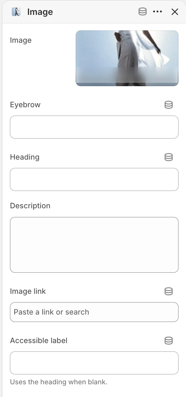
| Image | The card image. When blank, Strata shows a placeholder. |
| Eyebrow | Optional short label on the card. |
| Heading | Card heading. Default: Add an image. |
| Description | Supporting card text. Default: Add context for this image or story. |
| Card link | Optional destination for the whole card. |
| Accessible label | Screen-reader label for a linked card. When blank, Strata uses the card heading and then its generic view label. |
When a card has no Card link, it remains informational rather than becoming an interactive link.
Layout and motion
| Setting | Options and use |
|---|---|
| Desktop card width | Small, Medium, or Large. Default: Medium. Controls each card’s relative width in the larger layout. |
| Desktop vertical offset | None, Small, Medium, or Large. Default: None. Adds staggered top spacing in the larger layout. |
| Parallax speed | Slow, Medium, or Fast. Default: Medium. Sets the card’s relative movement when both parallax switches allow motion. |
Desktop and mobile behavior
The desktop card-width and vertical-offset choices create the staggered composition. At narrower sizes, cards stack in one column and the desktop width and offset choices no longer create a side-by-side grid. Exact responsive transitions and text wrapping still need accepted browser evidence.
Media recommendations
Use images with a clear focal subject and enough contrast for the configured text overlay. Add meaningful image alt text in Shopify Files; Accessible label is specifically for linked-card announcements. Exact image dimensions are not prescribed here; check each focal crop in the approved fixture.
Accessibility and motion
- Keep the static card order meaningful before enabling parallax.
- Write Accessible label values that describe the linked destination, not just “image”.
- Check keyboard focus visibility on linked cards.
- Keep text contrast legible over every image and test the reduced-motion presentation.
- Use Parallax speed: Slow when the composition contains dense text or close card spacing.
Common issues
- Cards do not move: confirm both Enable parallax for this section and global Enable parallax effects are on; reduced-motion preferences override them.
- The layout looks uneven: check Desktop card width, Desktop vertical offset, and Gap together, then judge the static layout before motion.
- Card copy is hard to read: adjust Overlay opacity and Card text color against the actual image, not a placeholder.
- A card is not announced clearly: add Accessible label or a descriptive Heading, and add Card link only when a destination exists.
- Mobile feels too tall: review the stacked order and shorten card copy; the desktop offset does not create the same stagger on mobile.
Related guides
- Flexible media grid for controlled spans without scroll parallax.
- Media slideshow for a single focal hero.
- Animation for the global parallax and reduced-motion settings.