
The Contact template combines a contact message with a Shopify contact form. Use it when customers need a clear way to ask a question without exposing private support addresses or account details on the storefront.
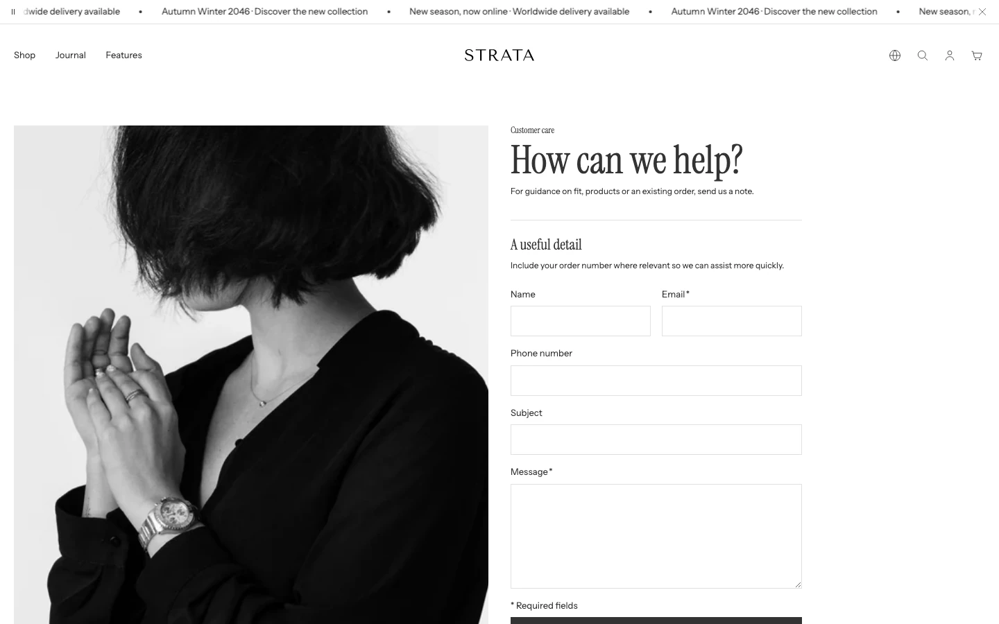
The Contact template on desktop.
Open the Contact template
- From Shopify admin, go to Online Store > Themes > Edit theme.
- Use the page selector to open the page using the Contact template.
- Select the Contact form section.
- Review the form with valid and invalid input in an unpublished theme before saving.
The Contact form section always includes Email and Message fields. Optional blocks add Name, Phone, Subject, and other questions in the order you choose.
Content
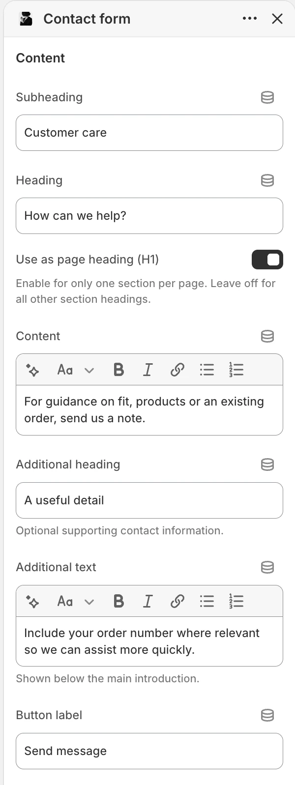
The Content group in the Theme Editor. The values shown are examples, not defaults.
Subheading
- Controls: Optional short label above the contact heading.
Heading
- Controls: Main contact heading. The default is
Contact us.
Use as page heading (H1)
- Controls: Makes this Heading the main title of the page. Turn it on in one section only. The default is off.
Content
- Controls: Rich text that explains how customers should use the form and what response to expect.
Additional heading
- Controls: Optional heading for supporting contact information.
Additional text
- Controls: Optional rich text shown below the main introduction.
Button label
- Controls: Submit-button text. The default is
Send message.
Media
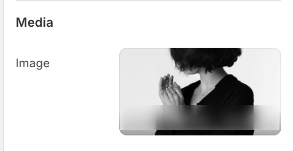
The Media group in the Theme Editor.
Image
- Controls: Optional image displayed beside the form.
- Use it when: Use a relevant, non-sensitive image that supports the contact context.
Layout
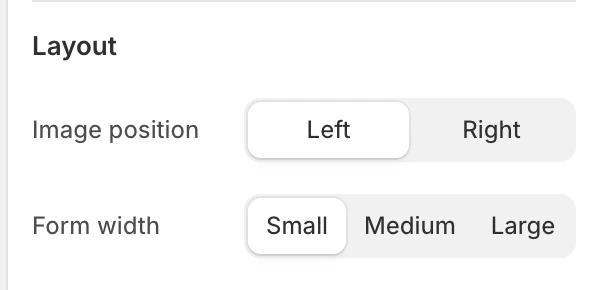
The Layout group in the Theme Editor.
Image position
- Controls: Chooses the image side.
- Options:
LeftorRight. The default isLeft.
Form width
- Controls: Sets the form's preferred width within the space available beside the optional image.
- Options:
Small,Medium, orLarge. The default isSmall.
Colors
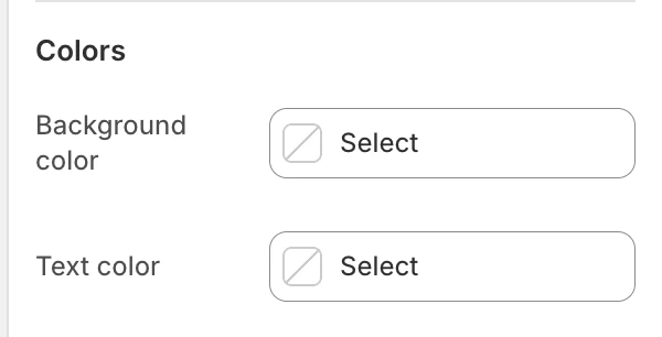
The Colors group in the Theme Editor.
Background color
- Controls: Sets the section background.
- When blank: Inherits Theme settings > Colors > General.
Text color
- Controls: Sets the heading, text, and form text color.
- When blank: Inherits Theme settings > Colors > General.
Spacing
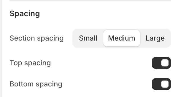
The Spacing group in the Theme Editor.
Section spacing
- Controls: Sets the section spacing to
Small,Medium, orLarge. The default isMedium.
Top spacing
- Controls: Adds or removes top spacing. The default is on.
Bottom spacing
- Controls: Adds or removes bottom spacing. The default is on.
Blocks
Name
Optional name field. Limit: 1.
Phone
Optional phone field. Limit: 1.
Subject
Optional subject field. Limit: 1.
Custom
Adds an additional text field. You can add more than one.
- Label: Field label. The default is
Custom field. - Required field: Makes the custom field required. The default is off.
Reorder blocks to match the information customers need to provide. The form always includes the required email and message fields.
Form fields and states
The form includes required Email and Message fields in addition to the configurable blocks. Message accepts 10–5000 characters, and the form provides error and success status messages.
Promise a response time only when the store's support process can meet it. Configure message delivery and handling through Shopify.
Desktop and mobile behavior
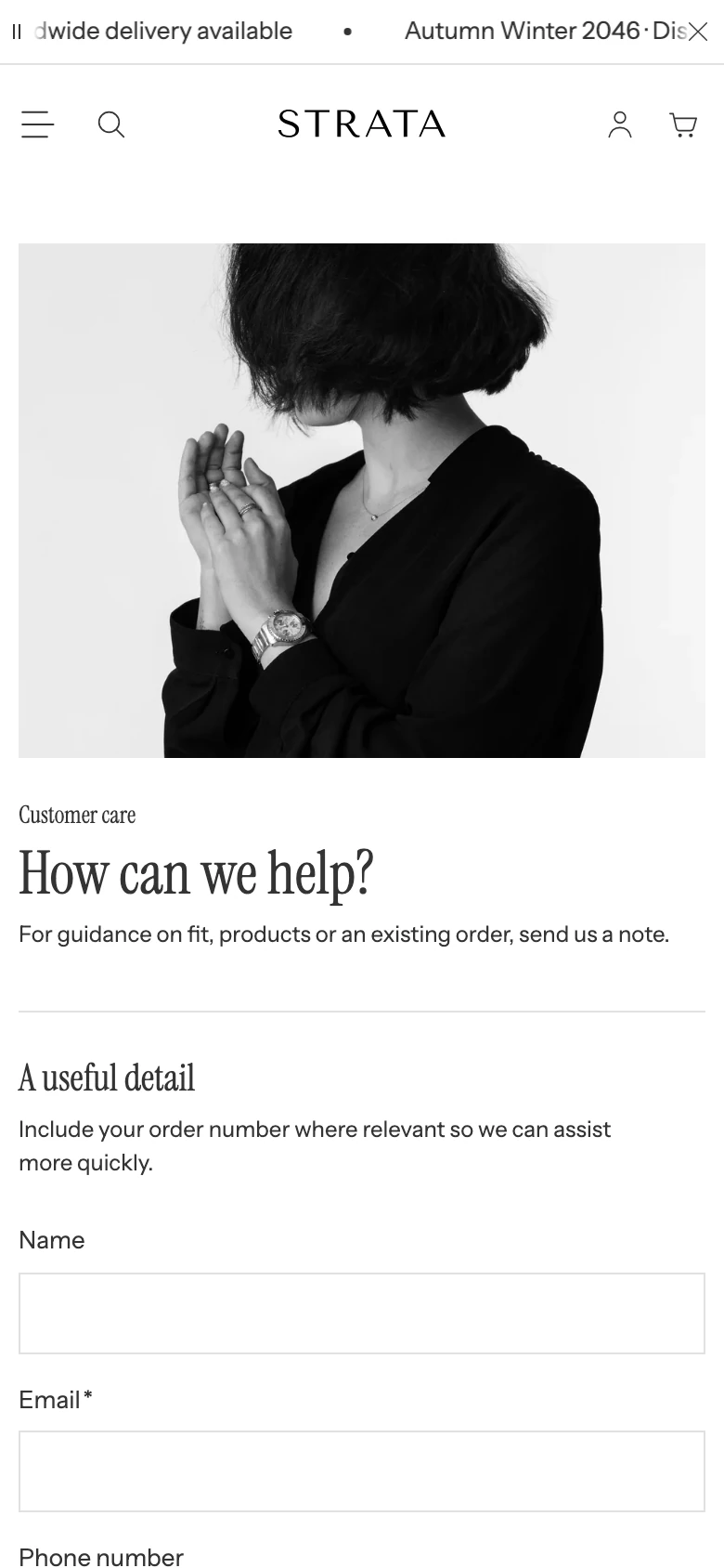
The Contact template on mobile.
Compare the image-left and image-right states at desktop and mobile sizes. Review long labels, validation messages, keyboard order, and whether the form remains usable when the image stacks above or below it.
Media recommendations
Use an image with a clear focal point and no customer, order, or account information. Check its crop in both image positions and on narrow screens.
Accessibility and motion
Use alternative text that explains the image's purpose. Keep the email, message, and optional fields labelled and keyboard reachable. Verify that focus moves to validation and success messages before publishing.
Common checks
- If the form does not show an optional field, confirm the corresponding block has been added and is not duplicated beyond its limit.
- If a custom field is unexpectedly optional or required, review Required field.
- If a submission fails, check the field validation state without sharing a real customer email or message.