
The Article template presents one blog post as a readable story with optional media, metadata, sharing, comments, and related articles. Use it when the same reading experience should apply across articles assigned to the template.
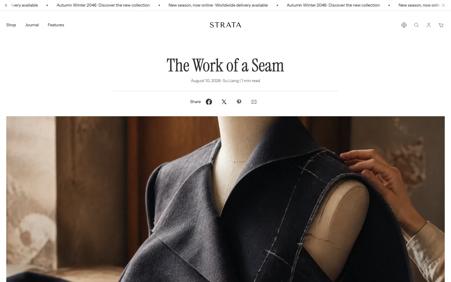
The Article template on desktop.
Media
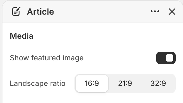
The Media group in the Theme Editor. The values shown are examples, not defaults.
Show featured image
- Controls: Shows or hides the article's featured image. The default is on.
- Use it when: Keep it on when the image establishes the story before the article content; turn it off when the article is intentionally text-led.
Landscape ratio
- Controls: Sets the wide featured-image frame above the article.
- Options: 16:9, 21:9, or 32:9. The default is 16:9.
- Dependency: The image appears only when the article has a featured image and Show featured image is enabled.
Layout
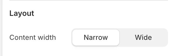
The Layout group in the Theme Editor.
Content width
- Controls: Sets the maximum reading width of the article header, content, and related reading areas.
- Options:
NarroworWide. The default isNarrow. - Use it when: Use narrow for long-form reading comfort; use wide only after checking line length, embedded content, and mobile wrapping.
Features
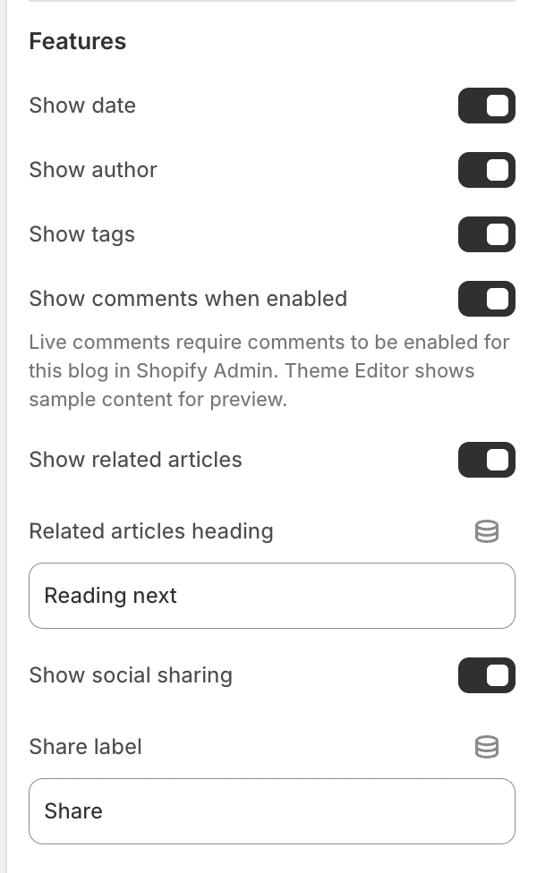
The Features group in the Theme Editor.
Show date
- Controls: Shows the publication date in the article metadata. The default is on.
Show author
- Controls: Shows the article author in the metadata. The default is on.
Show tags
- Controls: Shows article tags beneath the metadata. The default is on.
- Use it when: Enable it when tags are maintained as a useful route to related stories.
Show comments when enabled
- Controls: Shows the comments section when Shopify comments are enabled for the article. The default is on.
- Use it when: Keep it on when the store moderates and supports article comments.
- Dependency: The comments section does not appear when comments are disabled in Shopify, even if this setting is enabled.
Show related articles
- Controls: Shows the related-article area when other articles are available. The default is on.
- Use it when: Keep it on when the article should provide a next reading path.
Related articles heading
- Controls: Heading for the related-article area. The default is
Reading next.
Show social sharing
- Controls: Shows the social sharing controls. The default is on.
- Use it when: Enable it when the store wants readers to share the current article.
- Check before publishing: Confirm destination URLs and keyboard focus without sharing a private draft URL.
Share label
- Controls: Text shown beside the sharing controls. The default is
Share.
Spacing
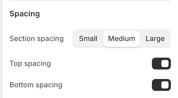
The Spacing group in the Theme Editor.
Section spacing
- Controls: Sets the Article section spacing to
Small,Medium, orLarge. The default isMedium.
Top spacing
- Controls: Adds or removes top spacing. The default is on.
Bottom spacing
- Controls: Adds or removes bottom spacing. The default is on.
Article content and comments
Article body content comes from the article record in Shopify. When live comments are enabled, the section can show existing comments and the comment form fields Name, Email, and Comment, followed by the Post action. Verify moderation, error, success, and pagination states before publishing.
Related articles
When enabled and available, the section presents up to two other articles as related reading. The selection is automatic, so preview several articles and confirm the suggestions are useful before publishing.
Desktop and mobile behavior
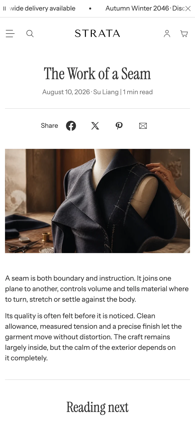
The Article template on mobile.
Before publishing, review the same article at desktop and mobile sizes:
- featured-image crop and reading width;
- metadata and tag wrapping;
- social-share control wrapping and focus order;
- comment list and form layout when comments are enabled;
- related-article cards when one or more other articles are available.
Media recommendations
Choose a featured image that remains legible in the selected ratio and preserves a clear focal point. Article body media belongs to the article content and should be tested separately from the template's featured image.
Accessibility and motion
Use meaningful alternative text for the featured image and any article body media. Keep headings in a logical order, keep sharing and comment controls keyboard reachable, and verify focus behavior for comment errors and success messages. Check the page with reduced motion turned on.
Common checks
- If comments are absent, confirm both Shopify's article comment setting and Show comments when enabled.
- If tags or metadata are absent, check the corresponding visibility setting and whether the article has that data.
- If related stories are not shown, confirm Show related articles and that other articles are available.
- If the featured image is missing, confirm the article record has an image and that Show featured image is enabled.