
Colors defines the shared palette used across the storefront. Set the general background and text relationship first, then review headers, drawers, buttons, product cards, and state messages.
Open Colors
Open Theme settings > Colors. The editor starts with the theme palette, then exposes color groups in this order: General, Header, Footer, Drawer/popover, Primary button, Secondary button, and Product.
How Colors is organized
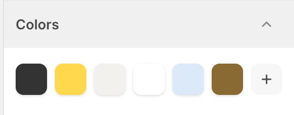
The palette at the top of Colors. Values shown are from the demo store, not defaults.
Colors begins with Shopify's shared color palette, followed by surface and component groups. The palette supplies reusable color references; each following field can keep that reference or use its own color.
Open the store's Theme Editor to review its actual saved values. Changing a shared palette color affects fields that still reference it, while a field with its own color remains independent.
Section color precedence
Many addable sections expose Background color and Text color fields without a preselected value. Their current precedence is:
- When the section field is blank, the section inherits Theme settings > Colors > General > Background or Text.
- Choosing a value in that section overrides the matching General color for that section instance only.
- A narrower control exposed for a block or sub-surface still governs that element. Examples include media Overlay color, block Text color, the Newsletter section's Text color, and product-card or button color groups.
This lets a store establish one global page surface, then create an intentional local contrast without changing every section. Clearing the section value makes it inherit the General color again.
Section colors do not replace semantic state colors or specialized surfaces. Success, warning, and error messages continue to use the General state fields, while Header, Footer, Drawer/popover, button, and Product groups keep their own scope. When several color controls are present, configure the broad section surface first, then the narrower overlay, block, form, or action color.
General
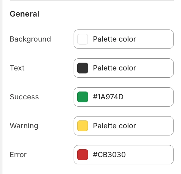
The General group in the Theme Editor.
- Background — the main page background.
- Text — the default text color used against the main background.
- Success — positive status and confirmation states.
- Warning — cautionary status messages and notices.
- Error — validation and failure states.
Start by checking normal text, links, form labels, and status messages against the background. A brand color that works for a button may not work for body text.
Header
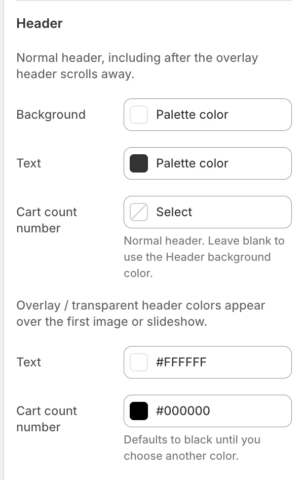
The Header group in the Theme Editor.
For the regular header, including after it stops overlaying the opening image:
- Background — the header surface.
- Text — navigation and control color.
- Cart count number — the number on the cart badge. Leave it blank to use the Header background color.
For the overlay / transparent header:
- Text — navigation and control color over the opening image. The default is white.
- Cart count number — the number on the cart badge. The default is black.
Review both normal and transparent header states. The logo assets are selected separately in Logo and favicon.
Footer
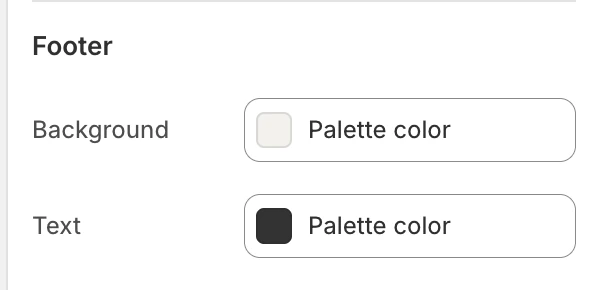
The Footer group in the Theme Editor.
- Background — the footer surface.
- Text — footer copy, links, and labels.
Check the newsletter form, social links, payment/currency controls, and any footer reveal treatment against these colors.
Drawer/popover
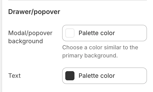
The Drawer/popover group in the Theme Editor.
- Modal/popover background — the background of supported drawers, popovers, and modal surfaces. Choose a value that remains visually related to the primary background.
- Text — labels and content inside those surfaces.
Review Cart, Search, Collection Filters, localization controls, and message/age surfaces where applicable. Translucent blur can alter the perceived contrast; see Appearance and spacing.
Primary button
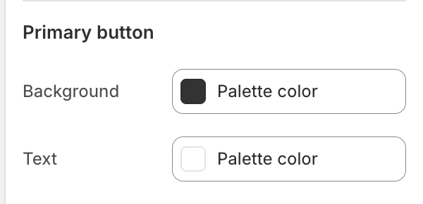
The Primary button group in the Theme Editor.
- Background — the main call-to-action surface.
- Text — the label shown on the primary button.
Check disabled, loading, and focus states where the component supports them. The chosen pair should remain readable over the full button surface.
Secondary button
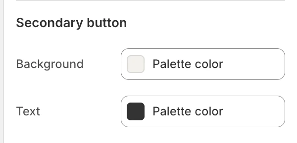
The Secondary button group in the Theme Editor.
- Background — the secondary action surface.
- Text — the label shown on the secondary button.
Use it for actions that should remain visible without competing with the primary action. Review it on cards, drawers, empty states, and forms.
Product
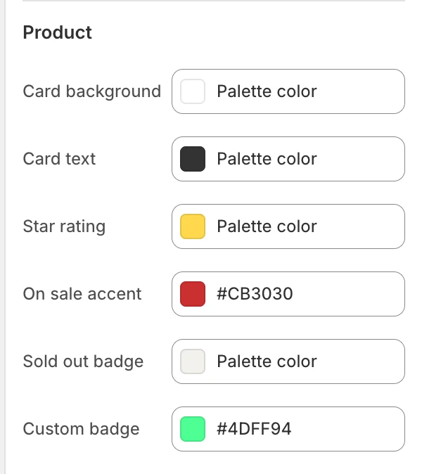
The Product group in the Theme Editor.
- Card background — the product-card surface.
- Card text — product-card titles, prices, and supporting labels.
- Star rating — the rating icon or score color.
- On sale accent — the sale-price or sale-state accent.
- Sold out badge — the sold-out badge color.
- Custom badge — the custom product badge color.
Review these states in a product grid and on a product page. A card background that is intentionally close to the page background still needs a visible image boundary, price, and badge treatment.
Review and accessibility
- Test normal, hover, focus, disabled, success, warning, error, sold-out, and sale states where the store uses them.
- Test one section with its color fields blank and one with an explicit override before assuming a palette change propagated everywhere.
- Check header text over both solid and image-backed headers.
- Check drawer and popover text with blur on and off.
- Do not rely on color alone for status, availability, or required actions; labels and other cues must remain available.
- Validate contrast with the actual font sizes and weights used by the theme rather than with swatches alone.
Related guides
- Typography for the size and font choices that affect contrast.
- Appearance and spacing for blur, rounding, and shadow.
- Color swatches for product variant color values.