
Color swatches replace or supplement variant text with visual choices where Strata supports them. Use them when a product’s color options are meaningful to the buying decision and the labels remain understandable without color alone.
Open Color swatches
Open Theme settings > Color swatches in the Shopify Theme Editor.
Enable color swatches
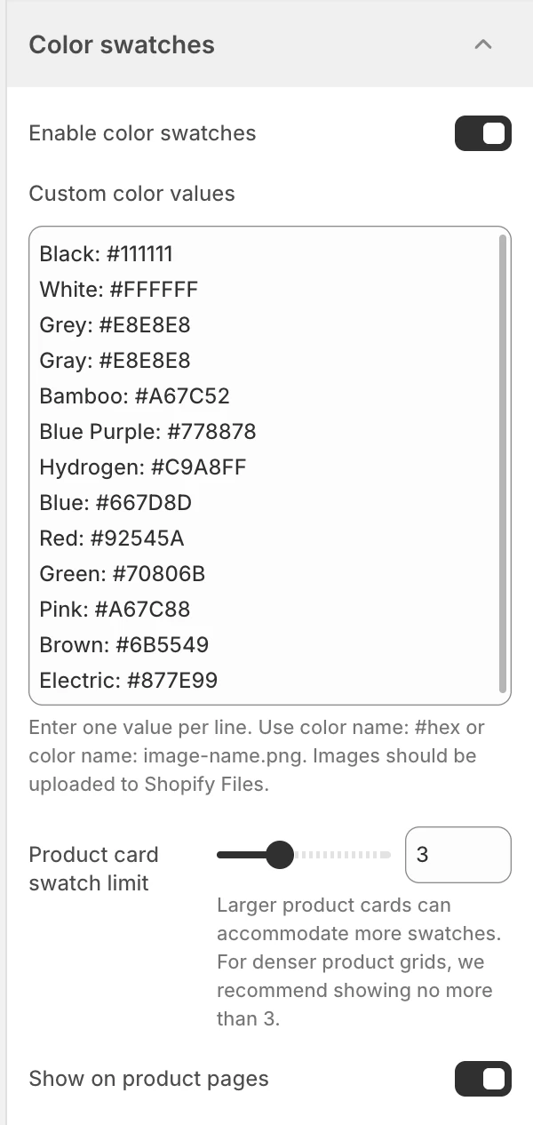
Color swatches in Theme settings. Values shown are from the demo store, not defaults.
The default is On.
| State | Effect |
|---|---|
| On | Enables the global swatch data used by eligible product-card and product-page controls. The dependent settings become available. |
| Off | Disables the global swatch system; product controls use their non-swatch fallback, such as option buttons or dropdowns where supported. |
This is the master switch. A product-card swatch can still be hidden separately with Show color swatches in Product card.
Custom color values
Visible when Enable color swatches is on. Enter one mapping per line using either format:
color name: #hex
color name: image-name.png
For image values, upload the referenced image to Shopify Files first. Keep the name before the colon aligned with the product option value; spelling and spacing differences can prevent a custom mapping from matching.
Use a hex value for a simple solid color. Use an image when a material, print, gradient, or multi-tone surface cannot be represented faithfully by one color.
Custom color values starts with this editable mapping:
Black: #111111
White: #FFFFFF
Grey: #E8E8E8
Gray: #E8E8E8
Bamboo: #A67C52
Blue Purple: #778878
Hydrogen: #C9A8FF
Blue: #667D8D
Red: #92545A
Green: #70806B
Pink: #A67C88
Brown: #6B5549
Electric: #877E99
These lines are defaults, not required product values. Keep only the names your catalog actually uses, and add a separate line for any spelling that must resolve to the same visual value.
Product card swatch limit
Visible when Enable color swatches is on. Sets the desktop product-card swatch limit from 2–5, in 1-item steps. The default is 3.
This controls how many choices a card attempts to show before its remaining-choice treatment. Larger product cards can accommodate more swatches; for a denser product grid, keep the limit at 3 or fewer. Mobile cards use the selected limit up to a maximum of 3 choices.
Show on product pages
Visible when Enable color swatches is on. The default is On.
| State | Effect |
|---|---|
| On | Eligible color options can use swatch controls on product pages. |
| Off | Product pages use their non-swatch option fallback where available. |
This setting does not remove the color option from the product. It changes the presentation of the option picker.
Matching and fallbacks
- Start with a product whose option is explicitly named and has several real values.
- Check native values before relying on custom mappings; a name mismatch can leave a value without the intended swatch.
- Review products with missing images, unavailable variants, and more choices than the card limit.
- Confirm that product cards and product pages agree about which values are selectable.
- Filters and other option controls can have their own presentation; do not assume a card swatch setting changes every filter.
Accessibility and review
- Make the selected state visible without relying on hue alone.
- Check the accessible name of each swatch and its keyboard focus state.
- Product-card swatches show the option name on pointer hover or keyboard focus. Treat this tooltip as supporting context, not as the only way to identify the value.
- Ensure a shopper can identify a value when the swatch image fails or the colors are visually similar.
- Test desktop and mobile cards with 1, 3, 5, and more than 5 color options.
A swatch is a visual aid, not a replacement for a meaningful option name. Keep the underlying product option labels accurate and review the fallback control when swatches are disabled.
Related guides
- Product card for card-level swatch display and limits.
- Colors for the storefront palette.
- Product for product-page variant controls.