
Image with text is the clearest choice for one visual and one message. Use it for a product benefit, collection introduction, founder story, or campaign call to action.
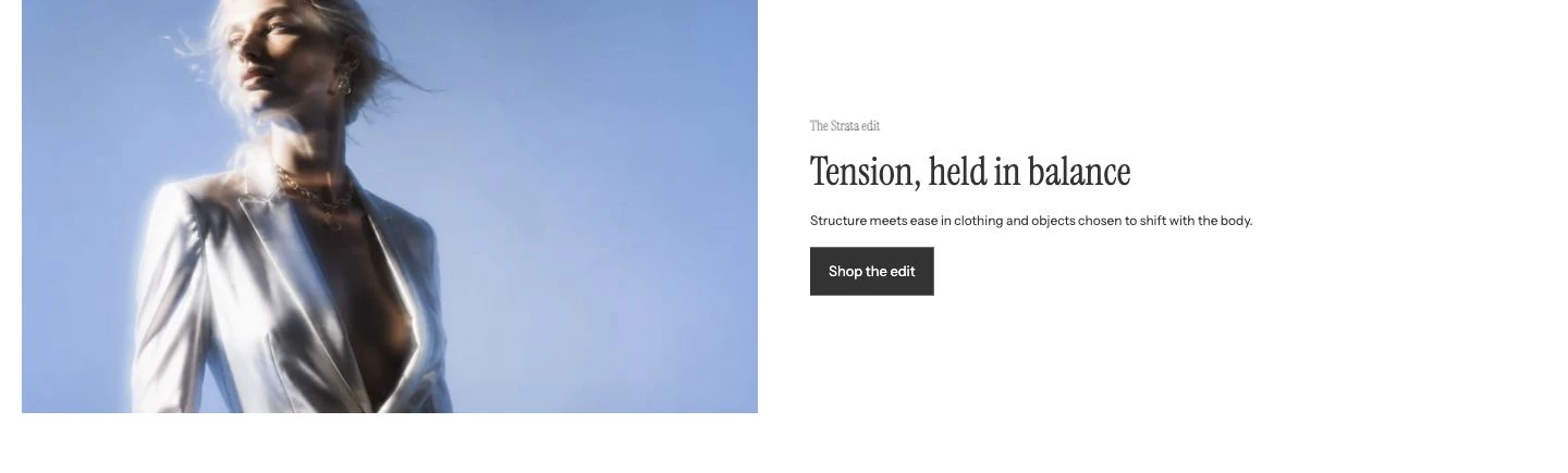
Desktop media position: Left.
Add Image with text
In Shopify's theme editor, add Image with text to a compatible template or open an existing section. It is not available in the header or overlay groups.
Content
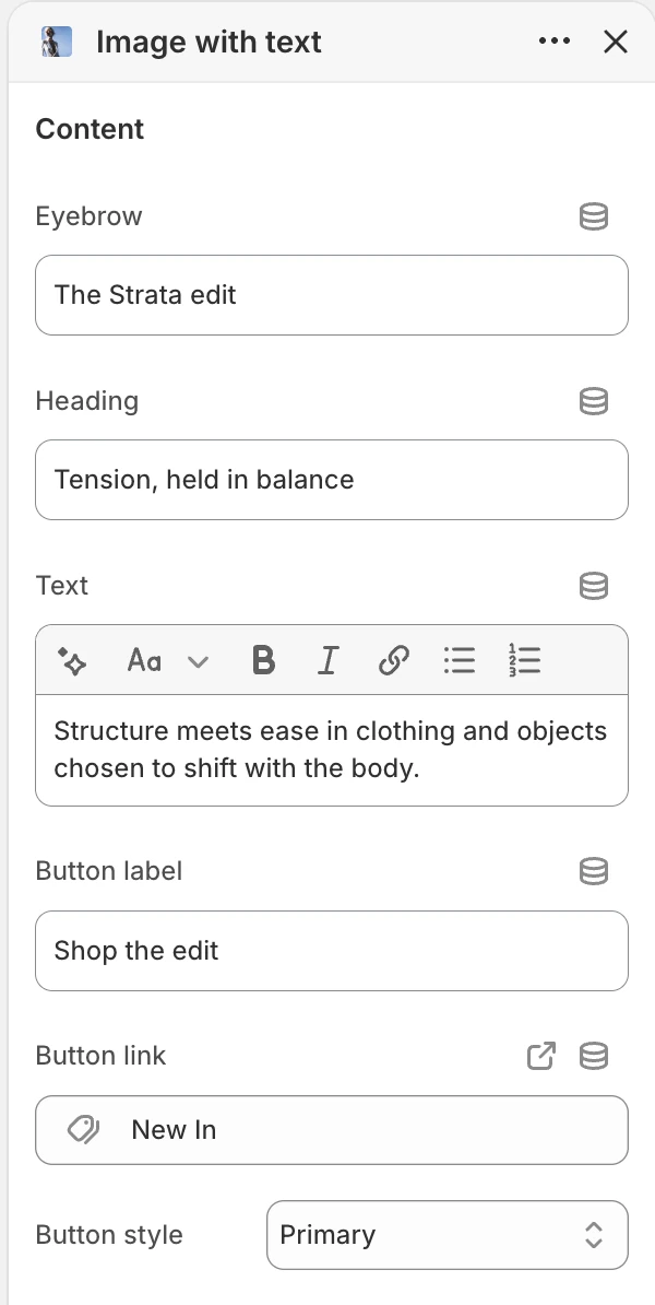
The Content group in the Theme Editor. The values shown are examples, not defaults.
| Setting | What it controls | Default |
|---|---|---|
| Eyebrow | Optional short context above the heading. | No default. |
| Heading | Main message for the content panel. | Tell your story. |
| Text | Rich text below the heading. | Pair an image or video with details about a product, collection, or brand story. |
| Button label | Visible action text. | Learn more. |
| Button link | Destination for the button. | No default. |
| Button style | Visual treatment for the action. | Primary, Secondary, or Text link. Default: Primary. |
The button is rendered only when both Button label and Button link are present. Leave both empty when this section is informational only.
Media
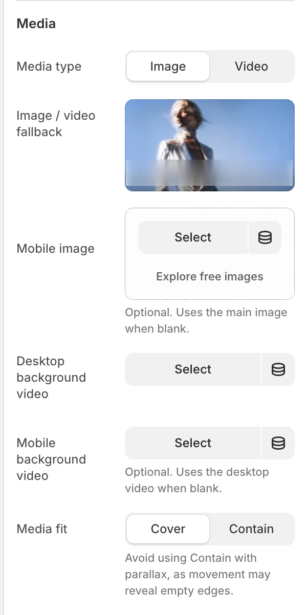
The Media group in the Theme Editor.
| Setting | What it controls | Options or default |
|---|---|---|
| Media type | Chooses a still image or background video presentation. | Image or Video. Default: Image. |
| Image / video fallback | Main image for the image mode and still fallback for video. | No default. |
| Mobile image | Optional mobile-specific image or video fallback. | Uses the main image when blank. |
| Desktop background video | Video used when Media type is Video. | No default. |
| Mobile background video | Optional mobile-specific video. | Uses the desktop video when blank. |
| Media fit | Decides whether media fills the frame or remains contained. | Cover or Contain. Default: Cover. |
When Media type is Video, the desktop video is used when available; the image is the still fallback. When a mobile video is blank, the desktop video is used. Provide a useful fallback because motion can be disabled or unavailable.
Cover fills the frame and may crop the source. Contain preserves the full source inside the frame and may leave surrounding space. When parallax is enabled, choose Cover because movement can reveal empty edges around contained media. Check the focal subject on desktop and mobile.
Layout
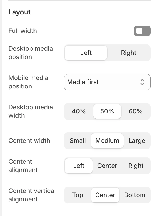
The Layout group in the Theme Editor.
| Setting | What it controls | Options or default |
|---|---|---|
| Full width | Removes the normal page-width constraint from the section container. | Disabled by default. |
| Desktop media position | Places media on the desktop Left or Right. | Left or Right. Default: Left. |
| Mobile media position | Chooses which column appears first on mobile. | Media first or Content first. Default: Media first. |
| Desktop media width | Allocates the desktop composition to media. | 40%, 50%, or 60%. Default: 50%. |
| Content width | Limits the content panel width. | Small, Medium, or Large. Default: Medium. |
| Content alignment | Aligns text and the button horizontally. | Left, Center, or Right. Default: Left. |
| Content vertical alignment | Aligns the content panel beside the media. | Top, Center, or Bottom. Default: Center. |
Use Mobile media position to control reading priority independently of Desktop media position.
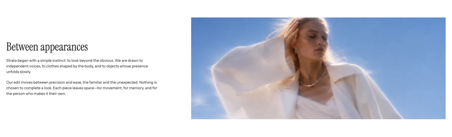
Desktop media position: Right.
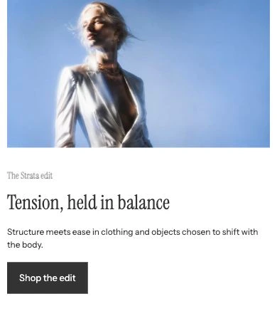
Mobile media position: Media first.
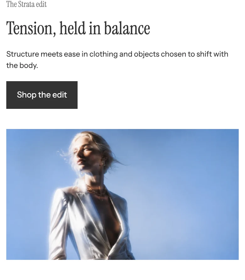
Mobile media position: Content first.
Motion and controls
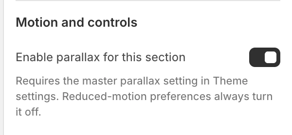
The Motion and controls group in the Theme Editor.
| Setting | What it controls | Default or dependency |
|---|---|---|
| Enable parallax for this section | Opts this section into scroll parallax when the global setting permits it. | Enabled by default. Requires global Enable parallax effects; reduced-motion preferences turn it off. |
Video is background media rather than a separate user-controlled player in this section. Do not put essential instructions only in video frames or audio.
Colors
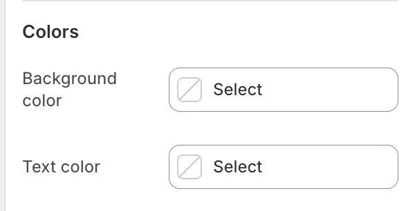
The Colors group in the Theme Editor.
| Setting | What it controls | Default |
|---|---|---|
| Background color | The section surface around the media and content. | Leave blank to inherit Theme settings > Colors > General; selecting a color in this section overrides the inherited value. |
| Text color | The default text color for the content panel. | Leave blank to inherit Theme settings > Colors > General; selecting a color in this section overrides the inherited value. |
Check the heading, body copy, and button against the selected colors and the media treatment.
Spacing
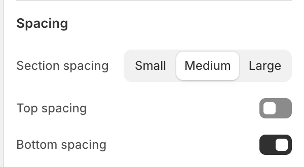
The Spacing group in the Theme Editor.
| Setting | What it controls | Options or default |
|---|---|---|
| Section spacing | Chooses the section's spacing scale. | Small, Medium, or Large. Default: Medium. |
| Top spacing | Adds or removes the section's top spacing. | Enabled by default. |
| Bottom spacing | Adds or removes the section's bottom spacing. | Enabled by default. |
Desktop and mobile behavior
Desktop uses the selected media position, media width, content alignment, and vertical alignment. Mobile has an optional image or video source and its own content order. Review the mobile crop separately from the desktop image.
Media and accessibility
- Write alt text for the source image, or ensure the heading is a suitable fallback when the image is decorative or the source has no alt text.
- Choose Contain when cropping would remove information; choose Cover only after checking the focal subject.
- Make the heading and button destination understandable without the image or video.
- Check contrast for the selected section colors and button style.
- Test with reduced motion and with the video unavailable so the fallback remains useful.
Common issues
| Symptom | Safe check |
|---|---|
| The button is not visible | Set both Button label and Button link. |
| The mobile image is not different | Upload Mobile image; a blank field deliberately reuses the main image. |
| Video shows a still image | Confirm Media type is Video, a desktop video exists, and the fallback image is intentional. |
| The subject is cropped | Try Contain, or adjust the source focal point before changing layout. |
| Parallax does not move | Confirm global Enable parallax effects is on and that reduced-motion is not active. |