
Use Video for one focused piece of motion, such as a campaign film, product demonstration, or brand story. The section accepts a Shopify-hosted video or a YouTube/Vimeo URL, with separate source and ratio controls for desktop and mobile.
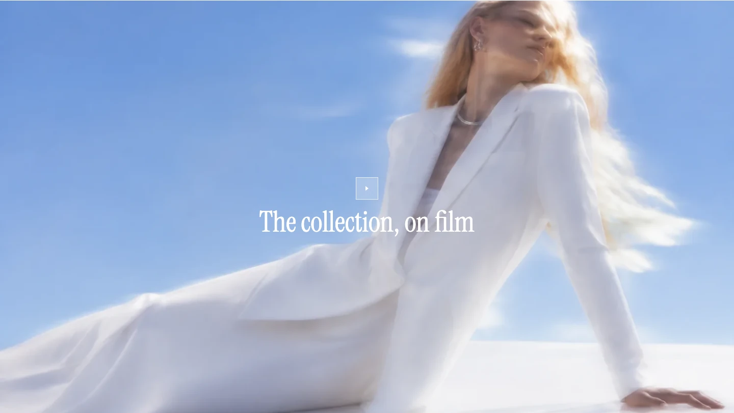
Video on desktop, showing the poster image and play button before playback.
Add a video
- In the Shopify Theme Editor, add a Video section to a supported template.
- In Media, choose a Desktop video or enter an External video URL. A hosted video takes precedence when both are present.
- Add a Poster image when the automatic preview is not the still you want visitors to see.
- Replace the example Heading with a short title when the video needs context, or clear it if no title is needed.
Content
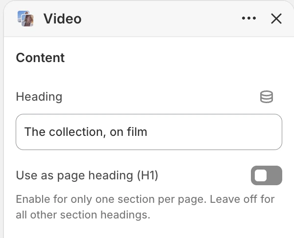
The Content group in the Theme Editor. The values shown are examples, not defaults.
Heading adds short overlay copy. Use as page heading (H1) makes it the main title of the page; enable that option in one suitable section only.
Media
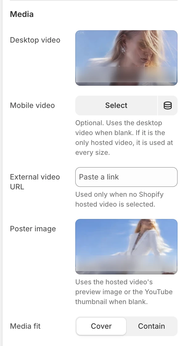
The Media group in the Theme Editor.
If a Shopify-hosted video and an external URL are both configured, the hosted source is selected first. Use one source path deliberately rather than expecting the external URL to replace a hosted video that cannot play.
Layout
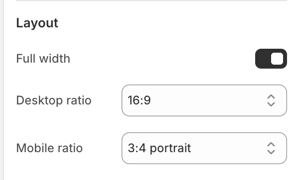
The Layout group in the Theme Editor.
Cover fills the frame and may crop the source. Contain keeps the complete source visible and may leave space around it. Confirm the focal subject at both ratios, especially when a desktop video is reused on mobile.
Header
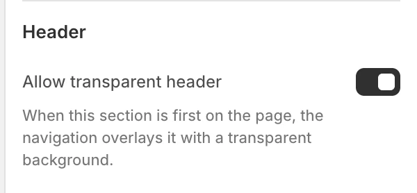
The Header group in the Theme Editor.
Motion and controls
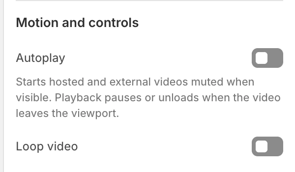
The Motion and controls group in the Theme Editor.
When Autoplay is off, the poster remains until the visitor selects Play. A manually started hosted video uses its normal video controls and is not converted back into the automatic muted flow. Keep a useful poster and do not make playback essential to the page.
Colors
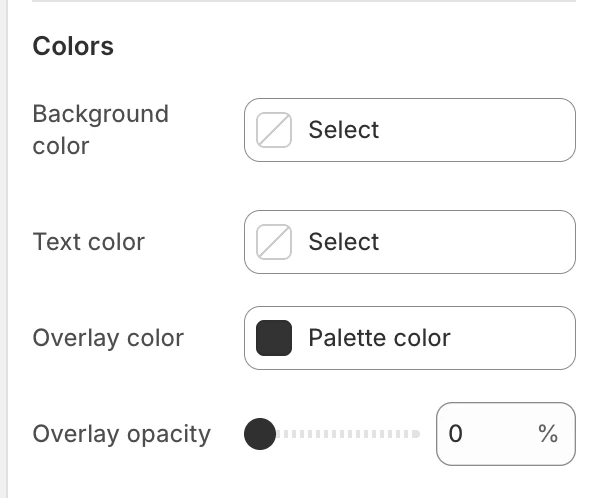
The Colors group in the Theme Editor.
Check the overlay against light and dark frames, not only the poster. If the section has no text overlay, use the lowest opacity that keeps the play control clear without hiding important media.
Spacing
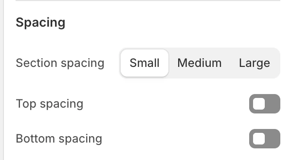
The Spacing group in the Theme Editor.
Desktop and mobile behavior
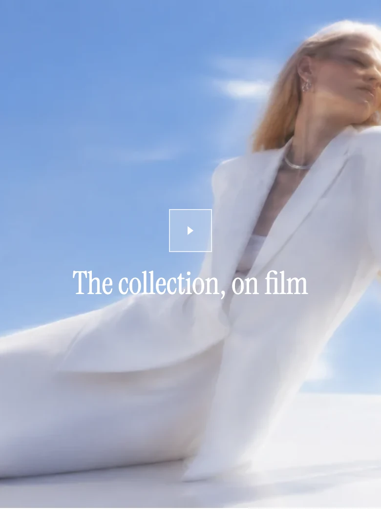
Video on mobile.
- The Mobile video source is optional. When it is blank, the desktop source is used. When it is the only hosted source, it is used at every size.
- The desktop and mobile ratio controls change the frame rather than editing the source file. Review crop and subject placement after changing Media fit.
- Desktop and mobile ratios are independent. Fullscreen on desktop makes only the desktop presentation full width and square; Fullscreen on mobile does the same only on mobile.
- If Allow transparent header is on, check the first section with both a transparent and a regular Header state.
- With Autoplay on, hosted and external playback starts muted while visible. With it off, visitors start playback manually.
Media recommendations
Choose a poster that communicates the video’s subject without playback. Provide a mobile source when the desktop composition does not keep its subject visible in the mobile frame. Confirm that the source, poster, and text remain useful with slow connections and with playback blocked.
Accessibility and motion
- Keep the play control usable with a keyboard and verify its label in the rendered page.
- Provide captions or an equivalent text alternative when speech carries meaning; do not place essential instructions only in audio.
- Make the poster and Heading understandable before playback begins.
- Keep the poster and surrounding copy useful without playback. Confirm manual activation with video controls and the static reduced-motion result; do not rely on Autoplay for essential content.
- Avoid flashing frames and unnecessary looping. If motion is decorative, the page should remain understandable when playback is stopped.
Common issues
The external video does not play
Confirm that the URL is a supported YouTube or Vimeo URL and that no Shopify-hosted video is selected. A hosted video takes precedence over the external URL. Provider consent and playback may also vary by browser.
The poster is not the expected image
Add an explicit Poster image. When it is blank, the section uses a hosted video preview or YouTube thumbnail when one is available.
Video does not start automatically
Confirm Autoplay is on, the section is visible, and reduced motion is not enabled. Browser or provider rules can still prevent automatic playback, so keep a useful Poster image for every pre-play state.
The mobile composition is cropped
Select a Mobile video, try Original or another Mobile ratio, and compare Cover with Contain. Review the result at the target device sizes before publishing.
Text is difficult to read
Adjust Text color, Overlay color, and Overlay opacity, then inspect several frames. A transparent header can place navigation over the same media, so check the header controls as well.
Related guides
- Media hero for a static hero or multiple image/video slides with navigation and autoplay controls.
- Split media banners for two linked media panels.
- Flexible media grid for mixed image, video, and text blocks.
- Animation for global motion and reduced-motion controls.