
Flexible media grid combines image, video, and text blocks in one editorial layout. Use it for lookbooks, campaign stories, and collection introductions where each item needs its own size and role.
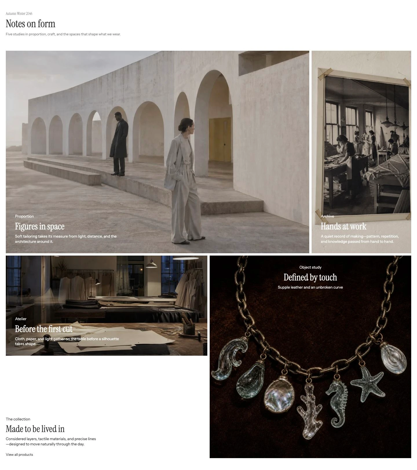
Four desktop columns with individual block spans create this composition.
Add Flexible media grid
- Open Online Store > Themes > Edit theme.
- Use the page selector to open the template where the grid should appear.
- Select Add section, then choose Flexible media grid.
- A new section starts with one 2 × 2 Image item, one 2 × 1 Video item, and two 1 × 1 Image items. Reorder or resize them to fit the story.
The section supports up to 8 blocks and can be added to templates and to the Footer group, but not to the Header or Overlay groups.
Content
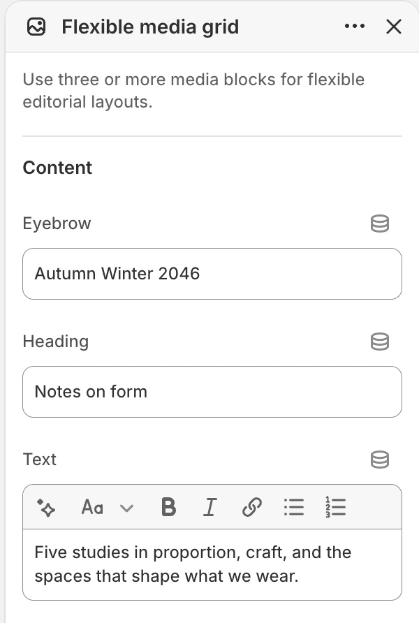
The Content group in the Theme Editor. Values shown are from the demo store, not defaults.
Use these settings for the introduction above the grid:
| Setting | Options and use |
|---|---|
| Eyebrow | Short label above the heading. Default: Editorial layout. |
| Heading | Main introduction. Default: Build a visual story. |
| Text | Supporting rich text. A new section includes a short explanation of the mixed-media grid. |
Leave the heading fields blank when the media should begin immediately.
Layout
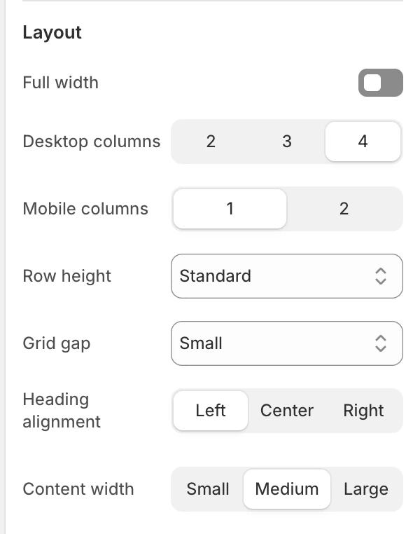
The Layout group in the Theme Editor.
| Setting | Options and use |
|---|---|
| Full width | Extends the grid beyond the normal page container when on. Default: Off. |
| Desktop columns | 2, 3, or 4 columns. Default: 4. A block’s horizontal span should fit the selected column count. |
| Mobile columns | 1 or 2 columns. Default: 1. The block-level Mobile span setting is useful when 2 is selected. |
| Row height | Compact, Standard, or Tall. Default: Standard. Changes the base row height before block spans are applied. |
| Grid gap | None, Small, Medium, or Large. Default: Small. |
| Heading alignment | Left, Center, or Right. Default: Center. |
| Content width | Small, Medium, or Large. Default: Medium. |
The same block order is used at both sizes, while the column choice and each block’s span determine the responsive composition.
Colors
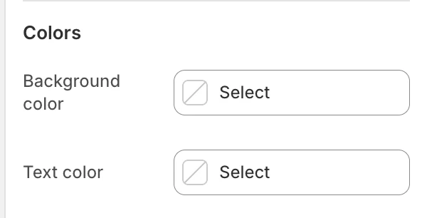
The Colors group in the Theme Editor.
| Setting | What it controls | Default |
|---|---|---|
| Background color | The section surface around the grid. | Leave blank to inherit Theme settings > Colors > General; selecting a color in this section overrides the inherited value. |
| Text color | The default text color for the section heading and supporting copy. | Leave blank to inherit Theme settings > Colors > General; selecting a color in this section overrides the inherited value. |
Block-level colors in Image item, Video item, and Text item can still override their own surfaces or copy.
Spacing
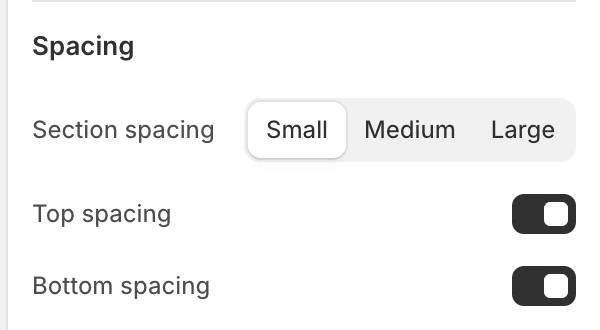
The Spacing group in the Theme Editor.
| Setting | Options and use |
|---|---|
| Section spacing | Small, Medium, or Large. Default: Medium. |
| Top spacing | Adds the section’s top spacing. Default: On. |
| Bottom spacing | Adds the section’s bottom spacing. Default: On. |
Blocks
Add up to 8 blocks. The available block types are Image item, Video item, and Text item. Reorder blocks in the Theme Editor to change the story order.
Image item

Image item block settings.
Media
| Setting | What it controls |
|---|---|
| Image | The primary image for the block. Shopify uses its alt text when the section needs an image description. |
| Mobile image | Optional replacement for the narrow layout. When blank, the main Image is reused. |
| Media fit | Cover fills the block and can crop; Contain keeps the full image visible. Default: Cover. |
Content
| Setting | What it controls |
|---|---|
| Eyebrow | Short label above the block heading. |
| Heading | The block’s main heading. |
| Text | Rich text supporting the block. |
| Button label | The visible action label. It appears with a destination only when Button link is also set. |
| Button link | Destination for the button. |
| Button style | Text link, Primary, or Secondary. Default: Text link. |
Layout
| Setting | Options and use |
|---|---|
| Content horizontal position | Left, Center, or Right. Default: Left. |
| Content vertical position | Top, Middle, or Bottom. Default: Bottom. |
| Content width | Small, Medium, or Large. Default: Medium. |
| Horizontal span | 1–4 columns in whole-number steps. Default: 1 for Image blocks and 2 for Video blocks. The visible result is limited by the section’s desktop column count. |
| Vertical span | 1–4 rows in whole-number steps. Default: 1. |
| Mobile span | 1 column or 2 columns. Default: 1 column. Used when Mobile columns is 2. |
Colors
| Setting | Options and use |
|---|---|
| Text color | Color for copy over the image. New Image item and Video item blocks default to white. |
| Enable overlay | Adds the color layer behind overlaid copy. Default: On. Turn it off when the image already provides enough contrast. |
| Overlay opacity | 0–80% in 5% steps. Default: 30%. |
Video item
Media
| Setting | What it controls |
|---|---|
| Desktop background video | Hosted video used in the desktop composition. |
| Mobile background video | Optional narrow-layout video. When blank, the desktop video is reused. |
| Fallback image | Still image used when the block has no playable video or motion is reduced. |
| Mobile fallback image | Optional narrow-layout fallback. When blank, the main Fallback image is reused. |
| Media fit | Cover fills the block and can crop; Contain keeps the full media frame visible. Default: Cover. |
Content, Layout, and Colors
The Video item uses the same Content, Layout, and Colors controls as the Image item. A new Video item uses the heading Create a video block and spans two desktop columns by default.
Keep important information in the text fields or fallback image; do not make the video the only way to understand the message.
Text item
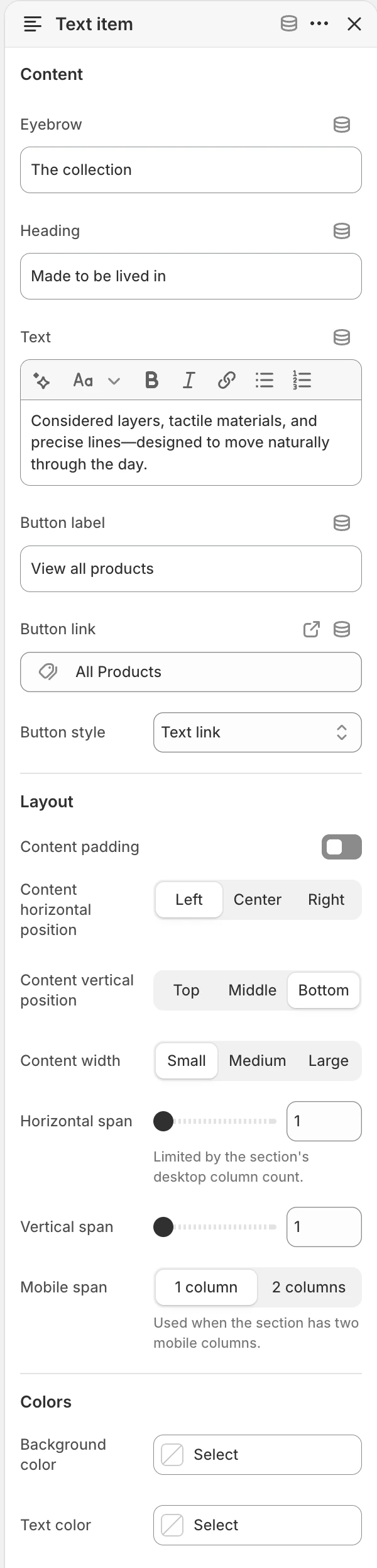
Text item block settings.
Content
The Text item provides Eyebrow, Heading, Text, Button label, Button link, and Button style. A button appears only when its label and link are both present. Choose Text link, Primary, or Secondary for Button style; the default is Text link.
Layout
Content padding adds internal spacing around the text and is on by default. Turn it off only when the surrounding composition supplies the required spacing.
The Text item uses Content horizontal position, Content vertical position, Content width, Horizontal span, Vertical span, and Mobile span with the same options and defaults as the Image item. It has no Media fit setting.
Colors
| Setting | Options and use |
|---|---|
| Background color | Background of the text block. The default follows the global background color. |
| Text color | Color for the block copy. The default follows the global brand color. |
Desktop and mobile behavior
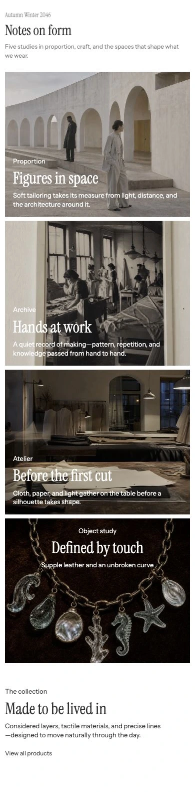
Mobile columns: 1. The same cards follow their configured order.
The section has separate desktop and mobile column controls. At a narrow size, one column stacks blocks; two columns allow Mobile span to keep a block at one column or span both. Review reflow, text wrapping, and reading order after choosing spans.
Long Text-block copy can be shortened when two mobile columns are selected. Keep the mobile composition understandable without relying on every line of that copy.
Media recommendations
Use an image alt description in Shopify Files for informative images. Supply a fallback image for every Video item, and add mobile-specific media only when the desktop crop does not preserve the subject. Review each crop and span at desktop and mobile sizes.
Accessibility and motion
- Keep headings and button labels meaningful without reading text embedded in an image.
- Check overlay and text color against the lightest and darkest parts of each image.
- Use Contain when cropping would remove information that visitors need to see.
- Treat video fallback images as the readable alternative when motion is unavailable or reduced.
- Review keyboard focus, reduced-motion behavior, and video playback before publishing.
Common issues
- A block is wider than expected: check Desktop columns, Horizontal span, and Vertical span together.
- The mobile grid feels crowded: try Mobile columns: 1, or give the important block Mobile span: 2 columns when using two columns.
- Text is hard to read over an image: enable the overlay and adjust Overlay opacity and Text color together.
- A button is missing: confirm both Button label and Button link are populated.
- Video content is unavailable: confirm the hosted video and its fallback image, then preview with reduced motion enabled.
Related guides
- Image with text for one focal image and one message.
- Media hero for one full-width hero or a controlled slideshow.
- Video for a focused video section.
- Animation for reduced motion and parallax controls.