
Product card settings control the repeated product summaries used by collection grids, product lists, search results, and other catalog surfaces. Configure them globally so shoppers receive a consistent browsing experience.
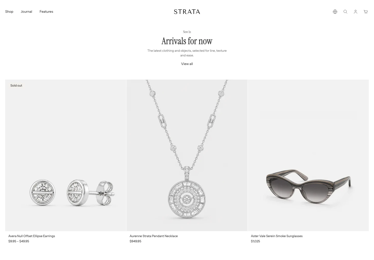
Desktop example: a sold-out card, a price range, and single prices in one row. Review these states with your own catalog.
Open Product card
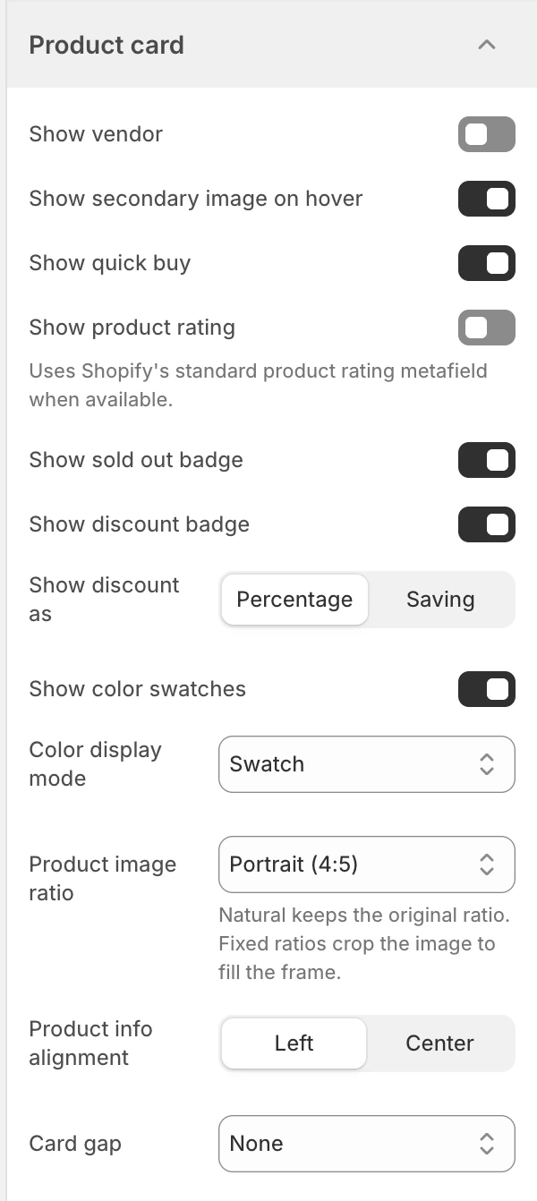
Product card in Theme settings. Values shown are from the demo store, not defaults.
Open Theme settings > Product card in the Shopify Theme Editor.
Content and actions
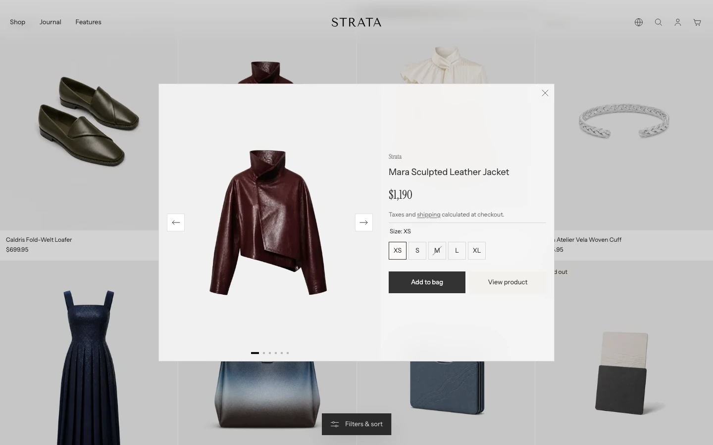
Quick buy opens this quick view when a product has options to choose.
Show vendor
The default is Off. Turn it on when the vendor is useful for browsing or when the catalog contains several brands. Leave it off when vendor names add noise or repeat the collection context.
Show secondary image on hover
The default is On. When a product has a second usable image, the card can show it on pointer hover and when the card receives visible keyboard focus. Touch devices do not have a persistent hover state, so do not use this setting as the only way to expose product imagery.
Show quick buy
The default is On. On desktop product cards, an available product with only Shopify's default variant can be added directly. Products with selectable options open a window so the shopper can choose before adding, even when the product currently has only one named variant. Gift cards, products with selling plans, and unavailable products do not show the normal quick-buy action.
The options window shows the product's images only. Videos and 3D models stay on the product page, which keeps the window light to open. A product without images shows the preview image of its media instead.
Product-card quick buy is hidden on mobile screens up to 749 px wide. Shoppers can still open the product page from the card to choose options and add the product.
Ratings and badges
Show product rating
The default is Off. Turn it on when a compatible product-review app syncs ratings with Shopify.
Set up the data before enabling the card display:
- Install and configure a product-review app that syncs its average rating and review count with Shopify.
- Import or collect reviews for the products that should show ratings.
- Open Theme settings > Product card and enable Show product rating.
- Use Show product rating as to choose the value shoppers see on cards.
Ratings are managed in the review app rather than entered in the Theme Editor. A product card with no rating data does not show a rating.
Show product rating as
Visible when Show product rating is on. Options:
| Option | Meaning |
|---|---|
| Average rating | Shows the average rating value. |
| Review count | Shows the number of reviews. |
The default is Average rating. If a product remains blank, confirm that the review app has synchronized both the product's average rating and review count before treating it as a theme issue.
The Product page has a separate Rating block. Add it to the Product page section (select Add block under Product page) when ratings should also appear beside the purchase information. See the Product guide.
Show sold out badge
The default is On. Shows a sold-out state when the product is unavailable for purchase. Keep it on when shoppers need a clear catalog signal.
Show discount badge
The default is On. Shows a discount state when the product has a comparable price and is on sale.
Show discount as
Visible when Show discount badge is on. Options:
| Option | Meaning |
|---|---|
| Percentage | Shows the discount as a percentage. |
| Saving | Shows the saving amount. |
The default is Percentage. Review currencies and long formatted amounts when using Saving.
Color swatches
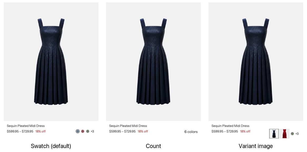
Color display mode: Swatch (the default), Count, and Variant image.
Show color swatches
Visible when the global Enable color swatches setting is on. The default is On. This card-level setting controls whether eligible color choices appear in product cards; it does not enable the global swatch system by itself.
Color display mode
Visible when global color swatches are enabled. Options:
| Option | Meaning |
|---|---|
| Hide | Shows swatches, the same as Swatch. To remove color choices from product cards, turn off Show color swatches. |
| Count | Show the number of available color choices. |
| Swatch | Show color swatches. |
| Variant image | Use a variant image when one is available. |
The default is Swatch. The global Color swatches page controls the source values and product-page behavior.
Image and layout
Product image ratio
Choose the card media ratio:
| Option | Value |
|---|---|
| Natural | Uses the image’s natural ratio. |
| Landscape (4:3) | Uses a 4:3 frame. |
| Square (1:1) | Uses a square frame. |
| Portrait (4:5) | Uses a 4:5 frame. |
| Tall (2:3) | Uses a tall 2:3 frame. |
New installations start with Portrait (4:5). Choose a ratio that matches the majority of catalog imagery, then review crops and focal points rather than relying on filenames.
Product info alignment
Options are Left and Center. New installations start with Center. Left alignment is usually easier to scan for product titles and prices; center alignment can suit an editorial catalog with short labels.
Card gap
Choose the space between neighbouring product cards in grids and carousels, such as collection pages, search results, and product rows:
| Option | Value |
|---|---|
| None | Hairline (1 px) |
| Extra small | 10 px |
| Small | 20 px |
| Large | 30 px |
New installations start with None. With None, cards sit one hairline apart and their text gains a small side inset so titles and prices do not touch the card edge. Choose a larger gap when each card should read as a separate object.
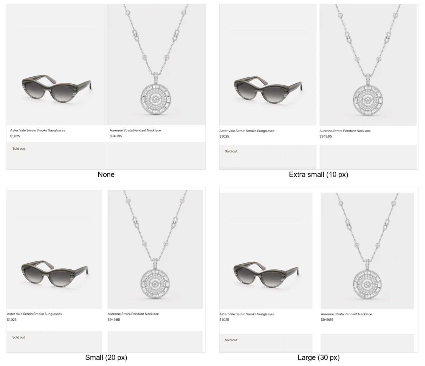
Card gap on a collection page: None, Extra small, Small, and Large. With None the cards sit one hairline apart and the text moves in slightly from the card edge.
Dependencies and responsive behavior
| Setting | Depends on | Check |
|---|---|---|
| Show product rating as | Show product rating on | Products with ratings supplied by the review app. |
| Show discount as | Show discount badge on | Sale and compare-at-price products. |
| Show color swatches / Color display mode | Global Enable color swatches on | Products with eligible color options. Hide shows the same result as Swatch. |
| Show quick buy | Desktop width, availability, product options, gift cards, and selling plans | An available default-variant product, a product with selectable options, and the mobile card. |
On mobile, product cards follow Product card swatch limit up to a maximum of 3 swatches. Choosing 2 therefore shows up to two choices on mobile, while choosing 4 or 5 still shows up to three.
On pointer hover or keyboard focus, an eligible product-card swatch exposes its option name in a small tooltip. The underlying control also retains an accessible name. This helps distinguish visually similar colors, but it does not replace accurate product option labels or a visible selected state.
Common issues
- Color choices still appear with Color display mode set to Hide: turn off Show color swatches to remove them from product cards.
- No swatches appear with Swatch selected: confirm global Enable color swatches, card-level Show color swatches, and eligible product color data.
- A swatch name does not appear: test pointer hover and keyboard focus on the swatch. Do not expect the hover tooltip to be the primary label on a touch-only device.
- A product rating is missing: confirm Show product rating, then check that the product has a published rating in the review app and that the app syncs ratings with Shopify.
Accessibility and review
- Test cards with long product titles, long prices, sold-out states, and missing images.
- Ensure quick-buy controls are reachable and understandable with a keyboard and screen reader.
- Do not communicate availability or sale state through color alone; keep the badge or text signal.
- Test both fine-pointer hover and touch layouts.
- Recheck card height and grid rhythm after changing typography, image ratio, or gap.
Related guides
- Color swatches for global swatch data and product-page choices.
- Currency format for currency-code display.
- Animation for hover zoom and product-image reveal.
- Collection for collection-grid context.