
Contact form gives visitors a direct way to send a message. Use it with clear response expectations and only request information the store needs to answer the enquiry.
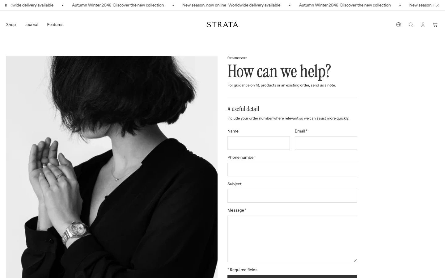
Contact form on desktop with Image position: Left.
Add Contact form
In Shopify's theme editor, add Contact form to a compatible template or open an existing section. It is not available in header, footer, or overlay groups.
Content
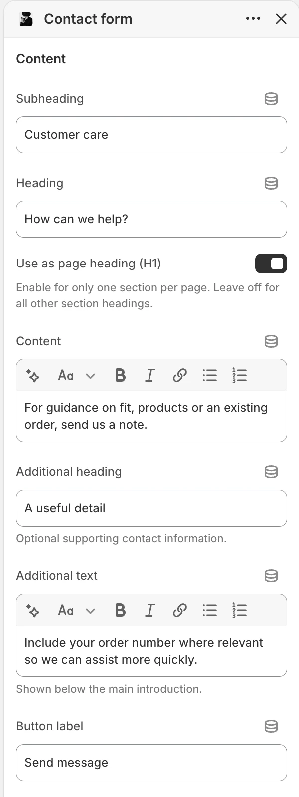
The Content group in the Theme Editor. The values shown are examples, not defaults.
| Setting | What it controls | Default |
|---|---|---|
| Subheading | Optional short label above the form heading. | No default. |
| Heading | Main heading for the enquiry form. | Contact us. |
| Use as page heading (H1) | Makes this Heading the main title of the page. Turn it on in one section only. | Off |
| Content | Rich text explaining how to contact the store and when to expect a reply. | Share how customers can contact you and when they can expect a reply. |
| Additional heading | Optional heading for supporting contact information. | No default. |
| Additional text | Optional rich text shown below the main introduction. | No default. |
| Button label | Submit button text. | Send message. |
Use the details fields for safe public information such as expected response time or service hours. Do not put private support instructions or credentials in this section.
Media
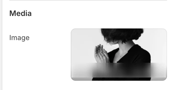
The Media group in the Theme Editor.
| Setting | What it controls | Options or default |
|---|---|---|
| Image | Optional image beside the form. | No default. |
When Image is blank, the section shows a neutral illustration in the selected Left or Right media position. Use it while arranging the page, then upload the intended image or choose whether the media treatment belongs in the final design. Add alt text to a meaningful source image and make decorative imagery non-essential to the enquiry.
Layout
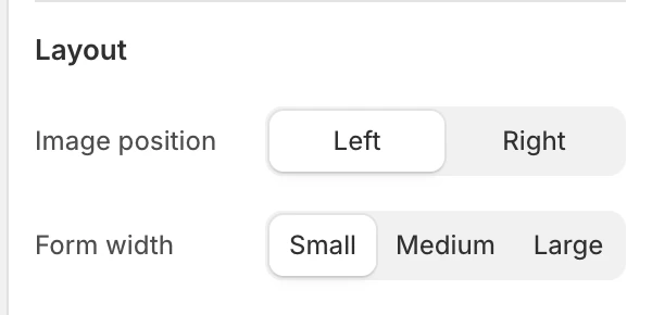
The Layout group in the Theme Editor.
| Setting | What it controls | Options or default |
|---|---|---|
| Image position | Places the image to the Left or Right of the form layout. | Left or Right. Default: Left. |
| Form width | Sets the form's preferred content width within the available space. | Small, Medium, or Large. Default: Small. |
The introduction and supporting text remain left-aligned. Use Small when the enquiry is simple and Large when the form has several approved fields.
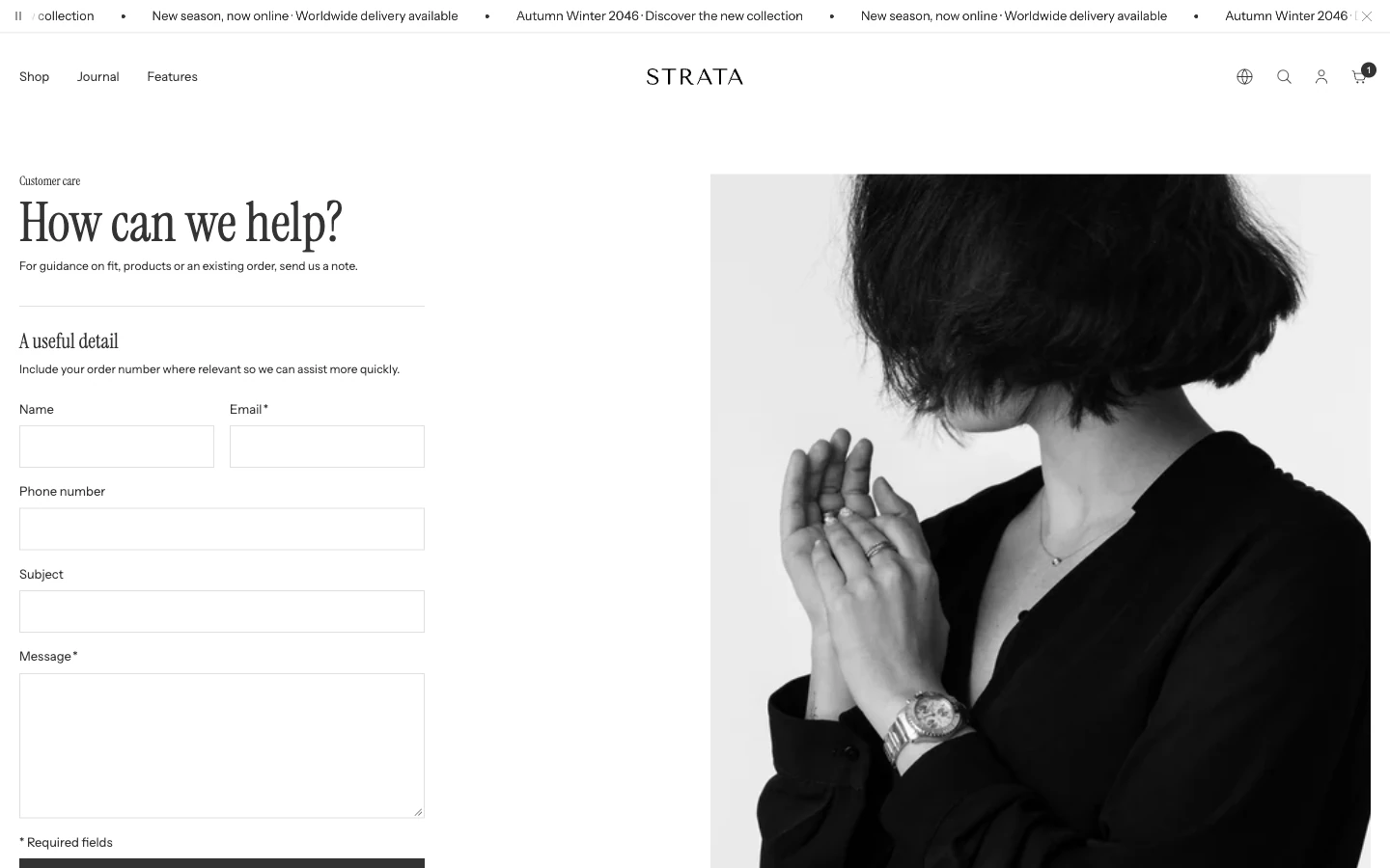
Image position: Right.
Colors
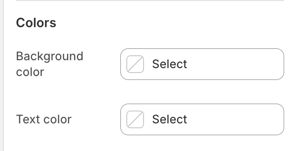
The Colors group in the Theme Editor.
| Setting | What it controls | Default |
|---|---|---|
| Background color | The section surface behind the form and optional image. | Leave blank to inherit Theme settings > Colors > General; selecting a color in this section overrides the inherited value. |
| Text color | The default text color for the form and supporting copy. | Leave blank to inherit Theme settings > Colors > General; selecting a color in this section overrides the inherited value. |
Check field labels, messages, and the submit button against the selected colors.
Spacing
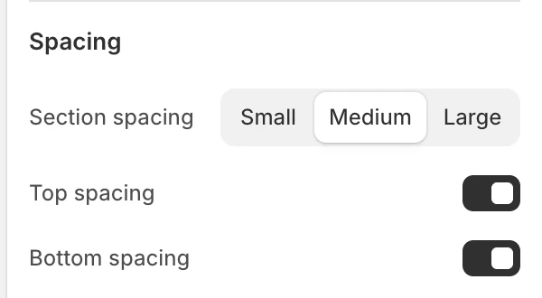
The Spacing group in the Theme Editor.
| Setting | What it controls | Options or default |
|---|---|---|
| Section spacing | Chooses the section's spacing scale. | Small, Medium, or Large. Default: Medium. |
| Top spacing | Adds or removes the section's top spacing. | Enabled by default. |
| Bottom spacing | Adds or removes the section's bottom spacing. | Enabled by default. |
Field blocks
Field blocks have no settings of their own; add, remove, or reorder them in the sidebar.
The section accepts up to 12 blocks. Blocks can be reordered in the Theme Editor.
| Block | Purpose and limit | Settings |
|---|---|---|
| Name | Optional name field. Limit: 1. | None. |
| Phone | Optional phone field. Limit: 1. | None. |
| Subject | Optional subject field. Limit: 1. | None. |
| Custom | Adds a store-specific text field. Repeatable within the section's 12-block limit. | Label, default Custom field; Required field, disabled by default. |
The form always renders Email and Message in addition to the optional blocks. They are not added through the block picker.
Validation and form states
| Field | What shoppers see |
|---|---|
| Name | Optional text field, maximum 100 characters. |
| Required email field, maximum 254 characters. Shopify validates the email value. | |
| Phone | Optional telephone field, maximum 30 characters; the current input requests numbers only. |
| Subject | Optional text field, maximum 150 characters. |
| Custom | Text field, maximum 255 characters; becomes required only when Required field is enabled. |
| Message | Required textarea with a minimum of 10 and maximum of 5000 characters. |
On an invalid submission, the form displays Shopify's form errors. On success, it displays the translated success status. Check both states with non-sensitive test information and confirm that keyboard users can reach the status.
Privacy and support boundaries
Never ask visitors to submit passwords, payment-card details, private API credentials, or unnecessary customer information. Explain sensitive workflows through a secure support process instead of adding more form fields. Review the store's privacy notice and where Shopify sends contact notifications before publishing.
Desktop and mobile behavior
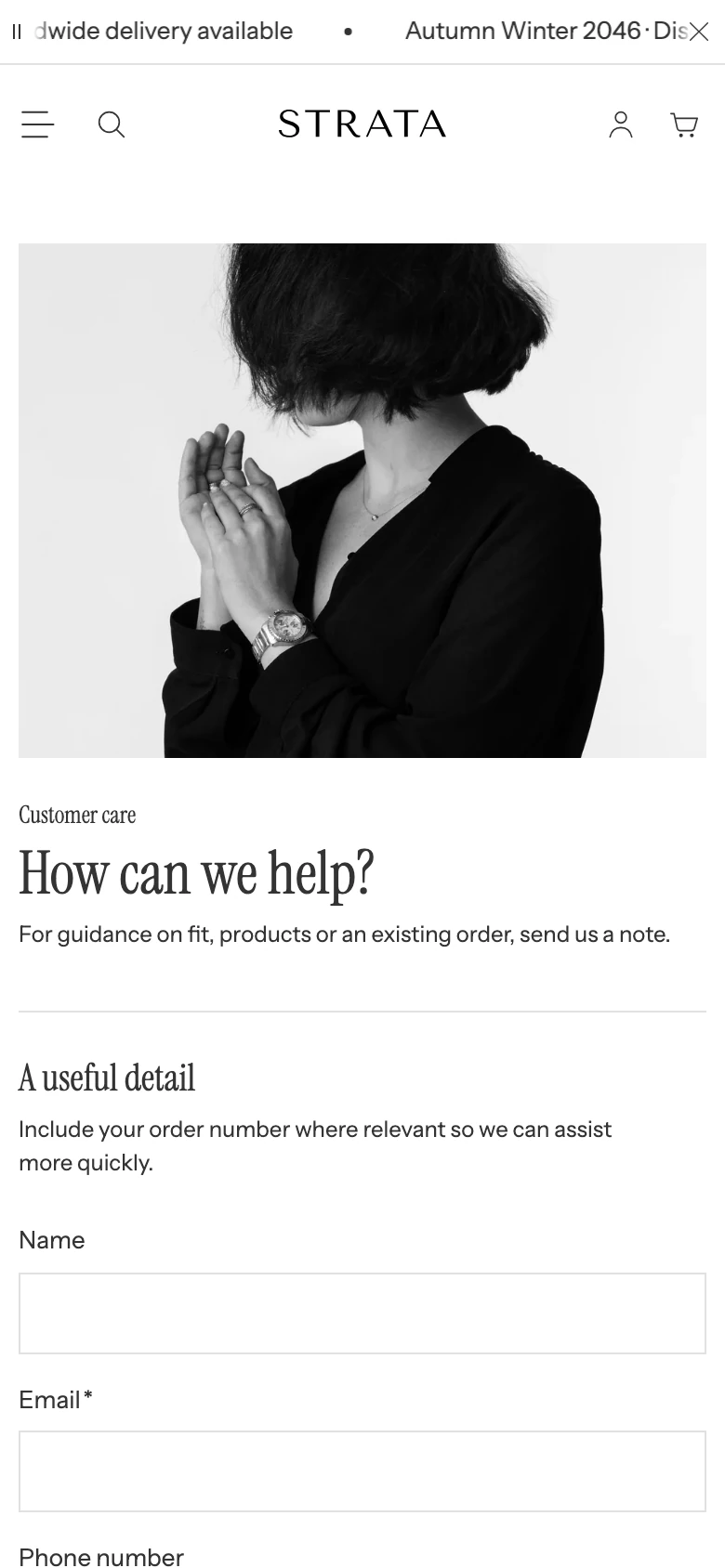
On mobile the image sits above the form.
The image can sit beside the form when supplied. Preview the longest field label, the error state, the success state, and image stacking on desktop and mobile.
Accessibility
- Keep field labels visible and unique, especially for repeated Custom fields.
- Use a meaningful image alt text or make the image decorative when the copy already communicates its purpose.
- Test keyboard order, visible focus, browser autofill, invalid-field messaging, and the success status.
- Mark only genuinely required fields as required; do not enable Required field merely to collect optional context.
Common issues
| Symptom | Safe check |
|---|---|
| A field is duplicated | Remove the extra Name, Phone, or Subject block; each has a limit of one. |
| A custom field is not required | Enable Required field on that Custom block. |
| The submit button does not send | Complete the required Email and Message fields and satisfy the message length rule. |
| Error text is not visible | Submit a controlled invalid test and check focus and the Shopify form error state. |
| Notifications go to the wrong place | Confirm the store's Shopify contact notification settings; the section does not define the destination. |