
Product recommendations
Show Shopify-generated related or complementary products with optional manual choices.
Product recommendations helps shoppers discover items related to the product they are viewing or buying. Use Shopify recommendations or choose products manually.
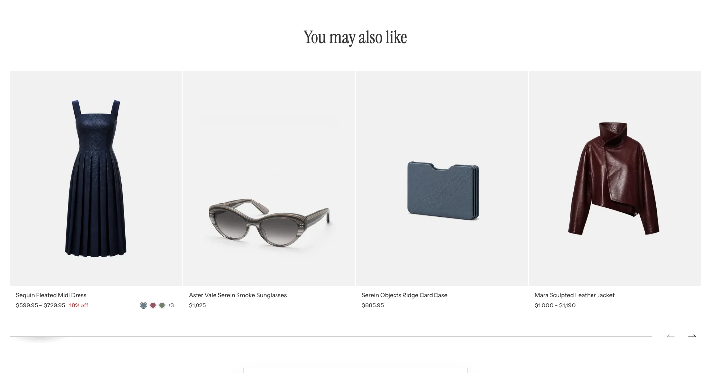
Product recommendations on a product page.
Add this section
Open a Product or Cart template in the Theme Editor and look for Product recommendations. If it is not listed, choose Add section > Product recommendations. On the Cart page, place it below Cart. Hide or remove the section to turn it off. It is not available on other page templates.
| Page | Automatic recommendations |
|---|---|
| Product | Uses the current product and your Recommendation type choice. |
| Cart | Always uses Related products for the first product in the cart. The Recommendation type choice applies only to Product pages. |
On the Cart page, products already in the cart are excluded, including manually selected recommendations. The section stays hidden when the cart is empty or no eligible products remain. The Cart drawer's Show product recommendations switch is separate and does not control this section.
Content
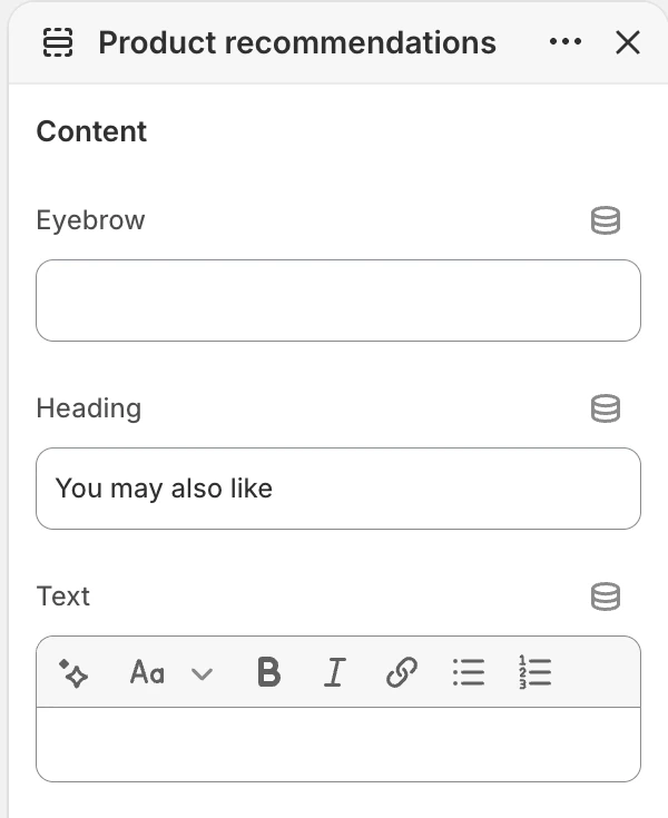
The Content group in the Theme Editor. The values shown are examples, not defaults.
| Setting | Default | What it controls |
|---|---|---|
| Eyebrow | Blank | Short text above the heading. |
| Heading | You may also like | Main heading for the recommendation group. |
| Text | Blank | Optional rich text below the heading. |
Products
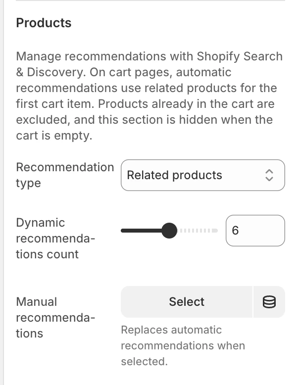
The Products group in the Theme Editor.
To manage automatic recommendations, open Apps > Search & Discovery > Product recommendations, choose the product, and edit its Related products or Complementary products. For the Cart page, edit Related products for the first cart product.
| Setting | Default | Options and use |
|---|---|---|
| Recommendation type | Related products | Related products suggests alternatives or similar products. Complementary products supports add-on purchasing. |
| Dynamic recommendations count | 2–10, step 1; default 6 | The maximum number requested from Shopify’s recommendation service. |
| Manual recommendations | Blank; up to 12 products | A hand-picked list. When selected, it replaces automatic recommendations. |
Use Manual recommendations when you want to choose the products and their order in this section. Leave it blank to use automatic recommendations with the page-specific source above.
Layout
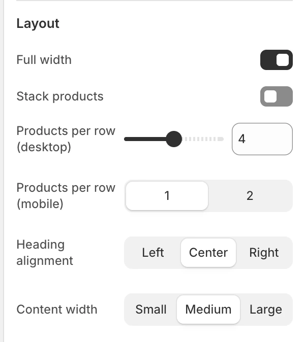
The Layout group in the Theme Editor.
| Setting | Default | Options and use |
|---|---|---|
| Full width | On | On uses the wider section container; Off keeps the section in the page-width container. |
| Stack products | Off | On renders a multi-row grid. Off renders a product-card carousel with carousel controls. |
| Products per row (mobile) | 1 or 2; default 1 | Card density on mobile. |
| Products per row (desktop) | 2–6, step 1; default 3 | Card density in the stacked desktop grid and the carousel’s desktop sizing. |
| Heading alignment | Left | Left, Center, or Right. |
| Content width | Medium | Small, Medium, or Large width for the heading. |
Colors
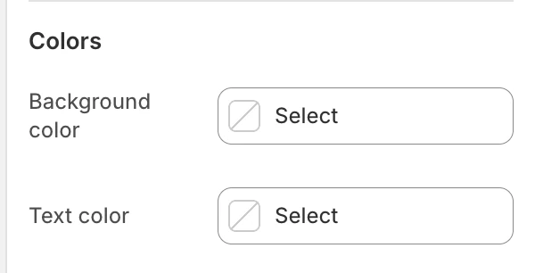
The Colors group in the Theme Editor.
| Setting | What it controls | Default |
|---|---|---|
| Background color | The section surface around the recommendation cards. | Leave blank to inherit Theme settings > Colors > General; selecting a color in this section overrides the inherited value. |
| Text color | The section heading and supporting text. | Leave blank to inherit Theme settings > Colors > General; selecting a color in this section overrides the inherited value. |
The cards use Theme settings > Colors > Product > Card background and Card text. Check those global colors against this section’s background before publishing.
Spacing
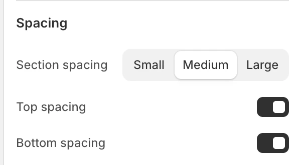
The Spacing group in the Theme Editor.
| Setting | Options and default |
|---|---|
| Section spacing | Small, Medium, or Large; default Medium. |
| Top spacing | Off by default. |
| Bottom spacing | On by default. |
Dynamic loading and empty states
With manual recommendations, the section displays your chosen products, subject to the Cart page exclusions above. Without them, it uses Shopify recommendations for the current product or the first cart product. If the response is empty, fails, or times out, Strata then hides the whole section. Results may be fewer than the requested count.
This section has no merchant-authored empty message. Keep nearby page copy useful when recommendations are unavailable, and do not promise a fixed set of products for dynamic recommendations.
Product card dependencies
Cards inherit the global Product card settings for images, vendor, badges, ratings, text alignment, and quick buy. Eligible color options also depend on Color swatches.
Quick-buy availability and its desktop/mobile behavior follow the shared Product card rules. The global Cart drawer setting can affect where a successful quick add is shown.
Desktop, mobile, and accessibility
The mobile and desktop column settings are independent. When Stack products is Off, review carousel controls and the final item; when it is On, review the last grid row. Dynamic content can arrive after the initial render, so check the heading, cards, controls, and focus order after the section appears. Product links, carousel controls, and quick-buy controls should retain visible focus and useful accessible names.
Common issues
- No section appears: confirm that Shopify has recommendations for the relevant product. On the Cart page, add a product to the cart and check that the recommended products are not already in it.
- The wrong recommendation type appears: on Product pages, check Recommendation type. Cart pages always use Related products for automatic recommendations.
- Manual products are ignored: confirm Manual recommendations is populated; it replaces dynamic results.
- Fewer cards appear: Shopify can return fewer than Dynamic recommendations count. On Cart pages, products already in the cart are also excluded.
- The progress bar is not configurable: this section exposes carousel controls but no separate progress-bar setting.
- Swatches or quick buy are missing: review the global Product card and Color swatches settings and the product’s availability/variant data.