
Collections turns a chosen set of Shopify collections into image cards. Use it for departments, seasonal ranges, or shop-by-use-case navigation when the order of the cards matters.
This is a reusable section that you can add to compatible templates. It is different from the fixed Collections grid on Shopify's Collection list template, which is designed to show the store's collection index and supports pagination.
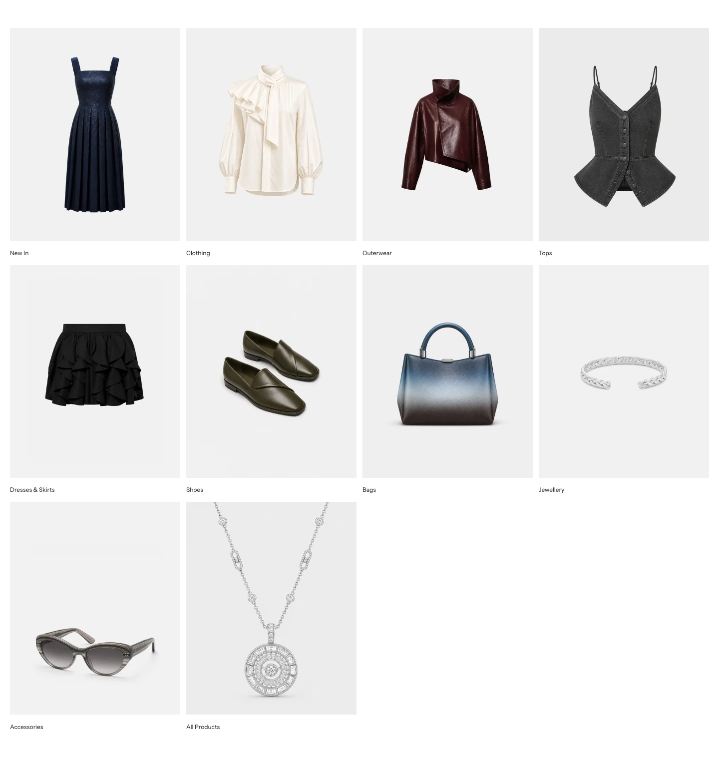
Collections with Layout: Grid and Content position: Below image.
Add Collections
In Shopify's theme editor, open a compatible template, select Add section, then choose Collections. A new section starts as a Grid with six Collection blocks. You can add, remove, and reorder up to 24 blocks.
Content
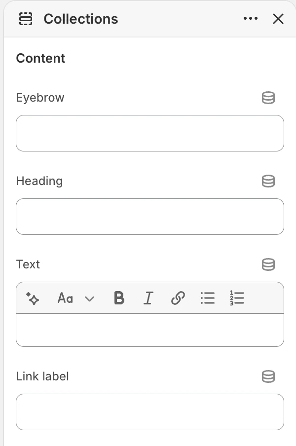
The Content group in the Theme Editor. The values shown are examples, not defaults.
| Setting | Options and default | What it controls |
|---|---|---|
| Eyebrow | Collections | A short line above the main heading. Leave it blank when the section does not need a pre-heading label. |
| Heading | Shop by collection | The main heading for the curated list. |
| Text | Help customers browse your store through a curated list of collections. | Optional rich text below the heading. |
| Link label | View all collections | The label for the heading link. When it is not blank, the link goes to Shopify’s collection index. This section does not provide a separate link URL setting. |
Layout
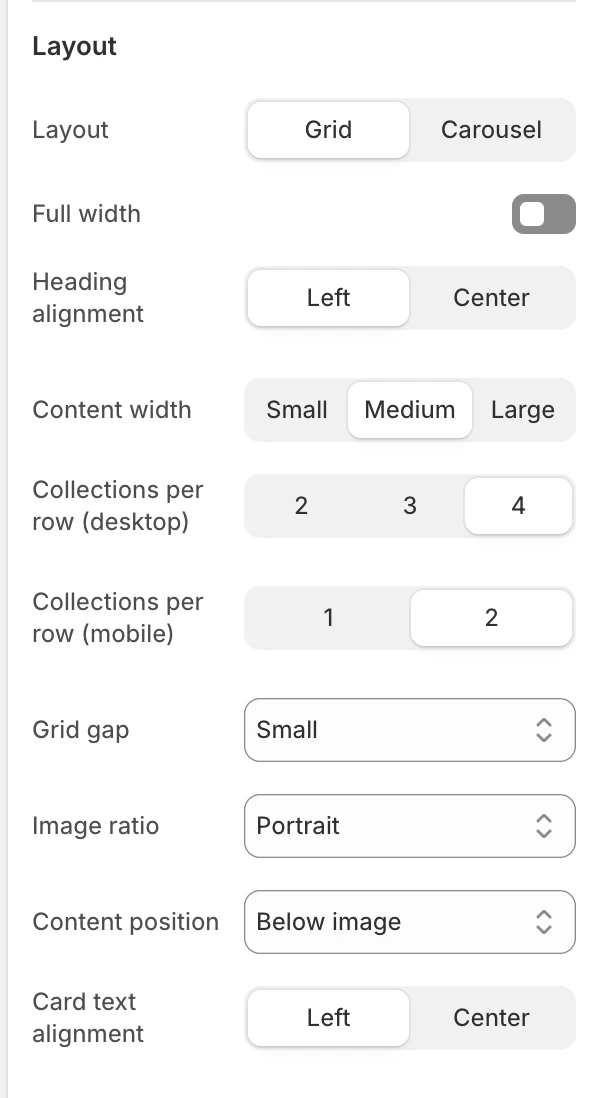
The Layout group in the Theme Editor.
| Setting | Options and default | What it controls |
|---|---|---|
| Layout | Grid or Carousel; default Grid | Chooses a multi-row grid or a horizontally browsable carousel. |
| Full width | Off | On lets the cards use the wider section container. Off keeps them in the page-width container. |
| Heading alignment | Left | Left or Center alignment for the heading group. |
| Content width | Medium | Small, Medium, or Large width for the heading content. It does not change the card grid width. |
| Collections per row (desktop) | 2, 3, or 4; default 3 | The number of cards across on desktop. |
| Collections per row (mobile) | 1 or 2; default 1 | The number of cards in a mobile row. Available only for Grid. |
| Grid gap | None, Small, Medium, or Large; default Medium | The space between cards. Available only for Grid. |
| Image ratio | Natural, Portrait, Square, or Landscape; default Portrait | The media shape used by every collection card. Natural preserves each image’s aspect ratio; the other choices crop to a consistent shape. |
| Content position | Below image or Over image; default Below image | Places the collection title below the media or over it. |
| Card text alignment | Left or Center; default Left | Aligns the collection title within each card. |
Some Layout controls appear only for one layout: Collections per row (mobile) and Grid gap for Grid, and the progress bar in Motion and controls for Carousel.
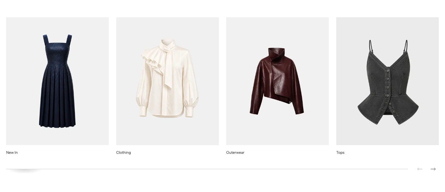
Layout: Carousel. The line under the cards is the carousel progress bar.
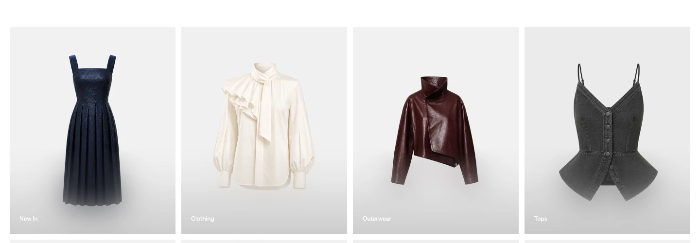
Content position: Over image. Use Overlay opacity in Colors to keep the names readable.
Motion and controls

The Motion and controls group in the Theme Editor.
| Setting | Options and default | What it controls |
|---|---|---|
| Show carousel progress bar | On | Shows progress below the cards. Available only for Carousel. Turning it off hides the progress bar; it does not change the carousel into a grid. |
Colors
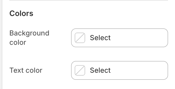
The Colors group in the Theme Editor.
| Setting | Options and default | What it controls |
|---|---|---|
| Background color | Leave blank to inherit Theme settings > Colors > General; selecting a color in this section overrides the inherited value. | The section surface behind the collection cards. |
| Text color | Leave blank to inherit Theme settings > Colors > General; selecting a color in this section overrides the inherited value. | The default text color for the heading and collection cards. |
| Overlay opacity | 0–80%, step 5%; default 15% | Controls the strength of the contrast layer behind card text. Available only for Over image. It does not control blur. |
Check collection titles and card controls against the selected colors. Overlay opacity is used only when Content position is Over image.
Spacing
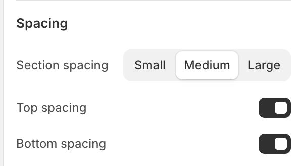
The Spacing group in the Theme Editor.
The Spacing group contains:
| Setting | Options and default |
|---|---|
| Section spacing | Small, Medium, or Large; default Medium. |
| Top spacing | On by default. |
| Bottom spacing | On by default. |
Blocks
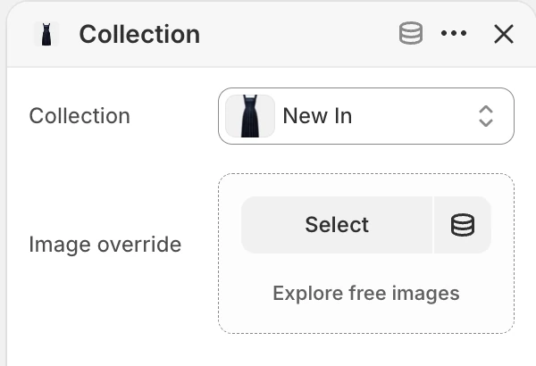
Collection block settings.
Add up to 24 blocks of type Collection. Blocks are rendered in the order shown in the Theme Editor.
Each block has:
- Collection — chooses the Shopify collection to link to.
- Image override — supplies an image for this section only. When blank, the card uses the collection’s featured image.
Select a Collection for every card you want to publish. Remove unused blocks so the collection list reflects the store's intended navigation.
Desktop and mobile behavior
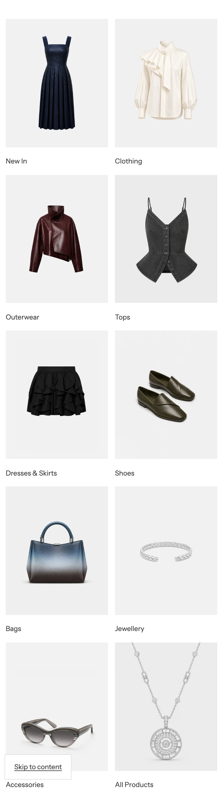
Grid on mobile with Collections per row (mobile): 2.
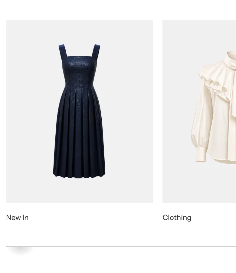
Carousel on mobile.
In Grid, the mobile and desktop column settings are independent. In Carousel, mobile shows part of the next card to make the horizontal direction easier to discover. Collections per row (mobile) and Grid gap do not affect the carousel. Long titles can change card height, especially when cards use Below image.
Accessibility and media
Use a meaningful collection image or Image override and check that the collection title still identifies the destination. With Over image, review text contrast on every card, not only the first image. Collection cards provide links and keyboard focus; verify the focus state remains visible in both content positions. Do not place important text only inside the image.
Common issues
- A collection card is missing: select a Collection for that block and confirm that it is available to the Online Store sales channel.
- The link is missing: enter a Link label; the destination is the collection index and cannot be changed in this section.
- The image is wrong: add an Image override or update the collection’s featured image.
- Overlay text is hard to read: use Below image, choose a stronger image, or revise the image focal point.
- The mobile column setting is missing: it is available only when Layout is Grid.
- The carousel still moves without a progress bar: Show carousel progress bar hides only the progress indicator. Choose Grid to stop using the carousel layout.