Lookbook
Build a page template from a standard page section and an editorial media grid.
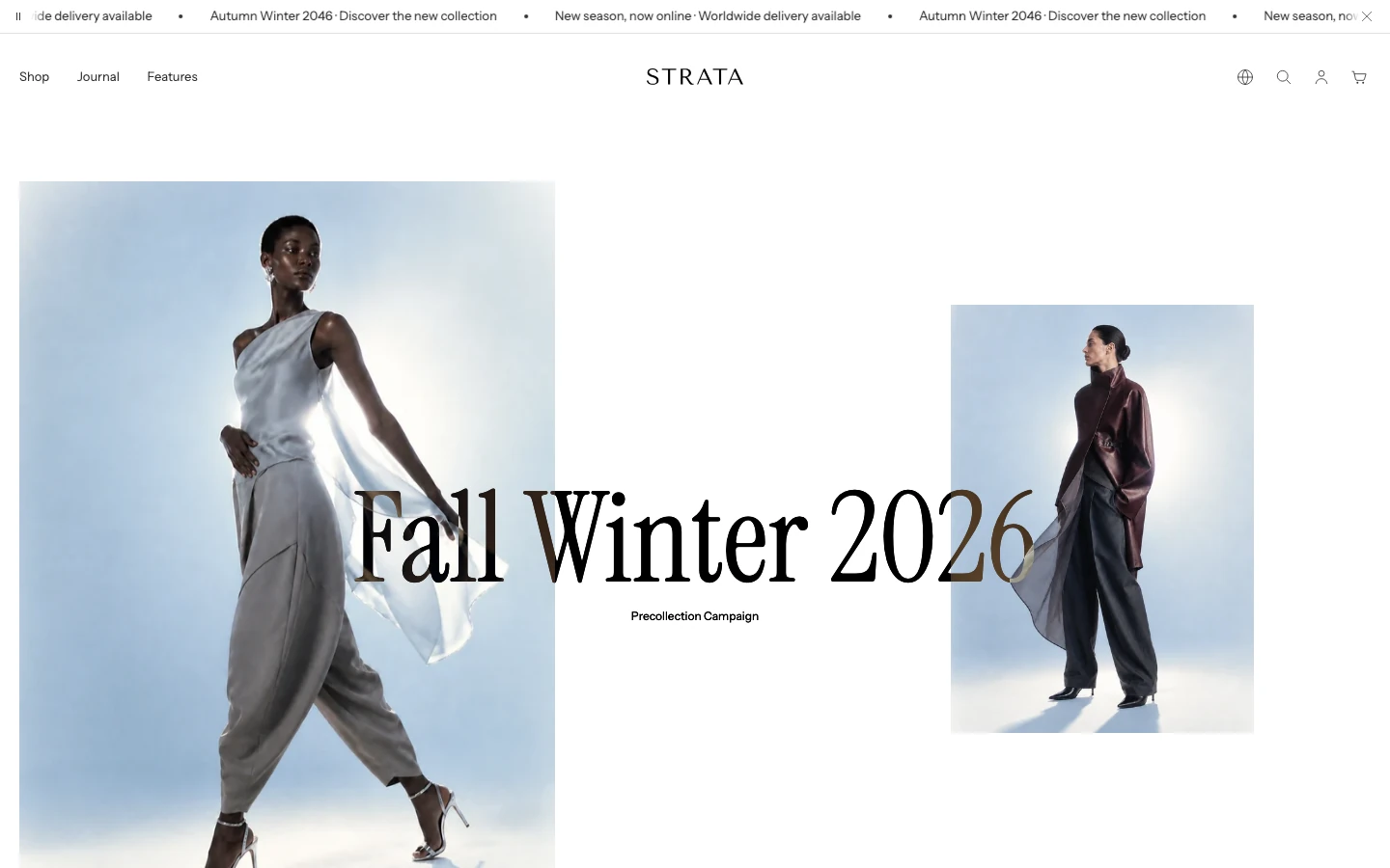
The Lookbook template combines a standard page section with a Flexible media grid. Use it for a visual story where an introductory title and text should lead into a sequence of linked looks, details, or campaign media.
Open the Lookbook template
- From Shopify admin, go to Online Store > Themes > Customize.
- Use the page selector to open the page using the Lookbook template.
- Edit the Page section for the introduction and the Flexible media grid for the lookbook content.
- Preview the same block order at desktop and mobile sizes before saving.
Template order
The current saved Lookbook template contains:
- Page
- Flexible media grid
The current saved fixture contains four image blocks in the order Look 01, Look 02, Detail, and Look 03. These are fixture values, not required merchant copy.
Page section
Content
Show page title
- Controls: Shows or hides the page title. The current default is on.
Layout
Title alignment
- Controls: Aligns the page title.
- Options:
Left,Center, orRight. The current default isLeft.
Content width
- Controls: Sets the page body width.
- Options:
Narrow,Wide, orPage width. The current default isNarrow.
Spacing
Section spacing
- Controls: Sets the Page section spacing to
None,Small,Medium, orLarge. The current default isMedium.
Top spacing
- Controls: Adds or removes top spacing. The current default is on.
Bottom spacing
- Controls: Adds or removes bottom spacing. The current default is on.
Flexible media grid section
Heading and content
- Eyebrow: Optional short label.
- Heading: Main lookbook heading.
- Text: Supporting rich text.
- Heading alignment:
Left,Center, orRight; the current default isLeft. - Content width:
Small,Medium, orLarge; the current default isMedium.
Layout
- Full width: Uses the full available width when enabled. The current default is off.
- Desktop columns:
2,3, or4; the current default is4. - Mobile columns:
1or2; the current default is1. - Row height:
Compact,Standard, orTall; the current default isStandard. - Grid gap:
None,Small, orMedium; the current default isSmall.
Spacing
- Section spacing:
None,Small,Medium, orLarge; the current default isMedium. - Top spacing: Adds or removes top spacing. The current default is on.
- Bottom spacing: Adds or removes bottom spacing. The current default is on.
Media blocks
The Lookbook fixture uses four Image blocks. The Flexible media grid section also exposes Video and Text blocks; use those when the story needs motion or a text-only panel. These blocks can be repeated without a stated limit. Their shared controls are documented in Flexible media grid.
Image
The Image block is used by the current saved Lookbook fixture.
Media
- Image: Desktop or primary image.
- Mobile image: Optional mobile-specific image.
Content
- Eyebrow: Short label above the block heading.
- Heading: Block heading.
- Text: Rich-text supporting copy.
- Button label: Optional action label.
- Button link: Action destination.
Style and placement
- Button style:
Link,Primary, orSecondary; the current default isLink. - Enable overlay: Adds a color overlay to image content. The current default is on.
- Overlay opacity: 0–80%, in 5% steps. The current default is 20%.
- Overlay color: Color used by the overlay.
- Text color: Color used by overlaid text.
- Content horizontal position:
Left,Center, orRight; the current default isLeft. - Content vertical position:
Top,Middle, orBottom; the current default isBottom. - Content width:
Small,Medium, orLarge; the current default isMedium. - Horizontal span: 1–4 desktop columns, in whole-column steps. The current default is 1.
- Vertical span: 1–4 desktop rows, in whole-row steps. The current default is 1.
- Mobile span:
1or2; the current default is1. - Media fit:
CoverorContain; the current default isCover.
The final visual effect of spans should still be confirmed in the accepted Theme Editor and storefront. Do not treat the saved fixture's spans as a required layout.
Desktop and mobile behavior
The template has independent Page and media-grid settings, plus mobile-specific columns and image fields. A final guide should compare:
- page title and introductory text alignment;
- the same block order at desktop and mobile;
- image crop, mobile image fallback, spans, stacking, and grid gaps;
- overlay readability and linked block focus states.
Exact breakpoints and layout outcomes are intentionally not stated here.
Media recommendations
Use a consistent visual story, but choose images with enough crop flexibility for the selected spans and mobile layout. Add mobile-specific images when the desktop composition cannot preserve the focal point. Exact dimensions require approved fixture testing.
Accessibility and motion
Give informative lookbook images meaningful alternative text and do not place essential information only in an image overlay. Ensure linked blocks have descriptive labels and visible keyboard focus. Verify reduced-motion behavior for media reveal before documenting it.
Common checks
- If the Lookbook template is not available in the page selector, confirm the page is assigned the Lookbook template.
- If the introductory page text is missing, review the Page section and the Show page title setting.
- If a block appears in an unexpected position, inspect its span and block order rather than changing the image itself.
Related guides
[!NOTE] The page/template order and setting labels above come from the current saved Lookbook template and section schemas. Responsive stacking, image crop, and interaction behavior remain pending accepted browser verification.