
Products, collections, cart and search
Understand product-card, quick-buy, collection, cart, and search decisions across Strata.
These answers follow the path from finding a product to choosing an option, adding it to the cart, and continuing discovery.
Why do Product card settings affect several pages?
Collection grids, product lists, Search product results, recommendations, and recently viewed products use the shared Product card presentation. Global Product card settings therefore create a consistent card across those surfaces, while each section or template controls its own product source, count, and grid or carousel layout.
Use the global guide for card content and appearance. Use the relevant section or template guide when the issue is which products appear or how the surrounding grid is arranged.
When does quick buy add directly or open another view?
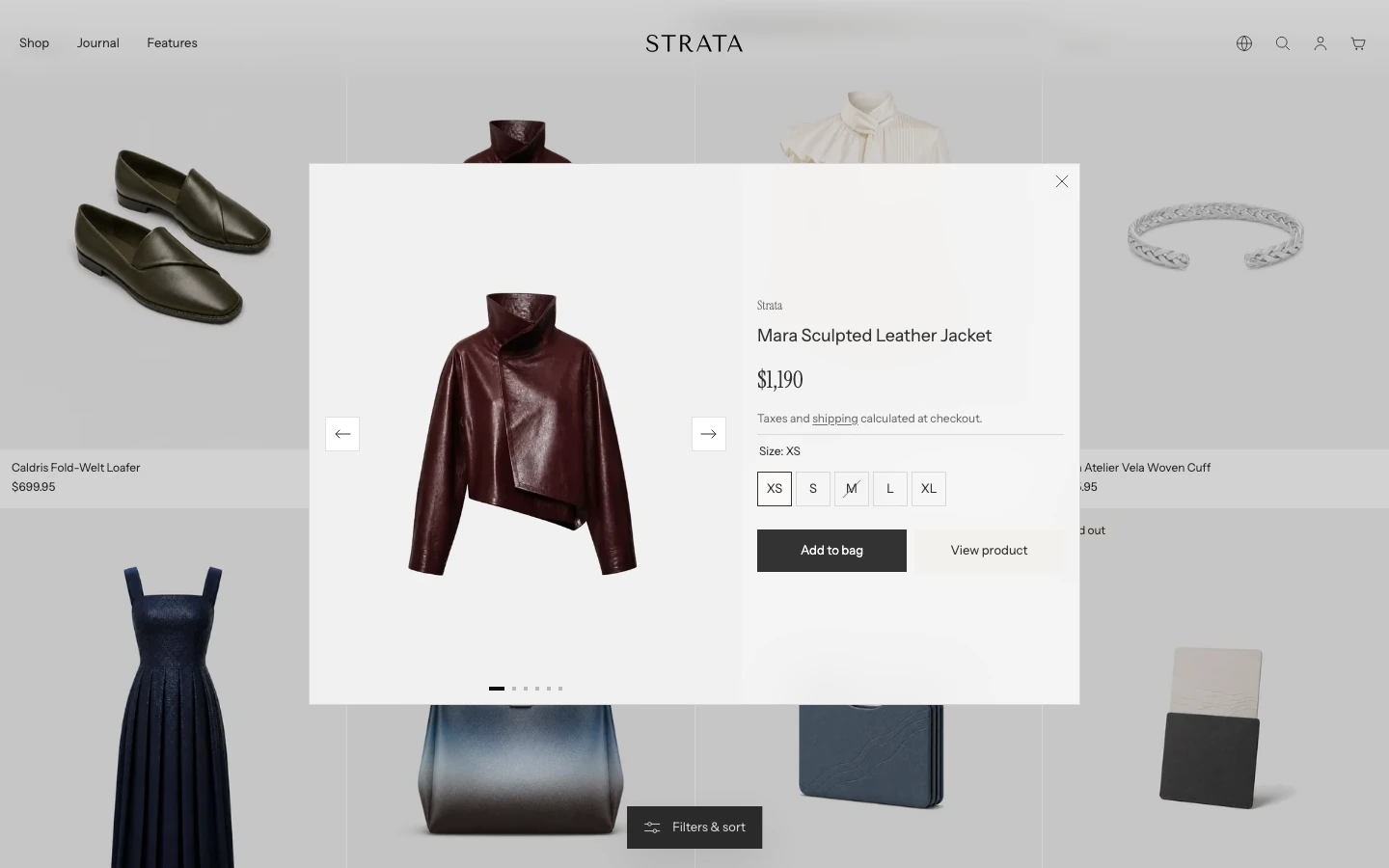
For a product with options, quick buy opens this quick view.
With Show quick buy enabled:
- on desktop, an available product with only Shopify's default variant can add directly;
- on desktop, a product with selectable options opens a window for choosing before adding, even if it currently has only one named variant;
- on mobile screens up to 749 px wide, product cards hide quick buy and shoppers open the Product page from the card;
- an unavailable selected variant does not offer the normal add action;
- gift cards and products with selling plans do not use product-card quick buy.
Preview these product states at desktop and mobile sizes before relying on quick buy as a purchase path. See Product card and Product.
Why does Color display mode: Hide still show swatches?
Color display mode: Hide still shows the Swatch presentation. To remove eligible color choices from product cards, turn off the separate Show color swatches control.
The global Color swatches setting remains the master control for swatch data, and Show on product pages separately controls eligible Product-page pickers. This limitation belongs to Product cards; it does not mean the product's color option has been removed.
Why are color swatches missing?
Product-card swatches need all of the following:
- global Enable color swatches is on;
- Product card Show color swatches is on;
- the product has a native swatch or a Color/Colour option that Strata can match.
Native Shopify swatch data takes priority. Custom color mappings are fallback presentation data and must match the option value. A Product page also has its own Show on product pages gate. See Color swatches for matching and accessibility guidance.
Which Product media layout should I use?
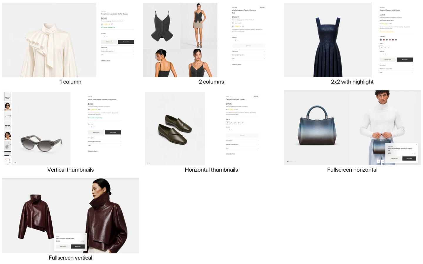
The seven Desktop media layout options.
Desktop media layout offers three different kinds of product story:
| Layout group | Options | Best suited to |
|---|---|---|
| Grid | 1 column, 2 columns, 2x2 with highlight | Keeping several product views visible while shoppers read the product information. |
| Carousel | Vertical thumbnails, Horizontal thumbnails | Concentrating attention on one active image, video, or 3D model at a time. |
| Gallery | Fullscreen horizontal, Fullscreen vertical | Building an immersive, full-width product page with a compact information panel over the media. |
The two Fullscreen layouts are Strata's distinctive product presentations. Both remove the ordinary media-side choice, place the product information in an expandable panel, and make the desktop Product page eligible for the transparent Header. Strata adds a dark Header gradient over Fullscreen horizontal and Fullscreen vertical to keep navigation readable over changing media.
- Choose Fullscreen horizontal for a full-height row that visitors move through sideways with gallery controls.
- Choose Fullscreen vertical for a two-column media wall with a sticky information panel. The panel can sit left, center, or right.
- In either Fullscreen layout, choose whether the panel begins expanded or collapsed. Mobile keeps the information expanded.
Choose a grid when comparison is more important than immersion. Grid layouts show a flat media sequence without arrows; in 2x2 with highlight, the first media item spans both columns. Choose a thumbnail carousel when shoppers need a compact, familiar gallery. Choose a Fullscreen layout when the product photography can carry the page and has enough contrast and crop flexibility for the Header and purchase panel.
Image zoom applies to image media, while video and 3D media keep their own controls. Use Product for media position, size, gap, ratio, mobile controls, and variant-media settings.
Why does a Product option open differently on mobile?
Eligible color options can use swatches. Size options use compact buttons, while other Product-page options use an enhanced dropdown on desktop and a mobile option sheet.
The Product Style setting exposes Auto, Swatches, and Desktop dropdown / mobile option sheet. This setting does not replace the compact Size selector. Check selected and unavailable variants in both viewports rather than expecting every option to use the same control.
What is the difference between recommendations and recently viewed products?
| Surface | Product source |
|---|---|
| Product recommendations | Shopify related or complementary recommendations, unless manually selected products replace them |
| Recently viewed products | The current browser's permitted local viewing history, excluding the current product |
Recently viewed history is not an account-level list and does not synchronize across browsers or devices. Either section can stay hidden when it has no eligible products.
Why are Collection banner and Collection separate?
- Collection banner owns the title, breadcrumbs, hero media, parallax, colors, and transparent-Header eligibility.
- Collection owns category shortcuts, filters, sorting, product loading, the grid, and promotional or subscribe blocks.
Open the section that owns the result you want instead of looking for hero controls inside the product-grid section.
Why are filters or category shortcuts missing?
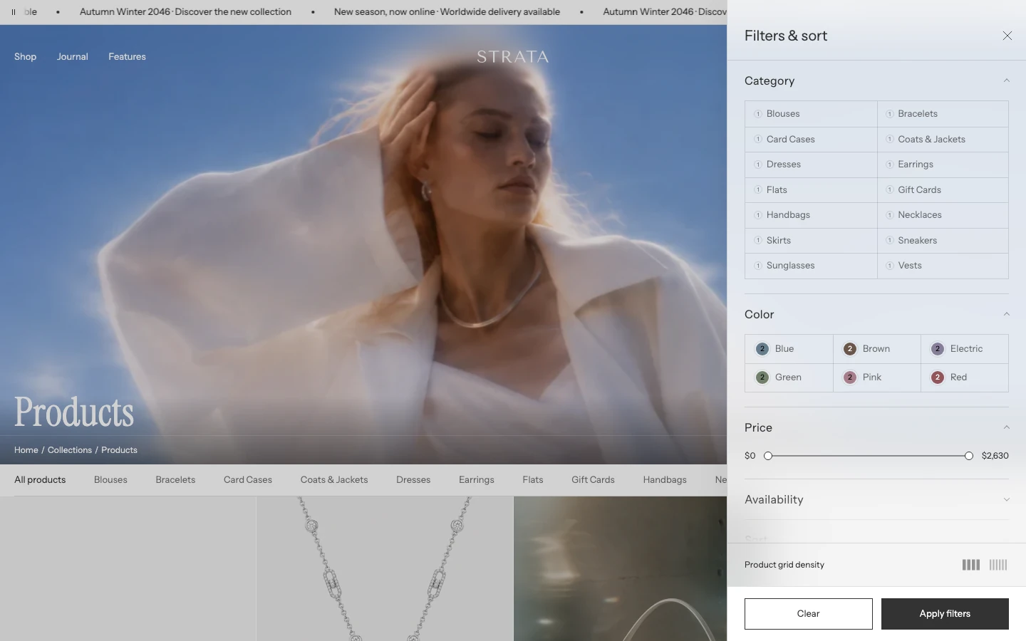
Filters and category shortcuts on a collection page.
The theme can display only filters Shopify supplies for the current result set. Enable filtering does not create filter definitions or product data. Show category shortcuts uses the Shopify category filter when available and falls back to product type.
Check Shopify's filter configuration and the products in the current collection before treating an empty control as a theme issue. See Collection for the filter and loading settings.
How should I choose Infinite scroll or Pagination?
Use Infinite scroll for continuous browsing. Use Pagination when shoppers benefit from a stable page sequence or need to return to a known result page. Promotional and Subscribe banners appear only in the first group and count toward Products per page. See the Collection guide for the available quantities.
The Collection guide explains the loading quantities and block-placement rules. When the result has no next page, the progress summary shows that browsing is complete.
What do the Collection grid density controls change?
Use Desktop density to choose the two desktop column counts available to shoppers: Spacious — 3 / 4 columns, Balanced — 4 / 6 columns, or Dense — 5 / 6 columns. Enable Show grid density controls when shoppers should be able to switch between that pair. Their choice can be remembered in the same browser.
Mobile does not use the desktop pair. Choose 1 column or 2 columns with Mobile columns.
Full width product grid is a separate merchant setting. It changes the available width of the grid, while density changes how closely cards are arranged within that space. Test both choices with real product titles, prices, badges, swatches, and quick-buy controls.
Why does Cart open a drawer on one page and a page on another?
Global Enable cart drawer chooses the normal cart experience. When it is off, Cart links open the full Cart page. When it is on, the Header can open the Cart drawer, except on the Cart page itself, where the shopper is already in the full cart flow.
On phones (screens narrower than 750 px) the drawer is never used: Add to cart updates the cart count in the Header, and the cart icon opens the full Cart page.
The free-shipping progress is shared by the drawer and page. It appears only for a non-empty cart with a positive threshold and the store's own currency. Configure the global behavior in Cart and page-specific content in the Cart template.
Where do Complete with products come from?
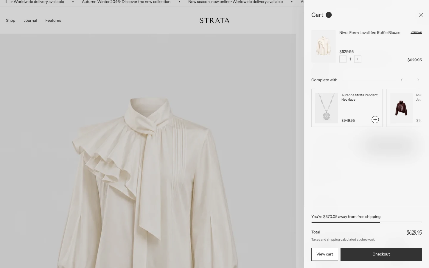
The Complete with row inside the cart drawer.
The Cart drawer shows up to 4 related recommendations for the first product in the cart. Configure that product's Related products in Apps > Search & Discovery > Product recommendations. Use Theme settings > Cart > Show product recommendations to turn the row on or off. It stays hidden when no eligible results are available.
The full Cart page can have its own Product recommendations section, with separate settings and optional Manual recommendations. Its automatic results also use the first cart product, and it excludes products already in the cart.
Why is the free-shipping bar missing?
The bar is hidden when the cart is empty, Free shipping minimum amount is blank or 0, or the shopper is not using the store currency. The threshold is not converted into a promise for every market. Check Cart settings before changing unrelated drawer or page content.
What appears before and after I type in Search?
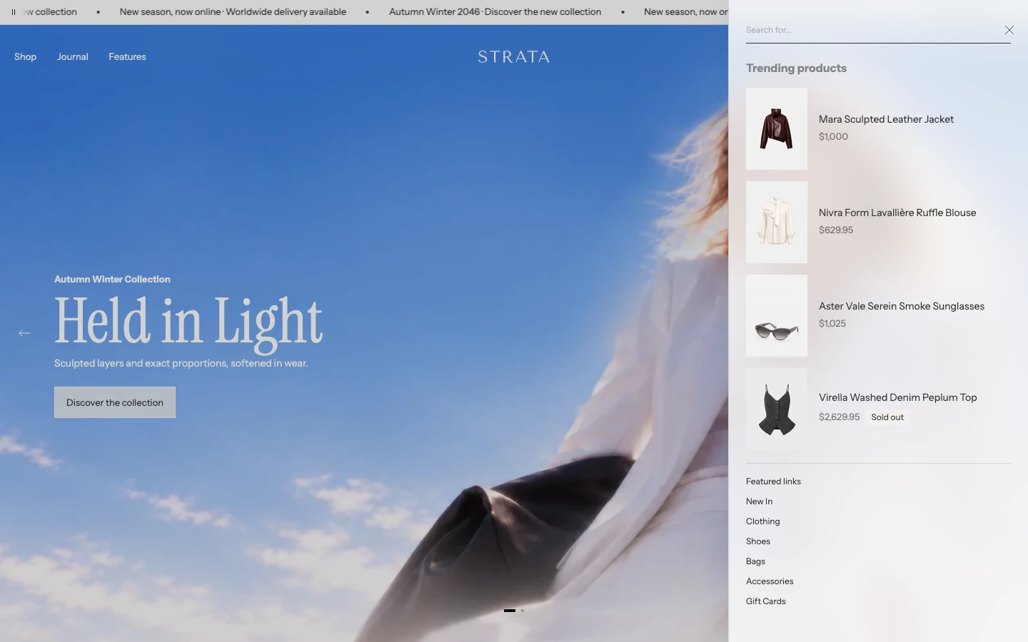
Before typing: trending products and featured links.
The predictive Search drawer keeps its configured Featured links and Trending products for an empty query or a trimmed query shorter than 2 characters. At 2 or more characters, it can return up to 3 suggested queries plus product and article resources.
When both types have results, the tabs are Products and Blog posts, with Products selected first. When only one type is available, it appears without a tab switcher. The full Search page supports both products and blog posts. Matching blog posts make a type-switching row available above the product filters; filtering and sorting apply only to product results.
Do not expect the drawer tabs and full-page result layout to match.
If the result differs
Use one representative product or collection and record its availability, variants, selling plans, filters, currency, and query. Then follow the canonical guide or Troubleshooting without changing unrelated global card settings.