
Media hero is Strata’s large image-and-video section. Use the Media hero — single preset for one fixed hero, or Media hero — slideshow when visitors should move between several image or video slides.
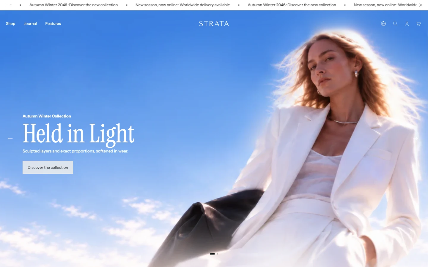
Desktop example: the first media section supports the transparent Header while keeping slide controls and copy visible.
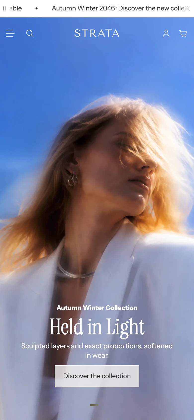
Mobile example: review the Header contrast, focal point, copy length, and controls together rather than treating the desktop crop as the mobile result.
Add Media hero
- Open Online Store > Themes > Edit theme.
- Use the page selector to open the template where the hero should appear.
- Select Add section, then choose Media hero.
- Choose Media hero — single or Media hero — slideshow, or add the blocks yourself.
The section supports up to 5 blocks. One block gives you a fixed hero; more than one enables slide controls and makes autoplay relevant. The Single and Slideshow presets use the same section controls; the Slideshow preset starts with two Image slides and one Video slide so each media type is clear during setup.
Layout
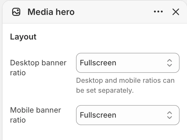
The Layout group in the Theme Editor. The values shown are examples, not defaults.
| Setting | Options and use |
|---|---|
| Desktop banner ratio | Fullscreen, Natural, 21:9, or 32:9. Default: Natural. |
| Mobile banner ratio | Fullscreen, Square, or 4:3 portrait. Default: 4:3 portrait. |
Natural follows the first slide’s available media ratio. Choose a fixed ratio when every slide should occupy a consistent frame, then check image and video crops together.
Header
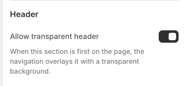
The Header group in the Theme Editor.
Allow transparent header
Default: On. When this section is first on the page, it can sit beneath a transparent Header. The Header’s own transparent mode must also allow the state. This setting does not make a later section transparent.
Motion and controls
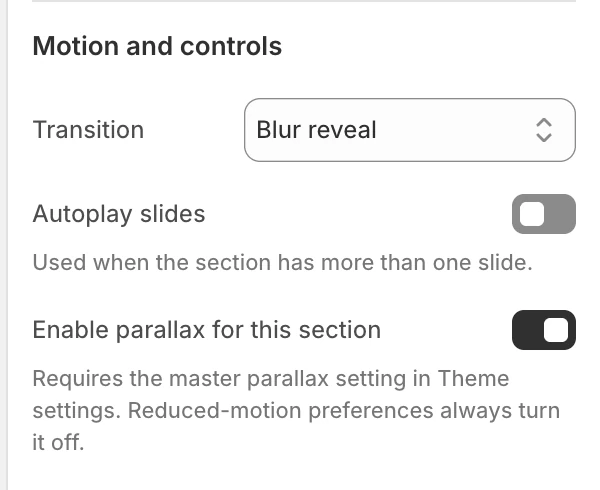
The Motion and controls group in the Theme Editor.
| Setting | Options and use |
|---|---|
| Transition | Slide, Fade, or Blur reveal. Default: Blur reveal. Use it for a softer layered change between slides. When global blur is off, it uses a gentle gradient reveal without the blur. |
| Autoplay slides | Advances between slides without a visitor selecting one. Default: Off. It applies when the section has more than one slide. |
| Change slides every | 3–12 seconds in 1 second steps. Default: 5 seconds. Visible when Autoplay slides is on. |
| Pause on hover | Pauses autoplay on devices that support hovering. Default: On. Visible when Autoplay slides is on. |
| Enable parallax for this section | Default: On. Allows this section to use parallax only when the global Enable parallax effects setting is also on. A reduced-motion preference overrides both settings. See Animation for the global control. |
With one block there is no slide-to-slide transition, dot navigation, or autoplay cycle to review.
Shoppers can select dots, move through them with a keyboard, and swipe on touch screens.
Transition: Blur reveal (the default), shown moving to the next slide and back.
Spacing
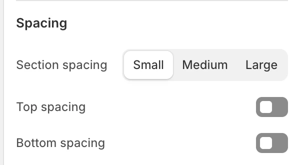
The Spacing group in the Theme Editor.
| Setting | Options and use |
|---|---|
| Section spacing | Small, Medium, or Large. Default: Small. |
| Top spacing | Adds the section’s top spacing. Default: Off. |
| Bottom spacing | Adds the section’s bottom spacing. Default: Off. |
Blocks
Add up to 5 blocks and reorder them in the Theme Editor. The available block types are Image slide and Video slide.
Image slide

Image slide block settings.
Media
| Setting | What it controls |
|---|---|
| Image | The main slide image. Select an image before publishing. |
| Mobile image | Optional narrow-layout replacement. When blank, the main Image is reused. |
| Media fit | Cover fills the frame and can crop; Contain keeps the full image visible. Default: Cover. |
When parallax is enabled, choose Cover. Contain can reveal empty edges as the media moves.
Content
| Setting | What it controls |
|---|---|
| Eyebrow | Short line above the slide heading. Default: Featured. |
| Heading | Main slide message. Default: Introduce your campaign. |
| Title size | Small, Medium, or Large. Default: Small. |
| Use as page heading (H1) | Makes this slide Heading the main title of the page. Turn it on for one slide only. Default: Off. |
| Text | Supporting rich text. |
| Button label and Button link | First action. The action appears only when both are supplied. |
| Button style | Text link, Primary, or Secondary. Default: Text link. |
| Second button label and Second button link | Optional second action. It also requires both fields. |
| Second button style | Text link, Primary, or Secondary. Default: Text link. |
Layout
| Setting | Options and use |
|---|---|
| Content horizontal position | Left, Center, or Right. Default: Left. |
| Content vertical position | Top, Middle, or Bottom. Default: Bottom. |
| Mobile text alignment | Left or Center. Default: Center. |
| Mobile text position | Middle or Bottom. Default: Middle. |
| Content width | Small, Medium, or Large. Default: Medium. |
Colors
| Setting | Options and use |
|---|---|
| Text color | Color used by the slide copy. Default: #FFFFFF. |
| Enable color overlay | Adds a color layer over the slide media. Default: On. |
| Overlay color | Color used by the overlay. Default: #000000. |
| Overlay opacity | 0–50% in 1% steps. Default: 30%. |
Video slide
Media
| Setting | What it controls |
|---|---|
| Desktop background video | Hosted video for larger layouts. |
| Mobile background video | Optional narrow-layout video. When blank, the desktop video is reused. |
| Fallback image | Still image used when the video cannot play or motion is reduced. |
| Media fit | Cover or Contain. Default: Cover. |
When parallax is enabled, choose Cover. Contain can reveal empty edges as the media moves.
The Video slide uses the same Content, Layout, and Colors labels and options as the Image slide (its default heading is Create a video block), including Use as page heading (H1), both optional buttons, and the overlay controls. There is no separate mobile fallback-image setting in this block; use the video’s mobile source or the shared fallback image. If all video and fallback fields are empty, the slide shows a video placeholder rather than a working Play control.
Desktop and mobile behavior
Desktop and mobile banner ratios, media sources, and text placement are configured separately. Desktop copy can use Left, Center, or Right alignment and Top, Middle, or Bottom positioning. Mobile copy uses the simpler Mobile text alignment and Mobile text position choices, so set and review it independently rather than assuming it follows the desktop layout.
Review every slide at both sizes, especially when a subject’s focal point moves between a wide and portrait crop. A mobile image or video can replace the desktop source; leaving it blank reuses the desktop source.
Media recommendations
Use descriptive alt text for informative images in Shopify Files. Keep essential copy in the slide fields rather than inside the image. Add a fallback image for every Video slide and check the fallback without playback.
Accessibility and motion
- Keep slide copy concise enough to read before the next transition.
- Use the visible arrows, dots, and play/pause control rather than making autoplay the only navigation path.
- Check focus visibility and the labels of the slide controls.
- Keep essential information available in still images and text when motion is reduced.
- Review keyboard, touch, autoplay, transition, and reduced-motion behavior before publishing.
Common issues
- The section looks static: check the number of blocks. One block has no slide-to-slide transition.
- Autoplay controls are missing: confirm there are multiple blocks and Autoplay slides is on; Pause on hover and Change slides every are conditional settings.
- The Header is unreadable over the first slide: review Allow transparent header, the Header’s transparent setting, the slide’s Text color, and the overlay together.
- A slide is too dark or too light: adjust Enable color overlay, Overlay opacity, and Overlay color, then check every slide rather than only the first.
- A video slide shows no useful still: populate Fallback image and verify the video source.
Related guides
- Split media banners for one or two independent promotions.
- Video for a focused video section.
- Flexible media grid for mixed blocks with independent spans.
- Animation for reduced motion and parallax controls.