
The Newsletter popup presents an email signup at a chosen moment and position. Use it for an offer, launch list, or regular store updates when the visitor can subscribe without leaving the page.
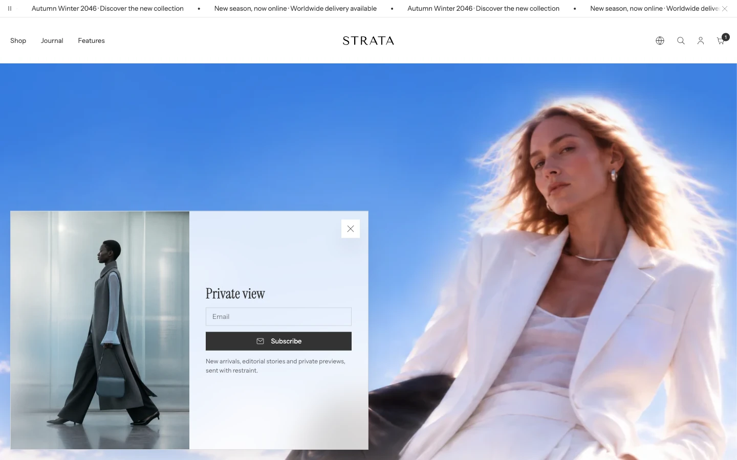
Newsletter popup on desktop with Image position: Left.
Add or open this feature
In Shopify, open Online Store > Themes > Edit theme, then select the Overlay group and open Newsletter popup. Strata allows one Newsletter popup in the overlay group. A new Strata install already includes Newsletter popup in the Overlay group, hidden. Select it in the sidebar and choose Show section (the eye icon) to turn it on; its content is ready to edit.
Content
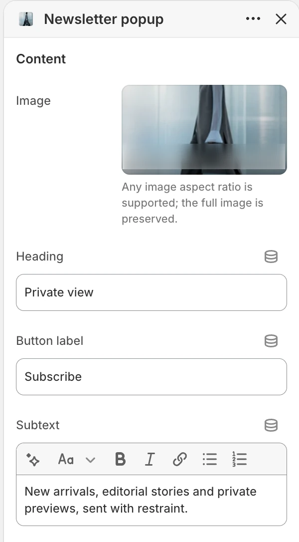
The Content group in the Theme Editor. The values shown are examples, not defaults.
Image
Adds the optional popup image. Any image aspect ratio is supported and the full image is preserved rather than cropped. Choose an image that still reads when the popup is placed at the edge of a smaller screen.
Heading
Sets the main signup message. State the value of subscribing rather than using a generic prompt alone.
Button label
Sets the submit button text, such as Subscribe. Keep the action explicit so visitors know the form will add them to the marketing list.
Subtext
Adds supporting rich text below the heading. Use it for update frequency, the type of content sent, or a concise expectation about the signup.
Form
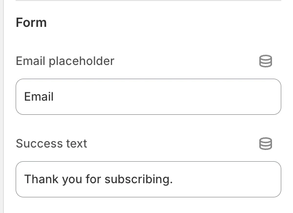
The Form group in the Theme Editor.
Email placeholder
Sets the text shown before a visitor enters an email address. Use a clear example such as Email; this is placeholder text, not a value submitted to Shopify.
Success text
Sets the confirmation shown after a successful subscription. Tell the visitor what happened without promising a delivery time that your email workflow does not guarantee.
Submitting the form adds the address to Shopify's customer marketing list. Shopify shows a validation error when the email cannot be accepted and displays the configured success message after a successful signup. Configure the rest of the email relationship in Shopify and your email service.
Layout
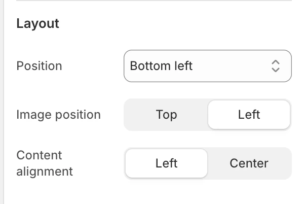
The Layout group in the Theme Editor.
Position
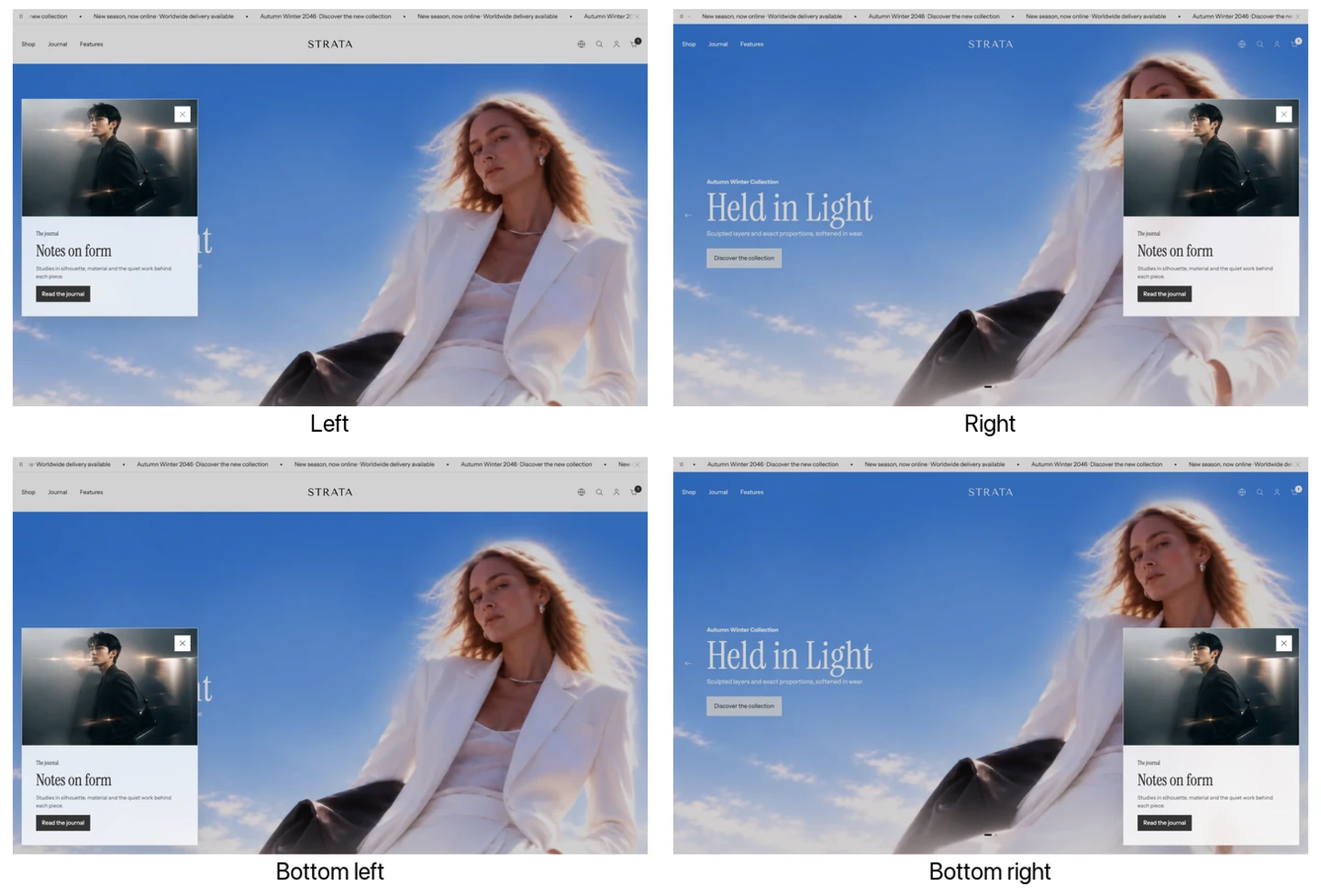
The four Position options, shown with the Message popup. The Newsletter popup uses the same positions.
Choose where the popup enters the storefront:
- Left — vertically centered on the left edge.
- Bottom left — anchored to the lower-left corner.
- Right — vertically centered on the right edge.
- Bottom right — anchored to the lower-right corner.
Image position
Choose Top or Left. Top places the image above the form content; Left places it beside the content when the available layout supports that arrangement.
Content alignment
Choose Left or Center for the heading, subtext, and form content.
Behavior
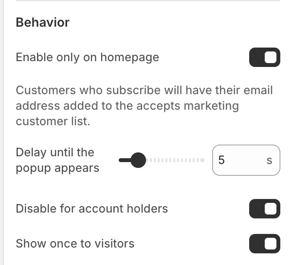
The Behavior group in the Theme Editor.
Enable only on homepage
Limits the popup to the home page. Enable it for a home-page campaign; disable it when the same signup should be available across the storefront.
Delay until the popup appears
Sets how long Strata waits before the popup can appear. The available range is 0–30 s, in 1 s steps. Use a delay long enough for visitors to understand the opening page before asking for an email.
Disable for account holders
Prevents the popup from appearing to signed-in customers. Enable it when account holders have already supplied an email or should not receive the acquisition prompt.
Show once to visitors
Limits the automatic popup to one display for a visitor. The seen state is kept in that visitor's browser. Disable it when a recurring reminder is intentional; avoid using a recurring prompt for a message that does not change.
A visitor who clears browser storage or uses another browser or device may be treated as new. Do not use this setting as a consent record or as a substitute for subscription management.
Popup state matrix
| Settings | Result |
|---|---|
| Enable only on homepage on | The popup is limited to the home page. |
| Disable for account holders on | Signed-in customers are excluded. |
| Show once to visitors on | The browser remembers that the popup has been shown. |
| Image Top | Media sits above the form content. |
| Image Left | Media sits beside the content where the layout permits. |
Desktop and mobile behavior
Review the popup at desktop and mobile widths after choosing an image.
Accessibility and motion
Use a meaningful image and heading, keep the close action discoverable, and make success and error messages understandable without color alone. The popup supports Escape and keeps keyboard focus within the open dialog. Strata coordinates automatic overlays so only one automatic popup takes focus at a time.
Common issues
- The popup does not appear: check that the popup is present and visible in the Overlay group, then review the delay, Enable only on homepage, Disable for account holders, and Show once to visitors.
- The popup appears only on the home page: turn off Enable only on homepage if the signup should run elsewhere.
- A returning visitor does not see it: check Show once to visitors and the browser's stored popup state.
- The image feels cropped: it is designed to preserve the full image; try a different image position or a source with more usable space around the subject.