
The Blog template turns a Shopify blog into a browsable editorial index. Use it to introduce the journal, feature one story, organise articles by tags, and collect newsletter sign-ups without changing individual article content.
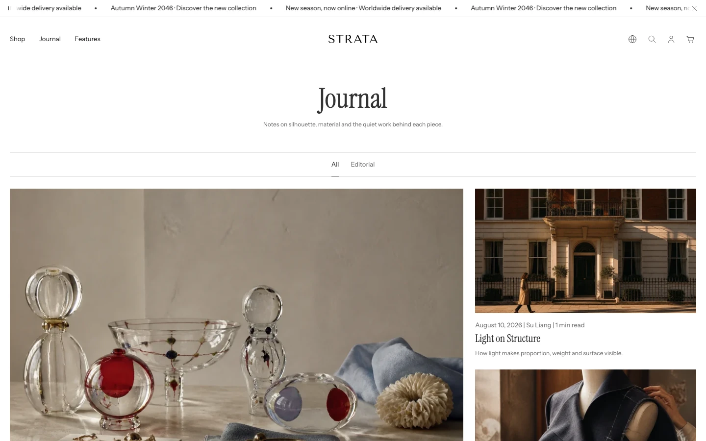
The Blog template on desktop with the feature post and tag filter.
Open the Blog template
- From Shopify admin, go to Online Store > Themes > Edit theme.
- Use the page selector to open Blogs > the blog you want to review.
- Select the Blog section.
- Preview a blog with several articles, article tags, an article without an image, and an empty blog before saving.
The Blog section can show an introduction, a feature story, tag links, an article grid, and an optional newsletter row.
Content
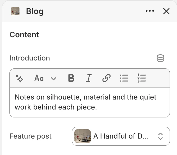
The Content group in the Theme Editor. The values shown are examples, not defaults.
Introduction
- Controls: Adds the rich-text introduction shown below the blog title.
- Use it when: Explain what the blog covers or set expectations for the type of stories customers will find.
Feature post
- Controls: Selects the article used as the feature story.
- Use it when: Choose a specific article when the editorial priority should not change automatically.
- Dependency: If no article is selected, Strata uses the blog's first article as the feature candidate.
Articles
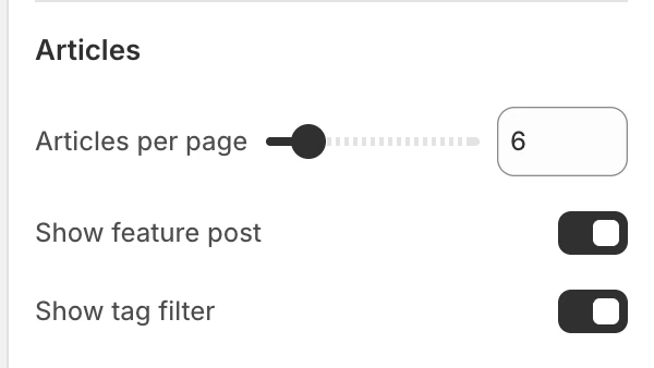
The Articles group in the Theme Editor.
Articles per page
- Controls: Sets the number of articles loaded for the listing.
- Options: 3–24 articles, in steps of 1. The default is 9.
- Use it when: Choose a count that keeps the listing easy to scan while providing enough content before loading more.
Show feature post
- Controls: Shows or hides the feature story at the start of the listing. The default is on.
- Use it when: Keep it on when one story should lead the page; turn it off when every article should have equal weight.
- Dependency: A feature story is shown only when a feature candidate exists.
Show tag filter
- Controls: Shows or hides the blog tag navigation. The default is on.
- Use it when: Enable it when articles have meaningful tags that help customers choose a topic.
- Dependency: The navigation is useful only when the blog has tags.
Layout
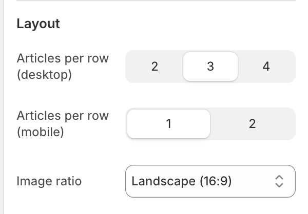
The Layout group in the Theme Editor.
Articles per row (desktop)
- Controls: Sets the number of article cards per desktop row.
- Options:
2,3, or4. The default is3.
Articles per row (mobile)
- Controls: Sets the number of article cards per mobile row.
- Options:
1or2. The default is1. - Use it when: Use one column when article imagery and excerpts need room; use two only after checking title wrapping and tap targets.
Image ratio
- Controls: Sets the article-card image ratio.
- Options:
Portrait,Square, orLandscape (16:9). The default isLandscape (16:9).
The feature story and article cards display their article image whenever one is available. When an article has no image, Strata shows a neutral illustration so the listing keeps its structure. Add suitable article images before publishing when imagery is part of the blog design.
Cards
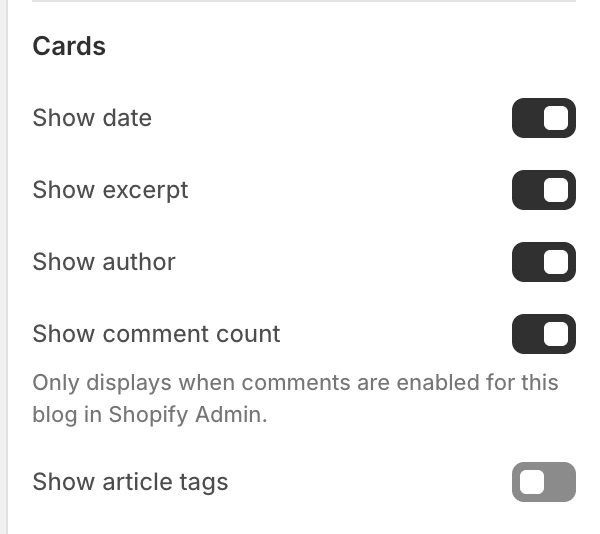
The Cards group in the Theme Editor.
Show date
- Controls: Shows publication dates in article metadata. The default is on.
Show excerpt
- Controls: Shows the article excerpt on feature and card presentations. The default is on.
- Use it when: Keep it on when a short preview helps readers choose between stories; turn it off for a more compact image-and-title index.
Show author
- Controls: Shows the article author in card metadata. The default is on.
- Use it when: Enable it when authorship is meaningful and author names are maintained consistently across the blog.
Show comment count
- Controls: Shows the number of comments for an article. The default is on.
- Dependency: A count appears only when comments are enabled for that blog in Shopify Admin.
Show article tags
- Controls: Shows article tags on the feature and card presentations. The default is off.
- Use it when: Enable it when tags are curated and useful as a second navigation path.
Newsletter
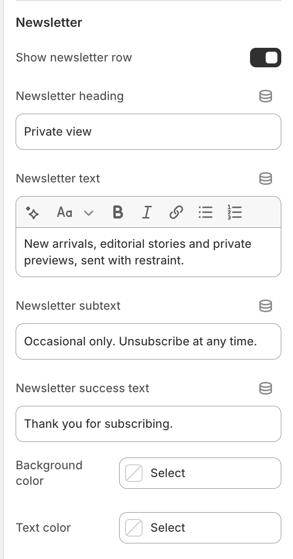
The Newsletter group in the Theme Editor.
Show newsletter row
- Controls: Adds the newsletter signup row to the blog listing. The default is on.
- Use it when: Enable it when the store has an approved email-capture workflow and the blog is a natural subscription entry point.
Newsletter heading
- Controls: The row's heading. The default is
Join our newsletter.
Newsletter text
- Controls: Supporting rich text below the heading.
Newsletter subtext
- Controls: Short supporting text for the signup row. The default is
You can unsubscribe at any time.
Newsletter success text
- Controls: Message shown after a successful signup. The default is
Thank you for subscribing. - Check before publishing: Test success and error states with the store's Shopify email-subscription configuration.
Background color
- Controls: Sets the background of the newsletter row on the Blog template.
- When blank: Uses the newsletter row's soft neutral background.
Text color
- Controls: Sets the newsletter row's heading, supporting copy, field, and action color.
- When blank: Uses Theme settings > Colors > General > Text.
Spacing
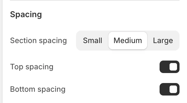
The Spacing group in the Theme Editor.
Section spacing
- Controls: Sets the Blog section spacing to
Small,Medium, orLarge. The default isMedium.
Top spacing
- Controls: Adds or removes top spacing. The default is on.
Bottom spacing
- Controls: Adds or removes bottom spacing. The default is on.
Desktop and mobile behavior
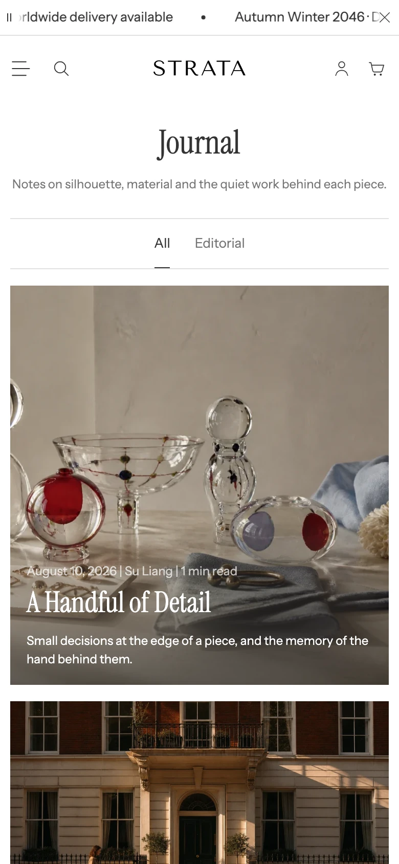
The Blog template on mobile.
The template exposes separate article-card columns for desktop and mobile. Before publishing, review:
- feature-story prominence and image crop;
- tag navigation when tags wrap or are absent;
- one-column and two-column article cards with long titles;
- article loading and any load-more state after the first group;
- newsletter form focus, validation, and success messaging.
Media recommendations
Use article images with a clear subject that survives the selected ratio. Check the focal point on the feature story and on cards.
Accessibility and motion
Keep tag links, article cards, and newsletter fields keyboard reachable with visible focus. Provide meaningful alternative text for article images. Check image reveals and article loading with reduced motion turned on.
Common checks
- If the feature story is not the expected article, check Feature post and Show feature post before changing article content.
- If the tag filter is not visible, confirm that the blog has tags and that Show tag filter is enabled.
- If excerpts or authors are missing, check Show excerpt and Show author in the Cards group.
- If comment counts are missing, check Show comment count and confirm comments are enabled for the blog in Shopify Admin.
- If a newsletter result is unclear, test the form with a non-sensitive address rather than a real customer address.